![[OLD FALL 2018] 15-104 • Introduction to Computing for Creative Practice](../../../../wp-content/uploads/2020/08/stop-banner.png)
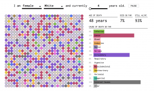
This is a screenshot of the data visualization chart for the many ways to die by Nathan Yau, It is titled How You Will Die and is published on FlowingData.com.
https://flowingdata.com/2016/01/19/how-you-will-die/
Created by Nathan Yau; Date Unknown.
I have long admired this project for several reasons. First and foremost it allows for the right amount of customization. Often times, data visualizations will overdo the interactivity component or not include it at all. This project is in the goldilocks zone of interactivity and customizability. I also very much admire how the information is presented. It takes a simple approach (using circles) to convey a complex amount of statistical data. Fascinating to say the least. I think this plays nicely into how Nathan Yau uses a very computational method visualization in his work. In many ways his artistic sensibilities are nested within the final product. As for the algorithms used, it seems to be various algorithms that pull from a statistical database.