Fanjie Jin-Looking Outward-09

WDCH Dreams, Refik Anadol

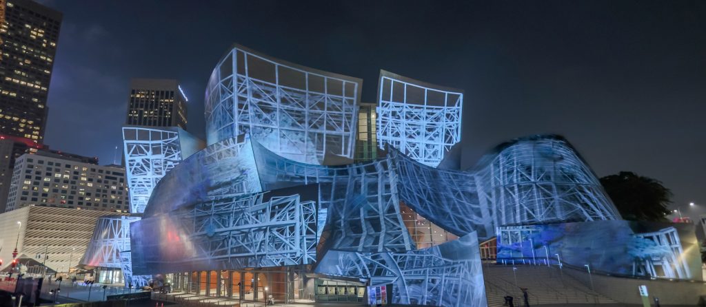
A Looking Outwards assignment that I found interesting was my classmate Taisei Manheim’s week 8 LookingOutwards post. I think this project, WDCH Dreams, that Tai has chosen is really interesting in that the data visualization was projected onto the facades of the Walt Disney Concert Hall. The displayed dataset was the 45 terabytes of data from the LA Phil data archives and through artificial intelligence algorithm, Refik Anadol utilized a computational ‘mind’ to mimic how humans dream – by processing memories to form a new combination of images and ideas. 

Agreeing with Tai, this project truly shows really high levels of rigorous and endeavors as every detail of the Disney Concert Hall from old Catia models has been remodeled so that all the projection and data visualization will be smoothly and coherently mapped on the very irregular surfaces. As an architecture student, this project is really exciting to me in that it is fascinating to see a new layer of meaning and information on top of the original complex geometry. Through the use of light as an architectural median showing the memories that are associated with this concert hall, Refik Anadol has established a new sense of visual performance that has a hybrid relationship between architecture and media arts with machine intelligence. 

Katrina Hu – Looking Outwards – 09

Claire Lee’s Post: Prelude in ACGT

Pierry Jacquillard’s Prelude in ACGT

I chose to review Claire Lee’s Looking Outwards 04 Post. Her post looks at Pierry Jacquillard’s Prélude in ACGT. This piece takes the A-C-G-T (adenine, cytosine, guanine, thymine) order of Jacquillard’s own DNA and turns it into a musical composition. He uses a Javascript-based program to do this, creating a piece that is correlated to the order of his own DNA. The project uses a midi library that generates signals to be converted into electronic sounds.

I also think the cited project is really interesting, as it combines the topics of art, technology, and biology. I agree with Claire’s assessment that this work is very simple, but that the concept in itself is very creative. It is also fascinating how the entire project’s sheet music is an entire book long, yet only contains 0.2% of Jacquillard’s entire DNA. I think the idea itself is very different from other works, as it combines many fields of study.

Kimberlyn Cho- Looking Outwards 09

A post I found most interesting while looking through my peers’ looking outwards is Lee Chu’s post for week 04. He focused on Porter Robinson and his visuals for live performances. I found the attached video of Porter’s visuals at one of his live performances to be really exceptional and breath-taking, which is why I chose to look into the process of the animations for my looking outwards. As Lee describes, Porter is a well known EDM artist who is noted for his amazing animations that are coherent to his music. I agree with Lee in that Porter’s musical style and artistic inspiration are well translated into his visuals that are portrayed in beautiful pastel, futuristic landscapes. As I looked into the process behind the animations, it was most interesting to learn that Porter receives a lot of inspiration from anime- especially the exploration of love and adventure in alternative realities by the characters. Hence, the artists behind his animations take Porter’s foundation into heavy consideration in all design choices, and actually personally involve Porter in most of the process. One of the challenges is said to have been trying not to be overwhelmed while creating a coherent piece of art. I found it amusing to hear that they actually struggled with this because it seems like they did an exceptional job at undergoing such a difficult development process.

Jasmine Lee – Looking Outwards – 09

For my Looking Outwards this week, I chose to look at Fanjie Jin’s Looking Outwards 05. He chose to write about Alex Roman’s renders, done using VRay and digital modeling. Although I am somewhat familiar with VRay, I have rarely looked at renders of this level before this. Roman’s renders focus on creating lighting conditions which are incredibly hard to capture in real life. Yet, he can completely convince the viewer that what they are looking at is real. His use of lighting is masterful and can turn blank-slate digital models into beautiful “snapshots” of famous existing buildings.

In his animated piece, “The Third & The Seventh,” Roman showcases his renders by providing a walk through instead of simply a slideshow of his pieces. He also shows the layers that went into creating each of his pieces, with multiple steps of post-processing. The inclusion of moving elements combined with varied light conditions adds a sense of fantasy to his illusions.

Even Exeter Library, a building which I had seen in person, felt somewhat familiar and otherworldly at the same time. Agreeing with Fanjie, the renders are so realistic they convince the viewer regardless of their previous experiences.

Phillips Exeter Library, recreated with dramatic lighting by Alex Roman.
Photograph of Exeter Library interior from ArchDaily.

Sean Meng-Looking Outwards-09

In this week’s Looking Outwards, I was interested in my classmate Fanjie Jin’s post about the randomness in art. The artist he researched is Cy Twombly. He creates large scale free handed calligraphy work using paint. According to the post, the artist creates his art pieces by completely relying on his intuitive feelings about composition, shape and colors. It brings up an interesting discussion about what is random and what is not in art. Even though the artist catches his intuitive stroke to create the paintings, he still maintain some degrees of control in his work since it was his hand and mind that determine the final work. I think what random about art is the artist come up with a methodology or workflow of creating and then he loses his control of his own workflow and let the invention does its own work without being affected by the artist himself.

“Blackboard” by Cy Twombly

Ammar Hassonjee – Looking Outwards 09

For this Looking Outwards project, I chose to focus on my classmate Jai Sawkar’s Looking Outwards 07 post. In this post, he talks about a project called Phantom Terrains created by Frank Swain and Daniel Jones which is an abstract representation of the data streams around us and is an attempt to visualize the invisible flows of data that run from our devices to routers back to our devices. The algorithm that drives Phantom Terrains works by having wireless data streams be transferred to a hearing aid, which then interprets the data flows as audio representations and sound signals. The sound signals can then be visualized as a topographic like map then.

A sample image showcasing the auditory signals and graph at the bottom and the information visualization of the data stream at the top.

I agree with Jai’s point that the project is very interesting in that it’s a compelling graphic that visualizes something we might not necessarily be able to see. In fact, it requires us to use our other senses of hearing to create a graphical information representation. The link to the website can be found here.

Taisei Manheim – Looking Outward – 09

A project that I thought was interesting when looking through different posts was Jai Sawkar’s Looking Outward post for week 7.  The project was called Phantom Terrains and was by Stefanie Posavec.  For this project she tries to make us aware of the invisible silent wireless data signals that surround us translating the characteristics of the wireless signal into sound.  She also created a graphic to depict the wireless network landscape on a walk around the BBC Broadcasting House.

I agree with Jai that this creates a very compelling graphic and that it is interesting how she managed to take a phenomena that is constantly occurring around us without us sensing it and recreating it so we could experience it with multiple of our senses.  Also, for our studio in architecture we had a mapping project in which we had to map parts of an island that can’t be seen, such as wind or the history of the island and it is interesting to see how they used different pitches, colors, and line thicknesses to denote different aspects of the wireless signals.

link to project

Stefanie Posavec, Frank Swain and Daniel Jones: Phantom Terrains

Jasmine Lee – Looking Outwards – 08

Paola Antonelli is the Senior Curator of the Department of Architecture and Design at the Museum of Modern Art in NYC. She joined the museum department in 1994 as an associate curator, and has worked her way up since. Before joining the MoMa board, she was a lecturer at UCLA and taught a course at the Harvard Graduate School of Design. Although she received her Master’s degree in Architecture from the Polytechnic of Milan, Antonelli never practiced as an architect. In her long career, she has curated architecture and design exhibitions across Italy, France, and Japan.

Eyeo 2014 – Paola Antonelli from Eyeo Festival on Vimeo.

What I admire the most about Antonelli is the work she has done in educating people about the importance of design in everyday life. Her curated exhibits in the past have focused on bringing awareness to design in peoples’ everyday lives, and the responsibility that designers hold towards the people they create for. Antonelli was also one of the earliest proponents of MoMa’s digital presence. She created one of the first websites for the museum at a time when the internet barely existed. The website was a digital library for the exhibit Mutant Materials in Contemporary Design. Convinced of the importance of curators being able to understand the art they select, Antonelli learned to code the website on her own through the help of several university students.

The way that Antonelli presents is very convincing, with anecdotes given from through her long career. Antonelli presents one argument that people have made against her, and then spends some time refuting that argument before moving into another related point. She makes use of visual imagery and popular symbols to relate to the audience and to keep them engaged. What I learned from Antonelli about presenting is that it is useful to get the audience to relate to you. In doing so, the audience becomes much more engaged as they start to feel familiar to you.

Aaron Lee – Looking Outwards 08

Michael Szivos of SOFTlab

Michael Szivos of SOFTlab is an architect based in New York City, which alone gives me an enough reason to review his talk as an architecture student. Michael created this design studio shortly after graduating from the Graduate School of Architecture, Planning and Preservation at Columbia University. Despite the fact that he described himself as an outsider of architecture world, it is quite surprising to find what many architecture firms today do in practice seems similar to SOFTlab’s work in the past.

At first glance, SOFTlab’s main body of work largely contemplates about the process of fabrication that support the design idea. However, this studio really governs both the initial design and the fabrication process. Many of their works have been successful and were selected by different publications and exhibitions including MoMa, The Met and The New York Times. One of their projects that I found inspiring was from Mobile World Congress 2017 at Barcelona. This large-scale installation of roof structure was designed for IBM booth promoting Watson. For this project, SOFTlab got its design motif from Antonio Gaudi, the legendary Spanish Architect. The beautiful cladding of aluminum petal like panels glow in different colors to as to show the glimpse of future technology of IBM. It was also interesting to watch beside from coding, many of the digital tools they were using overlapped to that of mine in school.

The way Michael Szivos presents is actually very interesting. Because he digressed from being traditional architect, he starts the presentation by comparing his firm to the fields using movie reference. This whimsical self-introduction gave me a better understating to picture about their practice furthermore.

The attached video is another project by SOFTlab called Iris – an array of responsive mirrors with LEDs that rotate in response to people’s movement.

The attached video is another project by SOFTlab called Iris – an array of responsive mirrors with LEDs that rotate in response to people’s movement.

website: https://softlabnyc.com/

SooA Kim: Looking Outwards – 08


Portée/ — Interactive unfold of a music score in space from Lab212 on Vimeo. 

Béatrice Lartigue is a French new media artist and designer. She is an art director and teacher in Paris. She creates interaction installation works with a group of designers, artists, and anyone who is interested and has technological background, including Lab212 – a Paris based pluridisciplinary art collective. She has skills in architecture, where physical space setting matters and impacts her installation works by bringing poetic and humanistic approach. I admire one of her projects, “Portée, Monumental Unfold of a Music Score, 2014”. This interactive installation piece gives a collective multi-sensorial experience to the audience. Luminous threads or electroluminescent threads are installed with a grand piano inside a church. The visitors are invited to wonder around and experience the qualities of music when they touch and trigger the luminous threads. The music notes/melodies are associated to each thread and every time it vibrates by the interaction of the visitors, it will trigger the electro-mecanic grand piano to play the melody from it. There is a lot to learn from her process of the work; she makes her ideas clear to other collaborators by providing initial concept sketches to blueprint storyboard on how this project will be executed.

Link:  portee-installation.com

Eyeo 2015 – Béatrice Lartigue from Eyeo Festival on Vimeo.