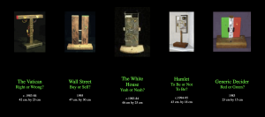
The project is called “A DECISION MACHINE SUITE” by Roman Verostko. It features a number of machines of simple rectangles of varying sizes and positions. Despite these variations, all the machines have one thing in common: blinking lights. They each have two lights that blink on and off, representing an answer to a question. The names of the machines are the questions, and range from “The Vatican: Right or Wrong?” and “Hamlet: To Be or Not To Be?” to just “Generic Decider: Red or Green?”. Whichever light is kept on is random, thus the answer cannot be predetermined. The project is a nod to Norbert Wiener (the “Father of Cybernetics”), who played a role in the information revolution of the 1900s and who noticed that even physics has uncertainty and chance.
- I admire how the project is so simple yet is based around offering answers to some complex questions. I guess I like this because these questions, at least some of them, are highly debated and have been for years, and so to leave the answers all up to a small little machine that picks lights at random is just very interesting and entertaining to me. I know I shouldn’t say this in an assignment, but it’s almost like a giant middle finger to all the great thinkers who have spent so much time thinking them over, only to have people do a complicated version of a coin toss for the answer. I also find the machine designs very interesting. Verostko decided to incorporate their questions into them. The “Red or Green” one is obvious, with each color being displayed behind one of the lights, and “Wall Street” is similar except with a “B” and “S”. But the others are a bit more subtle. “The Vatican” holds gold leafed lamp reflectors, and is shaped almost like a cross except without the top part (although I’m not sure if the cross was intentional). “The Whitehouse” includes its own colors, except they are black and white and are balloting marbles. More impressive than that, the wood the circuits rest on is actually from the Whitehouse from when it was renovated in the 40s. I admire the designs because Verostko could have just had a consistently simple design for all his machines, but instead he chose to spice things up and make them more interesting. The designs don’t just improve their look, but also gives the viewers something deeper to look into.
- Based off his the website hosting online versions of his work, it seems like his schematic was based on some else’s manual. The drawing he made of the circuit made it seem like it was very simple. However, what makes this project more interesting is that the online version doesn’t use circuits since its online. It just uses regular code, which he said Tamara Temple helped him with. The algorithm would probably be very simple as well, since its just two lights going on and off and a button which stops them.
- I don’t know much about the algorithm, but the circuits for the real machines have artistic sensibilities attached to them. For instance, the circuit for “White House” was placed on an actual piece of the White House. Also, the colorful wiring served both practical and aesthetic purposes.
- “A DECISION MACHINE SUITE” by Roman Verostko, 1983-1995
“Decision Machine Suite” by Roman Verostko

![[OLD FALL 2019] 15-104 • Introduction to Computing for Creative Practice](wp-content/uploads/2020/08/stop-banner.png)