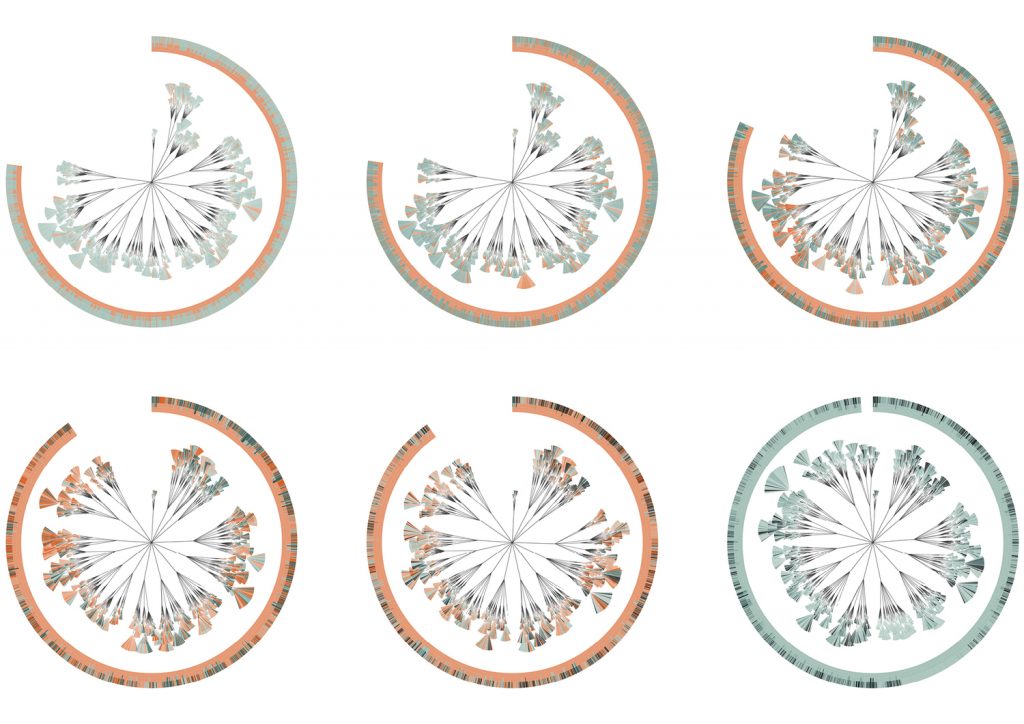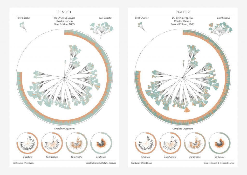
The piece I chose this week is a collaboration between Stefanie Posavec and Greg McInerny. These pieces were created by analyzing insertions and deletions that occurred between six editions of The Origin of Species by Charles Darwin. On her website, Posavec outlines that McInerny completed all of the programming and gathering of data and together they worked on the visual form. While it does not describe the particulars of the programming used to analyze all of the editions, it says that C++ and R were used in terms of programming languages. My guess is that an algorithm was used that analyzed all the sentences within each edition and then checked how many times that sentence was seen again in future versions.
Posavec modeled this form after another project that she did while working on her Masters in Communication Design. She calls the structure a ‘literary organism.’ Each diagram represents an edition, which is then broken down into chapters and subchapters. After that, the subchapters are divided into the paragraph ‘leaves,’ which are then broken into sentence ‘leaflets.’ The sentences in each edition are colored to indicate whether they survive to the next edition (blue) or have removed (orange).

I enjoyed this project because it’s not a dataset that would come to mind when I think about content usually depicted in data visualization. It is interesting to see the way that the content within the editions changes over time. It shows a progression in both scientific thought and how Darwin was developing his theories and knowledge. I think that the form is also pretty interesting. It feels heavily inspired by natural forms and the way that natural species are charted based on relations.
Sources: http://www.stefanieposavec.com/entangled-word-bank https://www.moma.org/interactives/exhibitions/2011/talktome/objects/145525/
![[OLD FALL 2019] 15-104 • Introduction to Computing for Creative Practice](wp-content/uploads/2020/08/stop-banner.png)