Project-07-Curves

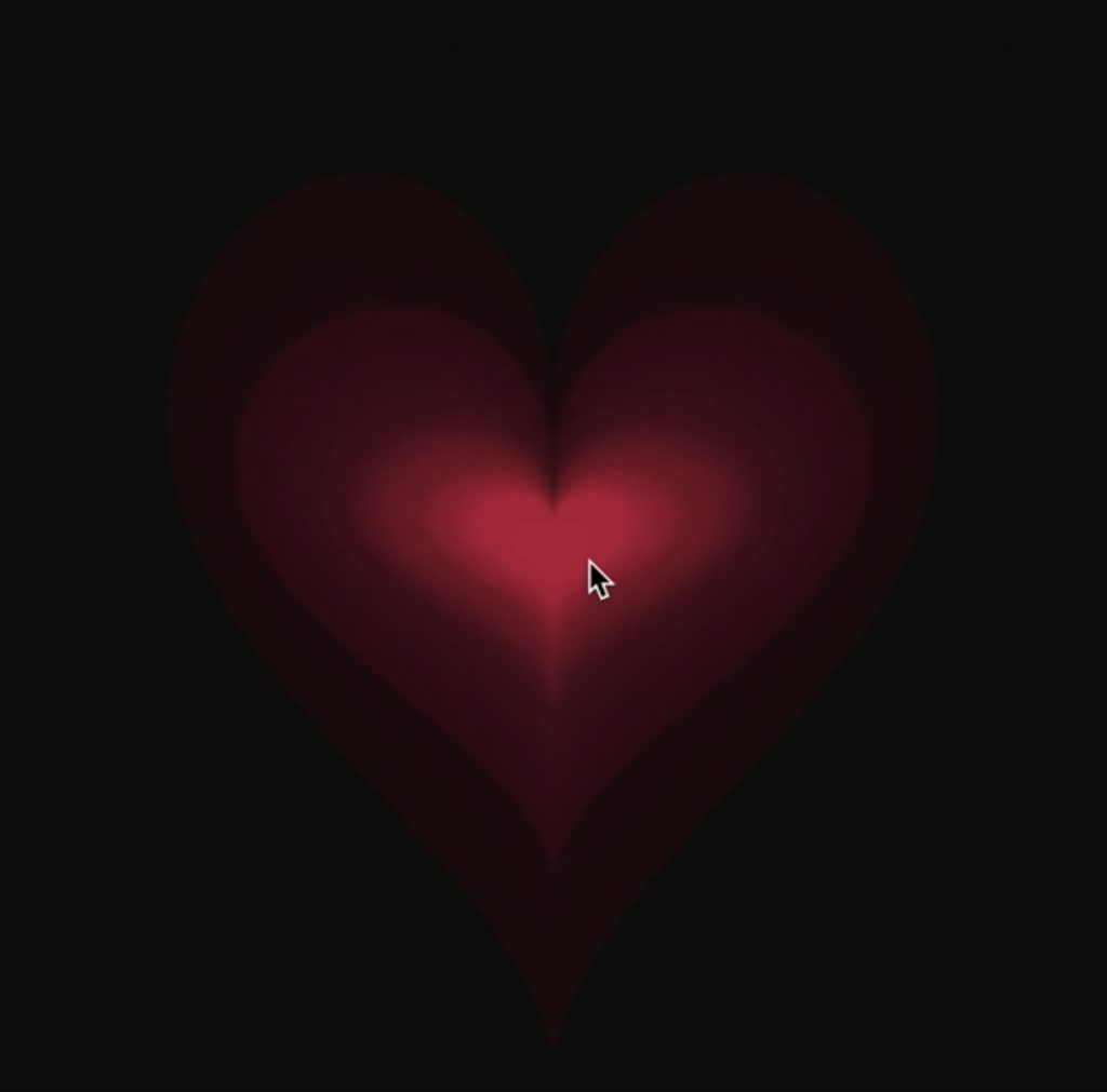
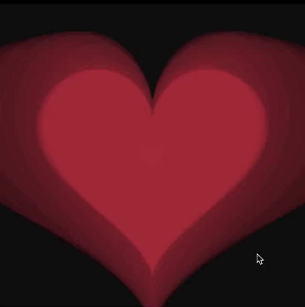
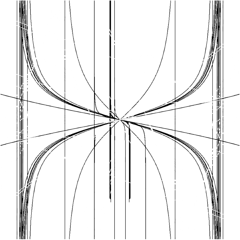
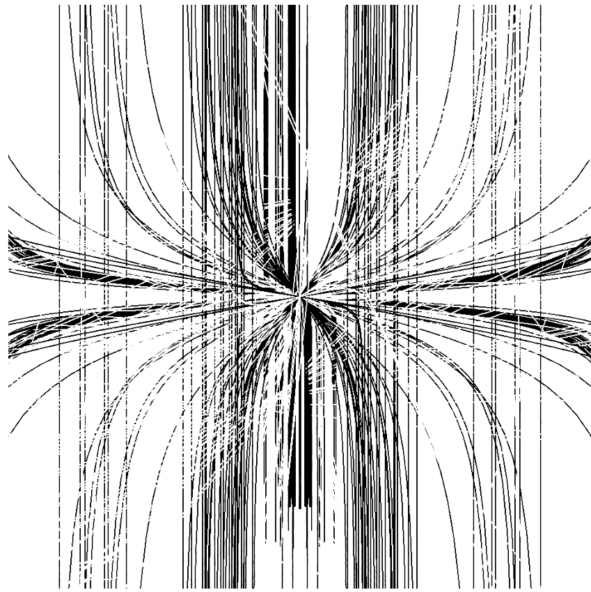
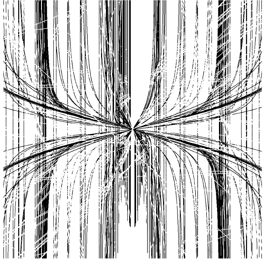
Please move your cursor around and feel the heartbeats.

heart
//jiaqiwa2; Jiaqi Wang; Section C
function setup() {
    createCanvas(480, 480);
    background(220);
    
}

function draw() {
	// Create a blended background
	fill(0, 10);
    rect(0, 0, width, height);
    //Keep track of how far mouse is away from the center
	var dX=Math.abs(mouseX-width/2);
	var dY=Math.abs(mouseY-height/2);
	//xoff and yoff are used to continuously govern 
	//two parameters of the curve respectively
	var xoff=map(dX,0,240,1,17);
	var yoff=map(dY,0,240,1,17);
	fill(220,49,63,60);
    heart(width/2,height/2,xoff,yoff);

}

function heart(Px,Py, xoff,yoff){
	push();
	//move the heart to the center of the canvas
	translate(Px,Py);
	noStroke();
	//start drawing heart curve 
	//with respect to mouse's distance from the center
	beginShape();
	for(var i=0;i<TWO_PI; i+=0.01){
		 var x=xoff*16*pow(sin(i),3);
		 var y=-yoff*(13*cos(i)-5*cos(2*i)-2*cos(3*i)-cos(4*i));
		 vertex(x,y);
	}
	endShape();
	pop();
}


For this project, I wanted to create a dynamic feeling of heartbeat using the Heart Curve.

Project-07: Curves

For this week’s project, I decided to use 2 different curves that reminded me of flowers, a 10 cusp Epicycloid and a 10 cusp Hypotrochoid. I decided to make them rotate and change in size based on the mouse movements but in opposite directions to give off a pulsating effect. I also utilized mousePressed so that the curves can alternate. The mouse positions also control the colors of the curves and the background so that the final output is unique in all positions. The colors of the flowers and background are quite muted to give off a slight vintage wallpaper vibe with a modern twist.

(below are screenshots of the code at different mouse positions)

sketch

function setup() {
    createCanvas(480, 480);
}

var nPoints = 100;

// background color codes
var r = 205;
var g = 152;
var b = 152;

// to switch curves based on mouse click
var whichCurve = 0;

// curve color codes
var curver = 202;
var curveg = 255;
var curveb = 255;

function draw() {

	// to add/subtract color codes based on mouse position
	var colordiffX = map(mouseX, 0, 480, 0, 53);
	var colordiffY = map(mouseY, 0, 480, 0, 53);

	background(r - colordiffX, g + colordiffY, b + colordiffX);

	stroke(255); // white outline

	// 5 x 5 curves (outer)
	for(var x = 60; x < width; x += 90){
		for(var y = 60; y < height; y += 90){
			push();
			translate(x, y);
			fill(curver + colordiffX, curveg - colordiffY, curveb - colordiffX);
			if(whichCurve == 0) {
				drawHypotrochoid();
			}
			else {
				drawEpicycloid();
			}
			pop();
		}
	}
	// 4 x 4 curves (inner)
	for(var x = 105; x < width - 90; x += 90) {
		for(var y = 105; y < height - 90; y += 90) {
			push();
			translate(x, y);
			fill(curver + colordiffY, curveg - colordiffX, curveb - colordiffY);
			if(whichCurve == 1) {
				drawHypotrochoid();
			}
			else {
				drawEpicycloid();
			}			
			pop();
		}
	}
}

// draw rotating 10 cusp epicycloid
function drawEpicycloid() {
	var x;
	var y;
	var a = mouseX / 30;
	var b = a / 10;
    var h = constrain(mouseY / 8, a / 10, 8*b);
    var ph = mouseX / 50;

    beginShape();
    for (var i = 0; i < nPoints; i++) {
        var t = map(i, 0, nPoints, 0, TWO_PI);
        x = (a + b) * cos(t) - h * cos(ph + t * (a + b) / b);
        y = (a + b) * sin(t) - h * sin(ph + t * (a + b) / b);
        vertex(x, y);
    }
    endShape(CLOSE);
}

// draw rotating 10 cusp hypotrochoid
function drawHypotrochoid() {
	var x;
	var y;
	var a = (width - mouseX)/20; // opposite movement from epicycloid
	var b = a / 10;
    var h = constrain((height - mouseY)/8, a/10, 10*b);
    var ph = (width - mouseX) / 50;

    beginShape();
    for (var i = 0; i < nPoints; i++) {
        var t = map(i, 0, nPoints, 0, TWO_PI);
        x = (a - b) * cos(t) + h * cos(ph + t * (a - b) / b);
        y = (a - b) * sin(t) - h * sin(ph + t * (a - b) / b);
        vertex(x, y);
    }
    endShape(CLOSE);
}

// mouse pressed alternates order of curves
function mousePressed() {
	if(whichCurve == 0){
		whichCurve = 1;
	}
	else {
		whichCurve = 0;
	}
}

LookingOutwards-07

The project that inspired me is Kepler, developed by Roberto Fazio. Kepler is an interactive immersive experience based on NASA open data describing in real-time the properties and features of most exoplanets discovered up to the present time. I think the concept of having real-time updates instead of using the algorithm to summarize the data collected over years is very intriguing. Also, the way they visualize data in virtual reality creates a fresh sensation and curious experience, which is suitable media for the content Kepler displays-always going beyond the limits of the knowledge, proceeding into the unknown world.

video of “Kepler”

As for the algorithm, I know that Kepler is recorded in real-time from the Unity 3D application. I happened to know a little bit of unity. It is a very powerful software that combines coding, visualization, and even more functions, which allows artists, designers, and developers to create a real-time 3D immersive experience together.

Kepler’s representation of exoplanet

In the past, perhaps most people learn about exoplanet through documentary film or vague images captured by spacecraft, which do not necessarily convey the thrillingness of the discovery. I would say the creator’s sensibility is manifest through finding the most suitable media that perfectly embody the content, which, according to the creator, “ shapes the relationship between creative technologies and anthropic observation, placing humankind as witness of the multisensory artistic experiment.”

Links:
https://frm.fm/a/roberto_fazio/kepler
http://studiorf.io/

Looking Outwards: Data Visualization

Bible Cross References by Chris Harrison, 2007

Bible Cross References Data visualization, Chris Harrison and Christoph Röhmild, 2007. It resembles a rainbow, similar to Noah’s Ark mentioned in the Bible.

This data visualization was a collaboration between Chris Harrison and Christoph Römhild. The data visualization depicts all of the cross-references in the Bible. There were over 63,000 cross references in total, and the challenge was to visualize this large amount of information in an elegant way. The bar graph at the bottom of the visualization represents all the chapters in the Bible. The length of each bar depicts the length of each chapter. Each cross reference is depicted by an arc, and the color of each arc corresponds to the stance of the cross reference between the chapters.

I admire the visual aspect of the data visualization. The data visualization was made so it resembles a rainbow, which also has symbolic meaning in the famous story from the Bible, “Noah’s Ark.” The connection between the Bible and data visualization was very interesting and relevant to the information Harrison was displaying.

I’m now sure about the algorithms that generated the work, but I think Harrison used an algorithm that was able to find cross references in the Bible, and compute its distance across chapters. Then, he would change the colors of the arcs based on the distance.

Project 7: Curves

I played around with some of the different roulettes I found on Wolfram Math World. I wanted my project to have a psychedelic effect and change colors depending on the location of the mouse. If you move your mouse around the screen, the colors and sizes of the shapes change on the screen. The background color also changes based on the which quadrant the mouse is in.


My favorite part of the project was experimenting with the shapes’ equations. A simple change in a subtraction sign, variable, or coefficient can drastically change the shape. I also attached a few screenshots below of what the program looks like at different mouse locations.

sketchDownload
var a;    //radius of fixed circle
var b;   //radius of moving circle
var h = 10;  //height of the moving circle 
var theta;   
 
function setup() {
    createCanvas(480, 480);
    background(220);
}

function draw() {
	drawBackground(); 

	for (var x = 0; x <= 480; x += 120) {
        for (var y = 0; y <= 480; y += 120) {
            push();
            translate(x+60, y+60);
            drawEpitrochoid();
            pop();
        }

    	for (var y = 0; y <= 480; y += 120) {
    		push();
    		translate(x + 60, y + 60);
    		drawRanunculoid();
    		pop();
    	}

    	for (var y = 0; y <= 480; y += 120) {
    		push();
    		translate(x + 60, y + 60);
    		drawInnerRanunculoid();
    		pop();
    	}
    }
                
}
//background changes color based on what quadrant the mouse is in.
function drawBackground() {
	if (mouseX < width / 2 & mouseY < height / 2) {
    	background(51, 0, 54);
    } else if (mouseX < width / 2 & mouseY > height / 2) {
    	background(173, 178, 211);
    } else if (mouseX > width / 2 & mouseY < height / 2) {
    	background (47, 57, 77);
    } else {
    	background (86, 102, 107);
    }
}

//draws large epitroid in the background
function drawEpitrochoid() {
	strokeWeight(0);
	fill(mouseX + 100, mouseY + 100 , 223);
	beginShape();    

	a = map(mouseX/2, 0, 480, 1, 50);
	b = map(mouseY/2, 0, 480, 1, 50);
	h = map(mouseX/2, 0, 480, 1, 50);

	    for (var i = 0; i < 480; i++) {

	        var x = (a+b) * cos(theta) - h * cos(((a+b) / b) * theta);
	        var y = (a+b) * sin(theta) - h * sin(((a+b) / b) * theta);
	        var theta = map(i, 0, 360, 0, TWO_PI);
	    
	        vertex(x, y);
	    }  

	endShape();
}

//draws flower-like shape
function drawRanunculoid() {
	strokeWeight(0);
	fill(mouseY / 5, mouseX / 5, 77);
	beginShape();    

	a = map(mouseY/10, 0, 480, 1, 50);
	b = map(mouseY/10, 0, 480, 1, 50);
	h = map(mouseX/10, 0, 480, 1, 50);

	    for (var i = 0; i < 480; i++) {

	        var x = a * (6 * cos(theta) - cos(6 * theta));
	        var y = a * (6 * sin(theta) - sin(6 * theta));
	        var theta = map(i, 0, 360, 0, TWO_PI);
	    
	        vertex(x, y);
	    }  

	endShape();
}

//draws inner flower-like shape
function drawInnerRanunculoid() {
	strokeWeight(0);
	fill(mouseY + 80, mouseY - 50, 100);
	beginShape();    

	a = map(mouseX/10, 0, 480, 1, 30);
	b = map(mouseY/10, 0, 480, 1, 30);
	h = map(mouseX/10, 0, 480, 1, 30);

	    for (var i = 0; i < 480; i++) {

	        var x = a * (6 * cos(theta) - cos(6 * theta));
	        var y = a * (6 * sin(theta) - sin(6 * theta));
	        var theta = map(i, 0, 360, 0, TWO_PI);
	    
	        vertex(x, y);
	    }  

	endShape();
}

LO 7 – Information Visualization

For this week’s LO, I decided to take a look at Periscopic‘s AgEvidence project (Dr. Lesley Atwood, Dr. Stephen Wood, Periscopic), which includes 16,000+ data points visualizing the impact of conservation agriculture in the US.

This project is quite inspirational not only because of the massive scale and data collected/visualized but also the impact of the way that the designers have presented data. The Periscopic data visualization firm collaborated with The Nature Conservancy on this project to help researchers from the Science for Nature and People Partnership team to synthesize and illustrate findings from over 40 years of agriculture research. AgEvidence displays the effects of conservation practices such as reduced tillage, early-season pest management, and cover crops on the environment and food production, as well as distinguishes research-rich and -sparse areas. I believe that the researchers first extracted and processed the data, then using percentage changes and nested levels to computationally visualize it.

I appreciate that the creators included key insights to highlight patterns in the data and make it more accessible to users. Moreover, they have allowed for easy data access and transparency through options to download filtered/holistic data sets so that users can discover even more nuances.

AgEvidence interactive tool: observations and map of study locations
detailed insights that make data more accessible

Project 7: Curves

sketch
/*
Bon Bhakdibhumi
bbhakdib
Section D
*/

var nPoints = 100;
function setup() {
    createCanvas(410, 400);
}

function draw() {
    background(171, 230, 255);
    for(var i=30; i<=400;i+=100){
        for(var j=30; j<=400;j+=60){
            push();
            translate(i,j);
            daisy();
            pop();
        }
    }
    for(var k=80; k<=400;k+=100){
        for(var l=0; l<=600;l+=60){
            push();
            translate(k,l);
            daisy();
            pop();
        }
    }
}

function daisy() {
//drawing a daisy
    var x;
    var y;
// making a ranunculoid or a 10-cusp epicycloid  
    var petal = 10;
    if (mouseY >= height/3 & mouseY < height*(2/3)){
        petal = 5;
    }
    var a = 20;
    var b = a / petal;
    var h = b;
// making a fried egg
    if (mouseY < height/3) {
        h = 0;
    }
    var ph = mouseX / 50.0;
    var ph = mouseX / 50.0;
    fill(255);
    stroke(100);
    beginShape();
    for (var i = 0; i < nPoints; i++) {
        var t = map(i, 0, nPoints, 0, TWO_PI);
        x = (a + b) * cos(t) - h * cos(ph + t * (a + b) /b);
        y = (a + b) * sin(t) - h * sin(ph + t * (a + b) /b);
        vertex(x, y);
    }
    endShape(CLOSE);
// middle part
    fill(255, 253, 158);
    circle(0, 0, a);
}

For this project, I decided to create an interactive pattern using ranunculoid and 10-cusps epicycloid curves. The pattern changes from a pattern of fried eggs, when mouseY is in the first third of the canvas, to a pattern of 5-petals daisies, when mouseY is in the second third of the canvas, and to a pattern of 10-petals daisies, when mouseY is in the last third of the canvas. The pattern also spins when mouseX changes.

LO 7: Information Visualization

All Street Limited by Ben Fry

An Information Visualization project that I really admire is All Streets Limited by Ben Fry. In his work, Fry created an intricate map of all the streets in the 48 states of the United States. To achieve this incredible work, Fry translated data from the U.S Census Bureau into a map by first,  using Perl.Next to parse and filter data. Writing in javascript, Fry applied the Albers equal-area conic projection to transform latitude and longitude coordinates. Later, he converted his work into print. I really enjoy looking at his work as it is a great illustration of how the interconnectedness of little elements–small streets and roads–can make up a system–the map of the United States–showing the complexity that is not usually tangible or is overlooked. His work reveals the universal truth of how things operate and the power of systems–from an atom to the universe.

Link : https://3rdfloor.fathom.info/products/all-streets

Title: All Streets Limited

Creator: Ben Fry

Year: 2007

Project-07 Curves

curves
var r = 0;    //red color variable 

var a = 0;    //radius of circle a (inner circle) for parametric function 
var b = 0;    //radius of circle b (fixed circle) for parametric function  
var h = 0;    //distance from center of inner circle

var theta = 0;    //angle variable
 
function setup() {
    createCanvas(480, 480); 
    background(220);
}

function draw() {

	//changing red level of background  
	r = map(mouseX, 0, 480, 0, 255); 
    background(r, 200, 200);

    //creates 9 Hypotrochoid curves
    for (var x = 0; x <= 400; x += 160) {
        for (var y = 0; y <= 400; y += 160) {
            push();
            translate(x+80, y+80);
            drawHypotrochoid();
            pop();
        }
    }

    //creates 16 Hypotrochoid Evolute curves
    for (var x = 0; x <= 480; x += 160) {
        for (var y = 0; y <= 480; y += 160) {
            push();
            translate(x, y);
            drawEvolute();
            pop();
        }
    }
}

function drawHypotrochoid() {

    //curve based on the Hypotrochoid equation 

    strokeWeight(0.5);
    stroke(255);
    noFill();
    beginShape();    

    a = map(mouseX, 0, 480, 1, 70);
    b = map(mouseY, 0, 480, 1, 5);
    h = map(mouseX, 0, 480, 1, 40);

        for (var i = 0; i < 2000; i++) {

            var x = (a-b)*cos(theta) + h*cos((a-b)/b*theta);
            var y = (a-b)*sin(theta) + h*sin((a-b)/b*theta);
            var theta = map(i, 0, 360, 0, TWO_PI);
        
            vertex(x, y);
        }  

    endShape();

    pop();
}

function drawEvolute() {

    //curve based on the Hypotrochoid Evolute equation
    
    strokeWeight(1);    
    stroke(0, 150, 0);

    noFill();
    beginShape();    

    a = 8*map(480-mouseX, 0, 480, 1, 30);
    b = 2*map(480-mouseY, 0, 480, 1, 20);
    h = 3*map(480-mouseX, 0, 480, 1, 10);

        for (var i = 0; i < 4000; i++) {

            var x = (a-b)*cos(theta) + h*cos((a-b)/b*theta);
            var y = (a-b)*sin(theta) + h*sin((a-b)/b*theta);
            var theta = map(i, 0, 480, 0, TWO_PI);
        
            vertex(x, y);
        }  

    endShape();

    pop();
}
screenshots of cursor at different points

For this project, I tried out a few of the equations from the reference and liked the look of the Hypotrochoid the best. Once I had the Hypotrochoid curve working I want to add some visual interest by replicating them with a loop. Once that was done, I added another curve, the Hypotrochoid Evolute and replicated that with a loop too. After the curves were all in place, I added the changing background. The biggest challenge was understanding how changing the values of variables in the equations effected the curve but once I was able to get that it was fun to mess around with! 

Project-07-Curves

Move your mouse and be patient to generate curves, and try wiggling your mouse in the same spot to build up contrast areas!

sketch

function setup() {
    createCanvas(480, 480, WEBGL);
    angleMode(DEGREES);
    noFill();
    translate(240,240);
} 

function draw() {
//draws black lines
   drawBulletNoseCurve();
//draws white lines to create 'gaps', that spins
   for(let j=0; j<360; j++){
   push();
   stroke(255);
   fill(255,255,255,50);
   rect(-240,-240,480,480,10);
   noFill();
   rotate(mouseY);
   drawBulletNoseCurve();
   pop();
   }
}

function drawBulletNoseCurve(){
    var x;
    var y;
    var a=mouseY/10;
    var t;
    var b=mouseX/50;
//vertical orientation curves
    beginShape();
    for(var i=0;i<100; i++){
         var t = map(i, 0, 100, 0, 200);
        x=a*cos(t);
        y=b*(cos(t)/sin(t));
        vertex(x,y);
    }
    endShape();
//horizontal biased 
    beginShape();
    for(var i=0;i<100; i++){
        var t = map(i, 0, 100, 0, 400);
        x=10*-a*cos(t);
        y=10*b*(cos(t)/sin(t));
        vertex(x,y);
    }
    endShape();
}

I used the Bullet Nose curve to create my project. It uses both black and white layers of lines on a white line, so the white layers create ‘gaps’ or glitches in the black pattern, but it uses the bullet nose curve rotated around the origin to create them. I decided to create a separate function for drawing the curve, as I would use it for different purposes with different strokes. The mouse position helps determine the width of the asymptote portions of the curves, as well as the severity of the curve (how flat the inner portion is). I also made the creative decision to have it build up or truly ‘draw’ instead of re drawing the background each time. This allows the user to see the history of the work and understand the curves and gaps better.

Beginning of the experience, with few lines
Later, with more lines drawn
Alternative final state, with mouse hovering creating bolder areas