Looking Outwards 07: Information Visualization

This week, I decided to look at Chris Harrison’s Amazon Book Map He looked at 735,323 books and captured similarity data between them based on what Amazon recommended. He then color coded them depending on genre and created a visualization of his findings. I really admire the effort he put into it and the way it all came together in a mosaic like pattern. The algorithms he used created the layout and clustering but he noted that his algorithm didn’t work well for unstructured graphs. Harrison has created a lot of these visualizations and is trying to look at a new way to display data, and I think he was very successful with this. Especially color coding, it allows the user to see how different genres mesh together in a more user-friendly way.

Chris Harrison, Amazon Book Map

Project-07-Butterfly Curve

sketchsl07.Download
// Sarah Luongo   
// sluongo
// sluongo@andrew.cmu.edu
// Project

/* This code aims to create the curve, butterfly curve, as explained on Wolfram
MathWorld. In addition to drawing the curve I played around with the fill color
and stroke depending on the X position of the mouse. */

// Setups canvas size and speed
function setup() {
    createCanvas(480, 480);
    frameRate(10);
}

// Draws the butterfly curve
function draw() {
    var red = random(255); // Random shade of red
    var green = random(255); // Random shade of green
    var blue = random(255); // Random shade of blue

    background(0); // Black background
    translate(width/2, height/1.64); // Translate to the "center" of canvas
    rotate(PI); // Rotate 180 degrees

    if (mouseX < width/3) {                           
        fill(red, green, blue); // Random fill color      
	stroke(0); // Black
	// Draws butterfly curve 4 times
        for (var i = 0; i < 4; i++) {
            drawButterflyCurve(i);
        }  
    } else if (mouseX >= width/3 & mouseX < 2*(width/3)) {
	noFill();
	stroke(red, green, blue); // Random stroke color
	// Draws butterfly curve 4 times
        for(var i = 0; i < 4; i++) {
            drawButterflyCurve(i*2); // i*2 makes size of curve bigger
        }
    } else if (mouseIsPressed) {
	background(225, 200, 255); // Purple background
	noFill();
	stroke(0); // Black
	drawButterflyCurve(1); // To see original curve
    } else {
	noStroke();
	fill(red, green, blue); // Random fill color
	// Draws butterfly curve 4 times
        for(var i = 0; i < 4; i++) {  
            drawButterflyCurve(i/3); // i/3 makes size of curve smaller
        }
    }
}

// Butterfly Curve
// https://mathworld.wolfram.com/ButterflyCurve.html
function drawButterflyCurve(j) {
    var da = .01; // How round the "wings" are
    var a = map(mouseX, 0, width, 0, width/9); // Constrain x size of butterfly curve 
    var b = map(mouseY, 0, height, 0, width/8); // Constrain y size of butterfly curve
    // Creates the butterfly curve
    beginShape();
    for (var t = 0; t <= 24*PI; t += da) {
	// The parametric equations found on the website commented above
	var r =  exp(cos(t))-2*cos(4*t)-pow(sin(t/12), 5);
	var x = a * sin(t) * r * j;
	var y = b * cos(t) * r * j;
	vertex(x, y);
    }
    endShape();
}

When I saw this curve on Wolfram MathWorld, I was super excited because I had attempted to draw a butterfly in my last project. I think this curve is way cooler because there’s a lot more curves and more going on. So, it wasn’t just a boring (although I don’t find it so boring) Butterfly Curve, I added some if statements to duplicate the curves, change colors of the fill and stroke, but if this is too much for you you can also click the mouse in the bottom right to get the normal curve. Also, moving the mouse up and down and side to side within each if statement changes the size of the curves. If you move it left to right within a third of the width it kind of looks like the butterfly is flapping it’s wings.

Mouse within 0 and 1/3 of the width
Mouse within 1/3 and 2/3 of the width
Within 2/3 and 3/3 of the width
Within 2/3 and 3/3 of the width if mouse is pressed (best if clicked at bottom right)

LO – Aaron Koblin

Eamonn Burke

I once again return to the work of Aaron Koblin, because I find his work to be the most interesting subjects and the best representations of the listed designers. Here he visualizes AT&T call traffic in NYC, which is a fascinating way to represent geography and globalization. As with the last Koblin project I used, I love this piece because it’s at the intersection of human behavior and design. It depicts the social phenomenon of urbanization and globalization, as physical distance becomes negligible and we become one mind.

 I think Koblin used his creative sensibilities to convey this idea of a collective brain, by evoking the concept of travelling neurons to suggest connectivity. He also clearly conveys the “hotspots” and distinguishes the different types of calls by using brightness and color. 

I would guess that the software Koblin used here tracks call information including distance and location, and then uses this data to plot functions of curves that are projected onto a 3D world model, with the height of the curve depending on the distance of the call.

LO-07

When I saw this assignment I immediately thought of the subreddit DataIsBeautiful. As I was scrolling through it, I found one that was very cool and interesting. It was a Visualizations of Color Themes in Pixar Films by redditor /keshava7 created about 4 months ago. I love Pixar films, and I’ve watched almost every one. Some of the older ones give me a great sense of nostalgia. Their visualization of data using Pixar films is very pretty, and I like how they are all shaped like disks. It reminds me of the old Blu Ray disks (although I also remember the older format of VHS). They created this visualization in Python by extracting 5000 frames per movie, and they compressed each frame into a pixel. They start each movie at 270 degrees and go clockwise, so the first frame of each movie starts at 270 degrees. There is another redditor /julekca who gives a more detailed description on how to do it, it makes me want to try it myself. It is very beautiful to see all the different colors of some of the films I watched as a child.

Here’s a link to the post:

Project 07 – Curves

I chose to use the Epitrochoid Curve for my project this week. My code draws two curves—a blue and red one, and it’s pretty cool to see how and where they overlap with each other.

*because of the lag it’s really slow on WordPress ;(*

  • Refresh the page to start from center with white background.
  • Move the mouse back and forth to build contrast areas by changing the direction of the curve (inward or outward).
  • Control the speed of curve drawn with mouse position.
  • Click the mouse to change background to black.
  • Click and hold the mouse to erase all previous curve paths, and visualize the curve with stars that get brighter and dimmer with mouse position (brightest at lower right corner).
  • Release the mouse to draw the curve at various starting points.
Maggie – Curves
//Maggie Ma
//Section D

//variables for equation on https://mathworld.wolfram.com/Epitrochoid.html
var a = 30; //radius of small circle
var b = 10; //radius of rotating perimeter circle
var h = 0; //height of curve from the center of b
var t; //time
var x;
var y;
var speed; 


function setup() {
    createCanvas(500,500);
    background(255);
}

function draw() {
    noStroke();

	constrain(mouseX,0,width);
	constrain(mouseY, 0, height);

	//draws dots (without trail) when mouse is pressed
	//background changes to black
	//dots change in size with mouse position
    if (mouseIsPressed) { 
		background(0);
		for (t = 0; t <TWO_PI; t += 1) {
			fill(0,0,255);
	    	epCurve2(); }

   		for (t= 0; t<PI; t+= 1) {
   			fill(255,0,0);
	    	epCurve2(); }
	}

	speed=map(mouseX,0,width,.5,-.5); //changes the speed and size of curve as mouseX moves
    a+=speed; 
    h+=speed;
  	
  	fill(255,0,0); //drawing red curve
    for (t =-PI; t < TWO_PI; t += .08) {
    	epCurve();
    }

    fill(0,0,255); //drawing blue curve
    for (t= -PI; t<PI; t+= .08) {
	    epCurve();
    }
}

function epCurve() { //Epitrochoid Curve function
	push();
    translate(width/2, height/2); 
    //draw curve
    x=(a+b)*cos(t)-h*cos(((a+b)/b)*t); 
    y=(a+b)*sin(t)-h*sin(((a+b)/b)*t);
    ellipse(x,y,0.8,0.8); //draws dots on canvas
    pop();
}

function epCurve2() { //Dotted curve when mouse is pressed
	push();
   	translate(width/2, height/2); 
    //draw curve
    x=(a+b)*cos(t)-h*cos(((a+b)/b)*t); 
    y=(a+b)*sin(t)-h*sin(((a+b)/b)*t);
    ellipse(x,y,0.5+mouseX/100,0.5+mouseY/100); //draws dots on canvas that change size w/ mouse position
    pop(); 
}

LO-7: Unnumbered Sparks, Janet Echelman, 2014

I was attracted to this work at the first sight. It is a monumental, beautiful sculpture work flowing in the sky, consisted of an intricate, color-changing net. The audience can interact with the piece by connecting to the project’s wifi and give instructions to the website promoted, such as changing colors, moving parts around, etc. I like how it gives the audience the chance to be the creators of this art work and fully participate in it by taking out the artist’s role as the maker. I also like the sense of vulnerability and mobility in this work. The piece is like a floating, colorful, and constantly changing nebula that has fragile, mysterious, mobile beauty.

The team collaborated with Janet Echelman, a sculpture artist who works with public space. What they used to build this sculpture is a kind of fiber that is fifteen times stronger than steel. And the sculpture was put up into the middle of an active city’s sky. The project team built the modal in Chrome with webGL. They then modified parameters to get the complex behaviors they were looking for. The mobile and interactive aspect of the piece was made possible by a language developed by the team. It sits in between Javascript and C language. People’s input would then directly influence what they see. The team commented on this, saying “they can draw and paint with light,…people are the Co-creators. Seeing the delight and wonder on people’s faces is the best reward for the team.”

LO 07 – Data Visualization

Wind Map (2012 – present)

Martin Wattenberg and Fernanda Viegas 

Wattenberg and Viegas’ Wind Map.

Martin Wattenberg and Fernanda Viegas’ Wind Map visualizes the tracery of wind flow over the United States in the most basic and familiar way—visual motion. On calm wind days, the artwork can be a “soothing meditation on the environment” (Wattenberg), whereas during hurricanes, the piece can become overwhelming and terrifying. Something that I found interesting was that bird watchers actually use the map to track migration patterns, and cyclists use it to prepare for trips. Even conspiracy theorists use the map to track mysterious air chemicals. Data for the wind map was collected from the National Digital Forecast Database, and Wattenberg took inspiration from Edmund Halley (1686), who developed the technique of using comet-like trails to visualize motion. Wattenberg used HTML and JavaScript. 

Images of the Wind Map during Hurricane Isaac (September 2012).

Project 07 – Composition with Curves

sketch
// Stefanie Suk
// 15-104 Section D

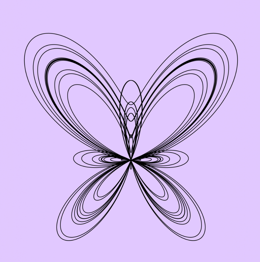
var nPoints = 100; //number of points for curves
var angle = 10; //angle of rotation

function setup() {
    createCanvas(480,480);
    frameRate(15); //set frame rate to 15
}

function draw() {
    background(33, 63, 99); //background of canvas to dark blue

    //placing Hypocycloid in center
    push();
    translate(width/2, height/2);
    Hypocycloid();
    pop();

    //placing Deltoid in center and rotate by angle
    push();
    translate(width/2, height/2);
    rotate(radians(angle));
    angle += mouseX;
    Deltoid();
    pop();

    //placing Epitrochoid in center
    push();
    translate(width/2, height/2);
    Epitrochoid();
    pop();
}

function Hypocycloid(){
    // variables for Hypocycloid
    var a1 = map(mouseY, 0, 300, 150, 180); //size changes with respect to mouseY
    var b1 = 15;
    var c1 = mouseX / 25;

    //color, stroke of Hypocycloid
    stroke(167, 219, 239);
    strokeWeight(6);
    noFill();

    //create curve, map to full circle radians
    //use math function to find x and y values
    beginShape();
    for (var i = 0; i < nPoints; i++) {
        var angle1 = map(i, 0, nPoints, 0, TWO_PI);     
        x1 = (a1 - b1) * cos(angle1) + c1 * cos((a1 - b1) * angle1);
        y1 = (a1 - b1) * sin (angle1) - c1 * sin((a1 - b1) * angle1);
        vertex(x1, y1);
    }
    endShape(CLOSE); 
}

function Deltoid(){
    colorR = map(mouseX, 0, 50, 100, 255);
    colorG = map(mouseX, 0, 50, 100, 255); //set color in specific range
    colorB = map(mouseY, 0, 50, 100, 255); //changes color with respect to mouseX,Y
    
    // variable for Deltoid, change size
    a2 = map(mouseY, 0, height, 10, 40); //size changes with respect to mouseY
    
    //color, stroke, fill of Deltoid
    stroke(255);
    strokeWeight(6);
    fill(colorR, colorG, colorB);

    //create curve, map to full circle radians
    //use math function to find x and y values
    beginShape();
    for (var i = 0; i < nPoints; i++) {
        var angle2 = map(i, 0, nPoints, 0, TWO_PI);
        x2 = ((2 *(cos(angle2))) + (cos(2*angle2)))* a2 ;
        y2 = ((2 *(sin(angle2))) - (sin(2*angle2)))* a2 ;
        vertex(x2, y2);
    }
    endShape(CLOSE);
}

function Epitrochoid() {

    colorR = map(mouseX, 0, 50, 100, 255);
    colorG = map(mouseX, 0, 50, 100, 255); //set color in specific range
    colorB = map(mouseY, 0, 50, 100, 255); //changes color with respect to mouseX,Y

    // variables for epitrochoid
    var a3 = map(mouseY, 0, 400, 40, 110); //size changes with respect to mouseY
    var b3 = 50;
    var c3 = (mouseX / 15);

    //color, stroke of epitrochoid
    stroke(colorR, colorG, colorB);
    strokeWeight(1.5);
    noFill();

    //create curve, map to full circle radians
    //use math function to find x and y values
    beginShape();
    for (var i = 0; i < nPoints; i++) {
        var angle3 = map(i, 0, nPoints, 0, TWO_PI);
        x3 = (a3 + b3) * cos(angle3) + c3 * cos((a3 + b3) * angle3);
        y3 = (a3 + b3) * sin(angle3) + c3 * sin((a3 + b3) * angle3);
        vertex(x3, y3);
    }
    endShape(CLOSE);
}

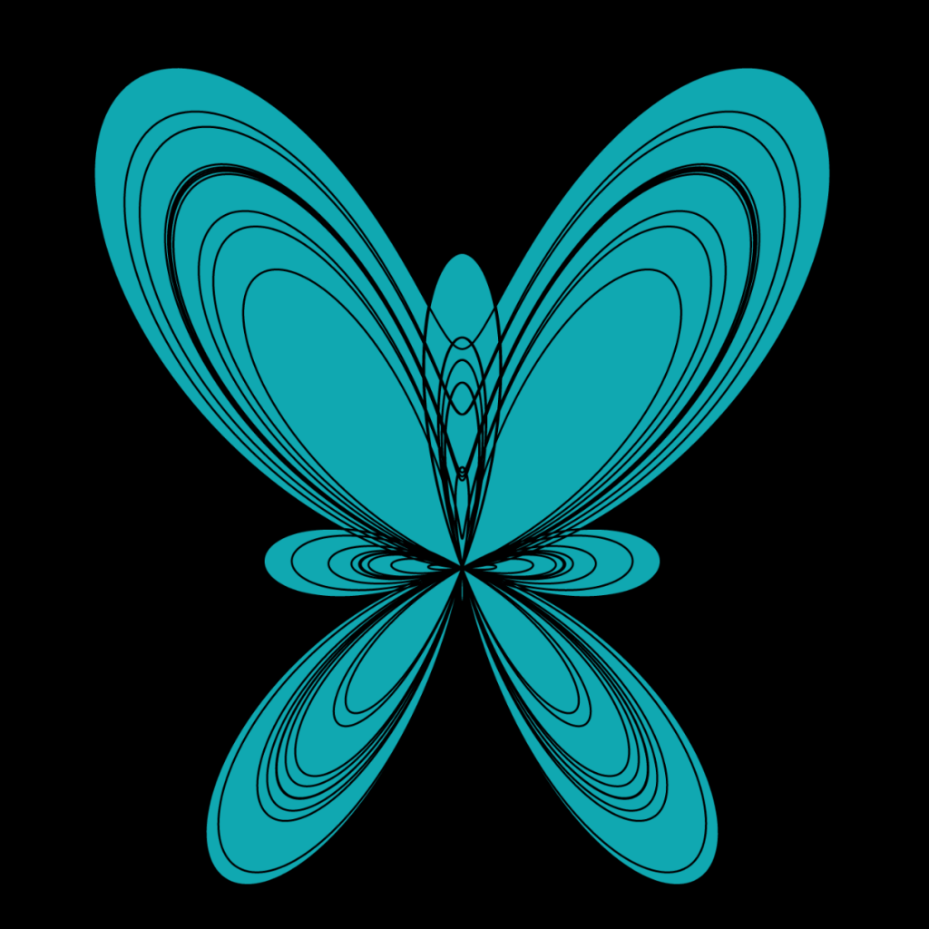
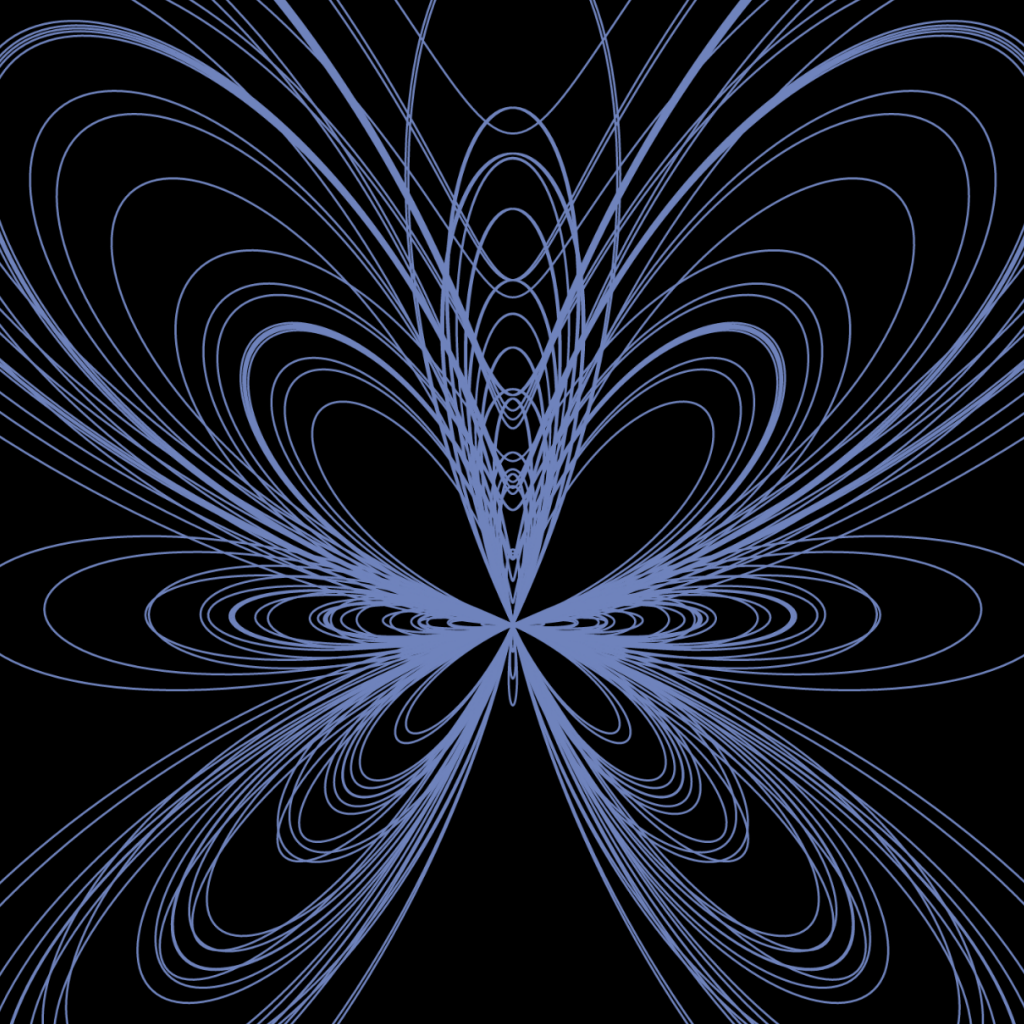
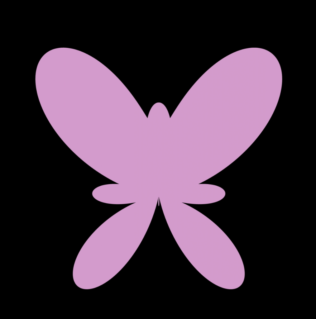
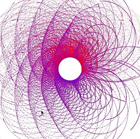
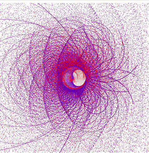
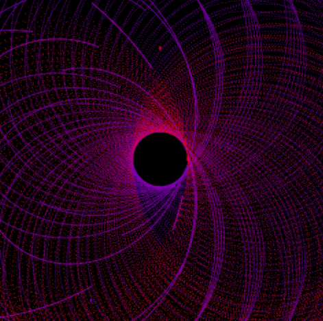
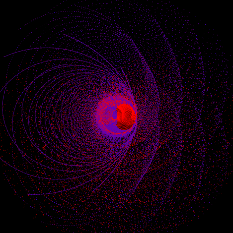
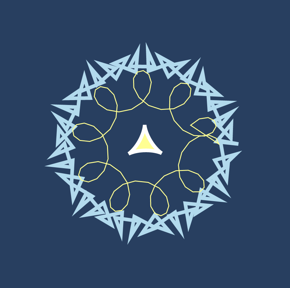
I utilized hypocycloid, deltoid, and epitrochoid using the reference from Mathworld to create this project. I chose these curves because I loved how they were structured. I thought that when these three curves are put together would create one unique interactive shape for my project. The exploration of this project was interesting, and I also played around with random colors and sizes with mouseX and mouseY. The unique part about these curves in my project is that the curves in my work create different smoothness depending on the position of the mouse (round, shape, spiky, squiggly). The different shapes created in the project look like forms of snowflakes, which is why I made the main color blue.

Looking Outwards 07 – Information Visualization

Image of Unnumbered Sparks

Unnumbered Sparks is a project by Aaron Koblin and Janet Echelman. This interactive monumental sculpture is a crowd-controlled visual artwork that is installed in air on a large canvas. The designs and colors of the sculpture are based on the visitors present in the area through their mobile devices. People are able to use their phones to paint different colors of light across the artwork. Every single movement of the mobile devices project vivid beams of light in the artwork. What I admire about this sculpture is that it is interactive with the audiences in the area. Thus, I find the large scale and complexity of the installation is really inspiring as a design major. The computational software that is used in this artwork explores different scale, shape, density, and interaction with visitors. The material used in this installation is also very interesting, because the structure of the sculpture is made with soft fibers that are attached to existing buildings in the area. The exploration of unique materials and interaction really shows how much the artists focused on the connection between installation and people. Computation technology is successfully used in this interactive sculpture and it also shows the creator’s sensibilities to incorporate art and people into the project.

Website:  http://www.aaronkoblin.com/project/unnumbered-sparks/

Video of Unnumbered Sparks

LO-07: Information Visualization

The project I chose this week was Aaron Koblin’s Amsterdam SMS. This project is an interactive visualization tool developed for the MIT Senseable City Lab which helps visualize SMS messages data. I admired this project because I was drawn to the boldness of the colors and like any artwork done using data, I just thought it was very interesting and cool. To generate this work, Koblin used Processing and OpenGL. The data he used was provided by KPN Mobile. Like his other works, Koblin uses bright colors or “light” (he doesn’t actually use light in this project but the bright colors do give off a similar effect!) to stimulate our sight and draw attention to the artwork.

Video of Amsterdam SMS Messages on New Years Eve (2007)