This project creates visualizations for the way that content is shared through Facebook. It creates branching organic visuals on a pastel background to show the different rates and tree-like structure that describes media dissemination using Facebook. The exponential share-based structure allows the graphic to start at the center and branch out to fill the space, so I think the algorithm may assign share trees randomly around the centerpoint to then extend in a somewhat linear fashion, but the curves of the branches may describe unique share patterns. The creator’s artistic sensibilities are manifested through the visual display of the linkages (the leave/flower graphics) and the algorithm that dictates the organization of the branches.
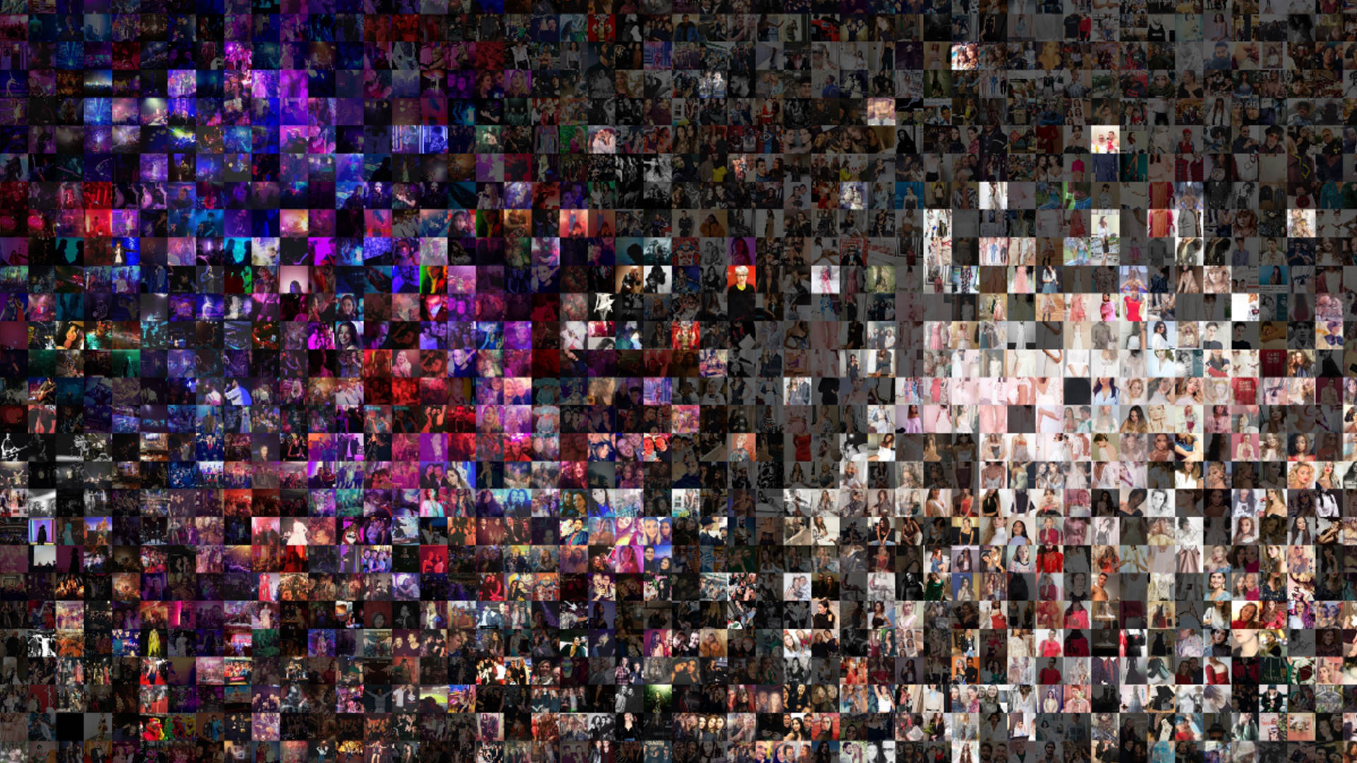
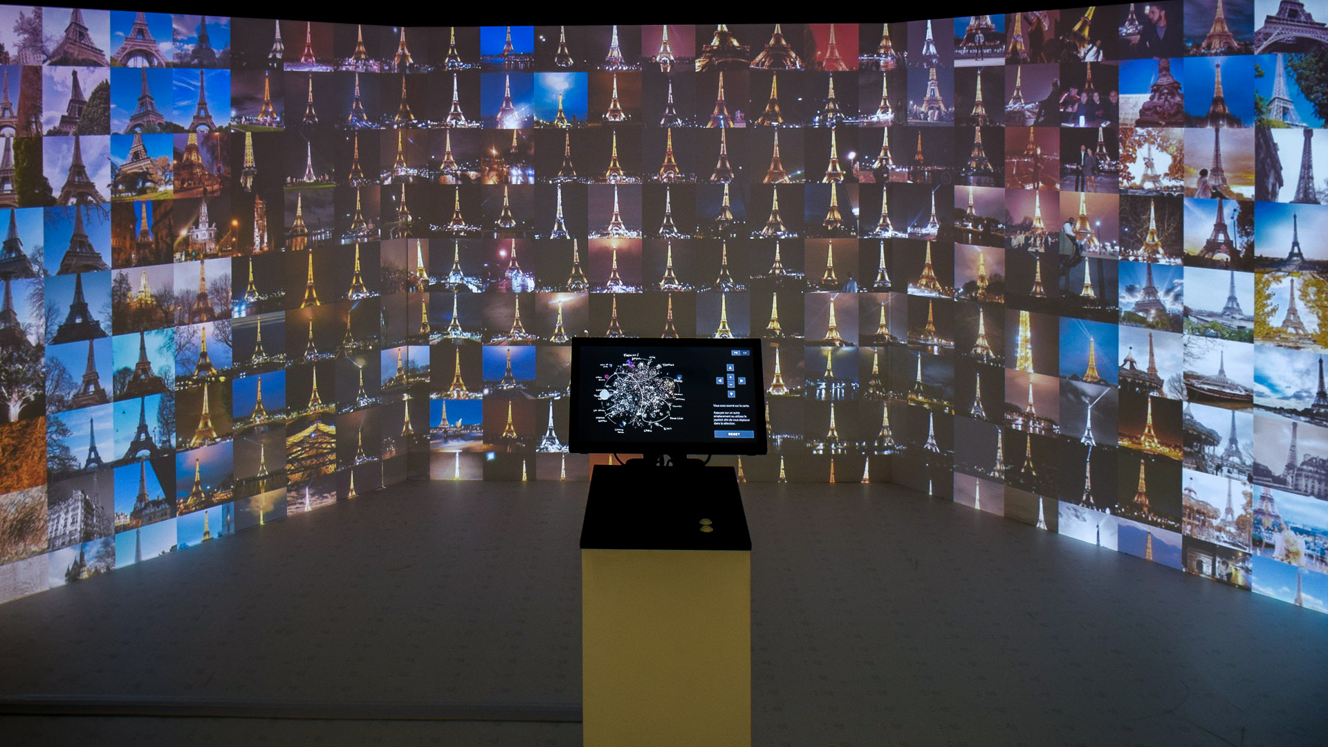
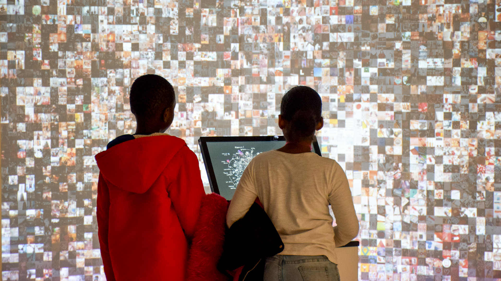
With an increase in use of technology, people’s city experiences have been collectively and continuously been documented on social media platforms, shaping a virtual city image. Designed and implemented by Moritz Stefaner in 2018, “Multiplicity” is a collective photographic city portrait that provides an immersive dive into the image space spanned by hundreds of thousands photos taken across Paris.
Collective photographic city portrait of Paris in 2017
Using machine learning techniques, “Multiplicity” is based on a sample of 6.2m geo-located social media photos posted in Paris in 2017, and it organizes images by similarity and content, allowing the audience to visually explore niches and microgenres.
Images organized by similarity and content
The projection spans three 1080p squares arranged in a slightly angled triptych structure, which allows for a more immersive experience, and visitors can navigate the manually annotated map using a touch device as well as a physical joystick. Overall, Stefaner intended to portray the city by using an arrangement of qualitative contents, encouraging viewers to explore and interpret on their own terms.
Immersive experience created by slightly angled triptych structure
Zooms portrayed in “Multiplicity” by Moritz Stefaner
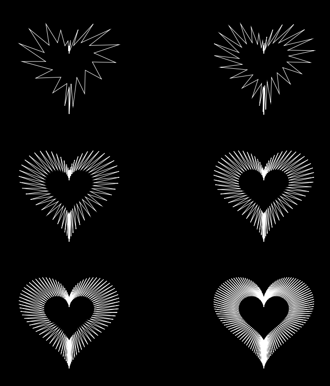
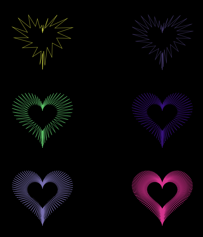
For this project, I wanted to draw a single object but in different ways. I took the functions from the website provided in the project brief and decided to draw a heart by plugging in functions for “x” and “y” and using the “beginShape()” function. I first began by using a “for loop” to draw a circle by creating a local variable that adds in increments for every loop. By altering this variable, I was able to draw the heart in different ways.
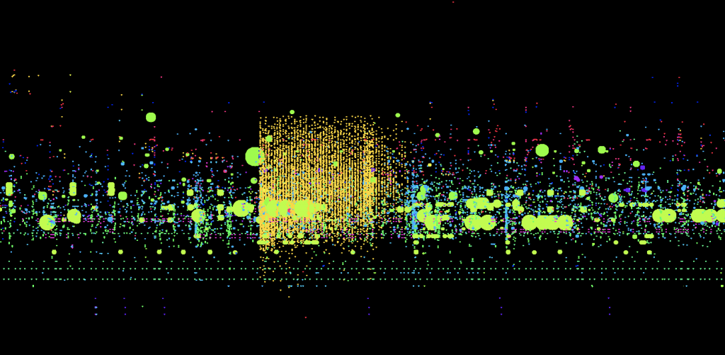
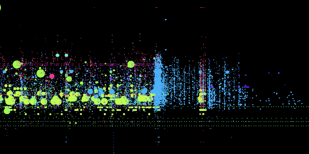
This week, I decided to look into the visualization of data on the NASDAQ Stock exchange. The different examples all represent a single minute of trade that occurs, the images on the top using a unique color to represent the trader, and the images on the bottom using unique colors to represent each stock. When there is a big grouping of the same color on the top, it means that the same trader is buying and selling stocks. If this occurs on the bottom, it means that a single stock is going through different transactions. The reason why I chose this project is because I thought it was really interesting to see how a very complicated topic like trading can be simplified and visualized with colors. I am in awe of how the creator broke down the system and found out the most efficient way to represent the concept. Not only does the visualization hold value and meaning, simply put, the project is very visually pleasing and engaging. It holds the viewer’s attention on the screen due to the movement and engagement, which is also useful to begin understanding the extent and depth of this project.
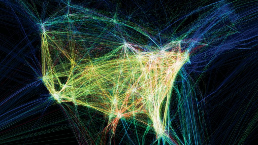
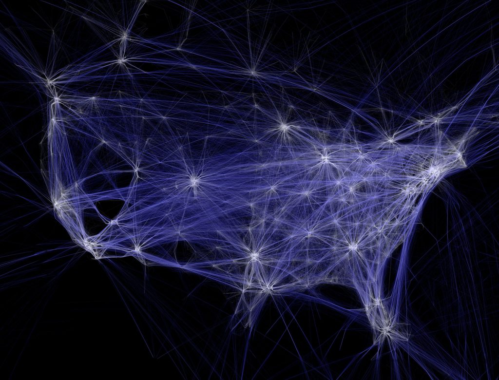
“Flight Patterns” Brightness increases as more flights fly out of that region
Color represents type of aircraftsWhite represents low altitude and blue high altitude
“Flight Patterns” was developed by Aaron Koblin, Scott Hessels, and Gabriel Dunne as part of a series of experiments for the project “Celestial Mechanics” initially created in August 2005. The artists parsed and plotted data using the Processing Programming Environment. The frames were then composited on Adobe After Effects and Maya.
I admire the artist’s ability to convey so much information through the different variations and avoids overcrowding the piece. Each element provides a new detail, the brightness increases as flight density increases, color represents type of aircrafts and altitude. I also admire the way he is able to create visual interest out of mundane data; each flight pattern looks like a mini firework.
The creator’s artistic sensibilities manifest in the final form through the story the piece tells. In Koblin’s Ted Talk he talks about how collecting data can make us more human and how he humanizes data through his work. For example, with this specific piece, you can see when people depending on their region are the busiest based on how bright that part of the piece is.
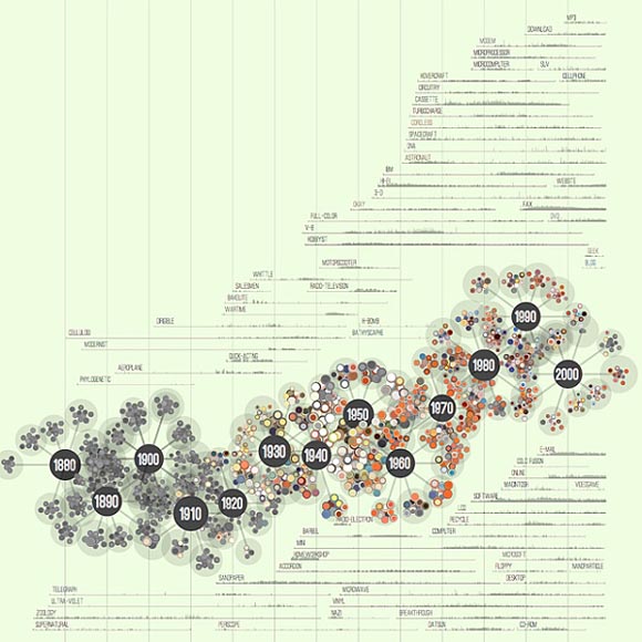
One piece of work that I admire is Jer Thorp’s “138 Years of Popular Science.” The data compiled is from Pop Science magazine’s past publications. The chart illustrates how different scientific terms have come into and out of popular usage over the years in scientific reports. As somewhat of an homage to the content, the data is visualized in a molecular chain format, with different atoms delineating distinct year clusters, further demarcated with different colors. Thorp developed a “simple, space-filling algorithm” that places the different molecules around the chain, and stacking them deliberately to create a neat flow. Further deepening the study is layered histograms in the background, showing the usage from different issues of specific terms. I like this work because it shows the artist’s personal design style with whimsical coloring and visualization, while also respecting the client for whom they are producing for with logic and thorough analysis. Every detail was clearly thought out. Furthermore, not only is it aesthetic but intellectually intriguing as it shows a progression and shift of technology and academic focus.
In a somewhat unrelated note, in the reddit app there is a subreddit that is interesting called r/dataisbeautiful which features data visualizations by anyone (ie regular people!) who chooses to submit a post. The content ranges from “Daily Polar Sea Ice Area with Monthly Ice Extent” to “The distribution of Minecraft Biomes in the overworld.”
http://www.random-art.org/about/ When I was doing research on randomness in art, random-art.org came up from many of my google searches. Random-art.org stores words and letters into seeds and turns them into art. Carnegie Mellon University alumnus, Andrej Bauer, designed the algorithm through javascript with ocam.js. Bauer was able to make random generative art accessible to the public. I thought that was a really admirable quality of the project. Anyone is able to go on the website and create their own art by simply typing in words. The website interprets the text and generates art. Random-art.org allows us to explore the possibilities shown to us by computer systems and randomness.
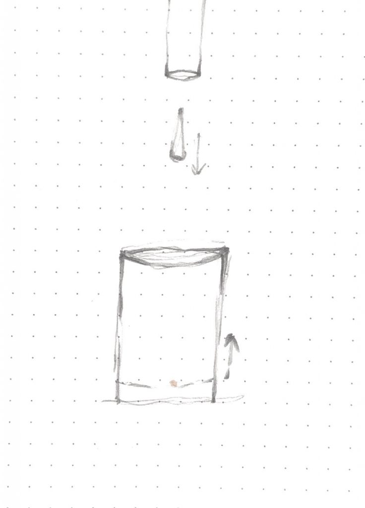
var y = 0;


function setup() {
  createCanvas(480, 480);
  frameRate(20);
}

function draw() {
  var v = 25
  background(230, 207, 106);

  //glass beaker
  fill(225, 230, 255);
  noStroke();
  rect(130,480,220,-270);
  stroke(80);
  strokeWeight(3);
  line(130,480,130,480-270);
  line(480-130,480,480-130,480-270);
  ellipse(240,480-270,220,10);


  //waterdrop
  fill(103,197,255);
  noStroke()
  ellipse(240,y,45);
  y = y + v;
  if (y > 480) {
    y = 0
  }

  //Pipe dropping water from the top
  noStroke();
  fill(71, 76, 84);
  rect(210,0,60,90);
  fill(0);
  ellipse(240,90,60,4);
  noStroke();


  //water level indicating seconds
  noStroke()
  fill(103,197,255);
  rect(130,480,220,-second()*4.5);
  stroke(83,167,245)
  strokeWeight(0.5)
  ellipse(240,480-second()*4.5,220,10);
  loop()

  //beaker outline
  noFill();
  stroke(80);
  strokeWeight(3)
  line(130,480,130,480-270);
  line(480-130,480,480-130,480-270);
  ellipse(240,480-270,220,10);


}
When thinking of a clock, or the idea of a clock, I was fascinated by the idea of how only something constant can be used as a device to define time. Systems that are perfectly constant are hard to find in this world, therefore we try to fine tune what we have to create a machine we can rely on. Water droplet’s relationship with gravity is constant most of the time. Therefore I thought it would be interesting to measure time with how fast droplets of water fill up a glass. Realistically, there are many other components in play that will affect how accurate this “clock” is but I found this alternate method of measuring time very fascinating.
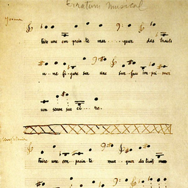
As one of the most renowned abstract artist, Marcel Duchamp produced “two works of music and a conceptual piece—a note suggesting a musical happening” between 1912 – 1915. Similar to his other creative work, his compositions represent a radical departure from anything done up till his time. In the process of the composing, Duchamp made three sets of 25 cards, one for each voice with a single note per card, where extensive passages of pitches and rhythms are fully specified, but the rhythmic coordination of parts within the ensemble is subject to an element of chance. It is considered as one of the earliest work that is mechanically driven and largely determined by random procedures.
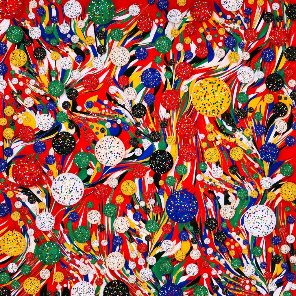
Manolo Gamboa Noan is an Argentinian generative artist who is known for his bright and chaotic images. According to Manolo’s bio on an art collection website, he focuses on exploring such dichotomies as chaotic v.s. ordered, organic v.s. artificial, and random v.s. controlled.
I am drawn to the piece “Mantel Rojo” because of the bright, jarring presence it has. Even though it is made entirely within the bounds of a computer, something we usually subconsciously consider to be cold and lifeless, the image is full of warmth and life. The randomness that Manolo plays with makes the image more real and expressive, making the audience feel as though there is a natural element to the image.
![[OLD FALL 2020] 15-104 • Introduction to Computing for Creative Practice](../../../../wp-content/uploads/2021/09/stop-banner.png)