L01 – My Inspiration

An interactive project I admire is Club Penguin. Club Penguin before its discontinuation was an online children’s game that became popular among people of all ages. I admire the simplicity of the game itself, but also the community built by the chat feature within the game. Even years after original players of the game had become “too old” to play, many still enjoyed it as well as created a multitude of different forms of art from it. Memes and YouTube videos were created daily about Club Penguin which shows the lasting impact the project had. The idea was started by a singular person and then developed by himself, Lance Priebe, and a co-founder, Lane Merrifield. The company itself was formed with 10 employees and eventually grew to over 10 times that. The game was developed for years and there is no information regarding how long the bare bones of it took to create. Sources state the game was created with commercial software, utilizing Flash Player to run. The code itself uses many things, such as java, ActionScript, and more. It has also been said that the company did create its own custom extensions for preexisting software for optimization. The fan page for the game states the founder got his inspiration from a newspaper depicting a penguin and a banana peel. The futures Club Penguin pointed to have already been seen. As an old, discontinued game, it still has a strong fan-base and inspires media. A simple project has had a lasting impact which gives insight into how influential computational projects can be. The game itself was even sold to Disney for a guaranteed $350 million dollars, revealing that someone with a passion and an idea can become successful no matter what it is.

A link is not possible as the game has been shutdown.
Official Title: Club Penguin
– Creator/Founder: Lance Priebe
– Co-Founder: Lane Merrifield
Source of Information: https://clubpenguin.fandom.com/wiki/Club_Penguin#:~:text=They%20never%20advertised%20at%20all,Puffle%20temporarily%20for%20the%20party
*This information may not be accurate as it is simply a fan made forum
*however it was one of the sole places I could find any information on the
*history and creation of the project.

Club Penguin Shuts Down After Disney Claim, U.K. Child-Porn Arrest - Variety

L01- My Inspiration

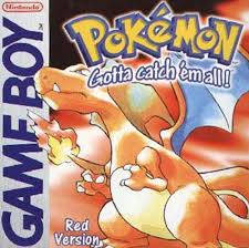
An interactive project I knew before this course were the Pokemon games, specifically Pokemon Red and Blue, the first two pokemon games. These games were developed under the names PocketMonsters: (Red, Green, and Blue) by Gamefreak, published by Nintendo and specially introduced in Japan in 1996 for the Game Boy. I admire these games because I grew up playing pokemon and was always around cards, toys, and the games themselves. These games are where pokemon started. These first games were made by a team of 10 people, they split up to design and code the game, 4 of which were programers. The games took about 6 years. The creator Tajiri was inspired by the Game boy allowing players to play together via cables, and by Square’s Game Boy game The Final Fantasy Legend. The games were written in Z80 Assembly, the “off-the-shelf” software as it was introduced in the late 1970s. This game led to interactive game play between players, letting them collect, travel, and battle with each other. The future of these games includes vr, 3D games, and more interaction with the real world. These games were developed by GameFreak, designed by Satoshi Tajiri, and composed by Junichi Masuda.

source of information: https://en.wikipedia.org/wiki/Pok%C3%A9mon_Red_and_Blue

Amazon.com: Pokemon - Red Version: Nintendo Game Boy Color: Video Games

LO1 – Some Technological Art that Inspired Me

My Inspiration: “Ghost Pole Propagator II”

Ghost Pole Propagator II, created by Golan Levin, 2016 (http://www.flong.com/projects/gpp-ii/)

This project is a digital interactive installation in Houston, for the Day for Night Festival. It projects stick figure visuals onto a large screen that followed human movement. It was mainly created by one person, but the project credited resources and assistance to 6-8 people.

An image processing technique called “skeletonization” was used to generate the stick figures from the human figure. This algorithm is similar to the one used in OCR (optical character recognition), except adjusted for human silhouettes. The art was developed in openFrameworks, which is a free C++ programming toolkit. Laser control and laser path related add-ons were also used. This art was inspired by Ghost Pole Propogator I that was created in 2007, which projected extremely abstract stick figures of observers.

Potential opportunities and futures of this artwork could be projecting more figures of different forms. This could include animals, birds, moving objects, and more.

LO1- MY INSPIRATION

As someone who had not watched Disney or Pixar movies during my childhood, I was immediately immersed by the Toy Story Series when my friends forced me to watch them in college. By watching Toy Story 1,2,3 back-to-back, I could see an enormous change in the quality and development of the characters and rendering.
Production companies Pixar and Walt Disney Pictures have produced multiple successful films and animations. During this time, production quality and rendering have improved exponentially. Technological improvements in lighting and motions effects have allowed the resulting films to produce more realistic people, toys, and overall graphics.


Pixar created a new software called RenderMan to handle more footage while also working on smoothness for more fully formed characters. Toys were conceived to be more realistic toys in shots using toy hands and feet.


A program called Simulation was also developed to develop fur graphics in Monsters Inc.. Each distinct particle of fur was simulated with acceleration, velocity, and force, using physics for design. This same technological foundation was then used in Monsters University, Ratatouille, Finding Nemo, etc.


Watching Toy Story 4 when it came out this summer with my friend, I was very impressed by the development in graphics and rendering, The refining of the materiality of fur for Duck and Bunny, doll effect of Bo Peep, as well as the realness of Forky as a plastic fork upgraded Toy Story 4 into a masterpiece in animation.


The future of animation only progresses with the advances made in both technology and creative design. The animation Onward has become a success in graphic works and computational design. Pixar and Disney’s future has a long way ahead as long as new software development improves production quality.

LO1 – My Inspiration

Two people were involved in making an app called Looom, which is available on iPads. Eran Hilleli worked as an animator-designer and is currently an animation director at Hornet, Art director at Klang games and lecturer at Bezalel academy of art and design. Finn Ericson took the role of an engineer. They worked remotely and took them about a year and a half to complete this project. They were first inspired by the animation technique “weaving loops” and realized how the software stopped the flow of the animators. Then they looked at classic toys like the View-Master discs, Etch A Sketch knobs or Game Boy, which exemplified creative solutions to technological constraints. I wasn’t able to find what exact software or scripts were used to make this app. However, I did find a picture of Eran Hillenli using a software to develop Looom (here).  I really admire this work since I was always interested in animating but was left frustrated working with Adobe CC softwares. Although this program isn’t for professional use, this app found a way for people at any age to animate easily. This digital flip book will allow people to approach animating without any prior experiences and release their creativity.

Video of Looom explanation

LO1- My Inspiration

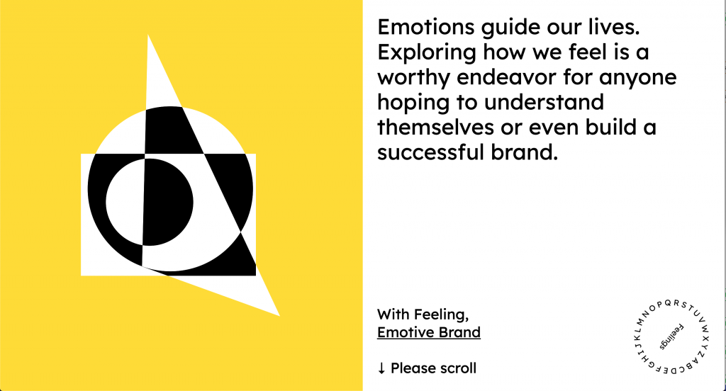
Emotive Brand is a San Fransisco based B2B brand strategy firm. I am not entirely sure how many people were involved, but according to my research, it seems like Emotive Brand’s lead designer Beth, senior designer Jonathan Haggard, designer Keyoni Scott, and creative director Thomas Hutchings have worked on it. They designed it in illustrator, animated it in After Effects, and transferred those animation to the web using Lottie.js. I think the creators have been inspired by their own previous works and their own brand identity, of handling emotions with design and interactive methods. This project introduced me to the Lottie.js. I used Lottie.js for my interactive project for the design class I took last semester. I think this project is a good inspiration for user interaction and experience.

Screenshot of emotivefeels.com

emotivefeels.com

LO1- My inspiration

A programming project that I admire is a project done by my friend, who is a junior in Carnegie Mellon University. He created a system that is based on the concept of revisioning the role of conversational agents in discussion-based contexts. Using the javascript library p5.js and its speech recognition library, he created a live prototype that translates the word a user says on screen. I think it was really cool to see how coding can involve both visual and auditory elements. It was admirable to see how coding could be turned into something personal and intimate like processing the words that come out of someone’s mouth. It took him 7 weeks and the process mostly consisted of experimenting and shifting around the code to match his end goal. He was very inspired by designer and engineer Maurice Conti, who encourages rebuilding the passive technology that are present today.

one of the prototypes// letter forms on screen in response to voice

LO1 – My Inspiration

I’m inspired by the interactive map initiative, Dashilar, created by Hara Design (Kenya Hara, Hiroaki Kawanami, Hiroyuki Saito, Sohei Takimi.) Link to project brief: https://www.ndc.co.jp/hara/en/works/2014/08/dashilar.html.

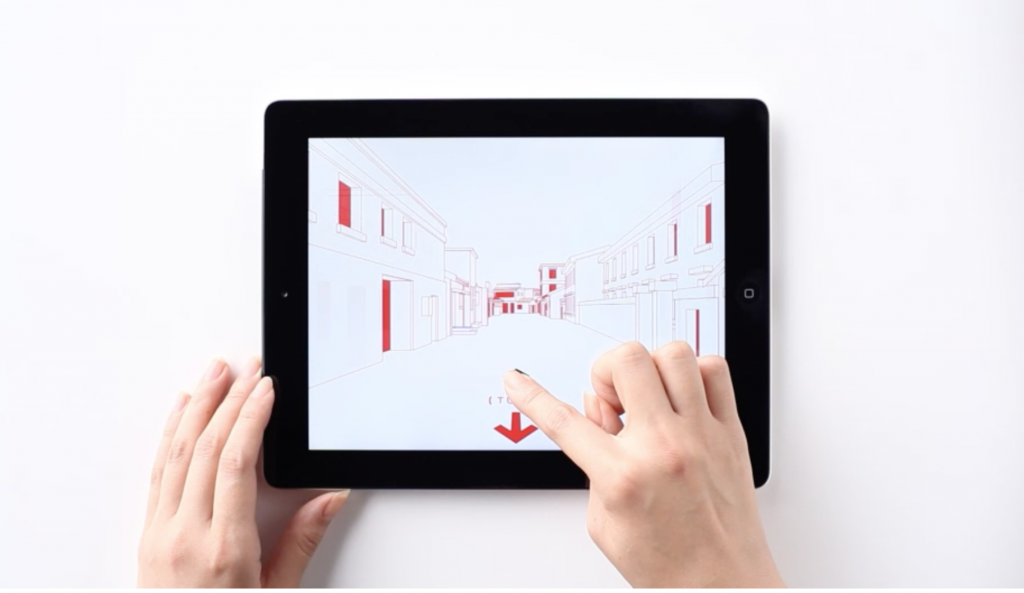
Street-view feature of city map app

I’m impressed by the practicality of this product, as it aims to educate and (digitally and physically) guide people about and through the city of Dashilar, the elegant aesthetics, respect to Chinese culture, and also its versatility and lasting potential in the form of physical products like signage and wrapping paper. Coming from a fine arts background, I appreciate traditionally “beautiful” things– however, learning design has made me start to think about how aesthetics can be translated into means of problem-solving, which this interactive map does beautifully and with consideration. I’m not familiar with the process of the creation of this project, but I’m positive complex code was used to create the streamlined zooming in/out function of the map, changing perspectives of the buildings depending on how you pan on the map, etc. The project’s creators may have been inspired by Google Maps for its functionality and traditional Asian maps for its visual language. This project points to even more considerate and useful interactive maps, especially for complex and historical landmarks around the world– aiming to educate visitors thoroughly about the historical significance of different places while effectively guiding them during their trip.

LO1 – My Inspiration

Week 1, 9/5/2020

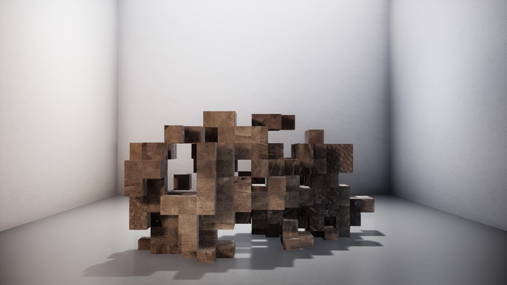
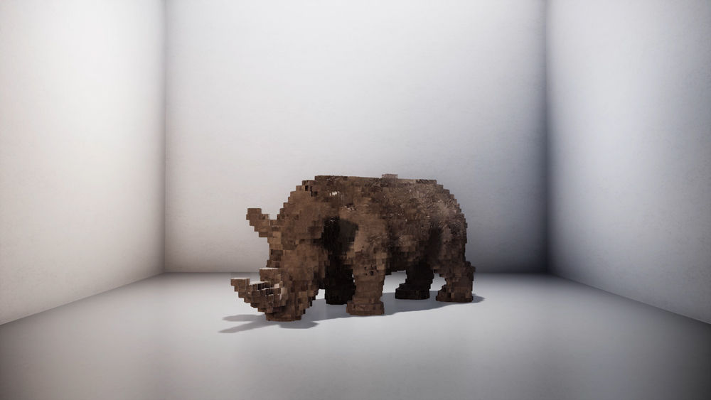
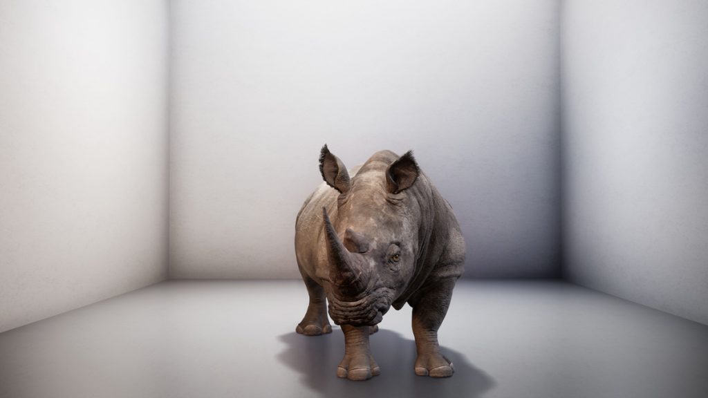
The project I want to talk about this week is called “the substitute”, by Alexandra Daisy Ginsberg. The piece is a 2-minute video showing a fully rendered northern white rhino that steadily increases in quality and vividness, from a blocky mass to a full-formed animal, until the video suddenly cuts short. The rendering is not of any particular animal, but a composite made from footage of northern white rhino herds captured by Czech scientist Richard Policht.

“The Substitute” by Daisy Ginsberg

Animation company The Mill created the animation and Dr. Andrea Banino from DeepMind, an AI development company, provided data for the rhino’s movement. The Cooper-Hewitt museum commissioned the project and provided the funding.

I really admire how the project attempts to present a stark contradiction to viewers. The last male northern white rhino died in 2018, rendering the breed virtually extinct despite a few surviving females. Despite this disaster, scientists are attempting to revive the species using banked genetic material that might be planted in surrogate mothers artificially. This project dares to ask if there’s any difference between this clearly ‘fake’ rhino and one that had been created in a lab. It also challenges our preconceptions around AI: why are we so eager to create new intelligence (i.e. AI) when we have been such bad shepherds of non-human intelligence on this earth? It asks whether this ‘fake’ rhino, rendered in a white box utterly devoid of context, is so different from the life we are making in our biotech labs or computer labs.

Images referenced from Ginsberg’s website

As far as I know, these companies used their own proprietary software for the project. The artist may have been inspired by other uses of AI that relate to art, such as AI that make songs (sweaty machines’ “Blue Jeans & Bloody Tears”, an AI-written eurovision entry, comes to mind), create sports (such as Speedgate), or write scripts (like comedy AI botnik). I hope that other artists see this project and are inspired to create new things that utilize AI to ask important questions about life & the responsibilities we have as the caretakers of our environment.

– Robert

LO: Voicing those Unheard- My Inspiration.

This past July, media-artist collective Breakfast (based in NY) released a Flip-Disk computational art piece to facilitate their ‘Don’t Go Quiet’ campaign in light of recent events with the murder of George Floyd and the insurgence in Black Lives Matter support.

“Dont Go Quiet” by Breakfast (2020) // 34.7 x 34.7 x 3.3 in // Flip-discs, software, camera + computer

The piece is composed of flip-discs triggered by the system’s real-time detection of new social media posts uploaded using the #blacklivesmatter hashtag or mentioning BLM, creating ripples (due to flip-disc movement) on an upside-down American flag. Through this piece, Breakfast hopes to highlight a collective, and hopefully, ongoing conversation to bring about an end to racism.

Flip-disc art has been around for quite some time, sometimes presenting itself in more practical forms: clocks, calendars, sign displays, etc. However, implementing a live internet tracking software to represent these current and highly important conversations brings another meaning to this technology. As an audience, we are drawn to artwork we can relate to; Breakfast has created an experience for its viewers to see the impact of each and every person speaking out against racism. I, like many, are inspired to stand alongside Black people today, tomorrow, and each day until we have created a world equitable enough. Let this be a time where we march harder, protest louder, and create with more empathy to see a world more diverse and inclusive than ever. Let your impact be seen.