![[OLD FALL 2018] 15-104 • Introduction to Computing for Creative Practice](../../../../wp-content/uploads/2020/08/stop-banner.png)
//Kade Stewart
//Section B
//kades@andrew.cmu.edu
//Project-07
function setup() {
createCanvas(480, 480);
}
var t = 10;
var x;
var y;
var col = 0;
function mouseClicked() {
//when the mouse is clicked, change the color scheme to 1 of 2 options
col = (1 + col) % 2;
}
function draw() {
//fills the background a diff color depending on the state
if (col == 0) {
background(0, 59, 26);
} else {
background(18, 0, 58);
}
//sets variables in the equations to the mouseX and mouseY
var a = mouseX;
noStroke();
fill(0);
//this makes the coordinate reference frame in the middle of the screen
push();
translate(width/2, height/2);
for (j = 0; j < 40; j++) {
beginShape();
noFill();
if (col == 0) {
//uses the green color scheme
if (j % 2 == 0) {
stroke(255, 255, 255);
} else {
stroke(190, 249, 156);
}
} else {
//uses the blue and orange color scheme
if (j % 2 == 0) {
stroke(245, 134, 124);
} else {
stroke(253, 218, 183);
}
}
//draws each astroid curve with a number of points determined by the mouseY
for (i = 0; i < mouseY; i++) {
x = (a - (width/2)*j) * cos(i) * cos(i) * cos(i);
y = (a - (width/2)*j) * sin(i) * sin(i) * sin(i);
//places the point to be drawn to
vertex(x,y);
}
endShape();
}
pop();
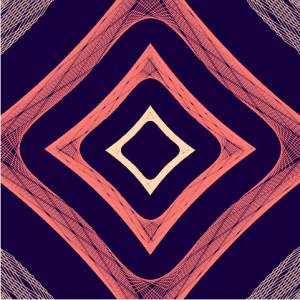
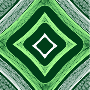
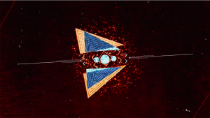
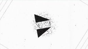
}I drew the astroid curve multiple times so that they could seemingly fold in and out of each other. This is manipulated by where the mouse is on the horizontal axis. I initially had the mouse’s y-height affecting the center of the curves, but it gave the user too much to vary in the curves. Now the mouse’s y-height affects the fidelity of each curve. Furthermore, clicking changes the color scheme between 2 options, just for some extra fun.