Vicky Zhou – Looking Outwards – 05

Air Max Promo Video

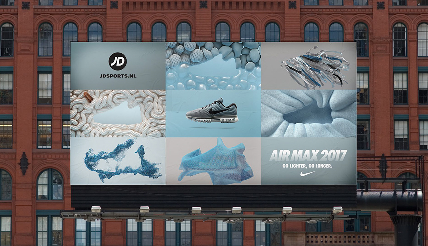
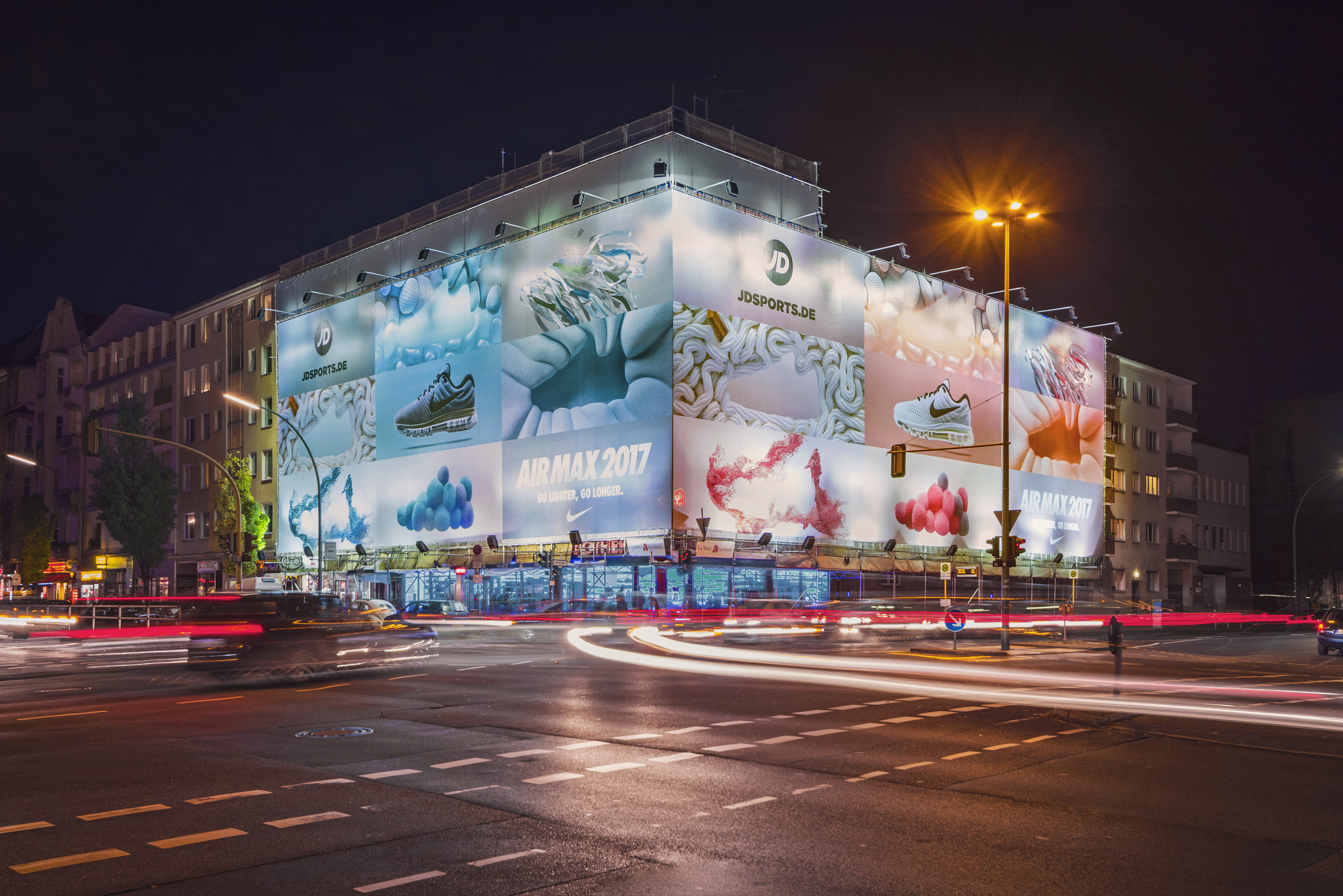
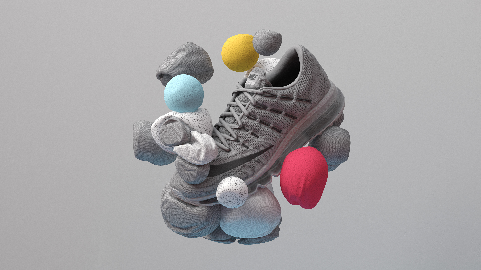
Nike’s Air Max 2017 launch utilizes 3D computer and motion graphics in an incredibly captivating way by playing with a diverse range of textures, interesting use of negative spaces, and metaphorical explorations of air and “lightness”. As with other Nike marketing and products, there is an immense team dedicated to all aspects of the creation of these ads and fine-tuning all the details, so the end result is nothing short of being incredibly hyper realistic. Nike creates a variety of different styles of the Nike Air Max by composing it through several different 3D computer graphic “mediums”, such as colored sand, toothpaste like texture, gum like strings, soft bunched up fabric, physical air balloon pockets, rubber sole like material, and so on. In addition, because many of these 3D computer graphics also evolved into motion graphics, they enabled another dimension in where the viewer could understood how the “material” behaved and reacted to gravity, pressure, and tension.
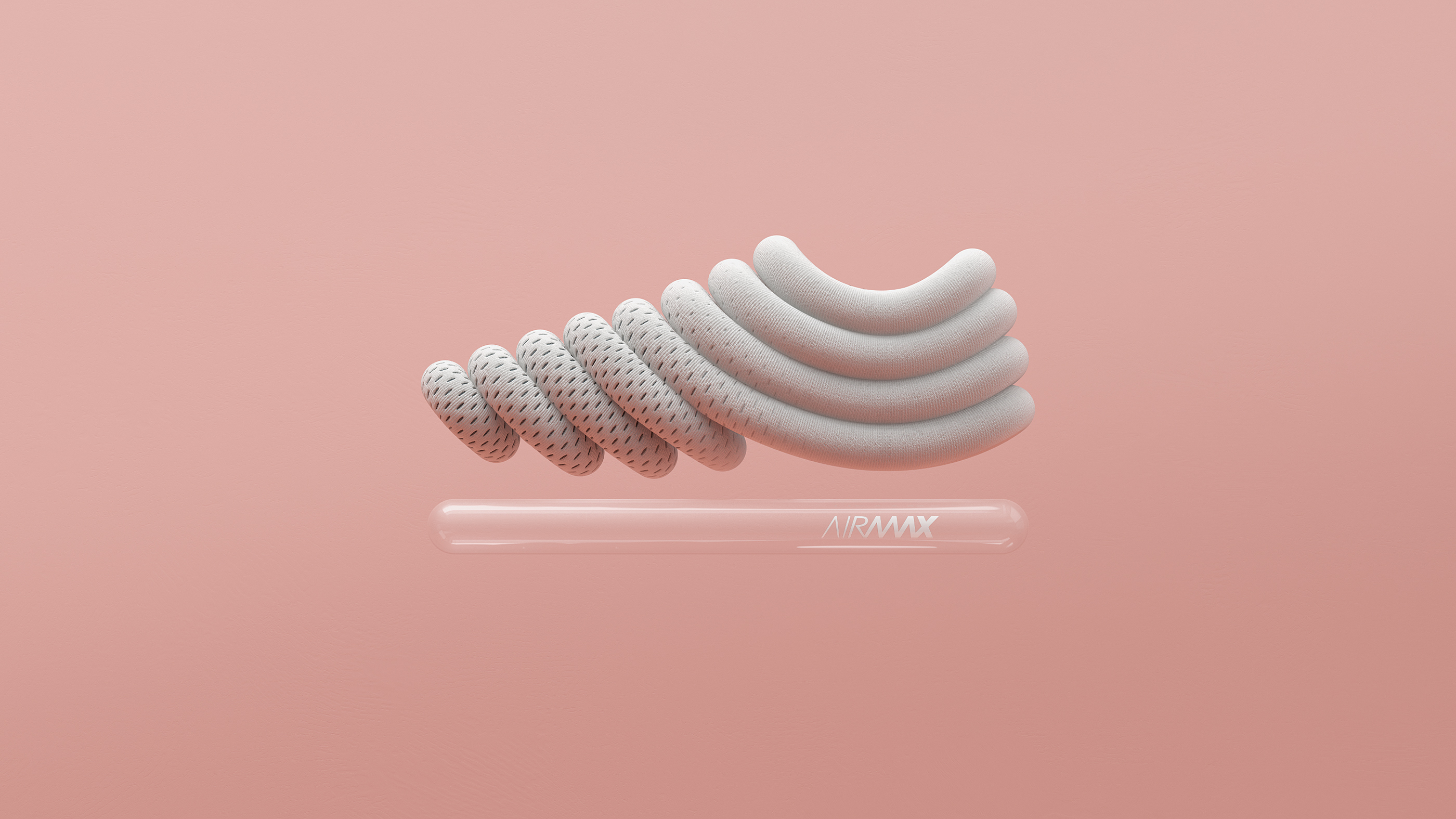
Air Max 2017
Air Max 2017 example
Air Max 2017 Campaign
Air Max 2017 Campaign cont.

Erin Fuller-Looking Outwards-05

Scale of ANIMAS

The Berlin-based studio Onformative created an interactive art installation called “ANIMAS” (2015). Physically the installation is a giant glowing sphere measuring two meters in diameter, on the interior is a powerful wide-angle projector and fisheye lens, producing images in a full 360-degree directional beam onto the sphere.

The orb, which can be seen from all angles, is constantly moving, producing a dynamic “texture” that is computer generated. Modulating frequencies audible in the installation respond to those in the installation space as sound is picked up and resonated back. While the project is not necessary “groundbreaking” in technologies, it was certainly executed well and a beautiful art piece.

Video of Animas in Action


Carley Johnson Looking Outwards 5

Print Fiction was a completely digital art galley produced and curated by Micheal Seibert in 2012. He put together digital art by artists (including himself) and displayed them all in a digital gallery (about 8 rooms total) created using Unity. The person can explore the gallery using the usual controls a first-person shooter might have. All of the artists gave different “types” of digital art from 3D sculptures to flat paintings, which creates a large mass of different types of 3D graphics, some being shown as 2D images and some being explored in a 3D space as 3D physical art. I like this project, because it really does seem like “the way of the future” to start opening larger virtual art galleries, which I could see becoming a big part of the AR/VR unfolding market.

This is the full space of the exhibit, separated into rooms.

ChristineSeo-LookingOutwards-05

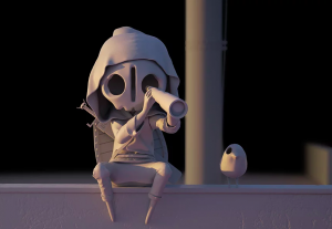
First stage of the process of when Julien Crochet created the work
3D rendering of Yoii’s character
The original “The Observer” 3D illustration

Julien Crochet is a 3D generalist that worked on “The Observer.” For this 3D artwork, he focused on modeling, texturing, shading, rendering, and compositing of the character that was inspired by the unique mood of an early morning. The character was inspired by Yoii’s character and rooftops. Since Crochet is a 3D Graphist, he has high proficiency in VRay, 2DS Max, Photoshop, and Maya. I was really intrigued by this artwork because his attention to detail for reflections and shadows really help to render a 3 dimensional space within the character’s surroundings. His use of shallow depth of field also was interesting because I am personally an art student and always work with rendering 3 dimensional spaces in 2D drawings.

I have not worked with a lot of rendering digitally, and it definitely captured my attention that he used a narrative illustration to show not only 3D rendering of the character, but also the space in the background. I wish Crochet worked in a series, where the character is portrayed in different locations, instead of one specific rooftop in Japan. However, the overall aesthetics of the piece as well as the color palette really captured my attention and gave a sense of reality in a digital world through 3D rendering.

http://juliencrochet.wixsite.com/portfolio/3d-observer

KadeStewart-LookingOutwards-05

The Barcelona-based artist Nuria creates 3d graphics for various publications and organizations. The top graphic was created for Ueno (a design company), and the bottom graphic was created for a workshop on Domestika, a website that hosts courses for creative practices. Their work utilizes a computer program that can arrange what appears to be glossy, “sticky” objects on a plane.

I love that the illustrations are always so lifelike. The pieces that Nuria creates always look like they are photos taken in a studio, even though they are really just virtual objects. The attention to detail to make the illustrations feel cohesive and real makes the 2d art feel 3d.

Nuria Madrid