Hannah Cai—Looking Outwards—09


link to the article

This post is a response to rjpark’s Looking Outwards 04 on the Artist Andrius Šarapovas’ room-sized interactive musical sculpture. The installation uses an algorithm to take 4G data and convert it into sound, consisting of 16 notes: C, D, F and G, spread across four octaves.

rjpark commented mostly on the inherent simplicity yet external complexity of the project—how the 77 individual units combined and placed throughout the room created such a complex soundscape. While I agree on the impressiveness of the generated soundscape, I think the installation is actually inherently pretty complex, due to all the filters and “instruments” those 16 notes are being played from (a metal bar, sound activator, sound damper, resonator, and mechatronics). I’m actually really curious how the network data was converted into sounds, and what choices were made in the formulation of the algorithm. Do the four notes mean anything in correlation to the data, or were the just chosen to create an appealing chord? What do the different textures of sound stand for? Overall, I like the end product a lot, but like many other projects which map data to a different output (sculpture, sound, visuals, etc), I wish there was more correlation between the input and output; otherwise the end products feel beautiful, but arbitrary.

Jaclyn Saik- Looking Outwards 09

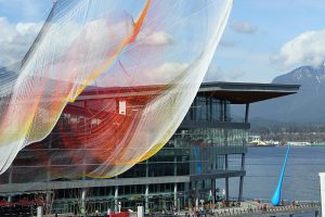
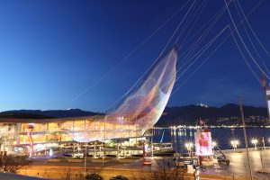
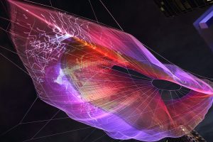
This week, I chose to look at an artist that Sophia Kim found in week 7. “Unnumbered Sparks” is a giant interactive installation that was made by artists Janet Echelman, Aaron Koblin and the rest of the people at Google Creative Lab. The installation was made to celebrate TED’s 30th anniversary, and was installed in Vancouver, Canada from March 15-22, 2014. It was most effective at night, when it was illuminated.

I was interested in this piece not only because it’s absolutely beautiful and something I would definitely pay to see in real life, but also since it is work from  the Creative Lab and I’ve always been interested in what they put out.

Sophia did a really good job talking about how interactive the sculpture is with devices like tablets and smartphones. I found it interesting that the sculpture is a representation of Google Chrome: since the lighting represents a “single fullscreen Google Chrome window over 10 million pixels in size”. This is also a pretty obvious way for Google to brag about their own web browser, but nevertheless, it’s pretty to look at.

Something that I want to look further into the the library Polymer, which the entire project is based on. Polymer is an open source library that lets you make unique, customized HTML elements. As a future digital designer, I find it interesting that there are libraries like this where you can create data that’s open to the public to use. In a way, it makes this art feel more approachable and easier to fathom.

Daytime, when the translucent materials are most obvious.
At dusk, when you can really start to see the colors.
Illuminated at night.

Alessandra Fleck-Looking Outwards-09

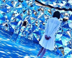
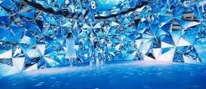
For this looking outwards, I wanted to look at Yingyang Zhou’s Looking Outwards 08 entry on media artist Chris Cheung. According to Yingyang, Cheung’s work is inspired by the intersection of light rays though a Brilliant cut grade diamond. Yingyang describes the phenomenon of Cheung’s work as “…splendors of our mother nature, ranging from the galaxy and distant stars, rare gemstones, glistens of flowing water, and refracted light beams.” Looking at Cheung’s work I agree that perhaps a key foundation to his work stems from a subtle, yet elegant event of light refraction that brings life to varying elements of mother nature. The fact that the theme of the project carries such a universal language, I think is very interesting. Additionally to Yingyang’s analysis on Cheung’s work I also think that as seen in his installation, Prismverse, the illuminated interior that as Yinyang notes is a metaphor for “the instant tone-up effect of Dr.Jart + V7 Toning Light” also acts as moment of extraction. What Cheung’s work seems to do is take a rudimentary event that occurs in nature and blows it up into a perspective that we can walk into. Typically the type of light refraction Cheung illustrates does not occur at such a large scale. Pulling the scale up and displaying the work at such a large level highlights the subtle beauty that is otherwise overlooked.

The images below shows the glowing effect of the Prismverse installation.

Link to the original looking outwards post by Yingyang Zhou: https://courses.ideate.cmu.edu/15-104/f2018/category/looking-outwards-08/

Link to bio of Chris Cheung: http://eyeofestival.com/speaker/chris-cheung/


Meejin Koon // Howeler + Yoon Architecture

For this week’s blog post, I am taking a deeper dive into the Howeler + Yoon Architecture firm from Min Lee’s Week 8 Looking Outwards on Meejin Yoon.

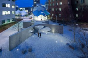
I actually had the pleasure of seeing 2 of their projects on a studio trip to Boston last summer. One project I really want to highlight from this firm is the Collier Memorial on MIT’s campus.

Sean Collier Memorial, MIT, Boston, Howeler + Yoon

This project is a memorial to an officer, Sean Collier, that was shot and killed in 2013. As most memorials result in statues, plaques, benches, etc. I remember being completely inspired by this project’s ambition, structure, and integration into the public landscape.

Now looking further into this project, and learning more about the firm from Meejin Yoon, I have learned that the entire design and structural analysis utilizes computational design. I believe the project mainly utilizes Rhino 3D Modeling Software and Grasshopper, a Rhino plug-in for computational and parametric design.

Computational model of Memorial

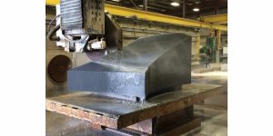
The structure being constructed of 32 granite blocks presents new challenges that are wouldn’t be the same for something like poured in place concrete. So for this project, not only was the design computational, but the actual fabrication of these pieces used a combination of manual labor and robotic sawing.

Fabrication of memorial at Quarra Stone Co., in Madison, Wis.

What I really appreciated in Min Lee’s piece is the emphasis on the idea of public/private space. With the Collier memorial, the project has transformed a public area to create new spaces for the public to interact with, rather than look at or observe. This firm is really combining their design goals with the right tools and software to make them happen.

Tanvi Harkare – Looking Outwards 09

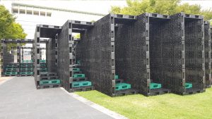
For this looking outwards, I liked the project that Romi Jin covered in her looking outwards 3 about computational fabrication. As an architecture major, computational design is one of the many ways we can design buildings for the future. The specific computational project was HG’s opening chronometry. I agree with the fact that using a tool called Grasshopper to create parametric designs are a very easy way to create iterations in your design process, versus trying to record all those things by hand. My favorite project by this group is their Hide-and-Seek project, which is an art museum and cultural space. They used computational design to create a labyrinth of corridors that visitors can use to go through series of small spaces. Users are to “hide and discover each other” through different material transparencies and stairs. The main building material is recycled plastic pallets & LED lights for lighting, which is an unusual combination of materials I haven’t seen before.

Click here for a link to the original looking outwards post, and click here for the link to the project!

The Hide & Seek pavilion

Christine Chen-Looking Outwards-09

2017 Nike Air Max Video. Link: https://vimeo.com/192130017

I was captivated by the 2017 Nike Air Max promo video that Vicky discovered. I watched the video over and over again and was just simply fascinated by how well the creators utilized various organic textures, pastel colors of blue and pink, and dynamic forms to create this enchanting motion graphic. I completely agree with Vicky about her comment on the creator’s incredible use of 3D computer graphic to help viewer’s understand the ways in which the materials of the shoes behave when they are under use. To add on to her comment, I think the how the creator’s uses metaphorical graphics, such as movements of the pumping of air balloons, the swirling of light fabric wrapping around the shoes and others, really helps the viewers understand and visualize the functionality and material of the shoes. One of the main pros of the shoe is its incredible lightweight, and the three-dimensional graphics of the forms really help to put emphasis on this. This video again reminds me of what first drew me towards stepping into the world of design and why I chose this major in the first place.

Vicky’s post: https://courses.ideate.cmu.edu/15-104/f2018/2018/09/23/vicky-zhou-looking-outwards-05/


Min Jun Kim- Looking Outwards 9


Multiverse by fuse*

This week I’ve decided to do a peer review of a Han Yu’s looking outward’s post. I found a post that is very interesting and it contains a project that immediately drew my attention. It is a art installation that has heavy usage of both visuals and sounds by a company called fuse*. The project is representative of the vastness of the multiverse that is infinite and always going through the cycle of life- that is, the birthing and the dying of the universe. Personally, I thought that the project was very engaging as an artform that encourages the audience to fall into deep thought. It really showed the immenseness of the universe with huge displays with patterns that never repeats itself. I thought that the experience of the project could have been improved had the screen been wider horizontally (like a room) and had different noises that blend with the visual display- or had other features such as user interation. Otherwise the I would have to agree with the poster about the influence that it has on the viewer- it really does give a sense of the infinite possibility of life. Overall, it was a super unique project with very good execution.

Link to Original Work: https://courses.ideate.cmu.edu/15-104/f2018/2018/09/18/han-yu-looking-outwards-04/
Creator’s name: fuse*
Created in 2018 in Italy

Kai Zhang-Looking Outwards-09

This week for Looking Outwards, I looked through LIngfan Jiang’s post for Looking Outwards 07 about an interactive art installation. Here’s his decription and reflection of the project below.

This week, I am particularly interested in this project called “skies painted with unnumbered sparks”. It was done by an interactive artist, Aaron Koblin collaborated with Janet Echelman in 2014. Made entirely of soft fibers, the sculpture can attach directly into existing city architecture.

Being an architecture student myself, I really like how the artist started to think about the space between the buildings and how art could be involved in it. I really like the contrast between the hard concrete buildings and the smooth, light installation. Most importantly, with computational information visualization and great lighting effects, it really became something its audiences are willing to interact with. It is also amazing how people could just use their phones to draw lines and that would project directly onto the installation.

I think the final form of this art piece is very successful. As I mentioned earlier, this project is done by an interactive artist,  Aaron Koblin and another artist, Janet Echelman, who mainly does amazing huge scale installation art. Therefore, I think the combination of the two artists really created something fascinating.  As for the algorithm behind it, I would assume that the installation becomes a bigger monitor of people’s phones. Whatever is drawn on the phones would project directly on to the installation.

Furthermore, I think this kind of techniques could really make some science fiction movie scenes come true where a lot of projecting figures are floating in the air in the future.

I really appreciate his reflection of this art installation from a perspective of an architect’s point of view. And for a person of the same identity, I do also have many of the same feelings when I see this project.

And I also see something else. Other than the aesthetic aspect of the project, I also see how this is valuable to the public. Often times we have nothing more to do with the architectural or many of the art installtion than being able to snap photos and post them to Instagram. But this kind of the work enables the possibility for the public to become part of the work. By using technology, everyone is able to join the party and become the composer of the great piece. Also, the form of interaction has a decent amount of capacity for everyone who wants to do the work. It creates a virtual connection between people and encourages the interaction between not only people to technology, but people with each other. And I think this the temperature of the technology driven by people with such ambitions to bring everyone together.

Vicky Zhou – Looking Outwards – 09

For this week’s looking outwards post, I found my fellow peer, Jason Zhu’s Looking Outward from week 1 quite interesting. The project he discussed is Colorspace, “an interactive sculpture that translates text messages into breathtaking animations of colored light.” He pointed out that this kind of interactive space could be used in “spaces where users have a lack of or no emotional connection to, but spend a significant portion of their time”, and/or schools and and workplaces. My main question would be though, aside from creating an interest for the first couple of interactions, how else could this environment be beneficial? For example, instead of just creating a sense of community and momentary interest, could this kind of interactive digital media be used to facilitate learning, if placed in a school environment, or help engage productivity, in placed in a work environment? In addition, I personally thought of a hospital, when Jason mentioned placing this installation in a space where people typically do not feel as connected and/or emotional to, and if that could possibly shift the user into having a more positive experience.

Lingfan Jiang – Looking Outwards 09

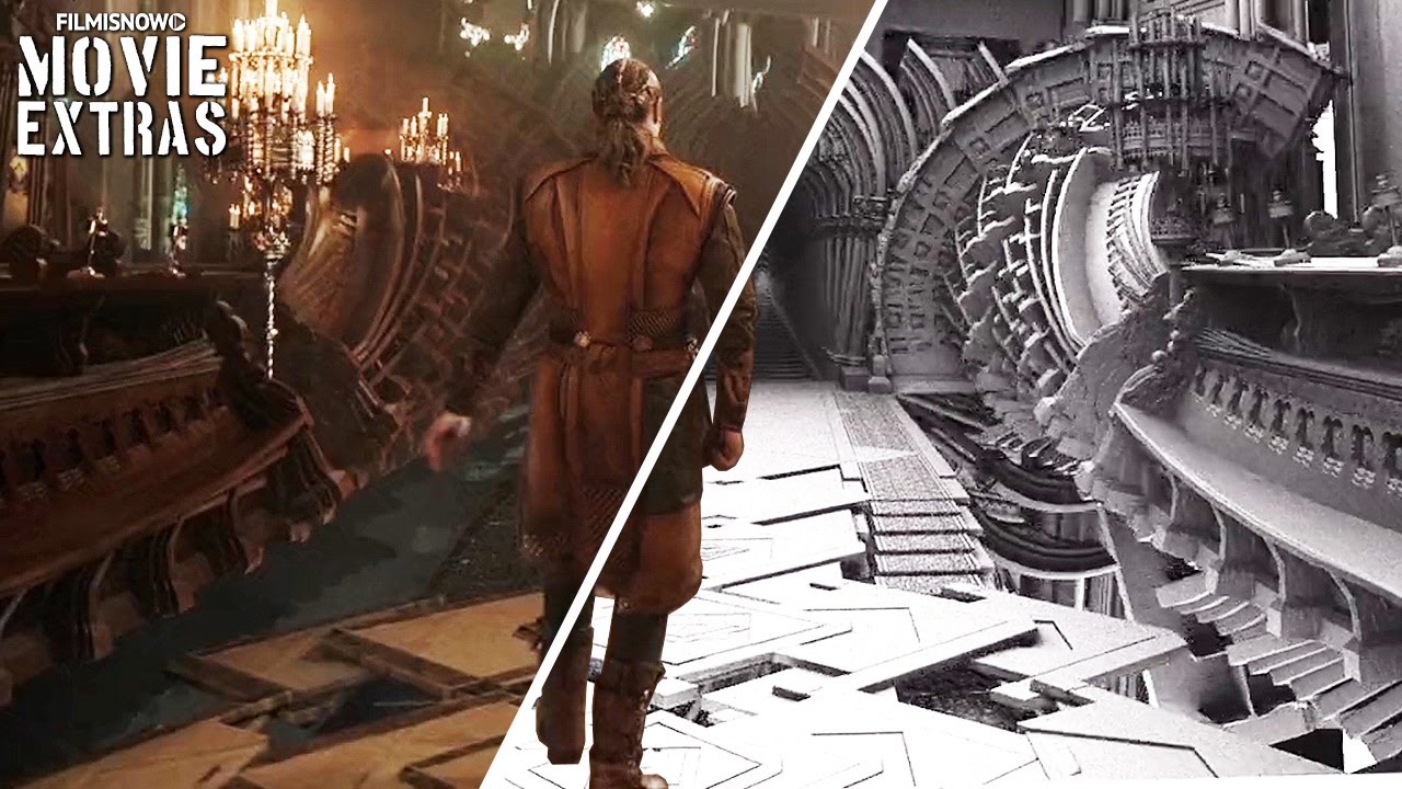
I looked through Kai Zhang’s posts. One of them talked about the making of Movie CGI Effects in Doctor Strange in 2016. The video attached is very interesting to look at. Here’s the link for that.

It is surprising that the process of CGI making is not all about 3D generated objects. A lot of the times it is a combination of 2D and 3D layers that make up the full imagery.

It is also amazing to see how much software is capable now. Being an architecture student myself, it is still really difficult for me to imagine rendering one frame of the movie. Although the process is a lot different from each other, the final product is still fascinating to look at.

I think in the original post, Kai really explained the process really well. For me, on the other hand, I am interested in what it means to have those amazing effects. First of all, being a Marvel movie, Doctor Strange is a movie with great fighting scenes and fancy looks. However, with those effects, actors had to act based on their imagination and acting experience. As for the movies themselves, we like to watch these kinds of visual effects. In order to not let people feel bored, more and more money is invested to create better effects. As a result, the characters’ emotions become less important in those movies. They are definitely nice movies to watch, but normally we do not learn from them anymore.  Image result for doctor strange cgi

Here is the original post.

Kai Zhang-Looking Outwards-05