Jaclyn Saik-Looking Outwards 12

My final project is going to be focused on typography and type interactions. I want to explore different ways I can enhance the reading experience of a poem on screens. I looked around for artists who worked with text interactions within javascript, and found some pretty interesting people.

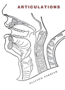
The first project I want to talk about is programmer and poet Allison Parrish’s Articulations, which scans over a ton of open source poetry and generates smaller poems based on them. Her work is an art piece and a critique on social norms, since it points out trends in poetry that highlight what humans are most compelled to write expressively about. Articulations is a compiled book, which I also find inspiring that something as technical as coded poetry can be published into a physical book.

The cover of Parrish’s book, which was released early 2018.

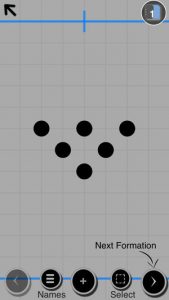
The other project I found was a lot different. Artist Bruce Luo creates processing sketches that imitate natural and organic movements, such as wind and rock formations and waves. One of his sketches in particular, Ripples (shown below) is just a really beautiful animation that relies on mouse activity.

(caption)  Ripples is an interactive sketch that creates both randomized movement and movement dependent on mouse position.

In our final project, I want to synthesize ideas from both of these projects. Parrish’s generative poetry is a really interesting way to combine the use of code and type, and as we continue to brainstorm how we implement our chosen poem into our project, I’ll continually think of how she did this as inspiration. I also want to use a similar interaction to Luo’s, except with our project I plan to make moving objects all based on type.

Looking Outwards Week 12 – Sara Frankel

Looking through my peers’ posts, I found that Jenna Kim’s Week 10 and Sean Meng’s Week 4 Looking Outwards are quite similar to my project. I hope to capture the shape and colors of music. Jenna wrote about Christopher Yamane’s “wassiliscope”. This project uses a telescope to translate light frequencies to audible frequencies. In other words, this artist brings forth the sound and correlation of the color portrayed.

Sean talks about pop artist Ed Sheeran’s visualization of his song “Shape of You”. Ed Sheeran uses colors and geometric shapes to fill his backdrop of his music video allowing the viewer to follow along and experience the mood of the music visually.

Ed Sheeran’s creative process explained with music visualization

This is relevant to my project as I hope to incorporate visuals connected to music to help enhance the users experience in understanding the music, which both projects do. I admire these projects as, a music major, I experience more of the entire musical experience. I would love to be able to share this with other people in terms of how I feel and see the music.

Christine Seo – Looking Outwards 12

I was very inspired by the ideas of Real Slow, a project that visualizes music, as well as AV Clash, a project that involves audiovisual compositions through audio and sound effects. Throughout the course, my favorite parts were when we had to incorporate the camera and when we had to allow music in our assignments. Thus, I decided to look for inspirations that interacts with these two topics. First, these both have very interesting visuals that react to sounds and music. For Real Slow, there is face detection that allows the components of the face to react to the music and volume, which I found was very fascinating. This interactive project was originally inspired by the music experience for an Australian indie-electronic band, “Miami Horror”. The artist wanted to create a program to fit the mood & tone of their electro music “Real Slow”. As I researched, I found out that the first prototype was developed on OpenFrameworks and then implemented the idea on the web using JavaScript libraries for face tracking called ClmTrackr and p5.js for creating sound visualization. For AV Clash, I though that it was interesting how there is interaction between the objects that responded to the sounds. The project allows the creation of audiovisual compositions, consisting of combinations of sound and audio-reactive animation loops. Objects can be dragged and thrown, creating interactions (clashes) between them. Both of these projects not only have some sort of interaction with music and the program, but also an interaction with the audience as well, whether it is through face detection, or mouse detection.

Caption: Video documentation of Real Slow (2015), a Face Sound Visualization with music by Nithi Prasanpanich

http://prasanpanich.com/2016/01/01/real-slow/

Caption: Video representation of AV Clash (2010), a project by Video Jack, that creates audiovisual compositions, consisting of combinations of sound and audio-reactive animation loops

https://www.creativeapplications.net/flash/av-clash-flash-webapp-sound/


Jessica Timczyk – Looking Outwards 12

A screenshot from the 3D interactive doodle
A screenshot of the first shot of Solace, an interactive animation.

In preparation for making my own final project, which will be an interactive animation, I researched some other interactive animations and found these two very interesting projects. The first project is a VR and 3D interactive animated doodle by Fx Goby and Google Doodle artist Hélène Leroux made in 2018, in tribute to filmmaker Georges Méliès called ‘Back to the Moon‘. The doodle allows the viewer to move around and look at the animated environment in 360 degrees. The second project, called ‘Solace’ is also an interactive film created in 2017 by Evan Boehm and Jeff Noon in collaboration with Nexus Interactive Studios. The project takes the viewer through a narrated story in which the viewer can interact with almost all of the shapes and pictures making up the story with their mouse. Unlike the first interactive animation, ‘Solace‘ allows the viewer to actually interact with the images and shapes that make up the characters and etc of the story, whereas ‘Back to the Moon’ only allows the viewer to move around in the frame. Though I really enjoy the interactivity of ‘Solace’, I think I personally am partial to the 3D environment of ‘Back to the Moon’ and also the story line that accompanies it. I think that ‘Back to the Moon’, though very innovative in itself, missed an opportunity to make the actual story line and images interactive. Overall, I very much enjoyed both. You can play with both of them in the link or video below.


Looking Outwards – 12

The Space Between Us, Santa Monica, CA. 2013
The Chronarium Sleep Lab, The Cathay, Singapore. 2015

The project The Space Between Us, is by Janet Echelman and the project The Chronarium, is by Rachel Wingfield. Both of these projects are similar in the way that they are both human centered and designed for interaction and to create an experience throughout. I found these projects interesting because the approaches to similar concepts are different. Echelman’s project is situated in an open environment, while Wingfield’s project is a part of an enclosed space. While both are different in the physical aspect, both project incorporates lighting and sound to create an immersive audiovisual experience for their audience. Both project also include some sort of physical change to the environment by the audience. In the Space Between Us, the audience had to carve or make indentations through the sand so that they could sit comfortably to look up at the aerial sculpture. In the Chronarium, the audience would lie inside a textile canopy, which would change the shape and form of the envelope as they moved/turned to find the most comfortable position to rest/sleep.

Jamie Dorst Looking Outward 12

For this week’s looking outward post, I found two different projects that have inspired my final project. The first one is a travel planner by Stamen Design that helps you plan a road trip, but also tells you what the weather is like along the way so you can plan better. After making your plan, you can drag around the stops on your trip and see how the weather changes if you take a different route. I think this is a good way to interact with weather and make the basic numbers more understandable and approachable.

An image of the trip showing the weather along the way
The other project I found was My Daily Color Palette by Jacobo Zanella. He made an image every day for the entirety of 2010 showing the color palette of his clothes and how much skin was showing. I thought this was a really cool project that would let you see patterns in what you wear, and see as the year goes by how that changes.
These are all of his color palettes for the month of May in 2010

Justin Yook – Looking Outwards 12

Osu gameplay
Example from Playbook.dance

The two projects that are relevant to my project are Osu by Dean Herbert, and Playbook.dance by Greg Lee. Osu is a rhythm game, where players press on the keyboard or click the mouse to the song they are listening to in the game. I admire the game because it has grown to be one of the biggest of its genre, and it has never lost any player engagement; the idea of interacting with music is interesting. Playbook.dance is an application for the iPhone, that allows choreographers to arrange dancers, represented by circles, to create concepts for staging and formations. I like this application because it is easy to use, and pretty flexible. The only negative side of it is that it is becoming outdated, because the author does not update it anymore.

Sources:

https://osu.ppy.sh/home

https://itunes.apple.com/us/app/playbook-dance/id572038933?mt=8

KadeStewart-LookingOutwards-12

Title screen for “Flight”
How the data is collected and visualized (A Dialogue between Four Hands, 2017)

Flight is a paper airplane simulator made by Armor Games, in which you can upgrade your airplane to go higher, faster, and farther. It really only the up and down arrow keys. This project is really interesting (in fact, I played a lot of it as a kid because it’s a fun flash game), but they missed on the opportunity to add difficulty via levels.

Another project is Giorgia Lupi’s 2017 “A dialogue between four hands.” She finds ways to collect data from a guitarist/drummer, and makes the data look interesting. It’s a great testament to our ability to eke out data from everyday life, not just from things with computers.

These two projects don’t seem to be very connected. However, Flight offers a great opportunity for data collection (simple key presses). The way that Lupi acquires data, on a very individual-level, could be enlightening for how good players of Flight are successful, and how bad players are…not so good.


Flight

A dialogue between four hands

Elena Deng-Looking Outwards 12

Mimic by Design IO

Cause and Effect by Scott Snibbe

After looking extensively through the list of generative artists I found two projects that i was the most interested in. Surprisingly, the projects seemed to be very similar to each other. I decided to look at Design I/O’s Mimic as well as Scott Snibbe’s Cause and Effect. I admire how both of the projects require the user/viewer to move and through this movement, the project will begin to interact. For the Cause and Effect, because it was done in the early 2000’s i believe that the technology from that time could not have lended itself well to visual interest. I think that in both projects the artist could have focused on the visual form more as opposed to the interaction.
I hope that in my final project I will be able to create a visual that reflects the user’s actions in an engaging visual manner.
https://www.snibbe.com/digital-art#/projects/interactive/causeandeffect/
http://design-io.com/projects/Mimic/

Victoria Reiter – Looking Outwards 12 – Project Precursors

In this Looking Outward post I investigated some interactive maps that exist.

Nancy Milholland’s San Francisco Public Art Map

Something I’ve recently spent some time learning and thinking about is that geography and cartography are not static things — they are fluid and can be utilized to show more than just topography and physical location, but culture and thoughts.

I found this in the San Francisco Public Art Map designed by Nancy Milholland.

Art locations represented as hot density clusters

Milholland uses a combination of official sources, such as the municipal planning department and arts commission, the SF Mural Arts program, and unofficial sources like Flickr, Instagram and YouTube. This allows her to document not only art officially recognized by the government, that was perhaps governmentally or privately funded, but also art erected more casually and personally.

Screenshot of an artwork’s description

I think what makes this project so powerful is the community-aspect of it. People within the community can contribute to finding and updating where there is art in the city, creating a richer knowledge-base than a more formal assessment that would exclude many less officially created art pieces. In this way, the map can grow and develop and reflect the people who live within its geographic area.

Ai Wei Wei’s Good Fences Make Good Neighbors interactive map

The second project I took inspiration from was Ai Wei Wei’s Good Fences Make Good Neighbors interactive map.

This map allows viewers to explore Ai’s New York City-wide exhibition online by clicking around to the different art pieces he has set up around the city. After selecting one, you can read more about where the inspiration for the piece is from (each piece represents a portrait of an immigrant or refugee who came to America at different points in history and from different places). The map also links to directions so you can physically go and see the piece in person.

Portrait from Good Fences Make Good Neighbors

This map is very personal also, because the pieces reflect the stories and experiences of individuals. Each place is not just a physical location, but a story.

I like the idea of personalizing a map, and having it reflect something about yourself, your community, etc., and I hope to use this inspiration for my final project.