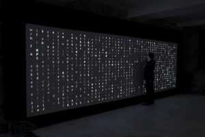
A project that I really liked is the Digital Type Wall that was created for Monotype, and then exhibited in the Metropolitan Wharf in London, UK in November of 2012. The exhibition and print design were created by the SEA design team, and the installation concept and code were created by Marcin Ignac and the Variable team. The project was created in collaboration with the Pencil to Pixel exhibition to help show how typography has changed through the years. There are over 6,000 different combinations that can be shown based off the animation that creates it, and it takes typography from over hundreds of fonts. The custom software was created using a Plask framework which creates the animation that chooses the specific fonts to display. Based off the video that I saw about the project, I assume there is a library of characters that this software goes through and creates an animation to display them in a random order.
I find this project interesting because of the variety of fonts that it displays. Because of this workflow, its engaging for all audience types and provides a unique experience. I think if the exhibit were more interactive, it would be more successful in helping to engage the audience further. Additionally, it seems that the project currently is just displaying the characters in a grid-like format. Although this creates a clean look which is easy to understand and look at, it would be interesting if the letters formed into something else, like a symbol or object. For more information about this project, visit the website here
![[OLD FALL 2018] 15-104 • Introduction to Computing for Creative Practice](wp-content/uploads/2020/08/stop-banner.png)