// Kevin Thies
// kthies@andrew.cmu.edu
// Section C
// Project 05 - Sellout Wallpaper

// For reference, my 'brand' is Thies Arch, maybe Thies Art one day.
// my logo is a stylized TA. when TA is referenced in the code, it refers to
// the little TA logos, which can be thought of as a rectangle with corners
// and a center.

var d;              // physical spacing between TAs in pixels
var TAXSpacing;     // x distance from centers of TAs
var TAYSpacing;     // y distance from centers of TAs
var TAXSCALE;       // proportion of width to height
var TAYSCALE;       // 1, establish TA proportions
var SCALE;          // SCALE value, proportions are multiplied by this
var TAx;            // width of TA
var TAy;            // height of TA
var rotation = 0;   // rotates every other TA
var colR;           // R value of gradient
var colG;           // G value of gradient
var colB;           // B value of gradient
var toggle = 1;     // toggles between designs


function setup() {
    // basic style setup
    createCanvas(480,480);
    background(0);
    angleMode(DEGREES);
    strokeWeight(1.5);

    // establish proportions of TAs and spacing
    TAYSCALE = 1;
    TAXSCALE = 0.58;
    SCALE = 40;
    d = SCALE/5;

    // width/height is equal to width/height proportions * SCALE
    TAx = TAXSCALE * SCALE;
    TAy = TAYSCALE * SCALE;

    // spacing is equal to TA size * SCALE + d
    TAXSpacing = TAx + d;
    TAYSpacing = TAy + d;
}


function draw() {
    // set up a basic grid of proportioned TAs TAXSpacing
    // and TAYSpacing apart from each other
    // columns of grid
    for (var y = 0; y < height; y += TAYSpacing) {
    rotation ++;

        // each row should progress a gradient, top being gray, bottom being beige
        // these ensure an even transition
        colR = map(y, 60, height - 60, 135, 174);
        colG = map(y, 60, height - 60, 135, 166);
        colB = map(y, 60, height - 60, 135, 128);
        stroke(colR, colG, colB);

        // rows of grid
        for (var x = 0; x < width; x += TAXSpacing ) {
            rotation ++; // every other TA rotates 180 degrees

            // move origin to the top right corner of each TA
            push()
            translate(x, y);

            if(rotation % 2 === 0) {
                rotate(180);
                drawTA(-TAx, -TAy);
            } else {
                drawTA(0, 0);
            }
            print(rotation);
            pop();
        }
    }
    noLoop();
}


// given top left coords of TA, draw TA to scale and maintain proportions
function drawTA(x, y) {

    if(toggle % 2 === 0) {
        stroke(174,166,128);
    }
    // T - |
    line( x, y,
          x, y + TAy);
    // T - --
    line( x, y,
          x + (0.44 * SCALE), y);


    if(toggle % 2 === 0) {
        stroke(135);
    }

    // A - |
    line( x + TAx, y,
          x + TAx, y + TAy);
    // A - /
    line( x + TAx, y,
          x + (.12 * SCALE), y + TAy)
    // A - -
    line( x + (.35 * SCALE), y + (.75 * SCALE),
          x + (.47 * SCALE), y + (.75 * SCALE) );
}

// I  ended up doing some variations with fixed colors,
// so clicking on the canvas will toggle between designs
function mousePressed() {
    rotation = 0;
    background(0);
    toggle ++;
    redraw();
}

As of today, I’m a sellout to my own brand.
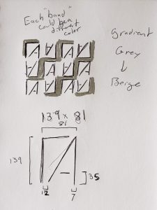
For context, I have a “brand” called ThiesArch, and I have a logo for it. Influenced a little by designer fabrics like Louis Vuitton and Gucci, and with a desire to spice up my portfolio website, I decided to go the route of a simple wallpaper made up of a tiled logo, so that at a distance it doesn’t look like much more than some lines and a gradient, but up close you could make out the logos. It’s all based off the proportions of the logo, so I could just change the scale value to make it look more or less legible. It would be cool to print fabric with this design, with the gradient accounting for the length, and make like a “branded company T-shirt” (it’d be just me).
It actually wasn’t as hard as I thought it would be to get the relative positions of the lines, since there are only five. It’s just tedious to make sure the proportions are correct.
Also if you click the sketch, I did one where the Ts and As form stripes, but that’s only legible on larger scales.

![[OLD FALL 2018] 15-104 • Introduction to Computing for Creative Practice](wp-content/uploads/2020/08/stop-banner.png)