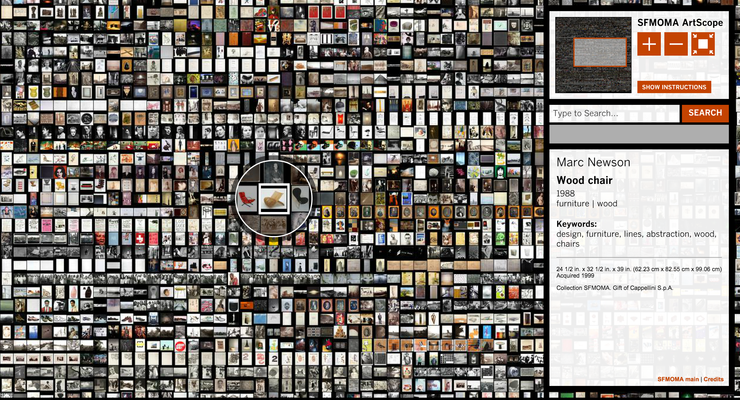
This week, the project I have chosen to explore is SFMoMA Artscope, an informational visualisation project created by Stamen. What I admire the most about this project is that it challenged my perception of what a map looks like– typically, I would think that a map would communicate information about a physical space, but what I found very interesting about this project is how it is mapping a collection of work irrespective of space, and arranging SFMoMA’s archive by acquisition date. Furthermore, I admire the fact that this project might allow people who do not have the oppurtunity to visit the museum to access the collection online, adding an element of inclusivity. Stamen built this project using their Modest Maps library, which is an open source toolkit that allows their designers and developers to quickly put together maps, specifically, maps that zoom and pan. I think Stamen was able to play around with artistic sensibilities, in conjunction with the brand of SFMoMA just by creating the map. This data visualisation tactic makes the artwork thumbnails seem almost collage like, and creates a bold visual language.
![[OLD FALL 2018] 15-104 • Introduction to Computing for Creative Practice](wp-content/uploads/2020/08/stop-banner.png)