I was looking through Looking Outwards and Jason’s Looking Outwards 07 caught my eye because of the simple little grid.


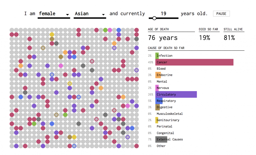
This project by Nathan Yau simulates causes of death and related mortality rates. I agree with the assessment that the simplicity of conveying complex data is very successful in this project, and that interaction is balanced nicely with customization or individualization. It’s a little strange to think about though, because it compares the individualization to a general population of other simulated individualizations. My first reaction to seeing this chart was how low the mortality rate is for majority of a person’s lifespan, compared to what I assumed it would be; at 70 years old, the Asian female population has only a 9% mortality rate, which is shocking considering all of the negative stats and information that we retain from media. Similarly, Nathan Yau’s other visualizations on life and death are equally as intriguing, although I think this project is the easiest to understand.
Skip to content
[OLD FALL 2018] 15-104 • Introduction to Computing for Creative Practice
Professor Roger B. Dannenberg • Fall 2018 • Introduction to Computing for Creative Practice
![[OLD FALL 2018] 15-104 • Introduction to Computing for Creative Practice](wp-content/uploads/2020/08/stop-banner.png)