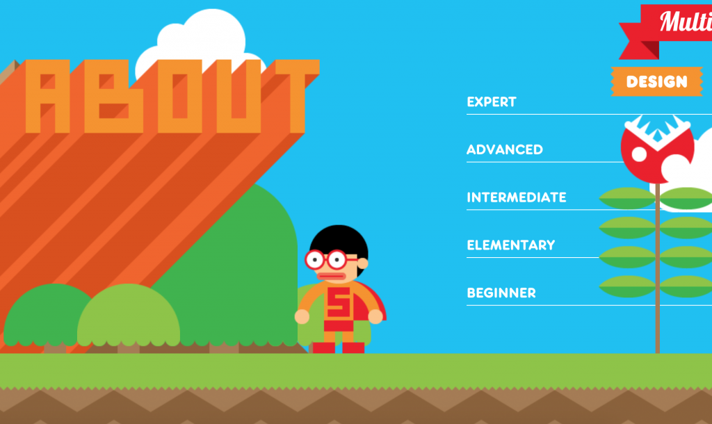
The first project is an interactive resume by Robby Leonardi. It’s colorful, fun, and highly interactive. The user scrolls up or down to move the figure through Robby’s resume. It really shows off the designer’s personality. One thing is that there is no link to a portfolio of his actual works/projects.

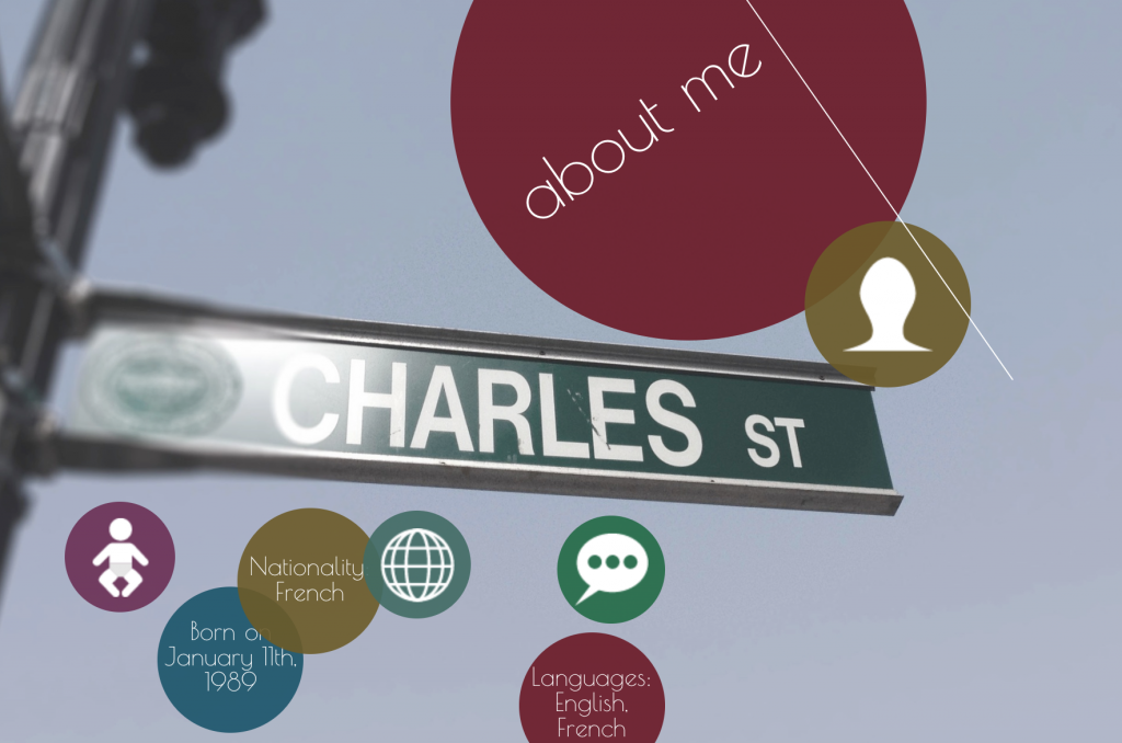
The second project is another online resume by Charles Richard. Similarly, the user scrolls up or down to navigate through Charles’s resume. However, this project uses more muted colors. One thing I noticed is that he uses circles throughout his project so it’s difficult to tell at a glance which ones are buttons and which ones are simply for aesthetics. Overall, I think both of these projects are fun, interactive ways to display one’s resume.
![[OLD FALL 2018] 15-104 • Introduction to Computing for Creative Practice](wp-content/uploads/2020/08/stop-banner.png)