Sydney Salamy: Project-02-Variable-Face

I wanted my project to react and change as the mouse of the viewer moved, so I played around with if statements, which was an interesting challenge. I wanted my project to have a cute aspect to it. Originally, there was supposed to be a fruit with a face reacting, but then it turned into a baby who didn’t want others touching its candy.

sketchsydney

//Dont Touch The Lolipop!

var pi = 3.14159;
var mainX = 320;
var headY = 220;
var bodyY = 360;
var iEyeBrowY = 212;

function setup(){
    createCanvas(640,480);	
    
}

function draw() {
    background(163, 210, 267);//baby blue
    noStroke();
    //baby base
    fill(233, 185, 122);//darker tan
    ellipse(mainX,bodyY, 170,170);//baby body
    fill(237, 189, 126);//tan
    ellipse(mainX,headY, 150,150);//baby head
    //arcs
    fill(255);
    arc(mainX,bodyY, 172, 172, 0, pi, CHORD);//baby diaper
    fill(255, 163, 195);
    arc(mainX,headY, 152, 152, pi, 0, CHORD);//baby hat
    //limbs
    fill(229,181,118);//darker tan 2
    ellipse(440,307, 150,40);//right arm
    ellipse(200,307, 150,40);//left arm 
    ellipse(355,475, 45,145);//right leg
    ellipse(285,475, 45,145);//left leg
    //lolipop
    fill(245);
    rect(490,245, 6, 100);//stick
    frameRate(.7);
    fill(random(230),random(200),random(220));//candy color
    ellipse(493,220, 106,100);//candy part   
    //facial features
    frameRate(10);
    fill(0);
    ellipse(343,225, 8,8);//right eye
    ellipse(297,225, 8,8);//left eye
    strokeWeight(4);
    stroke(0);
    line(336,iEyeBrowY, 355,218);//right eyebrow
    line(285,218, 304,iEyeBrowY);//left eyebrow
    //movement
    if(mouseX > 365){
        iEyeBrowY = 218;//stern
        line(315,256, 325,256);//flat mouth
        fill(128, 17, 17);
        ellipse(343,225, 8,8);//right eye
        ellipse(297,225, 8,8);//left eye
    }
    if(mouseX > 440){
        iEyeBrowY = 223;//angry
        arc(mainX,256, 20, 20, pi, 0, CHORD);//sad mouth
        fill("red");
        ellipse(343,225, 8,8);//right eye
        ellipse(297,225, 8,8);//left eye
    }
    if(mouseX > 545){
        iEyeBrowY = 218;//stern
        line(315,256, 325,256);//flat mouth
        fill(128, 17, 17);
        ellipse(343,225, 8,8);//right eye
        ellipse(297,225, 8,8);//left eye
    }
    if(mouseX < 365){
        iEyeBrowY = 212;//happy
        arc(mainX,256, 20, 20, 0, pi, CHORD);//happy mouth
        fill(0);
        ellipse(343,225, 8,8);//right eye
        ellipse(297,225, 8,8);//left eye
    }
    if(mouseX > 621){
        iEyeBrowY = 212;//happy
        arc(mainX,256, 20, 20, 0, pi, CHORD);//happy mouth
        fill(0);
        ellipse(343,225, 8,8);//right eye
        ellipse(297,225, 8,8);//left eye
    }
}

Sydney Salamy: Looking Outwards-02


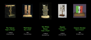
The project is called “A DECISION MACHINE SUITE” by Roman Verostko. It features a number of machines of simple rectangles of varying sizes and positions. Despite these variations, all the machines have one thing in common: blinking lights. They each have two lights that blink on and off, representing an answer to a question. The names of the machines are the questions, and range from “The Vatican: Right or Wrong?” and “Hamlet: To Be or Not To Be?” to just “Generic Decider: Red or Green?”. Whichever light is kept on is random, thus the answer cannot be predetermined. The project is a nod to Norbert Wiener (the “Father of Cybernetics”), who played a role in the information revolution of the 1900s and who noticed that even physics has uncertainty and chance.


  • I admire how the project is so simple yet is based around offering answers to some complex questions. I guess I like this because these questions, at least some of them, are highly debated and have been for years, and so to leave the answers all up to a small little machine that picks lights at random is just very interesting and entertaining to me. I know I shouldn’t say this in an assignment, but it’s almost like a giant middle finger to all the great thinkers who have spent so much time thinking them over, only to have people do a complicated version of a coin toss for the answer. I also find the machine designs very interesting. Verostko decided to incorporate their questions into them. The “Red or Green” one is obvious, with each color being displayed behind one of the lights, and “Wall Street” is similar except with a “B” and “S”. But the others are a bit more subtle. “The Vatican” holds gold leafed lamp reflectors, and is shaped almost like a cross except without the top part (although I’m not sure if the cross was intentional). “The Whitehouse” includes its own colors, except they are black and white and are balloting marbles. More impressive than that, the wood the circuits rest on is actually from the Whitehouse from when it was renovated in the 40s. I admire the designs because Verostko could have just had a consistently simple design for all his machines, but instead he chose to spice things up and make them more interesting. The designs don’t just improve their look, but also gives the viewers something deeper to look into.
  • Based off his the website hosting online versions of his work, it seems like his schematic was based on some else’s manual. The drawing he made of  the circuit made it seem like it was very simple. However, what makes this project more interesting is that the online version doesn’t use circuits since its online. It just uses regular code, which he said Tamara Temple helped him with. The algorithm would probably be very simple as well, since its just two lights going on and off and a button which stops them. 
  • I don’t know much about the algorithm, but the circuits for the real machines have artistic sensibilities attached to them. For instance, the circuit for “White House” was placed on an actual piece of the White House. Also, the colorful wiring served both practical and aesthetic purposes.
  • A DECISION MACHINE SUITE” by Roman Verostko, 1983-1995

“Decision Machine Suite” by Roman Verostko


Screenshot of the “Decision Machine Suite” by Roman Verostko


Sydney Salamy: Project-01-Face


The process and resulting product were interesting. The restriction to around ten graphic elements really forced me to focus on the most basic aspects of my face, with it being simplified enough to fit the requirements but contain enough features so that viewers could kind of see how it could be a portrait of my face. Even with the restriction, I was able to make the portrait a bit interesting with the use of colors.


SydneyFaceSketch

function setup(){
    createCanvas(400,400);	
    frameRate(.7);
}

function draw() {
    background(random(250),random(95),random(95));
    noStroke();

    fill(242, 226, 124);//yellow
    ellipse(200,200, 300,300);//yellow circle
    ellipse(200,200, 5,5);//yellow for shirt
    
    fill(46,2,2);//brown
    ellipse(200,210, 160,200);//hair base
    quad(97,299, 120,207, 280,207, 303,299);//hair bottom quad
   
    fill(242, 226, 124);//yellow
    ellipse(200,300, 195,80);//yellow for shirt
   
    fill(238, 179, 118);//darker tan
    ellipse(200,290, 90,70);//chest
    
    fill(245, 186, 125);//tan 
    ellipse(200,200, 125,140);//face
    
    fill(46,2,2);//brown
    quad(210,124, 200,150, 136,190, 143,155);//left bang
    quad(190,124, 200,150, 264,190, 257,155);//right bang
    quad(155,150, 185,120, 215,120, 245,150);//filler
   
    fill(255);
    ellipse(175,200, 35,35);//left eyeball
    ellipse(225,200, 35,35);//right eyeball
    fill(46,2,2);//brown
    ellipse(175,200, 25,25);//left eyeball inner
    ellipse(225,200, 25,25);//right eyeball inner
}

Sydney Salamy: Looking Outwards-01

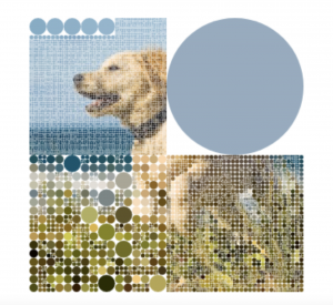
The project I chose is called “Visualization” by Λ B H I N Λ V . K R on OpenProcessing. The project starts with a cute picture of a golden retriever puppy running on a beach. When you run your mouse over the picture it turns into four circles with the color of their background. If you keep going over the circles they get smaller and smaller, and this causes the details in the photo to come back out. The end result is the same picture, except with a more mosaic look to it.

I admire how the creator was able to take such a simple idea and make it interesting. Despite the fact that you are just running your mouse to make circles smaller, it is somehow entertaining. It is satisfying to watch as the picture comes back, and also satisfying to shrink the circles, almost like popping bubbles, except more interesting because you are rewarded with the cute face of a dog. The interactive element is especially great because it allows the user to influence how they want the piece to look. They could leave part of the piece un-popped, pick a certain color to pop, etc. This allows the user to add a personal touch to the end result. I admire these aspects of the project because they are not only entertaining, but also show that a person doesn’t have to code a whole complicated piece to make something interesting, they can have a very simple idea and still be successful.

  • Only one person seemed to be involved in creating the project. I’m not exactly sure how long it took him to create his piece. I looked at the dates of the works before and after and it seems like he posts about three to four different pieces-one per day-and then there will be a gap, then another cluster of posts. I’m guessing he makes a bunch in advance and then posts them all at a time over the span of a couple days. The gaps between these clusters seem to be about three weeks to a month, so I think it took him about one to two weeks to create that single post (although this is just a guess).
  • The software he used seemed to be “off-the-shelf”. OpenProcessing is a very public/easy-to-access site, and the code he wrote didn’t seem like anything out of the ordinary. His project doesn’t look like something he would need custom software for.
  • I don’t know any specific works he might have been inspired by. However, many of his previous works included a variety of colors and shapes, and are user-interactive. Also, looking at his “Hearts” section you can see that the works he liked also fit into this category. “Visualization” also fits this description, so it seems he has a type of work he likes to create.
  • Since the work is interactive, entertaining, and visually appealing, I could see the artist possibly working in the gaming industry since coding and creativity are demanded there. Not so much complicated games but more leaning towards ones you would find in the App store for your phone. Like maybe one level would be the dog-bubble piece and then the next would be something different but using the same concepts and ideas throughout. I could imagine a game where you would start out with the four big bubbles, and then would have to guess what the image was while trying to pop the least amount of bubbles. He could also create gifs and/or short and interactive animations for websites.
  • Λ B H I N Λ V . K R.“Visualization.” OpenProcessing, 2015.

Video And Picture Below

DogOPvid5smol

Photo of “Visualization” by Λ B H I N Λ V . K R