![[OLD FALL 2019] 15-104 • Introduction to Computing for Creative Practice](wp-content/uploads/2020/08/stop-banner.png)
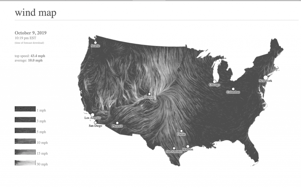
This map shows the delicate tracery of wind flowing over the US. From this data visualization, there are a number of information that have been weaved together to show the flow of wind in a visually aesthetic way. From the map, we can understand the directionality, speed, as well as the top and average speed. As indicated in the website, the wind map website has used National Digital Forecast Database. These are near-term forecasts, revised once per hour. So the map is a live portray of the wind current condition over us.
This is a really interesting project to me as it gives a strong and dynamic visualization of how the wind moves and from the map so that we can potentially assume how the wind might have responded to the particular terrain and topology condition of US. Also for natural disaster such as hurricanes, the map would indicates the progress of a natural disaster and serving as a educational tool for viewers.