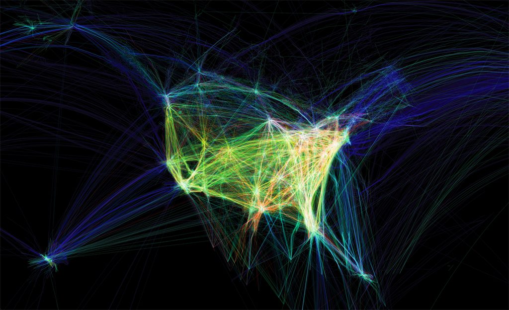
The blog post I looked at was Ankitha Vasudev’s post on a time lapse animation called Flight Pattern (2011) by Aaron Koblin. Flight Pattern displays a 24 hour time period of American air traffic patterns and densities, by following the routes of around 140,000 American planes crossing the United States. I found this project interesting because the time lapse animation visually shows how widespread and frequent travel inside of America is. Aaron Koblin’s use of color and patterns to illustrate a wide range of data including aircraft type, no-fly zones, weather patterns and alteration to routes helps to visualize large amounts of data into one concise animation. I also agree with Ankitha’s opinion that uses the time lapse animation and the data gathered for it in order to show the intertwining of humans and technology. The animation shows that human movement is synonymous to the movement of technology.
![[OLD FALL 2019] 15-104 • Introduction to Computing for Creative Practice](wp-content/uploads/2020/08/stop-banner.png)