Looking Outwards-05

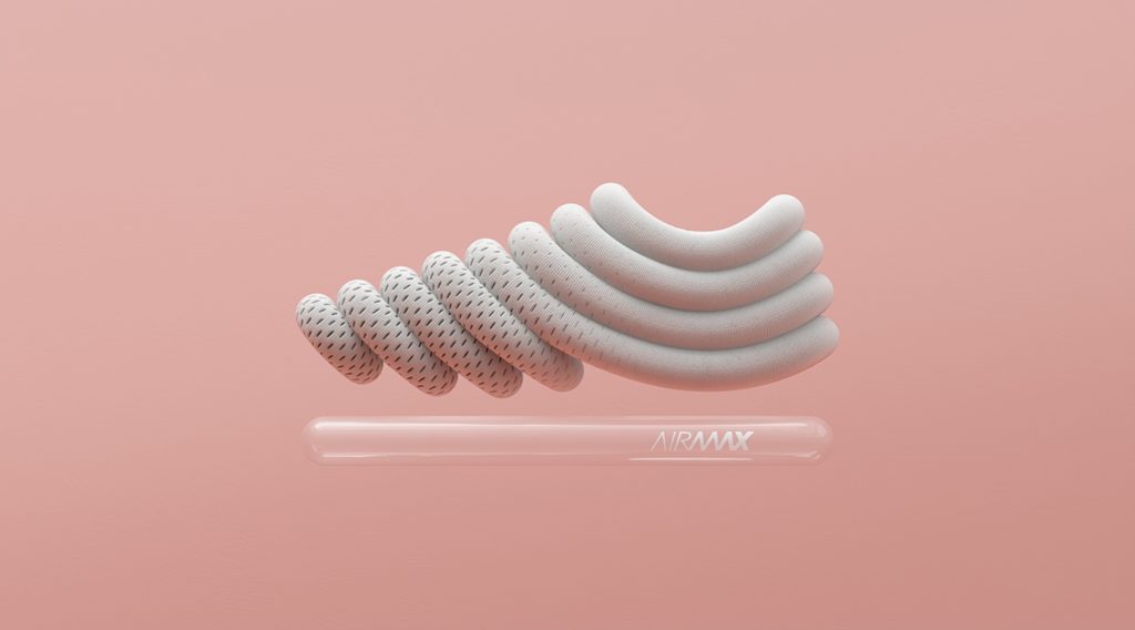
Air Max Campaign for Nike by ManvsMachine.
Graphic by ManvsMachine.

In this campaign, ManvsMachine created a series of 3d computer graphics that abstracted Nike’s Air Max sneaker into a layered composition. This project is admirable in its use of different textures to create variation between the abstracted shoes. Shading, transparency, and texture all help the graphics appear 3d. The textures he uses communicates the message of the shoe campaign as they demonstrate the airiness and lightness of the shoe, while his render of the shoe form composed from stones communicates a different aspect of the shoe’s performance. 

The shadows casted on the graphics are what truly help make it appear 3d. It gives dimension to the illustration and generates surfaces that bend, fold, and capture the light differently. In the campaign video linked below, ManvsMachine animates the graphics in a way that responds to the textures of the graphics which additionally helps make them appear 3d and have qualities that are bound to the physics of our world like gravity. 

Overall this project creatively uses all these methods to simulate the 3d experience of the graphic. 

Project 05: Wallpaper

project-05-wallpaper
/*
Lauren Kenny
lkenny
Section A

This program draws a repeating geometric pattern.

*/

var x;
var y;
var circleX;
var circleY;
var circleX2;
var circleY2;

function setup() {
    noLoop();
    createCanvas(600, 600);
    background(0);
    noStroke();
    x=50;
    y=50;
    w=100;
    h=100;
    circleX=20;
    circleY=20;
    circleX2=80;
    circleY2=80;
}

function draw() {
    drawGrid();
}

//////////////////////////////
// THIS CREATES THE CIRCLES
/////////////////////////////
function drawBottomLeft() {
    fill(255, 0, 0);
    arc(x, y, w, h, HALF_PI, PI);
    fill(255, 255, 0);
    arc(x, y, w-50, h-50, HALF_PI, PI);
}

function drawBottomRight() {
    fill(0, 255, 0);
    arc(x, y, w, h, 0, HALF_PI);
    fill(0, 0, 255);
    arc(x, y, w-50, h-50, 0, HALF_PI);
}

function drawTopLeft() {
    fill(0, 0, 255);
    arc(x, y, w, h, PI, PI+HALF_PI);
    fill(0, 255, 0);
    arc(x, y, w-50, h-50, PI, PI+HALF_PI);
}

function drawTopRight() {
    fill(255, 255, 0);
    arc(x, y, w, h, PI+HALF_PI, 0);
    fill(255, 0, 0);
    arc(x, y, w-50, h-50, PI+HALF_PI, 0);
}

//////////////////////////////
// THIS CREATES THE TINY DOTS
/////////////////////////////
function drawTopCircles() {
    fill(0, 255, 0);
    circle(circleX, circleY, 5);
    circle(circleX+5, circleY-5, 5);
    circle(circleX-5, circleY+5, 5);
}

function drawBottomCircles() {
    fill(0, 0, 255);
    circle(circleX2, circleY2, 5);
    circle(circleX2+5, circleY2-5, 5);
    circle(circleX2-5, circleY2+5, 5);
}

//////////////////////////////
// THIS DRAWS THE REPEATING PATTERN
/////////////////////////////
function drawGrid() {
    //PURPLE DOTS IN BACKGROUND
    var d=5;
    var e=5;
    for (var o=0; o<width; o+=10) {
        for (var p=0; p<height; p+=10) {
            fill(80, 0, 195);
            ellipse(d, e, 8);
            e+=10;
        }
        e=5;
        d+=10;
    }

    //LARGE CIRCLES
    for (var i=0; i<width; i+=100) {
        for (var j=0; j<height; j+=100) {
            drawBottomRight();
            drawBottomLeft();
            drawTopLeft();
            drawTopRight();
            y+=100;
        }
        y=50;
        x+=100;
    }

    //WHITE OUTLINED CIRCLES IN FRONT
    var f=5;
    var g=5;
    for (var q=0; q<width; q+=10) {
        for (var r=0; r<height; r+=10) {
            noFill();
            stroke(255);
            strokeWeight(.35);
            ellipse(f, g, 10);
            g+=10;
        }
        g=5;
        f+=10;
    }

    //TINY GREEN DOTS
    var greenCounter=0;
    for (var k=0; k<width; k+=100) {
        greenCounter+=1;
        if (greenCounter%2==0) {
           circleY=120; 
        } 
        else {
            circleY=20;
        }
        for (var l=0; l<height; l+=200) {
            drawTopCircles();
            circleY+=200;
        }
        circleX+=100;
    }

    //TINY BLUE DOTS
    var blueCounter=0;
    for (var m=0; m<width; m+=100) {
        blueCounter+=1;
        if (blueCounter%2==0) {
            circleY2=80;
        }
        else {
            circleY2=180;
        }
        for (var n=0; n<height; n+=200) {
            drawBottomCircles();
            circleY2+=200;
        }
        circleX2+=100;
    }
}


I wanted to experiment with a geometric pattern and the arc() function we learned this week. I’ve been trying to get myself back up to speed with the unit circle, so I challenged myself to try and get the angles right on the first try rather than trial and error like I normally do. I found that when I really thought through the math and logic first, it was easier to write the program. I also wanted to experiment with some conditionals in my loops. After making my intended pattern, I added some extra loops just to give the visual more dimension.

Project 05 – Wallpaper

sketch.sl5Download
// Sarah Luongo
// sluongo
// Section A

function setup() {
    createCanvas(465, 465);
    background(84, 141, 155);
    noLoop();
}

function flower() {
    push();
    translate(74, 74);

    // Purple petals
    for (var i = 0; i < 4; i ++) {
        noStroke();
	fill(51, 0, 102);
	ellipse(0, -15, 15, 25);
	triangle(-6, -22.63, 6, -22.63, 0, -31);
	stroke(229, 204, 0);
	strokeWeight(1);
	line(0, -16, 0, -11);
	rotate(radians(90));
    }
    
    // Pink petals
    push();
    rotate(radians(45));
    for (var i = 0 ; i < 4; i ++) {
	noStroke();
	fill(255, 204, 204);
        ellipse(-20, 0, 40, 15);
	triangle(-34, -5.4, -34, 5.4, -45, 0);
	fill(0, 0, 255);
	circle(-9, 0, 2);
        rotate(radians(90));
    }
    pop();
    
    // Center of flower
    noStroke();
    fill(55, 24, 85);    
    circle(0, 0, 12);
    pop();
}

// Horizontal vines
function vinesH() {
    // Vines
    noFill();
    stroke(24, 129, 24);
    strokeWeight(2);
    bezier(1, 74, 15, 85, 25, 65, 40, 74);
    // Leaves
    noStroke();
    fill(24, 129, 24);
    ellipse(8, 72, 3, 9); // Left-most leaf
    ellipse(22, 79, 4, 10); // Center leaf
    ellipse(38, 69, 2, 7); // Right-most leaf
}

// Vertical vines
function vinesV() {
    // Vines
    noFill();         
    stroke(24, 129, 24);
    strokeWeight(2);                                    
    bezier(74, 1, 85, 15, 65, 25, 74, 40);
    // Leaves
    noStroke();
    fill(24, 129, 24);
    ellipse(72, 8, 9, 3); // Top-most leaf 
    ellipse(79, 22, 10, 4); // Center leaf
    ellipse(69, 38, 7, 2); // Bottom-most leaf
}

function draw() {
    for (var i = 0; i < 5; i++) {
        for(var j = 0; j < 5; j++) {
        push();
        translate(106*i, 106*j);
        vinesH();
        vinesV();
        flower();
        pop();
        }
    }
}

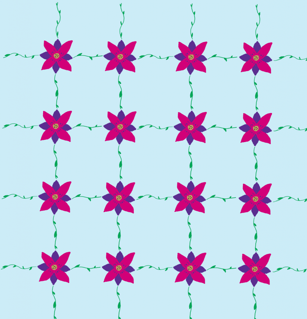
I wanted to do a floral pattern because I love flowers. I also really ran with the idea of creating something I would wear. I actually have a floral shirt with variations of pink flowers, and this is slightly based off of it. I normally draw flowers as I have created in this code (which you can see from the sketch below), and I wanted the multiple petals to make them all different colors. However, the colors I chose were different from the sketch because I didn’t have many pen options on my tablet, if I did they would have been the colors I choose in this code as they are all colors I love!

Looking Outwards-05

https://alteredqualia.com/three/examples/webgl_pasta.html

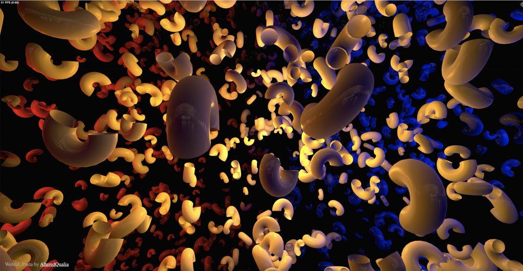
When looking for examples of 3D computer graphics, I found AlteredQualia’s website. This one project called WebGL Pasta caught my attention. It is a 3D rendering of pasta floating through space. The site is interactive, so if you move your mouse, you can explore the space and get it to move in different directions. What I find fascinating about this project, is the amount of depth they were able to achieve through the use of shadow, color, and movement. They were able to create this vast looking environment on a two-dimensional computer screen.

This project was built using WebGL (Web Graphics Library) which is a javascript API. WebGL allows for graphics to be rendered on the web, and it is something I’ve been quite interested in. This WebGL Pasta project seems to have been a creative exploration. I can see the artist’s attention to detail and ability to imagine vast environments. In a lot of their work they use this contrast of red and blue. I’m not quite sure why, but I would love to know their reasoning behind it.

Project 05: Wallpaper

The biggest challenge in this project was dealing with drawing the spines on the cactus. It turns out P5.js doesn’t really like nested loops in functions and it crashed the program when I tried to use it, so I had to do the inefficient solution of manually drawing the points.

cactus


function setup() {
    createCanvas(600, 600);
    strokeWeight(3)


}

function draw() {
for (x = 120; x <= width - 120; x += 120) {
    
    for (y = 120; y <= height - 120; y += 120) {
        
        createCactus(x, y, 60, 80)
    }
}


}

function createCactus(cactusx, cactusy, cactusw, cactush) { 
    push()
    rotate(radians(random(-PI * 2, PI * 2)))
    translate(cactusx,cactusy) 
    fill(35, 117, 67)
    ellipse(0, 0, cactusw, cactush)
    body()
    arms(45)
    flower()
    pop()
    noLoop()


}

function body() {
      point((random(-20, 20)), random(-30, 30))
      point((random(-20, 20)), random(-30, 30))
      point((random(-20, 20)), random(-30, 30))
      point((random(-20, 20)), random(-30, 30))
      point((random(-20, 20)), random(-30, 30))
      point((random(-20, 20)), random(-30, 30))
      point((random(-20, 20)), random(-30, 30))
      point((random(-20, 20)), random(-30, 30))
      point((random(-20, 20)), random(-30, 30))
      point((random(-20, 20)), random(-30, 30))
      noLoop()


}

function arms (x) {
    push()
    translate(x,0)
    rotate(degrees(90))
    ellipse(0, 0, 20, 40)
    pop()
    push()
    translate(-x,0)
    rotate(degrees(230))
    ellipse(0, 0, 20, 40)
    pop()
    }

function flower() {
        noStroke()
        push()
        translate(0, -40)
        for (r = 90; r <= 270; r += 180) {
            rotate(degrees(r))
            fill(245, 110, 191)
            ellipse(0, 0, 10, 20)
            
        }

        pop()    
    }


    //// for (x = 0; x <= cactusw/2.75; x += 10) {
        //for (y = 0; y <= cactush/2.25; y += 10) {
             //point(x,y)
            
        //}
    //}
    ///for (x = -(cactusw/3); x <= 0; x += 10) {
        ///for (y = 0; y <= cactush/2.25; y += 10) {
             //point(x,y)
            
        //}
    //}
    //for (x = -(cactusw/3); x <= 0; x += 10) {
        //for (y = (-cactush/2.75); y <= 0; y += 10) {
             //point(x,y)
            
        //}
    //}
    //for (x = 0; x <= cactusw/2.75; x += 10) {
        //for (y = (-cactush/2.75); y <= 0; y += 10) {
             //point(x,y)
            
        //}
    //}

Looking Outwards 05

A piece I found particularly interesting was the work Glasses, Pitcher, Ashtray, and Dice by Gilles Tran. In a blog post about the image, he described the process of making it, where he used ray tracing and radiosity to generate photorealistic images of the objects. It reflects a very somber mood, and keeps an audience uncertain as to whether the piece is to be reflective or dark. It seems as though Tran intended the piece to be ambiguous due to the quality of the elements drawn but also the hues of lighting, which imply a sunny day but a dark room. It is a very high-quality image despite being amateur work and over twelve years old. I find it very interesting how Tran manipulates color and focus to emphasize certain aspects of the work. Lines and edges are crisp and clear, but the whole piece can be seen as dated due to subtle outlines and a lack of warp when looking through the glasses.

http://www.oyonale.com/modeles.php?lang=en&page=40

Wall paper

sketch
var s = 70;
var x = 50;
var y = 0;


function setup() {
  createCanvas(550, 500);
}

function draw() {
  background(250);
  drawGrid();
  noLoop();
}

function drawGrid(){
    push();
    translate(x,y);                                     //background circles
        for (var i = 0; i < 8*s; i += s) {
            for (var j = 0; j <= 8*s; j += 15) {
                noStroke();
                fill(38,56,71);
                circle(i, j,5);
            }
        }
    translate(0,y);                                     //Odd column trees
        for( var q =0;q <7*s; q += s*2){
            for(var a =0; a <=500; a +=136){
                fill(55,83,102);
                stroke(55,83,102);
                shape(q-50,a);
            }
        }
    translate(70,s);                                  //Even column trees
        for( var q =0;q <7*s; q += s*2){
            for(var a =0; a <=500; a +=136){
                fill(35,52,61);
                stroke(35,52,61);
                shape(q-50,a);
            }
        }
    translate(-50,-68);                               //Red Diagonal lines
        for(var r =-70; r <=1000; r+= 140){
            stroke(163,69,89);
            strokeWeight(7);
            line(r,0,-500*(r/2),550*(r*0.45));    
        }
    translate(-500,0);                                //Beige Diagonal lines
        for(var r =-520; r <=1000; r+= 140){
            stroke(232,186,177);
            strokeWeight(2);
            line(r-100,0,250*r,500*(r*0.45));    
        }
    pop();
}

function shape(x,y) {
    push();
    translate(x,y);         //trees
    beginShape();
    vertex(50,0);
    vertex(34,21);
    vertex(39,24);
    vertex(30,28);
    vertex(38,32);
    vertex(25,38);
    vertex(34,41);
    vertex(22,48);
    vertex(47,48);
    vertex(47,61);
    vertex(52,61);
    vertex(52,48);
    vertex(78,48);
    vertex(64,41);
    vertex(73,37);
    vertex(63,31);
    vertex(69,28);
    vertex(57,23);
    vertex(64,20);
    vertex(50,0);
    endShape(CLOSE);
    push();
    fill(255);              //white circles
    circle(55,17,2);
    circle(52,21,3);
    circle(46,24,2);
    circle(39,28,4);
    circle(44,31,2);
    circle(53,34,3);
    circle(58,36,2);
    circle(66,38,3);
    circle(61,43,4);
    circle(54,44,3);
    circle(45,46,3);
    circle(39,46,2);
    circle(32,46,3);
    pop();
    pop();
}

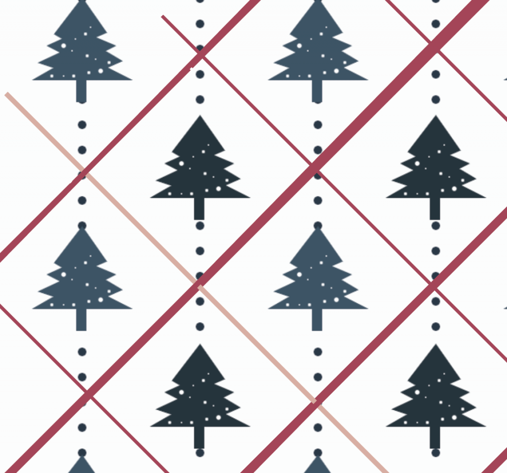
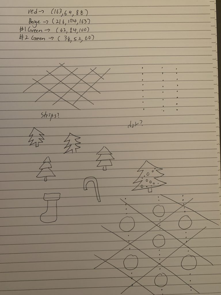
Because Christmas season is coming soon, I wanted to create something related with Christmas. First thing that pop up in my head was Christmas trees with colors of red, green, and white.

illustrator Iteration
Idea sketch

Looking Outwards – 05

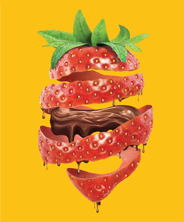
Strawberry by Wagner de Souza

For this week’s Looking Outwards on the topic of 3D computer graphics, I chose to look at the artwork titled Strawberry (https://www.behance.net/gallery/4114195/Strawberry) by the artist Wagner de Souza. I came across his work looking on Pinterest, and I found it really unique and interesting because he 3D mapped the proportions and form of the strawberry, then deconstructed it and created additional graphics. I like the aspect of how the strawberry almost “unravels” and reveals the chocolate, and it gives me a sense of how a strawberry might look if its outer layer were peeled. In terms of the algorithms, I think that de Souza used mapping techniques to plot coordinates in space. He also used the seeds on the strawberry as guiding coordinates. Additionally, I like how he incorporated shadows in the final strawberry rendering to give the effect of it realistically twisting, which was probably generated by creating a drop shadow or gradient. I think the artist would have thought about a strawberry and ways to deconstruct the form, and this led him to produce what he envisioned. He brought out his creativity with the chocolate added to it, and it dripping off the spiraling strawberry layers. While this overall image isn’t actually a believable thing that could happen, it is interesting to me to think of the process of imagining this in 3D, and using code to produce it.

Project 5 Wallpaper

Continuing my exploration of abstracting puritst paintings of the architect Le Corbusier/ Charles Edouard Jeanneret. This week I decided to attempt to re-interpret some of the common motifs that occur in his paintings into the wall paper assignment. Purists paintings and cubist paintings alike require often require subtle differences in their repetitions of geometry to achieve their ambiguous depth and transparency, so reinterpreting them into a wall paper which inherently a tiled seamless graphic proved to be a difficult task.

sketch
//tjchen
//section A
function setup() {
    createCanvas(600, 600);
    background(220);
}

function draw() {
    scale(1);
    for ( var row = 0; row <= height; row += 80){
        for(var col = 0; col <= width; col += 80){
            tilebigger1(col,row);
        }
    }
    for ( var row = 40; row <= height; row += 80){
        for(var col = 0; col <= width; col += 80){
            tilebigger2(col,row);
        }
    }
}

function tilebigger1(x,y){
    tile(x,y);
    push()
    translate(20,20);
    rotate(radians(180));
    //translate(x+40,y);
    tile(-x-60,-y-20);
    pop();
}
//second row type
function tilebigger2(x,y){
    push()
    translate(20,20);
    rotate(radians(180));
    //translate(x+40,y);
    tile(-x-20,-y-20);
    pop();
    tile(x+40,y);
}


function tile(x,y){
    noStroke();
    push();
    translate(x,y);
    //background 
    fill(146, 195, 234);
    square(0,0,40);
    //midground
    fill(88, 96, 105);
    rect(0,0,40,15);
    //women/bull/violin
    strokeWeight(1);
    stroke(0);
    fill(253, 223, 186);
    beginShape();
    curveVertex(40,0);
    curveVertex(40,0);
    curveVertex(23.9,4.56);
    curveVertex(21.62,10.8);
    curveVertex(24.7,16.55);
    curveVertex(32.69,16.29);
    curveVertex(35.72,23.64);
    curveVertex(31.37,27.76);
    curveVertex(23.89,29.92);
    curveVertex(22.41,36.07);
    curveVertex(29.58,39.75);
    curveVertex(40,40);
    curveVertex(40,40);
    endShape();
    //eyes
    noFill();
    strokeWeight(1);
    stroke(0);
    rectMode(CENTER);
    rect(26.18,9.83,3,5,2);
    rect(26.64,33.83,3,5,2);
    //nose bottle
    rectMode(CORNER);
    noStroke();
    fill(86, 122, 183);
    rect(3.5,18.5,15,22);
    fill(255);
    rectMode(CENTER);
    strokeWeight(1);
    stroke(0);
    rect(11,20,15,8,4);
    fill(183, 52, 9);
    noStroke();
    circle(8.5,20,3);
    circle(13.5,20,3);
    //guitar middle 
    noFill();
    strokeWeight(1);
    stroke(0);
    arc(40,20,15,15,HALF_PI,PI+HALF_PI,OPEN);
    pop();
}

Project-05- Wallpaper

sketchDownload

//Shruti Prasanth
//Section C
//Project 5- Wallpaper

function setup() {
    createCanvas(500, 500);
    background (243,239,201);
}

function draw() {
    rectMode(CENTER);
    //flower starts at canvas top left corner, and translates from the previous position:
    flower(0, 0);
    flower(150,0);
    flower(150,0);
    flower(150,0);
    flower(-75,150);
    flower(-150,0);
    flower(-150,0);
    flower(-150,0);
    flower(-75,150);
    flower(150,0);
    flower(150,0);
    flower(150,0);
    flower(150,0);
    flower(75,150);
    flower(-150,0);
    flower(-150,0);
    flower(-150,0);
    flower(-150,0);

}

function flower(x,y) {
    push();
    translate(x,y);

    noStroke();
    fill(215,210,143);
    //diam= 50
    circle(width/10, height/10, 50); 
    fill(255);
    circle(width/10, height/10, 10);
    push();
    translate(width/10, height/10);
    fill(255);

    //inbetween big circle and ellipse dots
    circle(-55,-100,10);
    circle(55,-100,10);
    circle(55,100,10);
    circle(-55,100,10);
    circle(-100,-18,10);
    circle(100,-18,10);
    circle(-100,18,10);
    circle(100,18,10);


    circle(0,-30,20);//inner white circles
    circle(0,30,20);
    circle(30,0,20);
    circle(-30,0,20);
    circle(-20,20,20);
    circle(20,20,20);
    circle(20,-20,20);
    circle(-20,-20,20);
    ellipse(0,70,20,50);
    ellipse(0,-70,20,50);
    ellipse(70,0,50,20); //right long petal
    ellipse(-70,0,50,20);
    circle(45,45,30); //bigger outer circle
    circle(45,-45,30);
    circle(-45,-45,30);
    circle(-45,45,30);
    pop();

}


For my coded wallpaper, I was inspired by the queen annes lace flower, and I decided to abstract the petals into a vector design version. I used a lot of ellipses and circles of varying sizes, and based it off a light green + white color scheme. This wallpaper might be something I would wear possibly on a printed dress.