LO 8 – The Creative Practice of an Individual

Gilberto Esparza, 2017

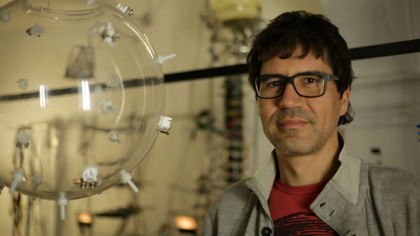
Gilberto Esparza, who graduated from the School of Fine Arts at the University of Guanajuato, Mexico and spent one year on exchange at the Faculty of Fine Arts of San Carlos in Valencia, Spain, is an globally renowned artist and a member of the National System of Art Creators in Mexico, having participated in solo and group exhibitions in many different countries, including Mexico, the US, Canada, Brazil, Colombia, Peru, Ecuador, Argentina, Spain, South Korea, etc.

“Parsley Looking For the Sun”, Gilberto Esparza, 2007

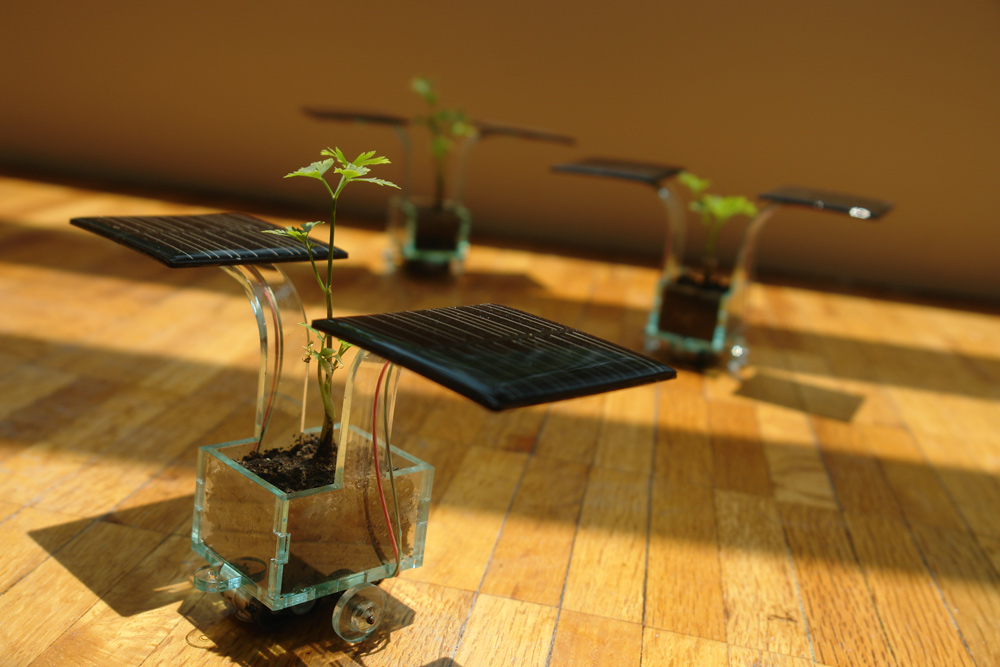
Esparza’s work focuses on electronics and robots to investigate the impact of new technologies on everyday life, social relationships, urban spaces and the environment, primarily employing recycling consumer technology and biotechnology experiments.

“Urban Cancer”, Gilberto Esparza, 2016
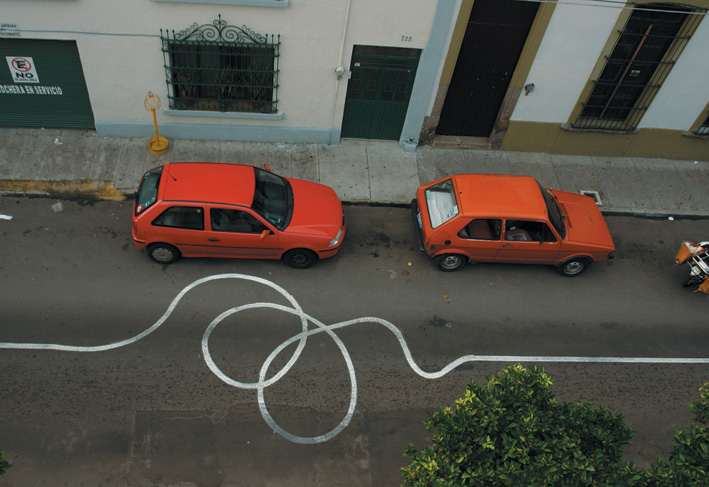
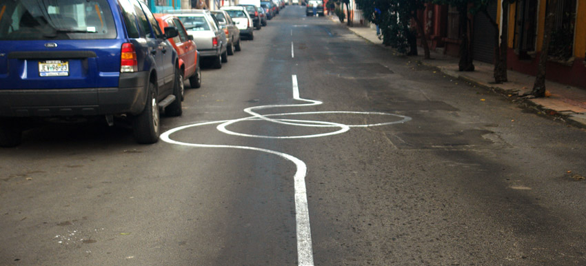
The deformation of a white line on the pavement of a street caused by the exaggerated increase in its length.

At Eyeo 2018, Esparza explains his process for learning more about environmental problems in Mexico and how as his technological beings developed, he developed not only in working with them but also in working in collaboration with other people.

By visually showing the progress of development through each stage, how he directly placed his creations in locations around the city where industrial technological garbage can be found, and the obstacles that he faced with particular methods, Esparza effectively portrays the purpose of his work, as well as his goal for society.

Learn more about Gilberto Esparza at https://gilbertoesparza.net.

HYDROCOMMUNITIES | Gilberto Esparza at Eyeo 2018 |

LO-08 Creative Practice of An Individual

Giorgia Lupi’s 2018 Eyeo Talk

Giorgia Lupi is an information designer, partner at Pentagram, co-founder of Accurat, and co-author of two books. She got her master’s degree in Architecture and is based out of Milan and New York. Her work is featured at the MoMA, Cooper Hewitt, and Smithsonian. She describes herself as a data humanizer, she humanizes data through the story behind the data. Her body of work usesdata to visualize aspects of life that we ‘don’t usually associate with numbers.’ Her work ranges from hand-drawn data visualizations to data driven fashion collections to large-scale computer graphics for big names like SNL and IBM. 

I admire how Lupi uses data to better understand human nature because she helps her audience empathize with others. For example, in the project of hers I admire most, Bruises she uses her friend’s daughter’s clinical data to illustrate both the factual and emotional aspect of the experience. Lupi’s presentation strategy is a conversational tone and a ton of visual aids. This is effective because it doesn’t feel dry, she tells a story and uses humor to engage her audience. I can definitely learn from the way she frames the story of her art to help her audience relate more. 

Bruises by Giorgia Lupi (music by Kaki King)
Key for Bruises Visualization

Eyeo 2015 – Nicky Case from Eyeo Festival on Vimeo.

Nicky Case is an extraordinary person. Nicky moved from Singapore to Canada at a young age. They largely confronted the world on their own, leaving home at age 16 after coming out as LGBTQ+ and not being accepted by their family. Nicky went on to pursue an internship at a video game development company, where they were faced with the idea “do video games matter?” which stuck with them ever since.

Nicky is an interactive storyteller. They develop deeply personal yet relatable games with nuanced choices that the user can make. Those choices are intended to cause the user to reflect on some aspect of society and identity. I really admire this aspect of Nicky’s work. While commonly played games tend to be relatively surface level, Nicky thinks about poignant, often subtle moments in life, and allows people to play through those moments to increase their own self awareness. It is a greatly heightened connection between game, player, and the developer. Nicky’s most popular game is probably their “Coming Out Simulator” which is autobiographical and follows the choices a young asian teen faces when coming out. Another one of my favorite works is “We become what we behold” which is a commentary on manipulation of the media and biases we develop. The games typically have simple often cute graphics, and easy game play that purposefully and effectively communicate their overarching ideas.

In regards to how Nicky presents, honestly when first watching their lecture I thought it was somewhat awkward with some jokes falling flat. However, thinking back, the message of the lecture stays with me, concerning telling stories through systems as well as making systems out of stories. What worked about the presentation was how Nicky presented in the method of the ideas they were discussing – Interweaving anecdotes and structure, all the while in a human, relatably not-smooth-sailing way, makes the presentation all the more memorable.

LookingOutwards-08

Nathan Yau was who I wrote about in my last Looking Outwards and he spoke in the 2019 Eyeo where he elaborates on his design journey. He specializes in creating data visualizations that are easy to read and concise. He created the website Flowingdata.com where he creates data visualizations for himself and others. He is also the author of both Data Points: Visualization That Means Something and Visualize This: The FlowingData Guide to Design, Visualization, and Statistics. Essentially he wants to make data more accessible and easier to read to everyday people.

What I admire is that he is a designer for the people. Nathan designs with the idea that data is only effective if it is able to get the message across without boring or confusing the reader. He even creates visual representations of his own personal life that other people may not be interested in. He creates them for himself, where he can see the relationships between data only he finds relevant. He mentions that he recently has a child and made a chart about when he sleeps. He is able to easily analyze and interpret all this information because of his visualization skills. He talks about his approach to data visualizations in a comedic and sentimental way and relating how he found his passion for his growth. His explanation and story reinforce the idea of simple yet developed data visualizations.

When Nathan Yau sleeps over the years

Project – 07

sketch
//Shaun Murray, 
//shaunmur - Section B

var nPoints = 2500
var R, G, B;
var mX, mY


function setup() {
    createCanvas(400, 400);
}

function draw() {
    mX = mouseX
    mY = mouseY

	background(mX - 75, mY - 50, mX - 150);
	push();
	translate(mX, mY);
	epi(0, 0);
	pop();

	push();
	translate(mX - 100, mY - 100);
	epi(0, 0);
	pop();

	push();
	translate(mX + 100, mY + 100);
	epi(0, 0);
	pop();

	push();
	translate(mX + 100, mY - 100);
	epi(0, 0);
	pop();

	push();
	translate(mX - 100, mY +100);
	epi(0, 0);
	pop();

	push();
	translate(mX - 200, mY);
	epi(0, 0);
	pop();

	push();
	translate(mX, mY + 200);
	epi(0, 0);
	pop();

	push();
	translate(mX + 200, mY);
	epi(0, 0);
	pop();

	push();
	translate(mX - 200, mY + 200);
	epi(0, 0);
	pop();

	push();
	translate(mX + 200, mY + 200);
	epi(0, 0);
	pop();
}

function epi(x, y) {
	var a = map(mouseX, 0, 400, 0, 50);
	var b = map(mouseY, 0, 400, 10, 90);
	R = mouseX
	G = mouseY + 50
	B = mouseY

    stroke(R, G, B);
    noFill();
    beginShape();
    for (let i = 0; i < nPoints; i++) {
        var theta = map(i, 0, 100, 0, TWO_PI);
        var x = (a + b) * cos(theta) - b*cos(((a + b) / b) * theta);
        var y = (a + b) * sin(theta) - b*sin(((a + b) / b) * theta);
        vertex(x, y);
    }
    endShape();

}


A visual representation of what you might see when you rub your eyes with your fists.

LO – 07

Shaun Murray,
shaunmur – Section B

This week I read about the works of Stefanie Posavec (b. 1981). She is a designer, artist, and author writing algorithms to create art.
I am interested in her collaboration project with Greg McInerny ‘(En)tangled Word Bank.’
The project is an abstract representation of the six editions of Darwin’s ‘On the Origin of Species’ and the changes made throughout these editions.
The six editions are represented as six circles with different colors, blue and orange, used to show whether the edits made it into the final version.
The color coding is a metaphor for Darwin’s own survival of the fittest.
The project has a visually appealing style using data collected from Darwin’s many revisions to create each circle’s design.
The algorithm used incorporates this data and has lines and shapes spawn from each circle’s origin.
Posavec’s artistic style shines through this project through her use of algorithms to create colorful and repetitive deigns.

Stefanie Posavec

(En)tangled Word Bank (2009)

https://www.moma.org/interactives/exhibitions/2011/talktome/objects/145525/

Project-07

Heying Wang

heyingw@andrew.cmu.edu

sketch

var nPoints=100;
function setup() {
    createCanvas(480, 480);
    background(220);
    frameRate(5);
   
}

function draw() {
    var x;
    var y;
    
    //constrain mouseX and mouseY
    constrain(mouseX,0,width);
    constrain(mouseX,0,height);

    //limite the size of the astroid with map method
    //sets up a constantly chaging background
    var a = map(mouseX,0,width,20,100);
    var b=  map(mouseY,0,height,20,100);

    background(100+a,150-b,100+b-a);
    for(i=0;i<=200;i++){
        fill('yellow');
        circle(random(width),random(height),1,1)
    }


    //draw one large astroid at the center 
    fill(a,b,50);
    translate(width/2+random(-2,2),height/2+random(-2,2)); 
    astroid(a,b); 
     
    fill(random(250),random(250),random(250));
    heart(a);
   
    push();
    //the one on the bottom right
    translate(width/4+random(-2,2),height/4+random(-2,2)); 
    rotate(radians(mouseX));  
    fill(a,b,160);
    astroid(a,b);
    
    fill(random(250),random(250),random(250));
    heart(a);
    
    //the one on the top left
    pop();
    push();
    translate(-width/4+random(-2,2),-height/4)+random(-2,2); 
    rotate(radians(mouseX));
    fill(a,b,160);
    astroid(a,b);
 
    fill(random(250),random(250),random(250));
    heart(a);
    //the one on the top right 
    pop();
    pop();
    push();
    translate(width/4+random(-2,2),-height/4)+random(-2,2); 
    rotate(radians(mouseX));
    fill(a,b,160);
    astroid(a,b); 
    fill(random(250),random(250),random(250));
    heart(a);
 
    //the one on the bottom left
    pop();
    pop();
    translate(-width/4+random(-2,2),height/4)+random(-2,2); 
    rotate(radians(mouseX));
    fill(a,b,160);
    astroid(a,b); 
    fill(random(250),random(250),random(250));
    heart(a);
       

}

//draw astroid and the lines
function astroid(a,b){
    beginShape();
    for (var i = 0; i < nPoints; i++) {
        var t = map(i, 0, nPoints, 0, TWO_PI); 
        x = a*pow(cos(t),3);
        y = b*pow(sin(t),3);
        vertex(x, y);
    }
    endShape(CLOSE);
    for (var i = 0; i < nPoints; i++) {
        var t = map(i, 0, nPoints, 0, TWO_PI); 
        x = a*pow(cos(t),3);
        y = b*pow(sin(t),3);
        strokeWeight(0.2);
        stroke('wight');
        line(x,y,0,0);
    }
   
}
//draw heart
function heart(a){
    k=map(a,0,100,0.5,1.2);
    beginShape();
    for (var i = 0; i < nPoints; i++) {
        var t = map(i, 0, nPoints, 0, TWO_PI); 
        x =k*16*pow(sin(t),3);
        y = k*13/16*13*cos(t)-5*cos(2*t)-2*cos(3*t)-cos(4*t);
        vertex(x, y);
    }
    endShape(CLOSE);
}

I made this constantly changing pattern with hearts curve and astroid curve. The background color corresponds to the position of mouse x and mouse y.

The size of the astroid curve and the heart curve also depends on where the user places he mouse. They can become as narrow as a pointer or as wide as a square. They will also be rotating around the center as the mouse move clockwise or anti-clockwise.

Thus, the user can interact with the page by moving their mouse around to create their unique, desired pattern.

Project-07-Curves

For this project, I was interested in the different depictions that were shown in the example for how to generate a circle curve. I thought it would be fun to try and draw a circle, but with a specific math curve. I chose the petal curve, and created a code that allowed you to manipulate the shape and frequency of the curve based on the position of the mouse. At first, it looks like a relatively pattern, with the petal curve rotating in the center, and its shape becoming skewed the greater the mouseX position it. However, if the mouse is pressed, then the pattern becomes more intricate, with the curves increasing in frequency to create a void, or circle, in the center. I had difficulty being able to take the curve a step further to make it more dynamic to look at. At first I chose a much more complicated curve, but I could not get the parentheses right while typing it in and it never looked correct!

peachsketch
var nPoints = 100
var angle = 0
var m;
var n;

function setup() {
  
  createCanvas(400, 400);
  m = width/2
  n = height/2
}

function draw() {
  background(0);
  frameRate(20)
  drawPetalCurve(m,n);
  if (mouseIsPressed){ // if mouseIsPressed, draws higher frequency of rotating petal curves
    for (j= 0; j<10;j++){
    drawPetalCurve(m,n);
  }
}
 
}

function drawPetalCurve (m,n){
  var x; 
  var y;
  var a = 100
  var b = 100
  var p = (constrain(mouseX, 50, 300))/50 //change dimensions of curve based on mouse location
push();
stroke(255)
noFill();
  translate(width/2, height/2) // curve drawn at center
beginShape();
  for (var i = 0; i < nPoints; i++) {
    rotate(angle)
        var t = map(i, 0, nPoints, 0, TWO_PI);
        x = p*a*cos(t)*(sin(t)*sin(t))	
        y = a*(cos(t)*cos(t))*sin(t) 
          vertex(m/2+x, n/2+y)
    angle+=0.1
       }
    endShape(CLOSE); 

pop();
   
}

Looking Outward – 07

The project I chose to look at for this week’s looking outwards was Aaron Koblin’s light project called “Flight Patterns”. The project facilitates a way to look at the air traffic over North America and visualize it into color and forms. I admire this project because the basis of looking at air traffic patterns seems mundane and maybe irrelevant, but Koblin was able to completely shift that to find underlying geometry, form, and depth of design. I suppose the algorithms generated for this piece was using air traffic control data and finding and system to systemize the information and plot into beautiful patterns and connections. I think the artist’s creative sensibilities lie in the determination for what colors respond to the algorithms to produce images that separate and combine information.

Link: http://www.aaronkoblin.com/work/flightpatterns/index.html

LookingOutwards-07

The work is called “Word Spectrum: Visualizing Google’s Bi-Gram Data” by Chris Harrison. It is a visualization of word associations found from Google, where words closer to the ends are more associated with that one word, while words in the center are more evenly associated between both opposing words, and where the font size of the word would be based on the frequency of use of the word. Immediately I was drawn to the work for the following reasons. First, it was visually obvious that there had been many factors that contributed to the color, size, and placement of each word. It reminded me of tug-of-war in the sense that the strength a word had (which would be the frequency of use), the closer or further it came to one side. Second, I admired how the words that were pitted against each other covered many topics, such as war/peace, socioeconomic status, ethnicities, religious beliefs, and things such as love/like. These words often come across our daily dialect and it was interesting to see exactly how often we associate certain words with it. The algorithm that helped generate the work was Google’s enormous bigram dataset, where distributions of words can be analyzed. The creator’s artistic sensibilities and thoughts are manifested in this work as many of Chris Harrison’s previous works focus on research done online. His previous works include unique visualizations of Wikipedia categories, Amazon book links, and internet searches. This work was intriguing and made me wonder what a visualization of my most common used words would look like.

https://www.chrisharrison.net/index.php/Visualizations/WordSpectrum

This is his visualization of war and peace, and the words most often associated with them. The most common words for both opposing terms are “for” and “with” which could be used to link people or groups that are at war or have peace.
This is the visualization of poor and rich associated terms. A lot of the words that are seen tend to mention nations, family, and environment. Through this visualization, I can see many terms that are used to associate with either economic status, and some of them do seem to have bias or stereotypes behind them.
This is Chris Harrison’s visualization of Wikipedia articles and categories that are seemingly unrelated. This shows how these research/search engine topics are focused on by Harrison, and shows that his artistic sensibilities are easily identified within his work.