![[OLD SEMESTER] 15-104 • Introduction to Computing for Creative Practice](../../../../wp-content/uploads/2023/09/stop-banner.png)
Title: WHO Immunization Progress Reports
Year: 2020
Artist: Stamen
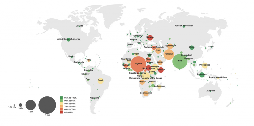
Stamen is a data visualization design agency that combines creativity and fun with utility. I also think that information can also be shown in creative ways which is why I wanted to look into a project that they created. One that I think is cool is the World Health Organization immunization Progress Report in which Stamen created data visualization of the world and their immunization progress. The compelling visualizations that they created tell a story of countries that have made significant progress in their immunizations. Data, especially data that involves other countries should be visualized because they are an easy way for people who speak different languages to understand information. Because Stamen is working with WHO, I think that their visualization was a smart and creative way to visually tell this story in a way that is accessible for everyone to see. Although these visualizations don’t solve the problem of increasing immunizations in countries, designing a way that people can see that these countries are struggling can lead to more solutions.