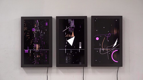
This project is called Flight Patterns by Aaron Koblin.
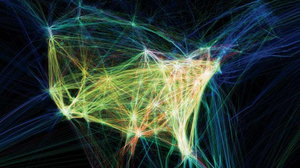
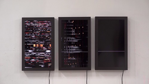
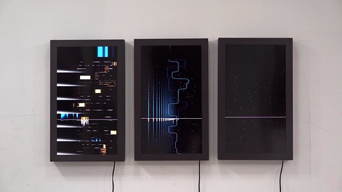
This is the visualization of the dataset of air traffic in North America. I think this project is very interesting in that each line created represents a different path, and in the end, the general form created reminds the audience of the form of North America on the map. The points of destinations of
“meeting points” that are overlapped often are white, and the paths, in general, have different colors to give diversity to the work and emphasize each unique flight pattern. As indicated from the official site, the dataset of the patterns was plotted using a processing programming environment.
![[OLD SEMESTER] 15-104 • Introduction to Computing for Creative Practice](../../wp-content/uploads/2023/09/stop-banner.png)
