his project relies on a particle system. It indicated regions with air pollution on an abstract Indian map. Hovering above the regions with your maps will lead to an info box appearing. The more red the region, the worse it is in terms of the air pollution.
Author: Karan
LO 7 Data Visualization
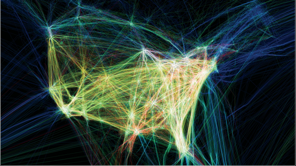
I really enjoyed the work by Aaron Koblin. Their work, “Flight Patterns” is very exquisite in terms of the visual elements. I really enjoy the glowing effect of the many lines. I also am fascinated by the idea behind. It basically maps the paths of air traffic over North America in colour and form. It was done using the Processing programming environment as they took data from the FAA. I enjoy the randomness of the lines and the abstract shape of North America that is created with line densities. I also like how the major destination are highlighted because of the number of lines starting and ending there. The artist has done a good job of preserving its cohesiveness while working that big of a data set.
Project 7: Curves
This project was done with the parametric equation of the Devil’s curve. It was an interesting project. I needed time do research on what curves I thought were interesting and cool. I wanted to make something that was visually appealing with simple interactions. I would not say that this project was hard.
Looking Outwards 6
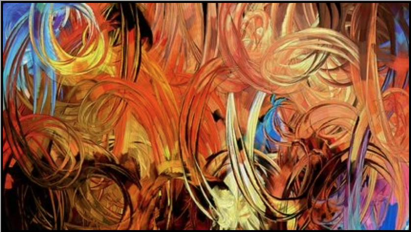
I really enjoyed this work by Patrick Gunderson. The visual complexity created by the ramdomly generated splotches of colour pattern is really visually pleasing. I really enjoy the complementing and in some cases contrasting colour patterns that are created randomly. It many arts it almost looks as if the art is capturing the motion of a specific object. He tries to incorporate imperfections into algorithmic systems the strikes the tension in between order and natural flow.
Looking Outwards 5: 3D Graphics
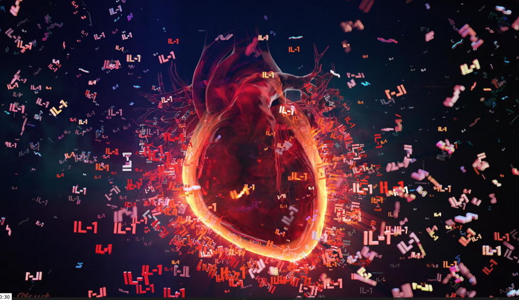
Alexey Kashpersky’s work is really inspiring. I was especially awe-inspired by her work “Heart Of Inflammation.” In this visualisation, Kashpersky uses animations and 3D visuals to produce an iteration of what the central role of the inflammatory cytokine IL-1 in recurrent pericarditis. I really enjoy the idea that Alexey uses such an advanced digital art form with such elegance to give out information on biological processes in the human body and diseases that humans face. The colours that she uses are absolutely gorgeous with perfectly contrasting features and communicative aspects. 3D rendering softwares like cinema 4D could have been used.
Looking Outwards 4

This post is regarding Christian Marclay’s works. I really enjoyed his work, ‘The Clock’, in 2010. Christian Marclay worked with fine art and audio cultures, transforming sound and music into a visible, physical form through performance, collage, sculpture, installation, photography and video. His work uses gramophone records and turntables as musical instruments to produce amazing works from sounds. I love the idea that Matclays purposefully damages records to create intentional effects on the music that he creates. In this work I really appreciate the concept of Time being a complex interaction being introduced within his work.
https://whitecube.com/exhibitions/exhibition/christian_marclay_masons_yard_2010
Looking Outwards: Computational Fabrication
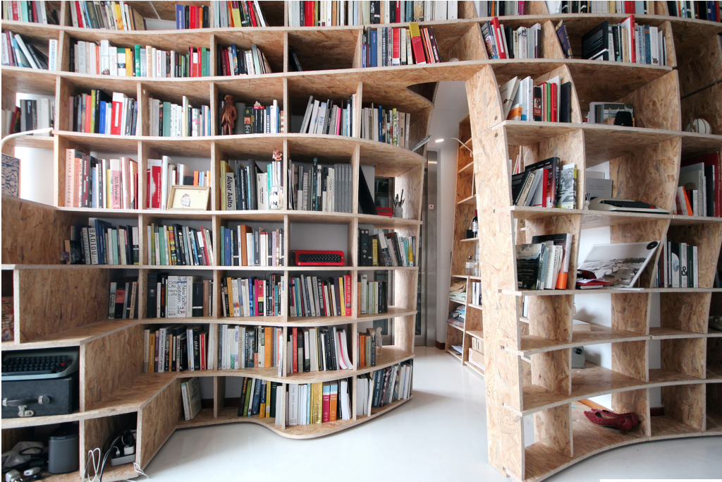
I found the project of digital fabrication to design a bookshelf very appealing. It was done by using a Lamella system assembly integrated in freeform geometry to create a system of shelves that are interdependent on each other. It uses 5-axis CNC swarf cutting to maintain consistency for the surface at joints and the connecting points. I really like the flowing over all visual that is created by the rigid modular structure of the shelves. The irony within this is something that I really enjoy. It was done by the Ahtehha firm that used these shelves within a library that they were designing.
Project 3: Dynamic Drawing
function setup() {
    createCanvas(500, 500);

    text("p5.js vers 0.9.0 test.", 10, 15);
}

function draw() {

    //setting up the background color
    let firstColor = color(45,0,85); //first color to be blended from
    let secondColor = color(219,146,7); //second color to be blended from
    bldval = map(mouseX, 0,width,0,1,true); //the blending proportion
    bColor = lerpColor(firstColor,secondColor,bldval); // the background color based on mouseX
    background(bColor); //setting background

    //vertical and horizontal rectangle
    noStroke()
    rectColor = lerpColor(secondColor,firstColor,bldval);
    move = map(mouseY,0,height,300,320,true); //constraining the position of the horizintal rectangle
    fill(rectColor);
    rect(mouseX-40,0,80,height); //vertical rectangle
    rect(0,move-40,width,80); //horizontal rectangle

    //circle on top right moving to top left
    fill(255);
    ellipse(450 - mouseX,100,30,30);
    fill(rectColor);
    crcWidth = 100 - mouseX/2;
    crcHeight = 200 - mouseX/2;
    push();
    translate(450 - mouseX,100);
    rotate(0+mouseX);
    ellipse(0,0,crcWidth,crcHeight);
    pop();

    //rotating white circles around mouse X and mouse Y
    push();
    fill(255)
    translate(mouseX,mouseY);
    rotate(mouseX/10);
    ellipse(0,-30,+10,10);
    ellipse(0,30,-10,10);

}
I enjoyed doing this. The hardest idea was possibly to start the project. After that it was pretty quick.
Project 2: Variable Face
var faceWidth = 100
var faceLength = 100
//hat, bow and sun glass colours colours R, G, B
var hbtR = 200
var hbtG = 150
var hbtB = 155

//skin colour variables
skinColour = 1

//sunglass shape and width
var sgWidth = 20
var sgHeight = 20

// hat size variables
var hatWidth = 200
var hatHeight = 100
var topWidth = 150

// mouth variables
mouth = 1


function setup() {
    createCanvas(300, 300);
    background(220);
    text("p5.js vers 0.9.0 test.", 10, 15);
}

function draw() {
    background(220)
    //skin colour
    if (skinColour==1){
        fill(117,64,27)
    } else if (skinColour==2){
        fill(207,152,84)
    } else if (skinColour==3){
        fill(244,203,151)
    }

     //face
    noStroke()
    ellipse(width/2,height/2, faceWidth, faceLength);

    //sunglasses
    fill(hbtR, hbtG, hbtB);
    ellipse(width/2-1/5*faceWidth, height/2-1/8*faceLength,sgWidth,sgHeight);
    ellipse(width/2+1/5*faceWidth, height/2-1/8*faceLength,sgWidth,sgHeight);
    stroke(hbtR, hbtG, hbtB)
    line(width/2-1/5*faceWidth,height/2-1/8*faceLength,width/2+1/5*faceWidth,height/2-1/8*faceLength);

    //bow
    triangle(width/2,height/2+1/2*faceLength,width/2-15,(height/2+1/2*faceLength)-5,width/2-15,(height/2+1/2*faceLength)+5);
    triangle(width/2,height/2+1/2*faceLength,width/2+15,(height/2+1/2*faceLength)-5,width/2+15,(height/2+1/2*faceLength)+5);

    //nose
    fill(0);

    triangle(width/2,height/2,width/2+5,height/2+10,width/2-5,height/2+10);

    //hat
    fill(hbtR,hbtG,hbtB);
    line(width/2-60,height/2-1/3*faceLength,width/2+60,height/2-1/3*faceLength);
    quad(width/2-30,height/2-1/3*faceLength,width/2+30,height/2-1/3*faceLength,width/2+23,height/2-faceLength,width/2-23,height/2-faceLength)
}

function mousePressed() {
    skinColour = int(random(1,4));
    faceWidth = random (75,150);
    faceLength = random(75,150);
    hbtR = random(0,255);
    hbtG = random(0,255);
    hbtB = random(0,255);
}
This is what I imagine my fashion sense in terms of colour coding would be: Same coloured hat, sunglasses and bow-tie. It was interesting to understand the relationship in between variables.
Looking Outwards 2: Generative Art
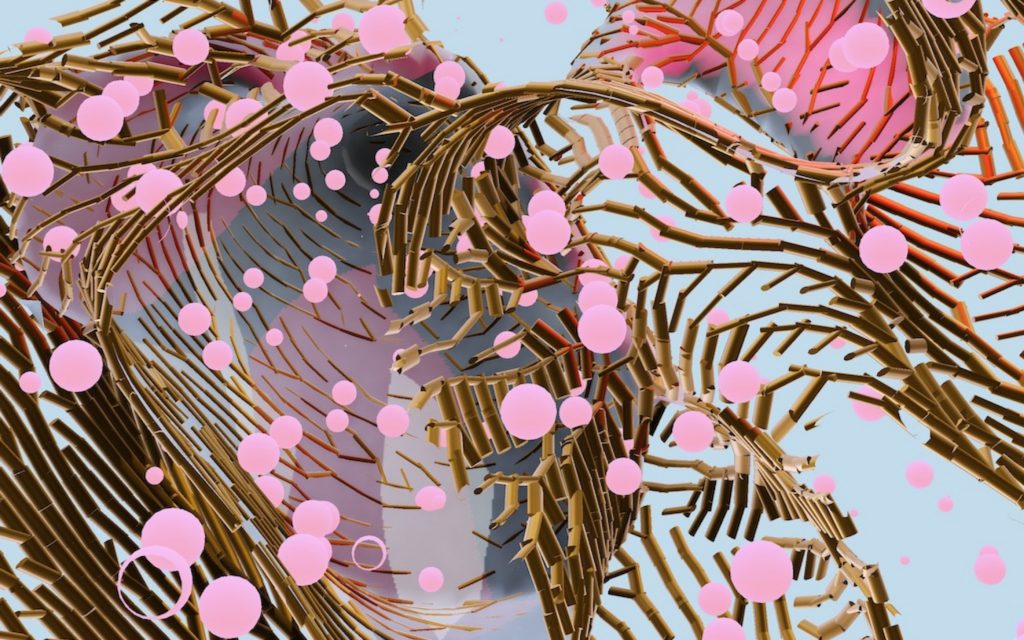
The work that I really liked was by Marcin Ignac. His work. ‘Coral Moss’ was the one that caught my eye. I really enjoy the idea of the Generative Growth that he embeds in this experiment. I feel that the colour scheme is really organics and gives the art very impressive flowing nature. Even though there is no set form or structure to the art, the simulation still seems very cohesive and I really appreciate that. The artist has used technologies like glsl, webgl, javascript, pex and nodes to create this real time simulation. As seen on their page, the artist explains that he merges, “reaction diffusion used to The artist strongly believes that data is not just numbers and is in fact a tool for art. He believes that data can be turned into Technology mediated creativity. This can be seen in his work as he uses algorithms to create something really beautiful.
http://marcinignac.com/experiments/codevember18-02-coral-moss/
![[OLD SEMESTER] 15-104 • Introduction to Computing for Creative Practice](../../wp-content/uploads/2023/09/stop-banner.png)