var points = 100;

function setup() {
    createCanvas(400, 400);
}

function draw() {
    background(map(mouseX, 0, width, 50, 0)); // background color goes from grey -> black as mouse moves to the right
    translate(width/2, height/2); // move origin to center
    hypotrochoid(); // draw the curve
}

function hypotrochoid() {
    // https://mathworld.wolfram.com/Hypotrochoid.html
    var x;
    var y;
    var a = map(mouseX, 0, width, 50, 80); // radius of fixed circle
    var b = map(mouseY, 0, height, 0.1, 1); // radius of circle rolling around fixed circle
    var h = mouseX/2; // distance from center of interior circle
    strokeWeight(map(mouseX, 0, width, 0.1, 3)); // stroke weight increases as mouse moves to the right
    stroke(mouseX, 100, mouseY);
    noFill();
    beginShape();
    for (var i = 0; i <= points; i ++) {
        var t = map(i, 0, points, 0, TWO_PI);
        x = (a - b) * cos(t) + (h * cos(((a - b)/b) * t));
        y = (a - b) * sin(t) - (h * sin(((a - b)/b) * t));
        vertex(x, y);
    }
    endShape();
}
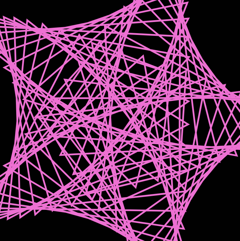
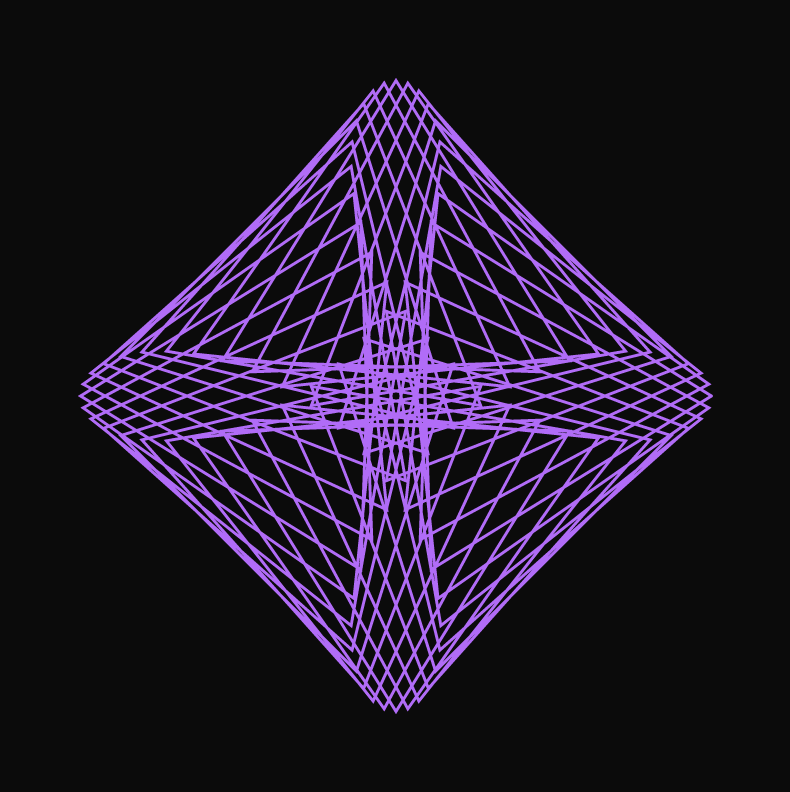
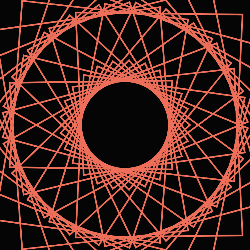
I started the project by just browsing all the different curves in mathworld and coding them to see how they look on the canvas. I ended up settling on the Hypotrochoid curve. The sample curve on the website actually didn’t seem very interesting, but once I allowed the parameters to change based on the mouse’s position, the curve had a lot more details and got much more complicated. It was quite incredible to see how the curve changes as the mouse cross the canvas. Here are some screenshots of the different looks:


The changes are quite drastic, so it’s interesting that they were all produced by the same equation.
![[OLD SEMESTER] 15-104 • Introduction to Computing for Creative Practice](wp-content/uploads/2023/09/stop-banner.png)