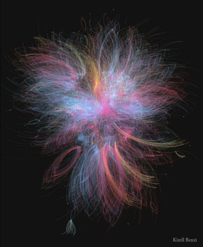
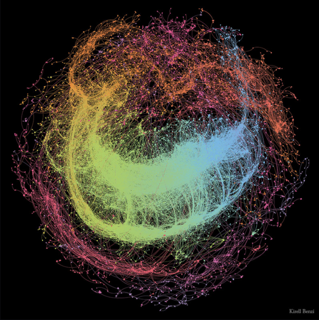
Dr. Kirell Benzi is a data artist and researcher. Kirell holds a Master of Science in Communication Systems from ECE Paris and a Ph.D. in Data Science from Ecole Polytechnique Federale de Lausanne. In 2017, he started his studio, Kirelion, around information design, creative technology, data visualization, and software engineering. He has collaborated with the likes of the EU, Stanford, Princeton, Cornell, Berkeley, UCLA, and more. He creates art that is exceptionally beautiful, pieces that one wouldn’t assume is based off of data points. Some of my favorites are; “The Dark Side and the Light” (2015), which is built upon the interactions between more than 20,000 characters from the Star Wars universe. The blue nodes represent those associated with the light side of the Force, including the Jedi, the Republic, and the Rebellion. The dark side is represented by the red nodes, which includes the Siths and the Empire. Yellow nodes represent criminals and bounty hunters, which mostly connect to the red nodes. The most influential characters are Anakin and Emperor Palpatine. I also really enjoy “Scientific Euphoria” (2014), which is about how in July 2012, CERN physicists found evidence of a new elementary particle, predicted by Peter Higgs in 1964. The graph shows the flow of retweets as people discussed the discovery. The network splits into two with European tweets concentrated in the center and U.S. tweets at the bottom.
https://www.kirellbenzi.com/art


![[OLD SEMESTER] 15-104 • Introduction to Computing for Creative Practice](wp-content/uploads/2023/09/stop-banner.png)