Looking Outwards 7: How Y’all, Youse, and You Guys Talk

When I found out this week’s “Looking Outwards” topic was computational informational visualization, I immediately thought of a quiz I took a couple weeks ago from the New York Times. The quiz, titled “How Y’all, Youse, and You Guys Talk” asks participants 25 questions about how they speak. The quiz results are a personal dialect map, which shows three locations in the U.S. that are most similar to one’s dialect and also locations that are most dissimilar (red maps most similar, while blue maps most dissimilar).

This is my map -- I'm from Rochester (so it was pretty accurate).
This is my map — I’m from Rochester (so it was pretty accurate).
screen-shot-2016-10-10-at-11-07-08-pm
The map also shows questions where it was able to pinpoint a location.

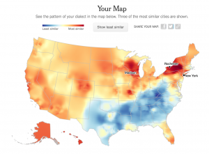
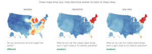
The data for the quiz and maps comes from 350,000+ survey responses collected from August to October 2013 by Josh Katz, a graphics editor for the New York Times who developed the quiz. Many of the questions in the quiz are based on those in the Harvard Dialect Survey, a linguistics project begun in 2002 by Bert Vaux and Scott Golder.

I find this project really interesting not only because it was extremely accurate in pinpointing my home city (I’m from Upstate New York) but also because Katz just did a fantastic job with it. While I definitely don’t know exactly how this work was generated computationally, I would imagine there is some kind of combination of research/statistics/probability and more complex forms of “if/then” statements to construct the location heat maps. I also like it because it puts data in a way that is extremely easy to understand visually.

You can take the quiz here and see for yourself if it’s accurate!

Christine Kim – Looking Outwards – 07

archnetworks_03
Architecture of Radio App on an iPad

Architecture of Radio is a site-specific application for iOS and Android devices that reveals the invisible view of networks all around us. It uses GPS to locate where the users are and reaches near cell towers from OpenCellID. When the location is calculated, it provides a 360 degrees view of the site. This application was made with Three.js and Ionic Framework, and with these software, it works by reversing the ambient nature of the infosphere. Architecture of Radio allows us to visualize the infosphere of a specific location and shows the system of data cables and radio signals surrounding us. This application helps the users by providing a comprehensible view of the network into the infosphere. Personally, I would like to look at the WiFi network around me that allows me to access the internet and various applications.

archnetworks_01-800x500
Architecture of Radio app showing system of network

archnetworks_02-800x500
using the app in different locations

Architecture of Radio Website

Looking Outwards 07

Vortex – Rachel Binx – March 2015vortex_power_curves_1000

Plotting channels of points as combined axis

vortex_wake_periods_1000

Plotting channels of points as stacked graphs


I really appreciated the pragmatism of this project. Often times visualization programs end up too focused on making the visualization interesting and nice to look at that functionality can be forgotten. This created a healthy mix between the two in my opinion by presenting the data in both a enjoyable way, but also in a way that makes it easy to extrapolate and understand.

The author also describes how she created the program, using React and d3.js. It takes in datasets which are decoded depending on their datatypes. Outside of that it allows custom colors and display choices depending on user preference.


Yugyeong Lee Looking Outwards 07

0002_us-copy
Periscopic, a Data Visualization firm, collected list of attendees of the 2016 Communications Network Conference in Detroit and built upon the data to help visualize the relationships between the attendees in hope to evoke a sense of connection in an event of network. I find this project very interesting because of their diagrammatic representation of the data. In the article that Periscopic provided, they describe steps they took in creating this interactive data which relates strongly with developing architectural diagrams (since I major in Architecture). Narrowing down dataset to articulate relationships they want to highlight, they included design aesthetic, color, and context that resulted in clear, interactive visualization. One special approach they took in collecting this data is that they asked the attendees to identify themselves in an open-ended question, expanding the categories. Through this graphical representation, Periscopic reveal the volume of multiple categories showing flow both visually and in context.
0001_all-copy