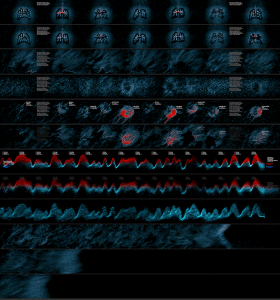
The artists vsualzied three data about people’s lives in New York into some public posters. I admire the project because the artists are giving the art and design fields new definition which inspire people to rethink of their daily lives. The artists using Python, PHP, MySQL and other tools to generate data, but they did not stop with those bunch of data, they rearrange the data and make them present in a more visual way. They used color contrast, density contrast and waves to indicate the change on the flow of people, data and environmental factors over time, and finally present these visualized data to public using large posters. In this way, people are getting more aware of the their daily lives, and things happened around them. By looking at things from a god view, the invisible trend and subtle changes become visible, making people to realize or know more about who they are and what they are doing. That is part of the main goal of art and design: to inspire and invoke people to something that are being ignored.
![[OLD – FALL 2016] 15-104 • COMPUTING for CREATIVE PRACTICE](wp-content/uploads/2020/08/stop-banner.png)