Nina Yoo- Project 09- Portrait

sketch


var underlyingImage;
var words = ['bee','key','lee','see','me','knee','allie','nina','i','love'];

function preload() {
    var myImageURL ="https://i.imgur.com/3K9LA06.png"
    underlyingImage = loadImage(myImageURL);
}

function setup() {
    createCanvas(500, 500);
    background(0);
    underlyingImage.loadPixels();
    frameRate(100);
}

var x = -5;

function draw() {
	x += 5;
	for (y = 0; y <height; y+= 10) {
		var theColorAtLocationXY = underlyingImage.get(x,y);
		fill(theColorAtLocationXY);
		rect(x,y,10,10);

	}
    var px = random(width);
    var py = random(height);
    var ix = constrain(floor(px), 0, width-1);
    var iy = constrain(floor(py), 0, height-1);
    var theColorAtLocationXY = underlyingImage.get(ix, iy);

    noStroke();
    fill(theColorAtLocationXY);

    var randomwor = words[round(random(0,words.length))];
    print(randomwor);
    text(randomwor,ix,iy);
  
}

This project was super fun in playing with different ways to load an image. I loved to figure out how to put on the words and create a sweeping image. It was cool to upload an image, but also see the process of developing the pixels.

Nina Yoo-Looking Outwards-08

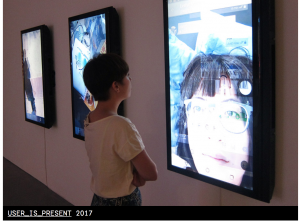
Kate Hollenbach Website – Picture below is sample from her website – User is Presen

INSTINT 2014 – Kate Hollenbach from Eyeo Festival on Vimeo.


Based in California, Kate Hollenbach joined Oblong in 2009 and still works for them. Kate is a designer alongside a programmer who designs for human interactions and physical space. When talking about human interactions and designing for environments, I really admire their workspace, especially the whiteboard, that they develop such programs and how immersive it is to a human. I am inspired to do products design because of human interaction, but the scale on how Kate Hollenbach takes it is much larger. For example, their project tamper where they were able to track human hand movements to manipulate projections was a showcase of how immersive a human movement can be in a setting such as that. The way they embedded the human to be an essential part of the interaction and having the interaction almost as if it was part of them was amazing to see. Kate did an effective job by presenting demonstrations of both professionals and the public as she was talking. It made me want to be a part of either the process or even the final product, but it has taught me that what excites a person the most is showing a glimpse of the final product and then its process.

Nina Yoo – Looking Outwards- 07

Lev Manovich – The Exceptional and Everyday – 144 hours in Kyiv- 2014

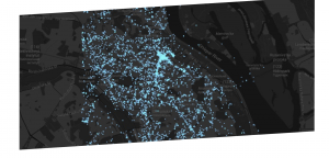
Instagram users in the City

The project of 144 hours in Kyiv takes place in Kyiv, Ukraine where they had tracked instagram usage across the area during the revolution on February 17 –  22. Lev had teamed up with Jay Chow, Alise Tifentale, and Mehrdad Yazdani to execute an aesthetic visual that described the power of social media and how it effects everyday life. While in real life the city was abuzz especially in the square, online was different. Pictures of protesters clashing with police was right alongside with cute instagram pictures posted by other people. It made it seem as if the protest was just a part of everyday life and that was what Lev was trying to convey about how social media can turn serious issues into everyday life. I admire Lev for his ability to express this information in an aesthetic way where it almost seems like a virus is spreading around. Instead of having boring statistical numbers, he took an idea of “lights in the city” and transfered it to track instagram users which is both easy to understand and visually appealing.

Nina Yoo – Project 07 – Curves

sketch
I was really intrigued by the hypotrochoid curve and how it was drawn the site itself. Through this project I was able to play around with the functions of cos and sin which I havent been able to delve into before. It was interesting to play with the numbers and see what different shapes appeared because of the repetitively drawn lines.

/* Nina Yoo
Section E
nyoo@andrew.cmu.edu
Project-07 Composition with Curves*/

var nPoints = 200
function setup() {
    createCanvas(480, 480);
    		frameRate(15);

    
}

function draw() {
	background(200,34,164);
	push();
	//into middle
	translate(width/2, height/2);
	drawHypotrochoidCurve();
	pop();
}


function drawHypotrochoidCurve(){
		//Hyptotrochoid
		//Link: http://mathworld.wolfram.com/Hypotrochoid.html

		var x;
		var y;
		
		var h = 15;
	

		var a = map(mouseX, 0,width,100,300); // (wat u want to effect, orginal range, new range) makes the variables interactive
		var b = map(mouseY, 0, height, 100,300);

		stroke(210,36,117);
		strokeWeight(2);

		beginShape();
			for(var i = 0; i <nPoints; i ++){

				// set variable t within the for loop so it keeps on looping (this acts as the angle for mouse)
				var t = map (i, 0, nPoints, 0 , 330 );

					// equation for the curve
				x = (a - b) * cos(t) + h * cos((a - b) * t); 
				y = (a - b) * sin(t) - h * sin((a - b) * t);
				vertex(x,y); // setting the patternn in the middle

			}
		endShape(CLOSE);


}


Nina Yoo Project-06-Abstract Clock

sketch

/* Nina Lee Yoo
Section E
nyoo@andrew.cmu.edu
Project-06-Abstract Clock*/

var prevSec;
var millisRolloverTime;
var change = 10

//--------------------------
function setup() {
    createCanvas(300, 300);
    millisRolloverTime = 0;
}

//--------------------------
function draw() {
    background(255,200,200); // My favorite pink
    
    // Fetch the current time
    var H = hour();
    var M = minute();
    var S = second();
    
    // Reckon the current millisecond, 
    // particularly if the second has rolled over.
    // Note that this is more correct than using millis()%1000;
    if (prevSec != S) {
        millisRolloverTime = millis();
    }
    prevSec = S;
    var mils = floor(millis() - millisRolloverTime);
    
    
    var hourBarWidth   = map(H, 0, 23, 0, width);
    var minuteBarWidth = map(M, 0, 59, 0, width);
    var secondBarWidth = map(S, 0, 59, 0, 178);


    // the sun is radiating
        noStroke()
        fill(255,205,109)
        ellipse(0,0,mils,mils)

     //sun grows at every hour
      noStroke()
        fill(237,242,109)
        ellipse(0,0,hourBarWidth,hourBarWidth)

        
	 //for the puddle growing every minute
        noStroke();
		fill(108,158,234);
        ellipse(150,200,minuteBarWidth,20);
    

     //for raindrop falling at a rate of a second
        noStroke();
        fill(255);
        triangle(140,secondBarWidth-5,160,secondBarWidth-5,150,secondBarWidth-20);
        fill(255);
        ellipse(150,secondBarWidth,22,22);


}


    /*noStroke();
    fill(40);
    ellipse(0, 100, hourBarWidth, 50);
    fill(80);
    ellipse(0, 150, minuteBarWidth, 50);
    fill(120)
    ellipse(0, 200, secondBarWidthChunky, 50);
    fill(160)
    ellipse(0, 250, secondBarWidthSmooth, 50);*/

I wanted to make a raindrop to fall into a puddle because rain is something that has a rythm to it so it reminded me of time. From there on I just added more elements to it pertaining to weather by making the puddles minutes, the drops seconds, the sun the hour, and the radiating part of the sun milliseconds. It was fun doing this project and playing around with the limits in order to create different images.

Nina Yoo-Looking Outwards – 06

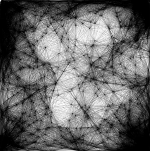
Keith Powers -Art From Code – 2009


Math and geometrical shapes are intriguing to me because of their simple beauty. I admire this project for taking a single mathematical concept and then creating a whole new design from it by using a random function, when technically its not random in the first place because it was calculated. So this project was made from random lissajous webs. The lissajous curve is a graph of a equations that describe harmonic motions. Keith Powers would change the way the picture looked by changing the amplitude and frequency. Powers is able to express his art work by presenting how a simple geometrical graph is able to create a complex dark image that causes the viewer to wonder what the picture might have sounded like or how the webs are similar to a spiders web itself. The way he spread the contrasting dark points also causes your eye to go around the whole page and just make it pleasing to look at.

Nina Yoo Project-05-Wallpaper Section E

sketch

/* Nina Yoo
Section E
nyoo@andrew.cmu.edu
Project- 05 Wallpaper*/
var head = 30
var eyes = 15
var eye =  30
var space = 50

function setup() {
    createCanvas(600, 400);
    background(216,117,28);
   

    for (var y = 25; y < height; y+=space) { //y position of wall paper
        for (var x = 25; x < width; x+=space) { //x position of wall paper

            //outercircle
            noStroke();
            fill(215,185,119);
            ellipse(x, y, head, head);

            //2nd circle
            noStroke();
            fill(0);
            ellipse(x,y,head*.5,head*.5);  //have to base i off of head variable

            //middle
            noStroke();
            fill(238,184,213);
            ellipse(x,y,head*.2,head*.2);
        }
    }
    for (var a = 40; a<width; a+=space){
        for (var b = 40; b<height;b +=space){ //offset spacing
                //tan overlayering
            stroke(200,200,124);
            noFill();
            ellipse(a,b, eye,eye); // create new variable eye to separate from the other loop
            
            //black center circle
            stroke(0);
            noFill();
            ellipse(a,b,eye*.5,eye*.5);

        }


    }

        }


function draw() {
    // draw is not called due to noLoop() in setup()
    noLoop()
}

I wanted to play with circles and the colors to mess with someones eyes on a lower scale and it was fun trying to trip myself up while also deciding where to have fill versus not. The spacing took some time to figure out where I wanted the nofill circles to be, but was worth.

Nina Yoo Looking Outwards -05 Section E

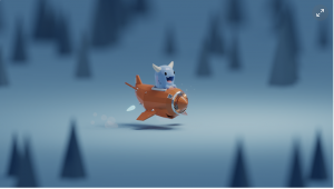
Mohammed Chahin-Road to Nowehere- August 20,2018

This project is really cute and something I would want to delve into because even though the subject looks as it if was more cartoony it actually has harsh edges and highlights to give it a more 3d generated or mechanical feel. The image generated provides a more realistic version of a 2d image causing the viewer to be tricked into thinking of the image more as an object or more able to be within their realm of “space”.  The algorithm that is generated most likely entails that there are variables that need to be calculated for the highlights and shadows to work precisely where they are supposed to be because if not then the 3d image would look more 2d than 3d. The artist itself was able to incorporate their own style of art by adding these cute designs instead of aiming for hyperrealism, which is effective in 3d designs, but this artist proves there can also be 3d depth in more imaginary characters.

LookingOutwards-04 SectionE

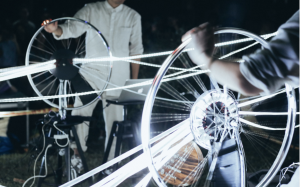
Cycling Wheel: The Orchestra – Reimagining Marcel’s bicycle wheel as a light+sound Instrument created by Keith Lam, Seth Hon, and Alex Lai created October 7,2017

The wheel in general is a soothing object as it follows the shape of the circle which is a strong geometric figure in the design world. A wheel/ shape of a circle is used in many different mechanisms allowing many machines to be invented and working. I was interested in how they took the wheel of a bicycle and decided to make it a sound.  A bicycle’s wheel is used mainly for movement, but it also a satisfying movement. It just kept me wondering in how they would change a subject like a wheel into sounds? The way they included the lights as they played with the sound is visually helpful. The algorithm that is used is primarily concerned with manipulating sound, lights, pitch, volume, and speed of sound all with the movement of the bicycle wheel. They used a combination of programs and tools, which focused on each variable. Due to the combination of the variables they were able to make the wheels act as instruments and with the inclusion of lights it caused it to become almost like a show, it was fitting that they called the project “the orchestra”

.

Nina Yoo- Project 04- String Art

sketch

/* Nina Yoo
Section E
nyoo@andrew.cmu.edu
Project-04*/

var change = 5 // changing the lines position from one another (increments)

function setup() {
    createCanvas(400, 300);
    background(0);
    
    
}

function draw() {
	
	
	for(var r=100; r < height; r+= change){ // starting at x position 100 and spreading height --> change is space between lines
		stroke(150,11,200);
		strokeWeight(.5);
		line(r, 0, width, r*.5);
		} // line goes along width, divides change by half

	//right side pattern reaching to bottom of canvas at 300	starting at y coordinate 100 from right side 

	for(var l=100; l < width; l+= change){
		stroke(90,112,6);
		strokeWeight(.5);
		line(l, 300, width, l *.3);
	}
	//overlaying previous to make curved design change

	for(var g=50; g < height; g+= change){
		stroke(75,154,22);
		strokeWeight(1);
		line(g, height,500, g);
	}
	//left side bottom --> turning at same point the top patter starts
	for(var h= 100; h<height; h+= change){ //100 is the starting value of change
		stroke(111,23,200);
		strokeWeight(.5);
		line(h, height, 0 ,h);
	}

	//overlaying left side bottom shape

	for(var j= 0; j<height; j += change){ //starts at 0 --> limit is height 
		stroke(68,112,115);
		strokeWeight(.5);
		line(j, width, 0, j);
		} 

	for(var m = 0; m < width; m+= change){
		stroke(100,78,150)
		strokeWeight(.5);
		line(m, 0, height,m)

	}
}


This project was fun to experiment with the different line patterns and textures you can create. For example, by overlapping sets of line you can create interesting shapes that look like after images and play with your eyes, which is what I experimented with on the green part of the project. It was also fun to see how shadows worked on the lines depending on the spacing set.