Dani Delgado – Looking Outwards 02

The head of the Phantom Terrains website

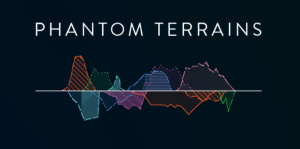
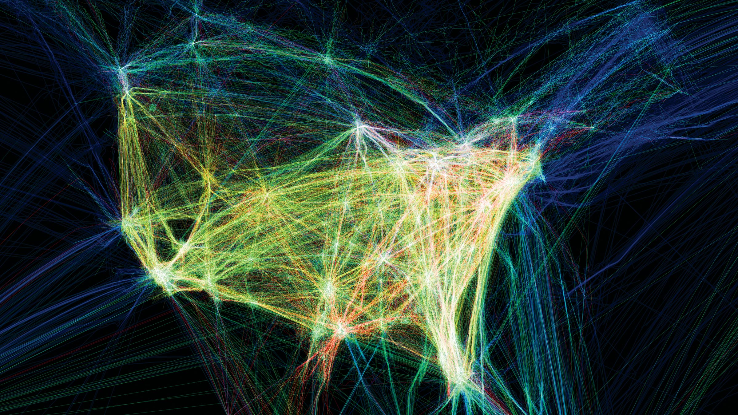
The project I choose to look into was one called “Phantom Terrains”. This 2014 project aimed to capture the wireless data that consistently streams from routers to our devices and then use an algorithm to transform it into almost music-like audio. Not only does this project allow us to more fully understand the plethora of data that is constantly streaming around us, but it also does so in a beautiful and elegant way by combing the audio and visual representations of these sound waves. I cannot begin to comprehend the amount of complex coding that was required to create such an algorithm, and I sincerely admire how the creators, Frank Swain and Daniel Jones, were able to apply it in such a beautiful way. Daniel Jones, specifically, has been working on combing art, sound, and technology to give us a better understanding of the world we live in.

How sound waves are visualized using Phantom Terrain

Phantom Terrains was developed using Nesta funds from the U.K. and can be interacted with by using bluetooth hearing aids (along with being sampled on their website). This implementation of the hearing aids sprouted from the idea of re-working this prosthetic technology into enhancement tech, allowing the user to be able to hear a wider range of sounds than the average human ear ever could.

This project is vastly intriguing and has piqued my wonder in terms of just how much invisible data is swirling around us at all times and just how much coding can do to help us to visually show that.

Link to the website: http://phantomterrains.com/

Jenni Lee – Looking Outwards – 02

Video demo of flight patterns

Colorized flight patterns

The project I chose is “Flight Patterns” by Aaron Blink, created in 2006. In this project, Aaron Blink visualizes paths of air traffic through color and form. This project is a graphic display of the patterns of generated airplane paths. Flight patterns was made to be a planetarium-based artwork installation that visualizes the data and algorithms of manmade aerial technologies. I was drawn to not only the nuanced, intricate visuals of the project but also the way in which it blends together data visualization, science, and art through the presentation of these mechanical algorithms. I find it most intriguing how the flight paths ultimately combine to create the shape of the United States, demonstrating the interconnectedness within the various flight paths. Additionally, I admire how Blink executed this project with artistic sensitivity, as the the pacing and texture of the white motion lines within the video demonstrate an expertise in motion graphics. Ultimately, I highly admire this project for its effective usage of generative art.

Link

Alessandra Fleck – Looking Outwards – 02

I find the project, Unnumbered Sparks ,presented at TED2014, by Aaron Koblin particularly inspiring because it takes what is one of the most prominent, yet unseen movements in the modern day, and projects it onto a visual depiction that fills the sky when looked upon from below. Stretching 745 feet across, this piece blanketing above ground takes in cell phone signals to draw and play with the color mapping details being projected onto it. Utilizing the Javascript interactive rendering API called WebGL, the user’s motion is able to come to life as it is rendered through shaders and javascript. To get the drawings/movement-associated art projected onto the “blanket,” websockets pass the data from a mobile to rendering browser. Just as the work flows along the lines of bringing a community together, it also does so in a similar language in the way the algorithms utilized connect to one another. What makes this work so interesting is that it is a piece of art that inspires those who are viewing the sculpture to also engage in art. In other words, an art piece that leaves room to branch out and become even more elaborate with the viewers art included into the piece. As a common theme of technological developments today is about sharing information across a larger span, it is neat to see such theme come out in a semi tangible application.

Victoria Reiter-Looking Outwards-02

“Galapagos” by Karl Sims, 1997

A project I find extremely interesting is one titles “Galápagos” by Karl Sims, produced in 1997. Sims attended MIT and earned a degree in life sciences, then continued on to earn a graduate degree in visual studies from MIT’s Media Lab. He combines these areas of study very gracefully in his installation.

Twelve monitors with weight-sensitive pads of Karl Sims’ installation “Galapagos,” exhibited in the InterCommunication Center, Tokyo, 1997-2000.

Sims’ installation “Galapagos” seeks to mimic the process of evolution through natural selection through a combination of computer-generated code and human interaction. Twelve monitors are set up, each with a foot pad in front. Each screen displays a very simple “creature” generated by code. The exhibition viewers are invited to step on the foot pad of whichever creature they find the most visually appealing, and the creatures not “selected” by the viewers disappear, and from the remaining creatures a new generation is produced using code to create random variations in such aspects as size, movement, color, number of arms, etc. As the process continues on, the creatures “evolve” to be more and more complex.

Top left creature is the “parent,” and the eleven remaining boxes demonstrate possible variations of offspring
Top left is parent, eleven others are possible variations of offspring

I would assume that this code contains many variables which are randomly assigned values in response to the weight of a person standing on the foot pad (much like how a code can respond to such things as a mouse click or a key being pressed on the keyboard). This concept clearly reflects Sims’ background, as he studied biological development, and integrated this into his master in visual studies, thus turning a scientific concept into interactive art.

This work inspires me, because it seems as though oftentimes there is a stark distinction between nature and computer science. Sims was able to bridge this gap by writing code which behaves the way nature behaves, in a way making empirical a concept that seems so vast and out of the hands of human control.

Link to full information about “Galapagos” here.
Link to further reading about the project as reviewed by Art New England and Wired also included.

Tanvi Harkare – Looking Outwards – 02

A project that I really liked is the Digital Type Wall that was created for Monotype, and then exhibited in the Metropolitan Wharf in London, UK in November of 2012. The exhibition and print design were created by the SEA design team, and the installation concept and code were created by Marcin Ignac and the Variable team. The project was created in collaboration with the Pencil to Pixel exhibition to help show how typography has changed through the years. There are over 6,000 different combinations that can be shown based off the animation that creates it, and it takes typography from over hundreds of fonts. The custom software was created using a Plask framework which creates the animation that chooses the specific fonts to display. Based off the video that I saw about the project, I assume there is a library of characters that this software goes through and creates an animation to display them in a random order.

 I find this project interesting because of the variety of fonts that it displays. Because of this workflow, its engaging for all audience types and provides a unique experience. I think if the exhibit were more interactive, it would be more successful in helping to engage the audience further. Additionally, it seems that the project currently is just displaying the characters in a grid-like format. Although this creates a clean look which is easy to understand and look at, it would be interesting if the letters formed into something else, like a symbol or object. For more information about this project, visit the website here

Christine Chen- Looking Outwards-02


Above is Austrian artist LIA’s work, Weaving, that was created in 2018
Source: https://vimeo.com/279291848

After looking at a range of various generative art, I found Austrian artist LIA’s work, Weaving, most fascinating and inspirational. LIA started producing art with softwares and algorithms as early as 1995 and is considered as one of the first developers of the field. She translates concepts into codes which she uses as “machines” to generate multimedia outputs, which are then used to generate art. In her piece Weaving, LIA was inspired by the use of punch card in the Jacquard mechanism that was used to record information in the past to efficiently weave complex patterns for textiles. LIA developed the software to reflect the method of the Jacquard mechanism to develop “digital textiles.”

What interests me most about this piece is how simultaneously different and alike the Jacquard mechanism and LIA’s method of creating the piece is. Both translates aesthetic patterns into codes, yet the output of one is physical while the other one is digital. It is as if one is a newer version of the other. Through this piece, LIA combined traditional art with today’s computer generated algorithms to create a breakthrough of both sides.

Kade Stewart-LookingOutwards-02

Marcin Ignac, Every Day of My Life (2012)

Marcin Ignac completes a lot of projects that focus on data visualization. Whether that’s data from an Internet of Things, from the stock market, or even from his dad’s workouts, Ignac finds a creative way to model the data. In “Every Day of My Life,” Ignac used an app called Tapper to track his foremost running app at all times of the day, every day, for two and a half years. He then visualized the data using Plask, separating each program into a specific color and each day into a band. The project should be consumed from top to bottom.

What I admire most about Ignac’s work, and specifically what I admire about this project, is that the work is something I would consider art at the end, but does not come from that. The usage of different programs is not meant to be artistic, and yet, Ignac takes it and makes art. In addition, the art holds onto the meaning – if I were to look at dark spots, I could probably guess where the holiday season slowed his work. This algorithm was probably pretty simple, assigning colors and arranging them chronologically. This simple yet meaningful project embodies Ignac’s style of grounding his work in the very real world of data.

Marcin Ignac

Emily Zhou – Looking Outwards – 02

London-based artist, Quayola, uses image-analysis and manipulation algorithms to generate digital landscapes in a project titled Pleasant Places.


Pleasant Places, Quayola, 2015

I am a big fan of the irony that is present in this work. The artist uses a computer program, a far cry from the natural world, to construct pleasant, organic works of art. I admire the contrast against the popular belief that only nature itself can produce feelings of comfort and tranquility.

The algorithm requires an input video (e.g. trees swaying in the wind), which it then relates by analyzing patterns of movement and colour. The result is a painting-like scenery. The shot-breakdown is demonstrated below:

Artistic sensibilities come into play in developing the algorithm. The artist performs computational brush studies as well as generative painting simulations in order to create a digital synthesis that can be applied to natural landscapes. The work exhibited as an audiovisual installation will hopefully inspire more people to consider computer technology as a means of art-making.

ChristineSeo-LookingOutwards-2

Metamorphosis is a generative animation video that was created by Glenn Marshall. This work is not a commercially used animation, it also shows the usage of technology, and exposes the process of rendering the technology through algorithmic animation programmed in Processing. As a generative animation, I thought this animation was very intriguing because it shows different movements through butterflies as well as having great transitions. Not only the project is aesthetically pleasing, the music plays a great role in showcasing this video, which I believe adds a lot to the mood of the overall piece. The color palette in the animation is eyeopening and the different strokes and movement of the piece expresses great nature in a technological way.

This piece is inspired by this previous short film made in 2007, called Butterfly. This film used experimental techniques using traditional 3D and 2D software. Expanding his creativity and experimental aspects in digital art, he created this algorithmic animation a year after. Overall, the interaction between the video rendering with animation, music and transitions created a beautiful and inspiring project.

Looking Outwards-02 Sophia Kim


Frederik Vanhoutte’s “Com Sigil – Pattern in Absence” is aesthetically pleasing to the eye. I appreciate the use of space and colors in this project. Using neon colors (pink, blue, and yellow), Vanhoutte makes the viewers notice the black shapes moving throughout the generative illustration. This generative art depends on the sound waves and vibrations from the song “Take a Deep Breath” by Talvekoidik. The system generates black shapes from multiple directions to move through the colored lines whenever there is a change in tone or vibration. The colored lines form many 3D shapes to make the illustration resemble a cube puzzle. I believe this project could have used JavaScript and/or Adobe Illustrator for its algorithm. In Vanhoutte’s recent works (2018), he focuses a lot on combining grids, geometry, and sound into his algorithm. “Pattern in Absence” is a great example of how he utilized those concepts, especially because he used a song that did not have drastic changes in sound.