(Visualization for Amersterdam SMS messages on New Year’s Eve)
This is a visualization for Amersterdam SMS messages data on New Year’s Eve created by Aaron Koblin. The data is visualized by representing each message with a colored dot vertically on a map. The dataset creates city-like animations. Interestingly, the vertical tubes go up and down together almost like music beats. The colored dots are denser at certain areas and closer at others, like population. And at 00:00 on New Year’s Eve, the number of data reaches ultimate high. The artist used P5js and OpenGL for the visualization. I appreciate this visualization because it makes the data a lot easier to understand for the viewers. I guess the artist could be using algorithms such as using one colored dot to represent one message sent, locating them geographically on a map.
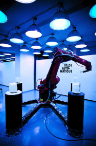
The data visualization project I chose to explore was Valse Automatique – a wildly interesting project which uses various softwares to analyze and transform live music into an industrial design piece, combining the fields of music, design, performance art, and computer science. The project itself, developed by Studio.Nand in 2010, was made possible by programming a robot using a custom language (KRL) to move in tune with the musical notes as they were processed by the computers and then sculpt a block wax by using built-in bunsen burners to create the objects.
This project analyzes music real-time and uses this data to sync the lights and the robot’s moments to the notes.
This project is just absolutely incredible to me, as it places product design in a theatrical performance complete with a score, choreography, and lights. The amount of vision and ambition that it took to complete this project is something that I hope to one day attain.
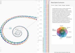
Ross Spiral Curriculum by Santiago Ortiz represents the evolution of human consciousness through the integration between domains, mainly cultural history, to create a dynamic choreography of learning. The goal is to allow students to understand the past as a dynamical system, better understand the present and envisioning the future.
The left is an example of the spiral showing how data connects together. The picture on the right shows the domains of the system.
Visually it is a colorful spiral that has different points on it. But when you zoomed in, there are connections between the data. Then you can compare each grade’s data by clicking the menu on the right. I think it is a very interesting way to display data. Visually it is very attractive can be an art piece that someone can hang on their wall, just like an abstract piece of modern art. One criticism will be: the project is a bit hard to understand, and there is not a lot of correlation between the data and the visual representation.
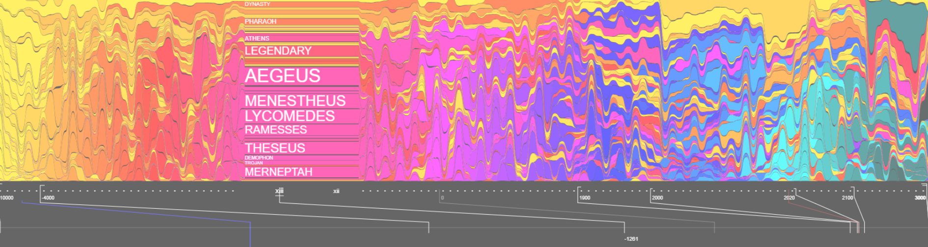
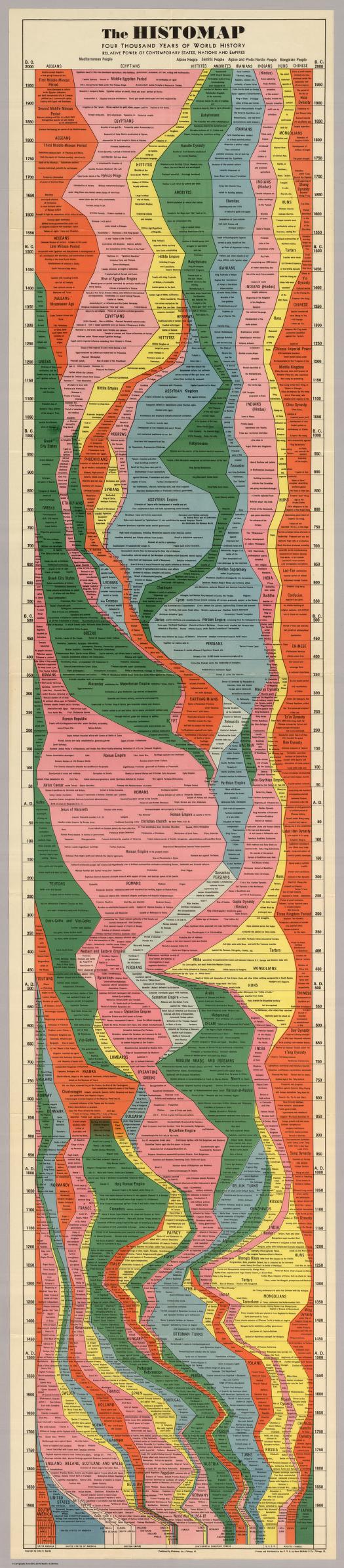
This is an exercice on representation done by Santiago Ortiz, remiscent of the Histomap, which is a visualization of 4000 years of History, created in 1931 by John B. Sparks.
Timeline of chronoligcal articles from Wikipedia: millenia (10 000 BC – 5 000 BC), centuries (40th BC – XIX), decades (1990s – 1990s), years (2000 – 2019), decades (2020s – 2090s) and centuries (22nd – 30th).
On this website histomap revisited, you could view the map zoomed in and click on the map, it would direct you to the wikipage.
This viedo is santiago ortiz talking about different ways to represent time.
What I admire of this project is all the theories behind to make data visulized especially focusing on the theme of time. It’s interesting to see the history not only in a linear way but you can ‘map’ it.
For Looking Outwards this week, I chose to do the project This Exquisite Forest, which is a project created by Aaron Koblin and Chris Milk between 2012 and 2014.
This Exquisite Forest Introduction Video.
I admire this project because of how community driven it is. The creators made the framework, but then as shown in the pictures below, the community was in charge of all of the actual content of the ‘forest’. The artist’s sensibilities are actually barely manifested in the final form of the project, as it is community driven for what animations are used. The actual form of the trees is controlled by the creators, however, and is very clean and minimalist. The overall structure was also created by them as well, and I admire how when you click on a leaf at the end of a tree, you can see the entire ‘story’ that it took to get there. As shown below in the first picture, each individual tree’s community creator has the option of adding as detailed of instructions as they want.
An Individual Tree’s instructionsInterface for adding to a segment of a tree.
Studio NAAD is a design firm that focuses on data visualization and interactive design. “Peak Spotting” is one of their projects for Germany railway company, Deutsche Bahn, that helps visualize railway traffic for Germany’s daily passengers. Peak Spotting compiles together Deutsche Bahn’s entire network of load and capacity prediction, and integrates it with task management tools and customizable visualizations to create an accessible and easy to decipher map. This intelligible map allows passengers to plan out trips in advance and optimize their route, and allows conductors to coordinate trains and traffic. I really admire this project because it is difficult to convey the hectic and abundant amount of data that is a train system in an accurate and straightforward manner, especially in major cities such as Berlin.
Sensing Streams – invisible, inaudible (2014) –– Ryuichi Sakamoto and Daito Manabe, Photo by Sarah Kim
This artwork, Sensing Streams – invisible, inaudible, was created by the collaboration between Ryuichi Sakamoto and Daito Manabe in 2014. This piece is made to express electromagnetic waves that are not visible to the human eyes. The waves express the “manifested in mobile and other communication technologies that have become integral to modern society.” The movement of the electromagnetic waves is conducted by antennas that provide data through a collection of electric waves originated by the technology used today. This projection of imagery and symbolism is displayed for people to visualize the cellular energy that is used in real time. I deeply admire this artwork because the visuals are produced through a set of information to convey certain emotions regarding our society’s attachment to technology.
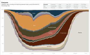
A visual of a chart of the amount of time on average people spend doing different things in one day.
Created by Amanda Cox in 2011, this graph shows how different groups spend their day, broken down by different activities. Within the graph, you can select different groups and demographics to see the differences in how different groups of people spend their day. I find this data extremely interesting because it allows us to see how the activities change based on the group that you are looking at. It provides us a way to compare these different demographic groups that I have never thought of before. Although I am not sure how the artist accomplished this work algorithmically, I suppose that they gathered the data by asking a random selection of people from these different groups how they spend their day over a certain period of time. The creator’s artistic sensibilities are reflected in the final work through her choice of colors and the form in which the graph was displayed, for changing the type of graph used to display the data could easily change how it is perceived.
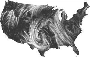
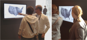
Windmap created by Wattenberg and Viegas
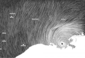
This week, I decided to look at the wind map developed by Marten Wattenberg and Fernanda Viegas. Featured in the MOMA as the first web artwork to be a part of the museum’s permanent collection, it is a living portrait of the wind currents over the nation. I decided to go with this project because it only uses HTML and Javascript, using the data from the National Digital Forecast Database.
Windmap in context
This was a really interesting project to me because through the wind map you’re also learning about the climate of the states and why the enivronment/terrain is the way that it is. I appreciate the artists’ choices in making the map monochromatic so the viewer isn’t influenced to believe anything about the terrain that the currents are covering. The idea of the map updating in real time allows the viewer at MOMA to apply what they’re seeing to a larger scale. The map also allows the viewer to see the progress of a natural disaster and serves as a learning experience. Hurricane Issac on the map in 2012
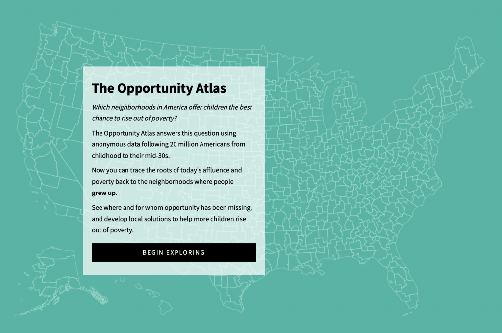
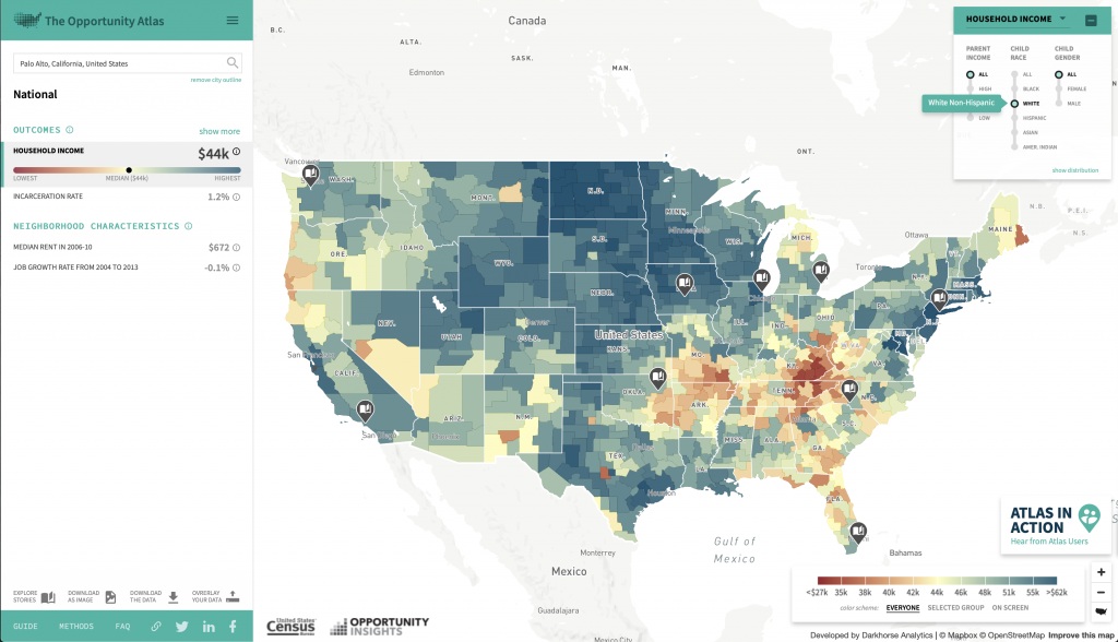
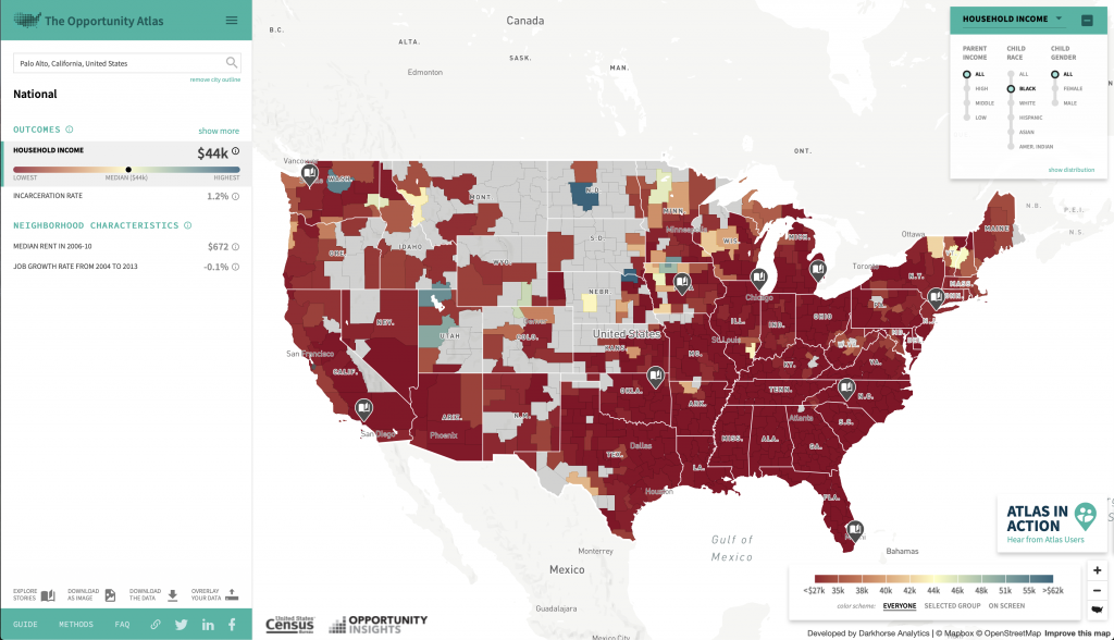
For this week’s looking outward, I am choosing to write about The Opportunity Atlas, a collaboration between Opportunity Insights and the Census Bureau. The map application was developed by Darkhorse Analytics.
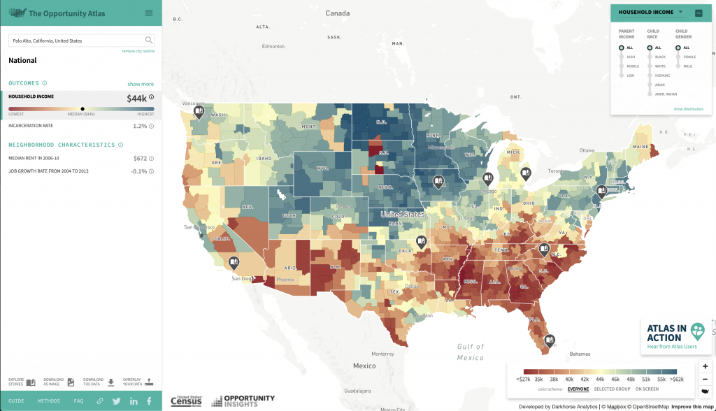
A description of The Opportunity Atlas and what it can be used for.The Opportunity Atlas looking at the country as a whole, comparing household income currently for each area of the people who grew up there.
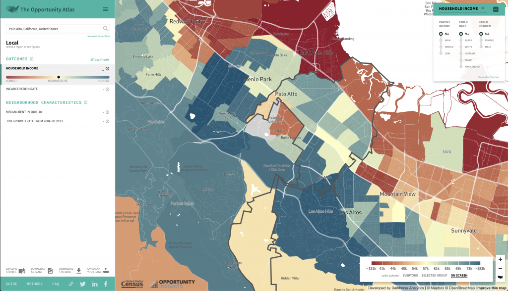
I really liked this project because I found it extremely interesting. I grew up in the Bay Area, where it isn’t uncommon to have a six figure salary coming from both parents–but I had a very different experience. It was really interesting just exploring the website, and seeing how different areas of the map, both in all of America and my hometown, had patterns. For example, my hometown is very affluent overall, but the town just next door is exactly the opposite.
My hometown–each colored section represents a different household income today for someone who grew up here, compared locally to the area
Another interesting part of this project was to look at racial differences. Overall in the country, when you compare household income from people who grew up in certain areas, the maps are extremely different for black people than they are for white people.
The Opportunity Atlas only looking at data from white people.The Opportunity Atlas only looking at data from black people.
I thought that this project was not only interesting, but very important. It shines light on something that a lot of people don’t notice, simply because their hometowns are usually in a slight bubble. When everyone around you is at the same place, it is much harder to notice the advantages or disadvantages you might have. It’s really inspiring to me that they were able to compute to visualize this data, because of how important I believe this is.
![[OLD FALL 2018] 15-104 • Introduction to Computing for Creative Practice](https://courses.ideate.cmu.edu/15-104/f2018/wp-content/uploads/2020/08/stop-banner.png)