Looking Outwards-01

Playful Geometries showcases music and art in an immersive environment.

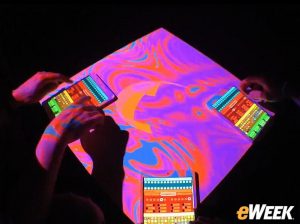
Playful Geometries is an interactive animated 3D scene projected onto a white table. The constantly changing scenery created through fun geometric shapes and configurations is synced up with the music that is played in the room in which the installment is located. The user interacts with the art in the room by playing with the music, creating different images as they do so. On the walls of the room are images that simultaneously show the inside of the cube that is shown on the white table. In this way, the exhibit is entirely immersive and draws the user into changing the scenery through their own fingers.

The designers of the exhibit were aiming to have fun with the project as well as with the result, but also to push the boundaries of the cheap computers that they were using to create this project. Their goal was to ultimately create something with many cheap computers that would go beyond the scope of something an expensive computer would be able to create.


Original Source:https://devart.withgoogle.com/#/project/17120531

YingyangZhou-LookingOutwards-1

FOLK website

FOLK home page


FOLK is a strategy agency specializing in the development of solutions to connect with people and influence their behavior.

The website of FOLK is straightforward, interactive and impressive. By developing the key  design element ‘frame’ which stands for the concept of helping and surrounding their customers through the entire strategic process), the website enable user to interact with the frame.

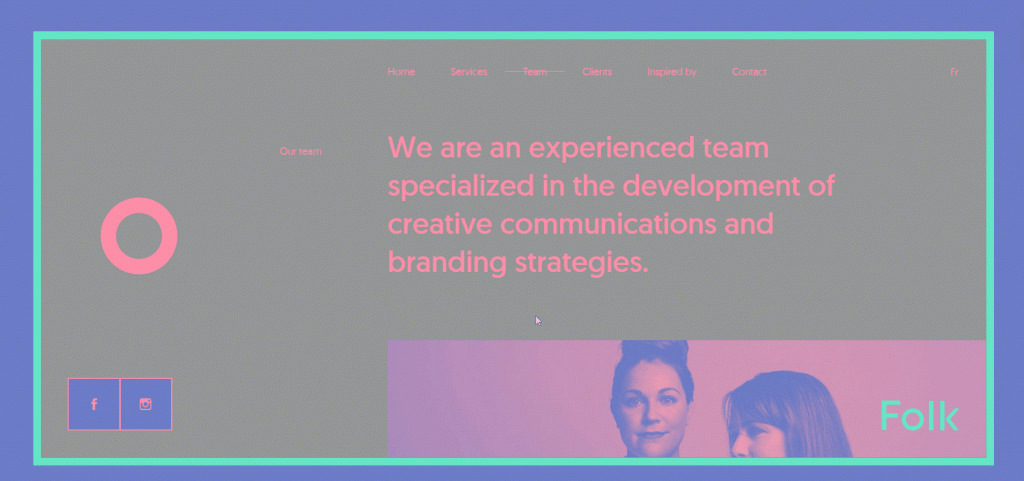
FOLK team page


The secondary web page is also interactive has multiple hierarchy of motions.

The website is design by Phoenix The Creative Studio based in Quebec. According to the website of the studio, it constitutes of a crew of 6 people. The web design requires knowledge of  HTML5, CSS3, JavaScript and OOP (object-oriented programming), the ability to work with external JS libararian, animation library and PHP7 would help too.

PHOENIX home page

Looking Outwards-01 Sophia Kim

https://video-images.vice.com/articles/599c68301cb85d42513c73f8/lede/1503422891712-1487003242956-blob.jpeg?crop=1xw%3A0.8431xh%3B0xw%2C0.0515xh&resize=2000%3A*

While studying fine arts in high school, I have always been inspired to go “above and beyond” and combine different mediums of art to amaze the viewers. Because of this inspiration, I have been intrigued by different interactive art projects that combine various art forms.

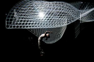
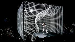
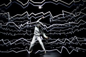
I found Adrien M and Claire B’s interactive installation, “Hakanaï,” to be very inspirational and fascinating because it combined technology, dance, and art to work in harmony, creating a hybrid of the physical and digital world. I admired how Adrien M and Claire B strayed away from the traditional form of art and made it interactive, so that the audience can have a personal experience. Also, it was very interesting that the installation was generated live and had each iteration (the performance has approximately six iterations) to be unique from one another.

Adrien M and Claire B are the creators of the installation. They invited different dancers to perform with their installation. They used video projection mapping, CGI, and sensors to depict every motion the dancer makes. Adrien and Claire created Hakanaï based on the beauty of nature. It took the creators many years to develop the software and many years of practicing with the performers.

ChristineSeo-LookingOutwards-1

Pixi is a digital organism, a light installation, by a group of artists in collective WERC, supported by a province in the Netherlands commissioned by staatsbosbeheer. Pixi is inspired by patterns in the nature, such as a flock of birds or a swarm of bees, where they react to each other and their movements, which leads the Pixi to be self sufficient and group intelligent. However, Pixi also reacts to its surroundings, so if there is a person that passes by, the lights will turn on along with the person as well. The Pixi adopts location-specific behavior: Pixies communicate wirelessly with each other, over radio waves, and has sensors that react to heat and temperature as well. The software was written in Arduino, used Fast LED lights, and battery where they only turn on at night. The battery also saves energy levels compared to other lights in the environment!

Nature plays a great role in this installation because Pixies are placed on to trees in a forest. In the piece, I thought there was a very interesting interaction between digital technology and nature. Since the society today is  very involved in technology, the environment is suffering every minute. Pixi is also very environmentally friendly, and could be carried out in the real world to save energy. So, one critique I would have is to carry this on to different areas, or even different parts of the world, not only just in one forest in Netherlands. This way, people would be more involved in the piece. In addition, this installation is not only visually pleasing, but also has a great interaction with the surrounding and people.

WERC also worked on Waterstaat 3 years ago, which was another light installation in nature that reacted to music in festivals. Although this installation was on water instead of in a forest, I believe Pixi was influenced by this older work. They were able to further their conceptual sense and make another installation that actually helped the environment and have a meaningful interaction with nature and people through technology.

Pixi – Nature aware, self-sufficient, digital organism ‘breathes’ in the forest

http://www.werccollective.com/pixi/#/
Min Jun Kim – Looking Outwards 1

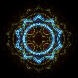
The computer generated art that inspired me would have to be fractal art. A fractal is defined to be a geometric figure or a curve that is infinitely self-similarly detailed and recursive. It is a mathematical set that when graphed or when processed on a computer can create intricate and beautiful patterns. The video that is linked above is a very good example of a fractal in action.
The reason that fractals have always intrigued me is because I’ve always imagined that life itself have been a sort of a fractal, that is infinitely intricate and recurring. When well-known people and scientists claimed that they believed in the simulation theory, I couldn’t help but think of the fractal. I truly admire that fact fractal art is a truly mathematical and naturally occurring beauty. Typically, I am not too intrigued by numbers, but the border where math meets art is a topic that has always interested me. The artwork that are displayed as images below are art that mathematicians have developed as numbers then displayed by an image processor.
Usually, these are produced by one person, and I can imagine that they have all been inspired by the original, Mandelbrot set which I believe was the first fractal to be discovered. The only thing that I would improve about the art if I could would be that these art forms are too purist, and it would be impressive if these fractals were used in more creative ways to encompass more art-forms. That would include creating fractals out of real images or incorporating fractals into other genres or types of art.

This is a fractal art that is drawn by Julian.
This is a fractal art that is designed by Kerry Mitchell.

Sources:
https://en.wikipedia.org/wiki/Fractal_art#Artists
https://en.wikipedia.org/wiki/File:Julian_fractal.jpg
http://gallery.bridgesmathart.org/exhibitions/2015-bridges-conference/lkmitch

Mimi Jiao Looking Outwards 1

Cooper Hewitt Smithsonian Design Museum’s Pen system was the first time I became actively aware of the design of the museum itself. By implementing its pen throughout the museum, it brings technology into a museum setting, and enriches and extends the overall experience.

The project was commissioned by Cooper Hewitt to implement visitor technology. Many teams, both domestic and international, including Local Projects and Sistelnetworks, were involved in the making of the pen. Designers as well as engineers, computer scientists, and manufacturers helped bring this to reality. To my knowledge, the technology used did not use much off-the-shelves software. The pen operates based on an embedded sensor that reads NFC tags throughout the museum. This technology is available the general public and is available on Android phones and many other products.

The Cooper Hewitt focuses on current and upcoming designed artifacts, with many exhibitions showcasing works that integrate technology and coding with the product/experience. By introducing this pen, that aspect of Cooper Hewitt’s identity is reinforced. In addition, it adds a playfulness to the experience, making it friendly for kids and adults alike. The part that impressed me the most about this design is that it brings power to the user and gives them the opportunity to revisit the museum remotely. Peripheral to the pen, interactive screens on tables were also implemented to push visitors to be become more hands on with design. These screens allowed people to design their own objects, giving them the freedom to manipulate form, material, context, and color. It has brought museum-going into the digital dimension, and has set a precedent for this type of experience.

For more information, visit Cooper Hewitt

Eliza Pratt – Looking Outwards 01


Limbo is a puzzle-based video game developed by a small, Denmark-based studio known as Playdead. Beginning in a dark forest without any introduction or tutorial, the game details the terrifying challenges of a young boy as he travels through “the edge of hell.” Though I rarely show interest in video games and get motion sickness from 3D animations, I fell in love with the minimalist nature of this game and its stunning 2-dimensional visuals. With eerie, film-noir style graphics and intuitive controls, Limbo has influenced both my own artistic style as well as my admiration for interactive media design.

A shot from one of the most nail-biting puzzles depicts the player attempting to survive a spider attack. The highly stylized design and lack of visible controls keeps the player fully immersed in the game.

Starting as a one-man project by concept artist Arnt Jensen in 2004, the game development expanded to a team of 16 by the time of its release in 2010. Much of the artistic direction and concepts for Limbo derived from Jensen’s admiration for the film noir genre and his desire for minimalistic controls. The absence of text, arrows, and buttons keep you fully immersed in the game and encourage the user to decipher the platform on their own. While the original designs were created using Visual Basic, the team moved to Visual Studio during the development process. After overwhelming success following the game’s release, Playdead expanded to a company of 35 programmers and designers and has released its second game, Inside, which has received even greater praise.

Sources:
Playdead
Wikipedia

Jaclyn Saik Looking Outwards 01

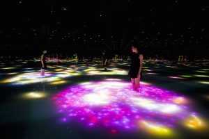
Viewers wade into a pool of moving water and watch the projection around them

I have always been drawn to interactive art that is set up to transform entire spaces and redefine the audience’s sense of reality while experiencing the installation. The Japanese company teamLab, who has created a lot of popular interactive art installations and who I’ve seen pop up periodically in my newsfeed, created an interactive koi pond display that looks very interesting and complex. The viewer first walked into a pool of calf-high moving water, surrounded by darkness and mirrors so it appears never ending, and then watches as koi fish (light projections) dart around them and change speeds, crashing into their legs and exploding into an array of flowers.

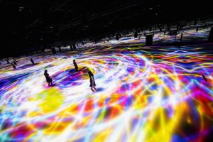
The koi fish projection changes speed. Paired with the dark setting and mirrored walls, the paths of light appear infinite.

teamLab created this installation for the “Odaiba Minna no YUME-TAIRIKU 2016” festival in Tokyo, and works as a way to celebrate Japanese culture.

What I found especially interesting about this artwork is that the technical aspects of it are all geared towards teamLab’s “Body Immersive” space idea, this philosophy of work focuses on making ” the boundaries between the viewer and the work become more abstract.” I think light projections are a clever way to do this, since playing and restricting your ability to see highlights the interaction that the user can have with the projections.

Although stylized, the koi are highly detailed.

As far as how this system operates, the creators keep most of their information to themselves. Based on my little knowledge of using computer science in interactive art, I’m guessing this system uses spacial or motion sensors to detect where people are within the space, and then run a complex that can project these schools of koi fish swirling around the users and occasionally crashing into them. I would love ot one day be part of creating artwork where the code responds to a person’s movements and actions while they do something natural (rather than directly interact with a machine).

Sharon Yang Looking Outwards – 01

The computational art project that caught my eye was on Facebook as I was scrolling through the feed. The artist Antoni Tudisco expresses humor through food made into human figures and the comical dance movements of the figure. I admire the creativity in his way of expressing humor; the sense of satisfaction and excitement engendered from eating or seeing the food is delivered. Tudisco also incorporates the trending as well as comical dance movements programmed highly realistically.

A post shared by Antoni Tudisco (@antonitudisco) on

You can also see irony in the videos in which the human figure does workout movements with the food, chicken drumsticks and such. The audience can relate to the irony in his artworks as most of us cannot resist these snacks and attempt to recover from the loss of self-control through exercising afterwards. Tudisco comically expresses this through his art pieces with amazing techniques and details in the dance movements and the images of food.

A post shared by Antoni Tudisco (@antonitudisco) on

Antoni Tudisco first got interested in photo editing as he created his own profile picture in MySpace when he was 13. He learned photo editing with Photofiltre and Gimp. At the age of 16, I established a clothing line named “Manila apparel” and sold t-shirts and hoodies with his own designs on them. He taught himself to use digital tools such as Adobe Palette as he started exploring 3D computational art.

Tudisco says his inspiration was and still is his own life. His childhood was strongly influenced by the 90’s cartoons like Ninja Turtles, Power Rangers and VoltesV and as time went on, he started to develop his own style in Illustrating.

He has many clients around the world, mostly big brands including Nike, MTV and Balenciaga. I believe the project points at a bright future for creative 3D arts and the artist Tudisco. Tudisco, being the ambitious and passionate artist that he is, wants to build his own empire and his own brands and ad agency. He encourages to other artists to be themselves to express their creativity and develop their own styles and follow their dreams.

Dani Delgado- Looking Outwards-1

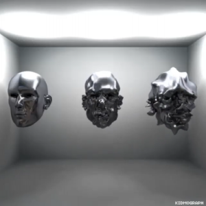
An example of Kidmograph’s work exploring motion

Gustavo Torres, also known as Kidmograph, is an Argentinian art director, motion designer and illustrator who focuses on creating interesting motion graphics using the already existing software. This artist uploads their work onto their websites and social media pages roughly every three days, leading me to believe that each graphic takes about two days or so to design.  I’m constantly inspired how Torres uses coding and animation software to create such vibrant images, especially at such a rate.

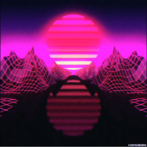
A digital landscape created by the artist Kidmograph

Many of these projects create worlds that are so surreal that they are only accessible through the digital realm, which I believe is quite the feat. As I am an artist that has primarily been exposed to traditional means, for him to be able to consistently create digital work which could not be reproduced in the physical world by any means is very admirable. His work is part of the reason why I wished to take 15-104 and start to learn at least the basics of coding.


Friendly reminder about my Skillshare class I did last year. Motion Graphics in Cinema 4D: Design an 80s-Inspired Animated GIF Link in bio January is a special month in Skillshare, and if you're willing to learn how I do most of my GIFs, you should definitely take this class. I cover the principles of building a scene in Cinema4D, then we go to AfterEffects to add some nice effects and post, and finally exporting the GIF optimized in Photoshop for social media/blogs like my Tumblr. The target is young (or not) people who wants to start doing regular content without being frustrated by the software. I did this course mostly from the side of a daily user, and lover of what I do. And I thought it would be a great opportunity to show how I do the things I do 🙂 #skillshare #course #kidmograph #retrofuture #cyberpunk #lofi #animation #design #cinema4d #aftereffects #photoshop #motiongraphics #mograph #art #newyear #gif

A post shared by Kidmograph® ‬ (@kidmograph) on

The artist started working with traditional means before moving his work to digital realm and since has worked with many large brands such as Adidas, Lolapalluza, and Paramount Pictures to create animations and graphic designs. His work was probably inspired by the psychedelic movements of the 70s and the current music scene which emphasizes originality and outlandish visuals.

While the programs he uses are not customized for him, I believe that such an artist can heavily influence the aesthetics of future designers and artists that have seen his work used by many popular companies.

https://www.kidmograph.com/