Yiran Xuan – Looking Outwards – 01

Snap Ships

Tested’ visit to Snap Ships’ Booth at MakerFaire Bay Area 2018

Though the primary focus of this video is the modular construction aspect of the ships, the most interesting component to me is the brief glimpse into the augmented-reality component. As a kid growing up with Lego, I made ships for hours on end, but they were static models so their interactivity was limited to my imagination. How great would it be to actually pilot my ship and have it interact with an environment?

Snap Ships currently seems to be only a startup looking for funding, consisting of a few guys who used CAD software, apparently Rhino, to design the components and 3D print them. The AR component looks like it may be made from Unity, which is a common starting point for game programming.

For now, the AR portion seems to be at a stage where a built model can be recognized by program through use of a special visual marker; the game can overlay the camera image of the ship with rocket flares and wing contrails. In addition, when a checkered platform is presented to the game’s camera, the game is abel to overlay a preloaded model onto it; the ship rotates with this platform that a person can hold and pick up. It is unknown whether the preloaded models can be replaced with the physically built ones.

Moving forward, the team looks to introduce more parts, such as mecha-themed components, as well as add more interactivity to the AR portion.


Victoria Reiter-Looking Outwards-01

Meandering River


Snapshot of image generated by the “Meandering River” project

Meandering River is an audio- visual installation put on display at the Funkhaus Berlin Sound Chamber between July 28 and July 30. Its designer is the Berlin-based studio for art and design onformative, which markets itself as existing at the boundary of art, design, and technology.

Meandering River features a visual presentation across multiple suspended screens, which is created in real-time as a reaction to an AI-generated audio soundscape. Berlin music group kling klang klong is credited with the initial inspiration of the music, by recording their interpretation of a soundscape inspired by the natural flow of a river. However, the soundscape utilized in the installation is actually composed by a computer, which used machine learning algorithms to “‘look’ not at the visuals but the raw data behind the visualization.” The main goal of onformative’s installation is to “create a ‘unique awareness of time,’ drawing us into what the studio describes as an ‘intense emotional journey’ that reminds us of nature’s beauty, its complexity, and capacity for slow, but dramatic change.”

What I find interesting about this project is how it seems to use technology to subvert the traditional understanding of what technology itself is. Technology is often seen as cold, unfeeling, artificial, and fast-paced, so to use it for the purpose of reflecting something emotional, natural, and slow, makes viewers rethink how technology can be purposed.

Little preview of the Meandering River soundscape and how it was created. Like the creation of the simulated river movement also the sound is created in an unusual and unpredictable way. We teamed up with @theklongs to create an A.I. driven soundscape. Using Machine Learning a computer was tought to compose. How? They invited different real piano players to improvise to the river visualisation. This material was used to teach a machine to create its own interpretation of the piece. The machine takes what it has learnt via Machine Learning algorithms and improvises by “looking” not at the visuals but the raw data behind the visualization. The result is 6 different machine composed pieces generated by klingklangklong, the machine and the river. #meanderingriver #river #digitalart #code #generative #machinelearning #soundofrivers #berlinevents #soundart #soundinstallations #artificialintelligence #theklongs2018 #funkhausberlin #nature

A post shared by onformative (@onformative) on

AI-generated soundscape for Meandering River

Link to a full description of the project and omformative’s website embedded above. Link to the Facebook event page here.

.

Elena-Deng-Looking-Outwards-01

One project that I find inspirational is Google’s Tilt Brush. I find it amazing that with all the technology of today, we are able to combine VR and fine arts in a new and innovative way. The project itself was developed by Skillman and Hackett, a rapid prototyping company in San Francisco. The project began in 2014 and since then it continually been in development. To the best of my knowledge, the creators of the product used preexisting headsets and handheld controllers, however the program was revamped and the two tracking sensors could allow you to paint or draw anywhere within the room.

The creators may have been inspired by artists and sculptors who bend the conventions of painting and 3D work. The future of the Tilt Brush, I believe, will be determined in what direction the users want the product to go in. As the technology improves, the Tilt Brush will become more responsive as well as lighter in physical form.

Vicky Zhou-Looking Outwards-01

Cooper Hewitt Interactive Pen

Cooper Hewitt Smithsonian Museum of Design, located in New York, New York, has an interactive pen component experience. This interactive pen allows the user to engage with certain exhibits, manipulate objects across interactive screens, and save exhibits that users find interesting and want to revisit later over time.

I personally had the pleasure of visiting the Cooper Hewitt with my friend this past summer, and was incredibly inspired by the uniquely engaging atmosphere. Unlike conventional museums where the most interactive component is an audio device that guides you around the exhibits, Cooper Hewitt’s interactive pen allows you to interact with certain exhibit pieces, create drawings and patterns on touch screen surfaces, and curate a collection of exhibits that a visitor finds particularly engaging and wishes to revisit over time.

The original origin of the Cooper Hewitt pen originated from Local Projects working with Diller Scofidio + Renfro, and then later expanded upon by the Cooper Hewitt team. This project allows not only future museums, but other areas of entertainment, such as theaters and amusement parks, to adopt and select certain points of the Cooper Hewitt pen that most engage users and apply it to their own respective businesses and environments.

Tanvi Harkare – Looking Outwards – 01

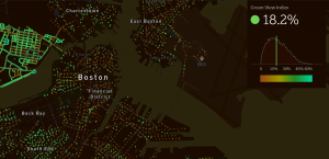
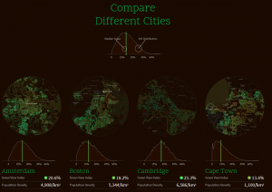
A computational project that I found interesting is Treepedia, an interactive map that shows you the green canopy areas created by trees and other greenery in many cities around the world. It was created by the Senseable City Lab at MIT, consisting of 5 individuals, and is completely open-source. They have also partnered with World Economic Forum and Global Shapers Community to help bring awareness for their project. For this map to work, the Senseable City Lab created “Green View Index”, which uses Google Street Views instead of satellite images to compare green canopy coverage in different cities. Their hope is to bring a better understanding of all the climate issues Earth is going through currently, such as global warming and air pollution. Additionally, users along with local authorities will hopefully help act and bring more green landscape into major cities. Users can also compare cities side by side and see how much green canopy space they have versus another city. Although it is not available in Pittsburgh yet, some cities that are currently available include Los Angeles, Boston, NY, plus 24 other major cities. In the future, the Senseable City Lab wants to expand their map to cover more places across the globe.

Map of green canopy space in Boston, MA

I find this project interesting because of the way that they approach the issue of not having enough trees in cities to help fight environmental issues. It’s something different that I personally haven’t seen anywhere else before; an easy to understand map that conveys all the information it needs to. One of my favorite aspects of the project are the comparisons between all the different cities. This seems like a very efficient way for cities to know how well their initiatives to create more green canopy spaces are working, if any further action was to be taken. The more cities that are represented on this interactive map, I believe the more successful this project will be in the future.

Comparison of green canopy space between 4 cities

Visit the Treepedia website here.


Jennifer Kong-LookingOutwards-01

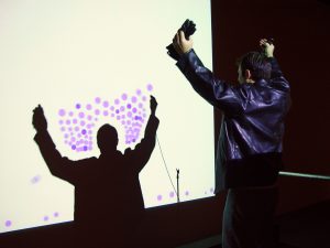
Demo of the Manual Input Workstation (2004) by Golan Levin and Zachary Lieberman

The Manual Input Workstation was made by artists, Golan Levin and Zachary Lieberman, in 2004. The time it took to complete this project can’t be determined. The project is interactive through hand movements that creates shapes with an analog projector and a video projector. There was a custom made program. They were inspired by another collaboration they did in 2003, Messa di Voce, which was an interactive art installation where audio was interpreted into interactive visual feedback. Messa di Voce was the inverse of Manual Input Workstation. Messa di Voce used audio to create visuals and Manual Input Station used visuals to create audio. In some ways, Manual Input Workstation was a precursor to virtual reality. It blended the line of virtual space and ‘real’ space.

Messa di Voce (2003) by Golan Levin and Zachary Lieberman, a similar project

I personally really loved this project because of how whimsical it is. Interactive installations were one of my favorite genres because it invited everyday people to engage with art and they did just that. I was amazed by the capability and complexity of code in 2004. I can imagine the top down design but have no idea how to implement it! These two aspects make the project admirable.


Sources: Official Website for Project

Documentation for Project by Golan Levin

Xiaoying Meng-LookingOutwards-1

(The ABC of Architects: a list of the most important architects and their buildings)

The ABC of Architects is a motion graphic video introducing some of the most famous architects and their iconic buildings in an alphabetical order. It was created by Andrea Stinga and Federico Gonzalez. The creators did a good job trying to include architects/architecture from countries around the world. They also have other architectural videos and graphics on OMBU Architecture, such as this one about Pritzker winners. I find the ABC of Architects intriguing and informative. The motion graphics simplify the forms and represent the characteristics of the architectures very well, making it easier for people to remember the buildings. The graphics move according to the music. This feature can better engage the audience and make the video more interesting. My only complaint with this feature is that sometimes the graphics move too fast. It might be difficult for people to follow. I think the same type of motion graphics can be used to create educational videos about building constructions and design ideas.

Jenni Lee – Looking Outwards – 01

Demo of VR automative design

Seymourpowell’s virtual reality tool for automative design enables designers in different locations to collaboratively participate in design projects. It acts as an augmented reality 3D drawing modelling tool for full-sized sketches of automobiles. Collaborators are able to dial into the project through a VR headset, the 3D sketch then projecting in front of them, allowing them to fully experience the design.

I admire this project, as not only will this tool allow for efficient virtual collaboration and advanced sketching features, but it will open paths for future designers by allowing them to understand how their car designs will exist in physical environments in various conditions. As I’m interested in products that intersect art and technology, this virtual reality tool is especially intriguing to me because it will be used across engineering, marketing, and design fields.

Jenny Hu — Looking Outwards 01

Slow Games by Ishac Bertran is one object of a series that reflects on people’s use of technology. It is a game based on classic moves in video games, but with a reduced frequency to one move a day. The technology and program used are unclear.

The slow speed to the game is the main differentiating factor for me. Instead of fast-paced and reactive choices, the game tests patience and memory coordination. It is a project that uses technology and computation to create a direct contrast of our main technological framework today.  It points to a different future where the value of technology takes a very different tone.

The full project page can be found here. 


Alice Fang-LookingOutwards-1

Demonstration of Sandbox AR

This augmented reality sandbox, developed by a team at UC Davis, is an interactive topographical map that changes based on the shape of the real sand in the sandbox. Elevation, water, and contour lines are projected in real time as the sand shifts and changes. I think this project is great from a design standpoint in bringing physical interaction with the augmented reality as a tool for education. Users can change topography with their own hands, and the projection provides a deeper understanding into the unique landscape, as well as simulate water flow into the valleys and surfaces created. I think it would be interesting to consider how the project would integrate in exhibition, for example if it were displayed at the Carnegie Museum of Natural History.

To the best of my knowledge, the team developed custom software, which is available free to download, for anyone who wants to build their own sandbox AR(!). I’ve also seen a few videos of science teachers unaffiliated with UC Davis who built the sandbox AR for their own classrooms, and I think having an open source for something like this is a great resource to educators, but also people who are interested in AR.

Oliver Kreylos, UC Davis