Carley Johnson Looking Outward 02- Section E

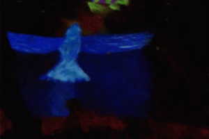
I was inspired by Herbert W Franke’s 1989 gallery entitled Homage A E.M. The thing that really got me inspired about this work was it’s blend of physical and digital. The series is based on real-time ballet movements, and then distorted and saturated for effect. I love when artists are inspired by the movement of the body, and blending dance and software had to be a particularly difficult challenge.

What’s exciting about this art is that it develops the primitive motion-capture software first developed by Eadweard Muybridge (whom Franke dedicated the gallery to). The performance involved both a live performer and a live software engineer, as he was motion-capturing the dancer and painting an electronic mirror image live on screen. This function reminds me of the “painting”-like command we learned in p5.js, where the computer continually draws a shape at a certain speed, following your mouse and leaving a trail.

Hommage à E.M.- 1989 by Herbert W. Franke.

Susie Lee – Looking Outwards- 01

A few years ago, a classmate of mine created this project that took the words of individuals and compiled them into a book. Called “Something Kind” by Marisa Lu, she collected the responses of Amazon Turk workers when asked to “write about something unexpectedly nice that someone did” for them. In order to highlight and inspire readers to take action, the book emphasizes the action words in the stories, highlighting a greater focus of “go & do”. The project utilized human computation through Amazon Mechanical Turk, several short programs in Processing, and Basil.js. I was really impressed and inspired by this project because how humanistic the approach was even thought it was one focused on computation. I also appreciated the small design details such as the heart form in the corner and sides of the book! In the post about the project, she mentioned how Maeda @ media was one of her inspirations during this project! This project really points out the opportunity of mixing in human emotion and responses to something that is generally more considered mechanical/ robotic. It is possible to mix in interaction with computation and I am excited to explore that!

Lumar-BookOfKindness


Something Kind
Marisa Lu

Christine Chen- Looking Outwards-01

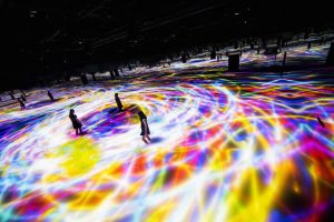
Above provides a quick glance of one of teamLab’s exhibitions in Tokyo
Source: Creators-TeamLab; Exhibition-TeamLab Planets TOKYO  https://www.youtube.com/watch?v=4UDi_2C04UY

TeamLab is a Japanese design and software collective.  The group consists of small group of around 30 various professionals, such as programmers, architects, engineers, artists, etc., from different fields who collaborate with each other to create forms that join art, science, nature, and technology together.  Creating the project required the group to write computer programs for digital creation and software applications that simulates forms of natures, such as waves. These digital creations are also interactive and reacts to people’s movements. The creators were motivated to create forms that go beyond the boundaries that divides up the nature and the artificial. Through this, they created a successful “first word art.”

What fascinates me most is how well teamLab portrays a “borderless world.” They show how digital forms dissolve the lines between technology and nature. Another boundary that was removed was the one between the artwork and the audiences as the installation pieces were interactive. While I was at the exhibition, I was astonished at how the simulated sounds, visual forms, and interactions made me feel as if I was standing among a natural environment. In there, nature and technology merged into one through the world created with teamLab’s creative output and exist harmoniously with each other.


Eunice Choe – Looking Outwards-01

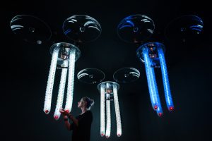
An interactive art installation that interested me was Petting Zoo by the architecture and design firm Minimaforms. This installation mimics the lifelike interactions animals have with humans through tubelike robots that hang from the ceiling. These robots have several sensors that can detect sounds, gestures, and touch that can encourage the robots to learn behaviors and personalities that evolve over time. For instance, the more a human interacts with the animal robot, the more it can become attached to the human.

I admire this project because I find it fascinating how the designers were able to capture complex human and animal emotions through artificial intelligence and robots. However, I find the idea of robots being able to evolve and develop emotions unnerving, and it makes me question the interactions humans and robots may have in the future. This installation was developed over several years by the two cofounders of Minimaforms, three designers, and eleven assistants. The designers utilized Kinect sensors to detect multiple people within the environment. In addition, the designers used Processing, which is a language that can make the robots coordinate with one another and allow for interactions with multiple people. Petting Zoo was inspired by The Senster by Edward Ihnatowicz, which was the first robotic sculpture. The designers also pulled inspiration from the work of Gordon Pask and Walter Grey Walter. This project’s ability to empathize with humans and animals show the potential of their interactions in the future. This project is one example of the development of artificial intelligence and how it contributes to creating a more futuristic society.

Jaclyn Saik Looking Outwards 01

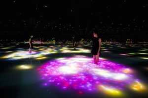
Viewers wade into a pool of moving water and watch the projection around them

I have always been drawn to interactive art that is set up to transform entire spaces and redefine the audience’s sense of reality while experiencing the installation. The Japanese company teamLab, who has created a lot of popular interactive art installations and who I’ve seen pop up periodically in my newsfeed, created an interactive koi pond display that looks very interesting and complex. The viewer first walked into a pool of calf-high moving water, surrounded by darkness and mirrors so it appears never ending, and then watches as koi fish (light projections) dart around them and change speeds, crashing into their legs and exploding into an array of flowers.

The koi fish projection changes speed. Paired with the dark setting and mirrored walls, the paths of light appear infinite.

teamLab created this installation for the “Odaiba Minna no YUME-TAIRIKU 2016” festival in Tokyo, and works as a way to celebrate Japanese culture.

What I found especially interesting about this artwork is that the technical aspects of it are all geared towards teamLab’s “Body Immersive” space idea, this philosophy of work focuses on making ” the boundaries between the viewer and the work become more abstract.” I think light projections are a clever way to do this, since playing and restricting your ability to see highlights the interaction that the user can have with the projections.

Although stylized, the koi are highly detailed.

As far as how this system operates, the creators keep most of their information to themselves. Based on my little knowledge of using computer science in interactive art, I’m guessing this system uses spacial or motion sensors to detect where people are within the space, and then run a complex that can project these schools of koi fish swirling around the users and occasionally crashing into them. I would love ot one day be part of creating artwork where the code responds to a person’s movements and actions while they do something natural (rather than directly interact with a machine).

Christine Chen-Project-01-Face

Christine Chen-Project-01-Face

/* 
Christine Chen
Section E
cyc1@andrew.cmu.edu
Project-01-Face
*/

function setup() {
    createCanvas(600, 500);
    background(172, 199, 250);
    noStroke();
    smooth();

    //dark brown hair
    var b=color(73, 48, 33); 
    fill(b);
    ellipse(300, 250, 350, 410);

    //neck
    var n=color(241, 192, 156);
    fill(n);
    rect (250, 260, 100, 100);

    //ears
    fill(n);
    ellipse(185, 220, 40, 60);
    ellipse(415, 220, 40, 60);

    //face
    var f=color(253, 211, 181); 
    fill(f);
    ellipse(300, 200, 240, 250);

    //bangs
    fill(b);
    triangle(370, 70, 220, 90, 130, 250);
    ellipse(270, 80, 110, 20);
    triangle(300, 70, 390, 90, 450, 250);

    //brows
    fill(b);
    ellipse(245, 190, 40, 20);
    ellipse(345, 190, 40, 20);
    fill(f);
    ellipse(245, 195, 40, 20);
    ellipse(345, 195, 40, 20);

    //blush
    fill(254, 158, 158);
    ellipse(230, 260, 45, 45);
    ellipse(370, 260, 45, 45);

    //eyes
    fill(40, 40, 40);
    ellipse(255, 220, 20, 20);
    ellipse(345, 220, 20, 20);

    //pupil
    fill(255, 255, 255);
    ellipse(260, 220, 5, 5);
    ellipse(350, 220, 5, 5);

    //nose
    fill(n);
    ellipse(300, 230, 20, 30);

    //lips
    fill(253, 125, 125);
    ellipse(300, 280, 50, 40);
    ellipseMode(CENTER);
    fill(f);
    ellipse(300, 265, 60, 20);

    //shirt
    rectMode(CENTER);
    fill(199, 88, 88);
    rect(300, 480, 220, 270, 60);

    //flower petals
    fill(255, 204, 67);
    ellipse(232, 150, 20, 20); //bottom right petal
    ellipse(215, 150, 20, 20); //bottom left
    ellipse(223.5, 125, 20, 20); //top center
    ellipse(208, 134, 20, 20); //top left
    ellipse(239, 134, 20, 20); //top right

    //flower center
    fill(227, 67, 67);
    ellipse(224, 140, 20, 20); 
    //
}

This is my very first project for this class. Throughout the process of creating the self portrait, I experimented with utilizing various simple geometric shapes to resemble face features. While I haven’t started learning about writing the codes for more complex shapes that may perhaps show some particular feature better, I realized that I could create more complex shapes by layering simpler shapes together! Overall, I enjoyed creating this piece as it fascinates me how codes can be used to control colors and shapes to create aesthetic images!

Self Portrait: Jaclyn Saik

For my self portrait, I wanted to play with the simple shape tools I understood in this program to create shadows, so that I could block out more of the details on my face in an interesting way (as opposed to outlining them with the stoke). When creating this, I learned that the program runs a lot like a physical canvas in the sense that everything is layered on top of each other. It reminds me of painting, since objects/shapes that I want in front of everything else come last in the code and I have to direct which color each one is, even if that color has been used previously in the artwork.

Self Portrait work

function setup() {
    createCanvas(620, 620);
    background(86, 116, 159);
    //text("p5.min.js vers 0.7.1 test.", 10, 15);
}

function draw() {
    //colors 
    s = color(253, 217, 147)
    l = color(255, 242, 216)
    d = color(233, 180, 90)
    g = color(98, 187, 70)

    fill(s);
    noStroke();
    ellipse(443, 251, 724, 785)
    
    fill(l)
    rect(336, -70, 352, 697)
    triangle(244, 425, 336, 207, 336, 425)
   
    fill(s);
    triangle(336, 425, 344, 380, 391, 425)

    fill(d);
    triangle(224, 314, 260, 341, 285, 292)

    //eye-01
    fill(d)
    ellipse(196, 256, 168, 98)
    fill(255)
    ellipse(205, 251, 168, 98)
    fill(g)
    ellipse(239, 244, 73, 73)

    //eye-02
    fill(d)
    ellipse(473, 256, 168, 98)
    fill(255)
    ellipse(482, 251, 168, 98)
    fill(0, 0, 114)
    ellipse(529, 244, 40, 40)

    //eyelids
    fill(s)
    rect(121, 184, 193, 46)
    fill(l)
    rect(391, 184, 193, 46)


    //eyebrow
    fill(s);
    triangle(336, 204, 467, 158, 596, 195)

    //lips
    fill(137, 183, 226)
    triangle(262, 499, 336, 466, 336, 500)
    fill(182, 215, 241)
    triangle(336, 466, 336, 500, 438, 500)
    fill(86, 116, 159)
    triangle(262, 499, 336, 543, 336, 500)
    fill(114, 155, 204)
    triangle(336, 500, 336, 543, 438, 500)


}

Dani Delgado- Looking Outwards-1

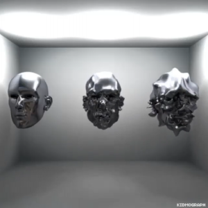
An example of Kidmograph’s work exploring motion

Gustavo Torres, also known as Kidmograph, is an Argentinian art director, motion designer and illustrator who focuses on creating interesting motion graphics using the already existing software. This artist uploads their work onto their websites and social media pages roughly every three days, leading me to believe that each graphic takes about two days or so to design.  I’m constantly inspired how Torres uses coding and animation software to create such vibrant images, especially at such a rate.

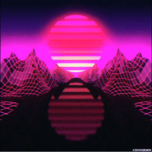
A digital landscape created by the artist Kidmograph

Many of these projects create worlds that are so surreal that they are only accessible through the digital realm, which I believe is quite the feat. As I am an artist that has primarily been exposed to traditional means, for him to be able to consistently create digital work which could not be reproduced in the physical world by any means is very admirable. His work is part of the reason why I wished to take 15-104 and start to learn at least the basics of coding.


Friendly reminder about my Skillshare class I did last year. Motion Graphics in Cinema 4D: Design an 80s-Inspired Animated GIF Link in bio January is a special month in Skillshare, and if you're willing to learn how I do most of my GIFs, you should definitely take this class. I cover the principles of building a scene in Cinema4D, then we go to AfterEffects to add some nice effects and post, and finally exporting the GIF optimized in Photoshop for social media/blogs like my Tumblr. The target is young (or not) people who wants to start doing regular content without being frustrated by the software. I did this course mostly from the side of a daily user, and lover of what I do. And I thought it would be a great opportunity to show how I do the things I do 🙂 #skillshare #course #kidmograph #retrofuture #cyberpunk #lofi #animation #design #cinema4d #aftereffects #photoshop #motiongraphics #mograph #art #newyear #gif

A post shared by Kidmograph® ‬ (@kidmograph) on

The artist started working with traditional means before moving his work to digital realm and since has worked with many large brands such as Adidas, Lolapalluza, and Paramount Pictures to create animations and graphic designs. His work was probably inspired by the psychedelic movements of the 70s and the current music scene which emphasizes originality and outlandish visuals.

While the programs he uses are not customized for him, I believe that such an artist can heavily influence the aesthetics of future designers and artists that have seen his work used by many popular companies.

https://www.kidmograph.com/

Jenna Kim(Jeeyoon Kim)- Looking Outwards- 1

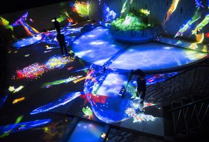
‘graffiti nature – living in the ruins of a bathhouse’: flowers grow as the visitors walk through the bathhouse

“for thousands of years, people have looked for meaning in the relationship between humans and nature. both exist in an eternal cycle of life and death, ever-evolving with the trials and tribulations of time. throughout history, humanity has caused immense damage to nature, yet has similarly been devastated by it, too. the connection is complex, multi-faceted and of great magnitude to teamlab’s core thinking.” https://www.designboom.com/art/teamlab-mifuneyama-where-gods-live-shiseido-saga-japan-07-24-2017/


(Drawing on the water surface created by the dance of koi and boats: one of the 14 installations by teamLab)

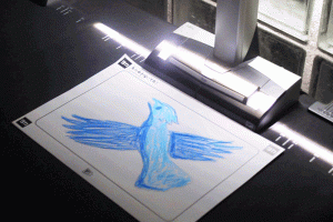
Visitors’ coloring pictures are scanned
Colored pictures applied to the installation.

“A forest where gods live”, by teamLab, is a project in which it transformed a 500,000 square meter garden located in Japan into a grandiose digital art exhibition. It shows 14 artworks, and these designers soften the sharp boundary between nature and manmade. These digital interventions are part of an open air museum where people can interact with nature and also look at the beautiful design. One part of this project that I really liked was the visitor interaction; visitors can color the pictures of the animals or flowers, scan these, and put these colored pictures in the actual installation. This project really inspired me to be interested in media design because I was mesmerized by this design that represented nature in a digital intervention without harming the nature; maybe, I want to be part of this team to continue a project similar to this in the future. The thought that continuity of life and death existing in the nature like the forest, rocks, and animals influenced teamLab to apply digital art to the forest park. teamLab did several similar projects related to nature before “A forest where gods live”. This is a team that collects different professionals in the digital art world. Artists, engineers, mathematicians, graphic designers, and many more people are brought together to create art that is jaw dropping. For this project, it used “project mapping”, which is alike to video mapping and augmented reality, and light and sound technologies. Project mapping, unlike simple projection of a screen, is a display of 3D objects on interactive displays. I have to say that the project is flawless because it accomplished the goal, to create digital art that is not harmful to nature, successfully through just simple projection of digital art, music, and light on to the nature itself.

Dani Delgado Face

Project01Dani

/*Dani Delgado
Section E
ddelgad1@andrew.cmu.edu
Project_01_Face
*/

function setup() {
    createCanvas(500, 600);
    background(197, 202, 233);
   }

function draw() {
	//hair
	noStroke();
	fill(93, 64, 55);
	rect(115, 130, 250, 350, 90, 90, 0, 0);

	//curls
	arc(125, 220, 55, 70, 1.52, 4.712, PI, OPEN);
	arc(120, 280, 60, 70, 1.52, 4.712, PI, OPEN);
	arc(115, 345, 65, 75, 1.52, 4.712, PI, OPEN);
	arc(115, 415, 85, 80, 1.52, 4.712, PI, OPEN);

	arc(355, 220, 55, 70, 4.712, 1.52, PI, OPEN);
	arc(360, 280, 60, 70, 4.712, 1.52, PI, OPEN);
	arc(365, 345, 65, 75, 4.712, 1.6, PI, OPEN);
	arc(365, 415, 85, 80, 4.712, 1.6, PI, OPEN);

	arc(255, 137, 105, 80, 3.14, 0, PI, OPEN);
	arc(190, 140, 50, 50, 3.14, 0, PI, OPEN);

	arc(325, 168, 70, 70, 3.75, 7, PI, OPEN);
	arc(150, 165, 60, 60, 2, 5.6, PI, OPEN);

	//body
	noStroke();
	fill(158, 158, 158);
	rect(85, 430, 315, 170, 95, 95, 0, 0);

	fill(120, 110, 100);
	rect(145, 525, 15, 85, 20, 0, 0, 0);
	rect(335, 525, 15, 85, 0, 20, 0, 0);

	//face
	fill(185, 125, 90);
	noStroke();
	rect(210, 390, 60, 70, 0, 0, 80, 80);

	fill(265, 205, 155);
	rect(140, 150, 200, 250, 90);
	rect(215, 410, 55, 50, 90, 10, 80, 80);
	
	//ears
	arc(141, 300, 45, 60, 1.52, 4.712, PI, OPEN);
	arc(340, 300, 45, 60, 4.7, 1.65, PI, OPEN);

	fill(255, 160, 140);
	arc(141, 298, 28, 32, 1.52, 4.712, PI, OPEN);
	arc(340, 298, 28, 32, 4.7, 1.65, PI, OPEN);

	//mouth
	fill(50, 20, 30);
	arc(240, 335, 55, 65, 6.28, 3.14, PI, OPEN);

	fill(249,249,249);
	rect(212.5, 335, 55, 8, 0, 0, 35, 35);

	//nose, eyes, earrings
	fill(255, 160, 140);
	rect(230, 255, 20, 60, 90, 90, 5, 5);

	fill(70, 40, 38);
	ellipse(190, 260, 29, 29);
	ellipse(290, 260, 29, 29);

	fill(255, 171, 64);
	ellipse(129, 317, 9, 9);
	rect(134, 322, 5, 13, 10);
	ellipse(352, 317, 9, 9);
	rect(340, 322, 5, 13, 10);

	fill(225, 245, 254);
	ellipse(124, 307, 7, 7);
	ellipse(357, 307, 7, 7,);

	fill(250, 250, 250)
	ellipse(186, 265, 10, 10);
	ellipse(286, 265, 10, 10);

	noFill();
	stroke(90, 60, 50);
	strokeWeight(6);
	arc(186, 234, 40, 10, 3.24, 6, PI, OPEN);
	arc(292, 234, 40, 10, 3.24, 6, PI, OPEN);

	//bangs or front hair
	noStroke();
	fill(93, 64, 55);
	arc(300, 140, 200, 170, 1, PI, OPEN);
	rect(215, 140, 120, 50, 90);
	rect(295, 180, 50, 30, 90);

}

The process of creating this self portrait was an interesting experience as I have not had much prior experience with coding. However, I wanted to push myself by researching how to use arcs and other simple, but more complex shapes and then incorporating them into my work. The process was a bit long and unfamiliar, but fun nonetheless.