Caroline Song – Project 02 – Variable Face

sketch

/*  Caroline Song
    Section E
    chsong@andrew.cmu.edu
    Assignment-02 */


var eyeSize = 25
var faceWidth = 50
var faceHeight = 50
var pupilSize = 20
var noseSize = 50
var mouth = 30
var bodyHeight = 250
var bodyWidth = 250

function setup (){
    createCanvas(640, 480);
}

function draw(){
    background(134, 227, 219);

    //face shape
    noStroke(0); 
    fill(254, 217, 255);
    ellipse(width/2, height/2, faceWidth*4, faceHeight*5);

    //eyes
    fill(250);
    var eyeLX = width/2 - faceWidth*0.75;
    var eyeRX = width/2 + faceWidth*0.75;
    ellipse(eyeLX, height/2, eyeSize*3, eyeSize*3);
    ellipse(eyeRX, height/2, eyeSize*3, eyeSize*3);

    //pupils
    fill(0);
    var pupilLX = width/2 - faceWidth*0.75;
    var pupilRX = width/2 + faceWidth*0.75;
    ellipse(pupilLX, height/2, pupilSize, pupilSize);
    ellipse(pupilRX, height/2, pupilSize, pupilSize);

    //nose
    fill(214, 0, 0);
    ellipse(width/2, height/2 + faceHeight*0.65, noseSize, noseSize);

    //mouth
    fill(245, 135, 170);
    arc(width/2, height/2 + faceHeight*1.5, mouth*2, mouth, 0, PI);

    //body
    fill(255, 243, 168);
    var faceH = faceHeight*5
    ellipse(width/2, height/2 + faceH/2 + bodyHeight/2, bodyWidth, bodyHeight);
}

    function mousePressed() {
    eyeSize = random(25, 50);
    faceWidth = random(50, 75);
    faceHeight = random(50, 75);
    mouth = random(60, 85);
    bodyHeight = random(250, 400);
    bodyWidth = random(250, 400);
}

This project was interesting in terms of using variables and math to find the coordinates to my shapes, as opposed to using Illustrator and/or Photoshop to do it for me. At first, I found this project to be challenging, but as I kept adding more objects to the face, I started to understand and familiarize myself with the process of creating this variable face.

Caroline Song – Looking Outwards-02

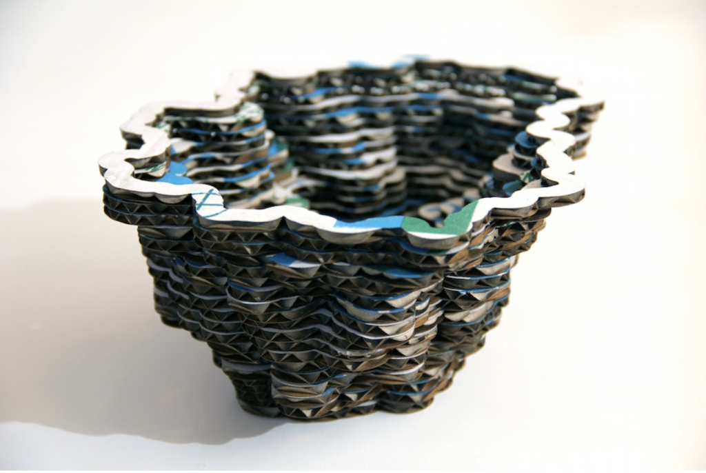
Mitchell Whitelaw specializes in creating generative systems, as well as data-aesthetics. This specific project called Local Colour (made in June 2011), is made out of recycled vegetable boxes, that are both laser-cut and laminated into bowl forms such as the one below. After that, there is a network diagram graphic that is mounted onto the bowls by using a second generative process.

Local Colour, made out of vegetable boxes that have been laser-cut.

I find this project to be interesting because of its use of recycled vegetable boxes to create a bowl, which then showcases a network diagram. Network diagrams can visualize data from places such as social networks, biological systems, and etc. The network diagram being on a bowl is the part that intrigues me because this bridges together the scientific data that network diagrams have, with the artistic form it takes in the shape of a bowl.

I do not know much about the algorithm that generated the work, but I suppose that it took into account the specific curves and edges of the bowl in order to properly infuse the graphic into the form. I also suppose that the algorithm had to somehow take numerical data and translate it into a visual form in order to incorporate it into the bowl.

Whitelaw’s artistic sensibilities are shown in this algorithm very clearly. As I stated above, his algorithm had to take this precise, scientific data and turn it into a graphic that could be presented visually on the laser-cut vegetable boxes. The fact that the data had to go from numbers to graphics alone shows Whitelaw’s artistic side.

Caroline Song – Project 01-Face

sketch

/* Caroline Song
    chsong@andrew.cmu.edu
    Section E
    Assignment 1
    */

function setup (){
    createCanvas(600,600);
    background(220);
}

function draw(){
    background(235,194,237); // background lilac
    //hair
    fill("black");
    rect(185,210,230,250); 
    ellipse(300,210,232,250);

    //face and body
    fill(255, 219, 172); // skin tone color
    rect(253,350,90,45); // neck
    ellipse(300,250,205,250); // face
    
    //shirt
    fill(135,206,250); // makes cardigan blue
    quad(165,396, 435, 396, 550, 600, 50, 600);
    fill("white");
    rect(200,395.5,200,254); // shirt

    //eyes
    ellipse(350,250,55,40); //eyes
    ellipse(250,250,55,40);
    fill("black");
    ellipse(350,255,30,30); // pupils
    ellipse(250,255,30,30);
    fill("white")
    ellipse(350,260,10,10); //pupils highlight
    ellipse(250,260,10,10);

    //eyebrows
    fill("black")
    rect(320,210,55,5);
    rect(220,210,55,5);

    //nose
    fill(241, 194, 125);
    triangle(287, 300, 300, 275, 312, 300);

    //mouth
    ellipse(300,335,30,15);

}

The hardest part of the assignment for me was realizing that I would not be able to make the self-portrait as detailed as I would like, simply because I do not have the tools or the means yet to do so. However, this first project was very interesting in terms of being able to see what I was able to create with my limited knowledge.

Caroline Song Looking Outward – 01

An interactive piece of design that has recently been an inspiration of mine is a website called Work Responsibly by Ales Nesetril. It has a very simplistic approach, as well as a calming color scheme (light grays and greens). Because the website is dedicated to helping young adults find a responsible and balanced lifestyle/mindset regarding their job, the peaceful sensation the site seems to give off makes sense.

A sample page from Work Responsibly. Here, you see the subtle color scheme of the website that I had mentioned above, as well as the minimalist approach I had also previously described. Link: https://www.workresponsibly.org/

Regarding Work Responsibly itself, this website is a compilation of mental resources, organized by what each person is specifically struggling in, in order to live the most productive and healthy work/life-style.

A collection of resources for sleep deprivation. The placing of the articles in an unconventional grid format is intriguing and allows the eye to be drawn to other resources more than others, which seems purposeful. Link: https://www.workresponsibly.org/sleep

One of my favorite parts of this website are the sliding effects that take place as I navigate the website. This is such a smooth transition that nothing takes me aback as new information glides across the screen in a manner that allows me not to feel stressed at all, even as a great deal of material is being presented to me.

As I mentioned before, this website was created by one person in the start of 2019 (however, Nesetril did mention his willingness to expand in collaboration with other designers). Therefore, this piece of interactive design is very new, which the author acknowledges by saying that this is currently a design that is in process and is always growing.

Using WebFlow to create this website (commercial software), Nesetril’s website design has potential to grow into a reliable mental health resource for those in the workforce. Especially since mental health is a prominent issue today, this website seems to have been created at the right time for it to increase in noticeability.