Sewon Park LO-1

“Before and after” pictures from ASAP Rocky’s “Yamborghini High” highlighting the effects of visual tools throughout the film.

Many hip-hop artists have been attempting to emphasize the importance of aesthetics to promote their music. As such, qualities of album covers, concert posters, and music videos have been improving. One piece of such artwork that I have been heavily inspired by is the music video of “Yamborghini High” by ASAP Rocky. 

The music video is characterized by extensive datamoshing that goes in sync with various auditory components of the song. I enjoyed this video because of the skillful use of digital tools used to bring out pre-existing colors such as coloring the sky pink to match the pink lamborghinis featured in the video. Furthermore, I liked the synergy drawn from the combination of both music and visual art. The use of aggressive datamoshing at highlights of the song such as the beat dropping or the chorus was groundbreaking.

Overall, I enjoyed this project for its visual creativity and contributing to the future of convergence between music and visual art.

The video was directed by Shomi Patwary with the help of Robert Simmons (Compositer, colorist, and main visual effects artists), and Unkle Luc (Graphics Artist). They mainly utilized Adobe After Effects, Mocha Pro, and Boujou. Shomi stated that his old digital novel, “Alfa Arkiv” inspired use of visual tools in the video.

Link: https://airship.nyc/projects/yambo.html

Emily Stark- Looking Outwards 01

Think about an interactive and/or computational project (from anywhere, by anyone except yourself) that you knew about before starting this course, and which you find inspirational. In a blog post of about 100-200 words,

Please discuss the project. What do you admire about it, and why do you admire these aspects of it?

  • How many people were involved in making it, and how did they organize themselves to achieve it? (Any idea how long it took her/him/them to create it?
  • To the best of your knowledge, did creating this project require the development of custom software/scripts, or did the authors create the project using “off-the-shelf” (commercial) software?
  • What prior works might the project’s creators have been inspired by?
  • To what opportunities or futures does the project point, if any?
  • Provide a link (if possible) to the work, and a full author and title reference.
  • Embed an image and a YouTube/Vimeo video of the project. All images and videos should include a caption, e.g .”Computer-generated image titled X by Artist Y”, or “Video documentary on the process used by Artist Z.” As always, cite sources. You may find WordPress support for adding captions to embedded content, or you can simply type text below the image.
  • Label your blog post with the Category, LookingOutwards-01. (You can find these Categories already made for you in the “Categories” section of the WordPress editor.)
  • Also label your blog post with your section, e.g. SectionA.

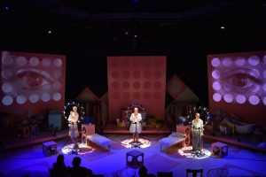
I have very limited experience with interactive art, but one project that stands out to me was by one of my fellow students. The project was an interactive piece in the play “A/B Machines” put on by the School of Drama last fall. Giada Sun was the media designer with Sean Leo as the assistant media designer on the play and made an interactive photo booth for the audience. In addition to that, cameras were used the entire show for the actors to interact with, which were then projected onto the set. I believe Giada used Millumin to program the projections. This show, sadly, had the short run time of one week.

Ammar Hassonjee – Looking Outwards – 01

A video showing the project, unofficially titled ‘Sensing Change’, examined up close and how it changes graphical data to match current weather conditions.

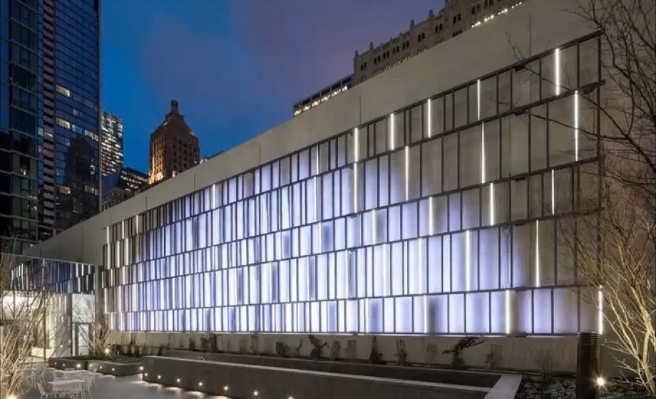
On 151 North Franklin street Chicago, a design firm named ESI Design recently led the development of a 95 ft long display attached to the side of a Loop Parking Garage that shows weather inspired graphics reflecting the current real time weather in Chicago, mimicking graphics such as downpours, fluffy clouds, and even falling snow. I personally love the simplicity and purpose of the graphics and how it corresponds with real time data to be something both aesthetic and useful. A missed opportunity in my opinion that the project had was perhaps finding a way to graphically represent upcoming weather in the next few hours in order to show weather predictions as to communicate even more data, but the creators made a wonderful decision to use a parking garage as the background of the canvas, a very public element, as the background so that the graphic is seen by many.

Image of facade with graphics changing, courtesy of ESI Design.

Although I couldn’t find any inspiration for this specific project or design idealogies from ESI Design, according to their website, the ESI Design studio’s main objective in all of their projects is to combine both digital and physical elements in order to create a truly transcendental experience for visitors. In this Loop Garage display, their hope is that natural ivy and foliage will grow over the canvas, leading to a beautiful harmony of both digital graphics and natural figures.

https://chicago.curbed.com/2019/8/14/20805835/art-installation-loop-garage-sensing-change

LaurenPark-Looking Outwards-01

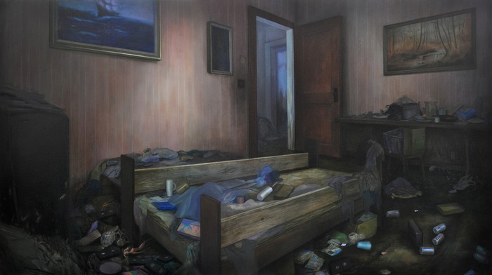
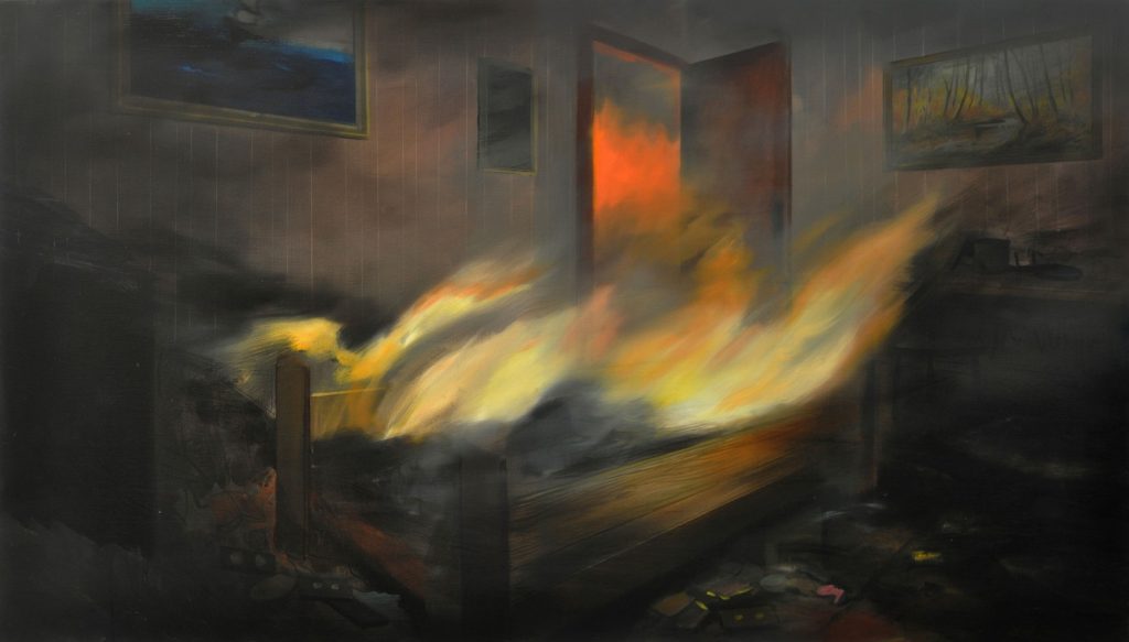
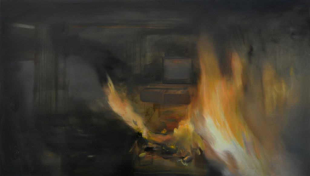
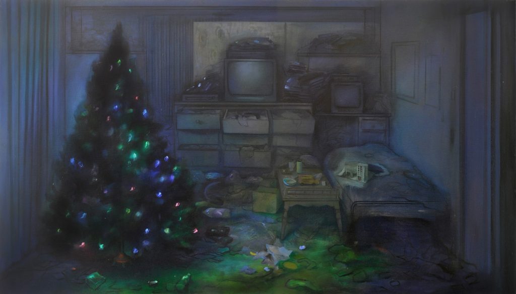
Brandi Twilley creates a series of paintings based on her memory of the living room she grew up in as a child. She paints freely, dramatizing this living room by using soft flames, as the artist revisits the memory of her home in Oklahoma when it burnt down. I find it really intriguing that the artist uses the series to show the happening and overwhelming movement of fire as it takes over the room. It is also fascinating to see the amount of detail in each object in the living room, while each object also has soft light that makes this scene so hazy. The artist can improve these pieces by being more consistent in the way she stylizes and inserts sharp details in some paintings, while not as much in others. However, this may be what lets the artist be successful in trying to depict a specific scene differently every time which shoes the haziness in her memories. Another successful moment the artist has is the way she portray loneliness throughout each scene, focusing mainly on the fire. I think that the artist was inspired by the way her mind’s imagination works when recreating this memory. She takes multiple parts that she remembers from that room and pieces the image together, binding it altogether with the dominance of the fire.

https://www.vice.com/en_us/article/qkwqkx/artist-paints-the-fire-that-destroyed-her-childhood-home

Jasmine Lee – Looking Outwards – 01

The interactive piece that I’m choosing to talk about is an exhibit I came across in the Boston Institute of Contemporary Art. The Visitors by Ragnar Kjartansson is a 64-minute music piece that uses synced video projection to create an immersive visual and audio experience for visitors.

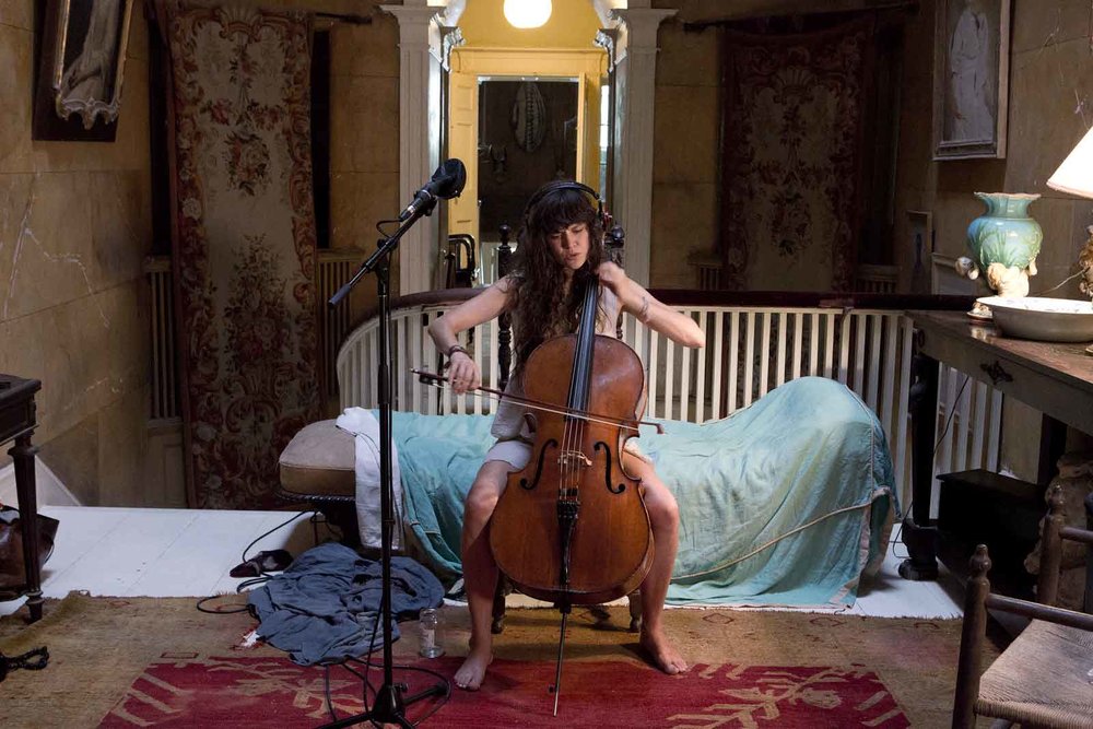
A female performer playing the violin recorded for The Visitors piece.

Set up in a dark room behind curtains, visitors are drawn in by a chorus of instruments. Stepping in, they face nine different video projections placed on different areas of the wall. There are different performers in each projection and as music stops coming from one video, it begins in another video. The experience is especially interesting because of the way the performers seem to leave their respective videos and walk into the space of another performer. The performances together create a chorus that can only be experienced in the room of the exhibit itself.

A third-party recorded video of the exhibit by Ragnar Kjartansson at the Boston ICA museum.

This work is profound because it explores the potential of video as a medium to create more immersive experiences for visitors in a way that a single video cannot. It experiments with how 2D visuals can transform into a 3D experience by encouraging the movement of the viewer. The artist, Kjartansson, often uses repetition combined with music to explore the potential qualities of sound. Born to an actress and a director, Kjartansson was very influenced by both historical art and performance. He collaborated with other musical performers in a historical upstate New York house to create this piece.

Timothy Liu — Looking Outwards — 01

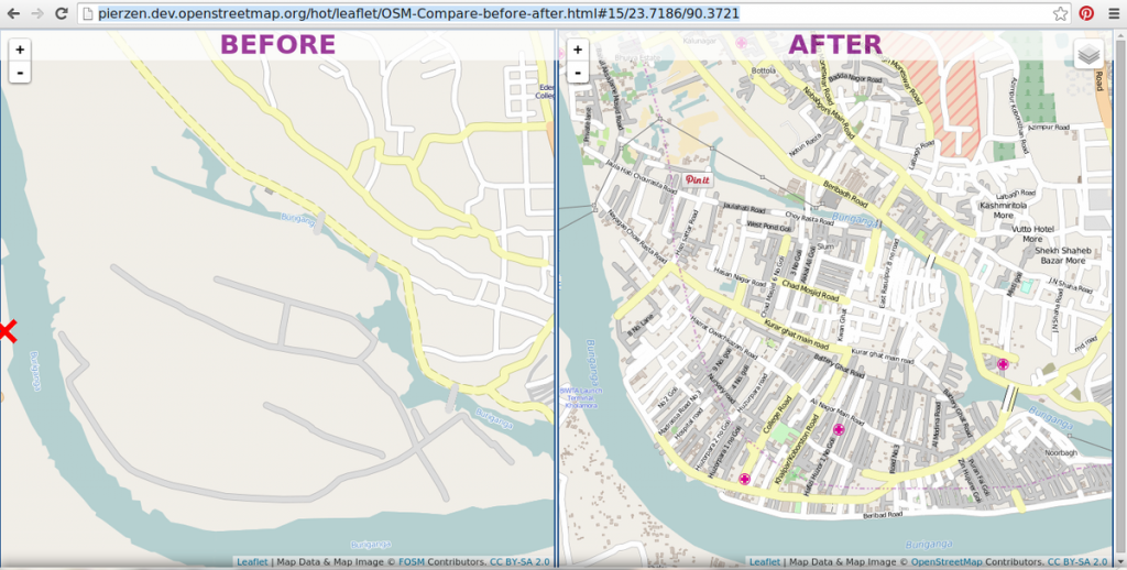
This is a before-and-after map of Kamrangirchar, Bangladesh — a striking example of the type of impact Missing Maps can have on a rural area (via Missing Maps, Twitter)

I recently had the opportunity to participate in a “mapathon” through Missing Maps, a collaborative initiative that aims to map “off-the-grid” parts of the world in order to improve humanitarian access and disaster relief efforts during times of crisis. The platform was designed and launched in September of 2014 by the American Red Cross alongside Doctors Without Borders. The project is an open collaboration that involves volunteers mapping streets, buildings, and infrastructure in high-risk areas into OpenStreetMap. Community volunteers then take these satellite maps and add in specific details, including what each building specifically is, before handing them off to humanitarian organizations that then use these maps to plan more efficient disaster responses. This project heavily utilizes OpenStreetMap (OSM), a software that actually originally involved a java-based applet on the OSM homepage. Over time, the basis of OSM has evolved into an online JavaScript editor known as iD.

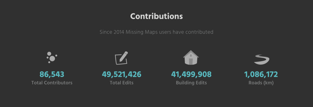
The creators were likely motivated to create an initiative that enabled anyone with a working computer to help those in need. OSM was already in existence before the start of Missing Maps, and the creators of the initative likely felt that OSM could be better utilized through humanitarian efforts. Through its simple and easy-to-use online OSM editor, Missing Maps has impacted hundreds and thousands of people around the world who have suffered through crises. I was incredibly inspired by how simple yet powerful Missing Maps’ mission is, and it was amazing to think that I was able to potentially impact a small town in Kenya simply by mapping out a portion of their rural roads. And yet, the opportunities for further exploration and mapping are endless. There’s still a massive amount of rural area that needs to be mapped, and the 86,543 contributors thus far are ready to continue with their efforts to help the Red Cross save lives.

Some of the incredible contributions that have been made by the thousands of Missing Maps volunteers around the world (via Missingmaps.org).
A video explaining how Missing Maps works (https://www.youtube.com/watch?v=wEEnOqmVfqM)

Sources used:

https://www.missingmaps.org/

https://www.redcross.org/about-us/our-work/international-services/mapping-vulnerable-communities.html

https://wiki.openstreetmap.org/wiki/History_of_OpenStreetMap

Angela Lee – Looking Outwards – 01

A video detailing the installation of “Floating in the Falling Universe of Flowers” by teamLab.
Digital installation “Floating in the Falling Universe of Flowers” by teamLab.

This summer, I visited teamLab’s Planets exhibition of digital art in Tokyo, Japan. I was especially inspired by the art piece, “Floating in the Falling Universe of Flowers.” The project, a video showing flowers falling towards the ground, was projected across a dark dome ceiling, and viewers could watch lying down, sitting, or standing. According to the creators, the video is rendered in real time by a computer, and the viewer’s interactions with the installation affect what is rendered. teamLab, a collaborative creative arts group, worked with Hideaki Takashi, who created the soundtrack. The work felt similar to another installation from the exhibit (“Drawing on the Water Surface Created by the Dance of Koi and People – Infinity”) since both works explored the beauty of temporariness. As someone who tends to enjoy routine, this installation inspired me to be more open-minded towards change. While the imagery of the flowers falling and wilting was sad, I was also struck by the beauty of its aging process. This piece of art was thought-provoking because it lead me to realize that an exact moment in time can never happen again—everything is temporary, and maybe that elicits beauty. I think the creators created a impactful, immersive space by engaging the senses through sound, smell, and sight.

Caroline Song Looking Outward – 01

An interactive piece of design that has recently been an inspiration of mine is a website called Work Responsibly by Ales Nesetril. It has a very simplistic approach, as well as a calming color scheme (light grays and greens). Because the website is dedicated to helping young adults find a responsible and balanced lifestyle/mindset regarding their job, the peaceful sensation the site seems to give off makes sense.

A sample page from Work Responsibly. Here, you see the subtle color scheme of the website that I had mentioned above, as well as the minimalist approach I had also previously described. Link: https://www.workresponsibly.org/

Regarding Work Responsibly itself, this website is a compilation of mental resources, organized by what each person is specifically struggling in, in order to live the most productive and healthy work/life-style.

A collection of resources for sleep deprivation. The placing of the articles in an unconventional grid format is intriguing and allows the eye to be drawn to other resources more than others, which seems purposeful. Link: https://www.workresponsibly.org/sleep

One of my favorite parts of this website are the sliding effects that take place as I navigate the website. This is such a smooth transition that nothing takes me aback as new information glides across the screen in a manner that allows me not to feel stressed at all, even as a great deal of material is being presented to me.

As I mentioned before, this website was created by one person in the start of 2019 (however, Nesetril did mention his willingness to expand in collaboration with other designers). Therefore, this piece of interactive design is very new, which the author acknowledges by saying that this is currently a design that is in process and is always growing.

Using WebFlow to create this website (commercial software), Nesetril’s website design has potential to grow into a reliable mental health resource for those in the workforce. Especially since mental health is a prominent issue today, this website seems to have been created at the right time for it to increase in noticeability.