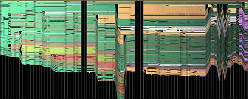
image on the edit history of abortion by Martin Wattenberg
In collaboration with Fernanda Viegas, the set of visualizations titled History Flow are representations of the edit history of Wikipedia articles. With these visualizations, it is interesting to see how a pattern emerges. For example, with the abortion visualization above, the zig zag pattern on the right delineates an argument of differing opinions. The black columns that cut through the graph shows when the article was erased and instead substituted with something offensive, which Wattenberg states is not uncommon on controversial topics. I’m curious to see what the colors in each visualization represent, and if it was words that were plotted onto the graph or ideas.
Northeast FAA Data Visualization Aaron Koblin Link: http://www.aaronkoblin.com/work/flightpatterns/index.html
The Flight Patterns visualizations are the result of experiments leading to the project Celestial Mechanics by Scott Hessels and Gabriel Dunne. FAA data was parsed and plotted using the Processing programming environment, which is a flexible software sketchbook and a language for learning how to code within the context of the visual arts. And the frames were composited with Adobe After Effects and/or Maya. The project does not only represent data visually but also experiments with the possibility of representation technique. As a result, the outcome turns out to be more than just information but is also informative art piece that has aesthetic value.
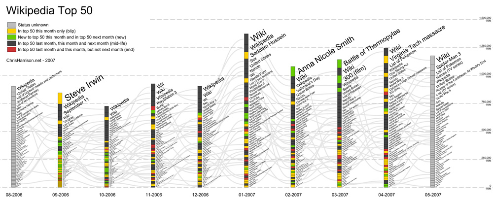
This is Professor Harrison’s “Wikipedia Top 50” from 2006-2007.
For this week’s Looking Outward on informational visualization, I looked at a chart developed by CMU professor Chris Harrison on Wikipedia article popularities over a 10-month span. Wikipedia has long been an infamous news source, but the influence it’s had on information gathering and research is undeniable. Thus, Professor Harrison saw Wikipedia as a way to better understand how users browsed the internet in 2006. As he described it, visualizing this information allowed us to get a better read on the internet’s “pulse” and what activity was trending at the time.
The graph is organized by month for every month from August 2006 to May 2007. Each month is organized into its top 50 search categories/results, sorted by descending order of frequency. In total, each of these bars represents all the traffic to Wikipedia for top 50 pages. For example, in September 2006, the top Wikipedia search result was “Steve Irwin” (the Crocodile Hunter sadly passed away during this month), while the 50th most popular result was “Podcasting” (huh!).
Prof Harrison’s information visualization does an excellent job utilizing design principles to convey meaning. He uses visual hierarchy, both through font size and bar size, to show which search results were prominent each month. He uses color to help differentiate “blips” from “mid-life,” “new,” and “end.” He also uses gray trend-lines to showcase which search results are common across months to show changes in activity. And finally, he utilizes a consistent scale with clear labels and axes to indicate the magnitude of the different search results. Overall, Prof Harrison’s information visualization display utilizes both design principles and data-management strategies that make it a compelling and power piece of information.
Virality by Rachel Binx visualizes the spread of facebook stories by analyzing the origin of the story to its various branchings. Her team focused on the three most shared images on facebook (all from George Takei’s page) and tried to emulate the energy of these images using WebGL.
With the help of Zach Watson, Binx uses WebGL as a framework for her project to produce the visualization as well as iterate on various animation styles. WebGL, short for Web Graphics Library, is a JavaScript interface for rendering interactive graphics on a web browser. It uses a 3d project exported from various 3d softwares such as Blender or Autodesk Maya to produce an interactive visualization accessible from most, if not all, browsers. The software allows Binx to experiment with different rendering options such as the color, opacity, degree, density of the branches
Virality (female) by Rachel Binx 2012Virality (male) by Rachel Binx 2012
The animated data visualization starts from the origin of the viral facebook images and analyzes its various branches, with each re-share of the image becoming its own branch. Some re-shares show a burst of energy with the re-share almost becoming its own viral element, while others create new branches in the visual form of arcs of various angles.
I found this work to be interesting in its relevance to modern day social media tactics and its resourcefulness. Social media can be considered one of the most efficient ways to spread information to various groups of people today. Many businesses and corporations take advantage of the excessive use of social media to exploit users as well as spread data or any other types of information. To be able to track the pathway of a viral image on facebook can indicate useful advertising tactics, as well as interesting feedback and conclusions for not only companies, but also for the average social media user.
For this project, I was intimidated at first because I was not sure how some of the mathematical equations for the lines worked because I haven’t taken a math class in a while. However, I realized that just by plugging different equations into the for loop it created interesting results that I was not expecting. In the end I chose to use a Hypotrochoid and a Ranunculoid. The combination of the overlapping geometries, along with the changing colors according to the mouse location give it a bit of a psychedelic vibe.
//Taisei Manheim
//Section C
//tmanheim@andrew.cmu.edu
//Assignment-07


function setup() {
    createCanvas(480, 480);
}

function draw() {
    //background color determined by mouse
    background(mouseX, mouseY, mouseX - mouseY);
    drawHypotrochoidCurve()
    drawRanunculoidCurve()
}

function drawHypotrochoidCurve() {
    //http://mathworld.wolfram.com/Hypotrochoid.html

    //mouse only affects image while on canvas
    var x = constrain(mouseX, 0, width);
    var y = constrain(mouseY, 0, height);

    //changes speed in which it changes so that as you move away from center image changes
    var a = map(x, 0, width, 0, width / 64);
    var b = map(y, 0, height, 0, height / 64);
    var h = width / 2;

    push();
    translate(width / 2, height / 2); // starts in the center of the canvas
    noFill();
    beginShape();
    for(var i = 0; i < 360; i += 1) {
        var x = (a - b) * cos(i) + h * cos((a - b) * i);
        var y = (a - b) * sin(i) - h * sin((a - b) * i);
        vertex(x, y);
    }
    endShape();
    pop();
}

function drawRanunculoidCurve() {
    //http://mathworld.wolfram.com/Ranunculoid.html

    //mouse only affects image while on canvas
    var x = constrain(mouseX, 0, width);
    var y = constrain(mouseY, 0, height);

    //changes speed in which it changes
    var a = map(x, 0, width, 0, width / 8);
    var b = map(y, 0, height, 0, height / 8);

    push();
    translate(width / 2, height / 2); // starts in the center of the canvas
    rotate(mouseX/ mouseY);
    noFill();
    beginShape();
    for(var i = 0; i < 360; i += 1) {
        var x = a * (6 * cos(i) - cos(6 * i));
        var y = a * (6 * sin(i) - sin(6 * i));
        vertex(x, y);
    }
    endShape();
    pop();
}
Video showing Aaron Koblin’s Flight Pattern visualization as a graphic animation.
The project above is called “Flight Patterns” by Aaron Koblin. It is a graphical visualization which uses a software to represent flight patterns and routes running across America through representational means of form variation and color. Koblin developed the project as part of a larger study called “Celestial Mechanics” in partnership with two other scientists at UCLA. According to Koblin’s website, the project leaders took FAA data of flight patterns and parsed it using an algorithm. The parsed data was then processed using another program and visually edited with software such as Maya and Adobe AfterEffects.
I like this projects interest in utilizing a data set like flight patterns and turning it into a very interesting and compelling visual graphic. I think the author’s original intent in creating the graphic was recognized as they wanted to study celestial data and represent it.
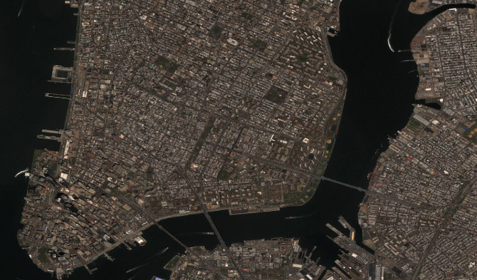
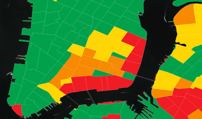
The project I chose was PENNY, an artificial intelligence tool developed by Stamen and researchers at Carnegie Mellon University. Penny is an AI that is built on machine learning using neural networks to understand what kind of infrastructure is found in low income versus high income housing and then guess the neighborhood income based on these patterns. It was built on top of DigitalGlobe’s analytics platform called GBDX, which uses the world’s most advanced commercial imaging satellites to create high resolution imagery that developers could then use. The AI was first given income data from the U.S. Census Bureau, which was then divided into smaller areas to match satellite images from GBDX. Then the Census based color map was overlaid on the satellite map. Then the AI looked for patterns in the satellite imagery and how they correlate to the income map. Through this is started to notice patterns in NEw York City, such as lower income areas tending to have baseball diamonds, parking lots, and large similarly shaped buildings (such as housing projects), middle income areas having more single family homes and apartment buildings, and high income areas having more greener spaces, tall shiny buildings, and single family homes with lush backyards. You could then change the neighborhoods by adding different types of infrastructure to see how the AI would predict the income of the area would change. I found this project interesting because I live in New York City and you could notice differences in low income areas and high income areas, but never seen the visuals of the neighborhood’s infrastructure converted into data to understand their income.
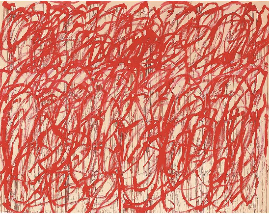
Cy Towbly, Bacchus, 2006-2008, Cy Twombly Foundation, currently exhibited in Gagosian New York
This painting is created by Cy Towbly, an American painter who has been acknowledge by his large-scale, freely-scribbled, calligraphic works on solid fields of plain colors such as off-white, grey and tan. His workflows are influenced greatly by Pollock, who has been mentioned in the description.
As this painting is completely based on his intuitive feeling about composition, shape and colors, it is an example of how the randomness of emotions and thoughts can be represented with color and gestures to articulate emotional expression. As the painting itself only consists of the simplest element- stoke, it allows viewers to examine the energy that’s associated with the expression and also has left room allowing viewers to interpret it.
This work is really inspirational to me as it has manifested how the randomly generated compositions can be really expressive and full of impact while being dynamic and unpredictable.
// Nawon Choi
// nawonc@andrew.cmu.edu
// Section C
// Project 06 Abstract Clock

var prevSec;
var millisRolloverTime;

var ons = ['zero', 'one', 'two', 'three', 'four', 'five', 'six', 'seven', 'eight', 'nine'];
var tns = ['ten', 'eleven', 'twelve', 'thirteen', 'fourteen', 'fifteen', 'sixteen', 'seventeen', 'eighteen', 'nineteen'];
var tnspls = ['twenty', 'thirty', 'forty', 'fifty', 'sixty', 'seventy', 'eighty', 'ninety'];

var milli;
var sec;
var mins;
var hr;

function setup() {
    createCanvas(400, 400);
    millisRolloverTime = 0;
}

function draw() {
    background("black");

    // Fetch the current time
    var H = hour();
    var M = minute();
    var S = second();
    if (prevSec != S) {
        millisRolloverTime = millis();
    }
    prevSec = S;
    var mils = floor(millis() - millisRolloverTime);

    textFont("Helvetica");
    textAlign(CENTER, CENTER);

    // increase in size based on time
    fill(50);
    textSize(mils);
    textStyle(NORMAL);
    var mm = int(mils / 10);
    milli = toWords(mm);
    text(milli, width / 2, height / 2);

    fill(75);
    textSize(S * 5);
    textStyle(NORMAL);
    sec = toWords(S);
    text(sec, width / 2, height / 2);

    fill(150);
    textSize(M * 2);
    textStyle(NORMAL);
    mins = toWords(M);
    text(mins, width / 2, height / 2);

    fill(230);
    textSize(H);
    textStyle(NORMAL);
    hr = toWords(H);
    text(hr, width / 2, height / 2);
}

function toWords(x) {
    if (x < 10) {
        return ons[x];
    } else if (x >= 10 & x < 20) {
        var i = x - 10;
        return tns[i];
    } else {
        if (x % 10 == 0) {
            var i = (x / 10) - 2;
            return tnspls[i];
        } else {
            var i = x % 10;
            var o = ons[i];
            var ii = int(x / 10) - 2;
            var t = tnspls[ii];
            var arr = [t, o];
            return join(arr, "");
        }
    }
}
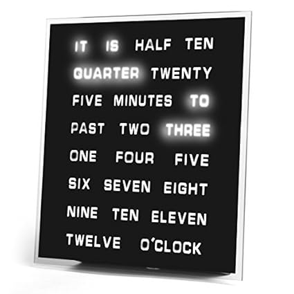
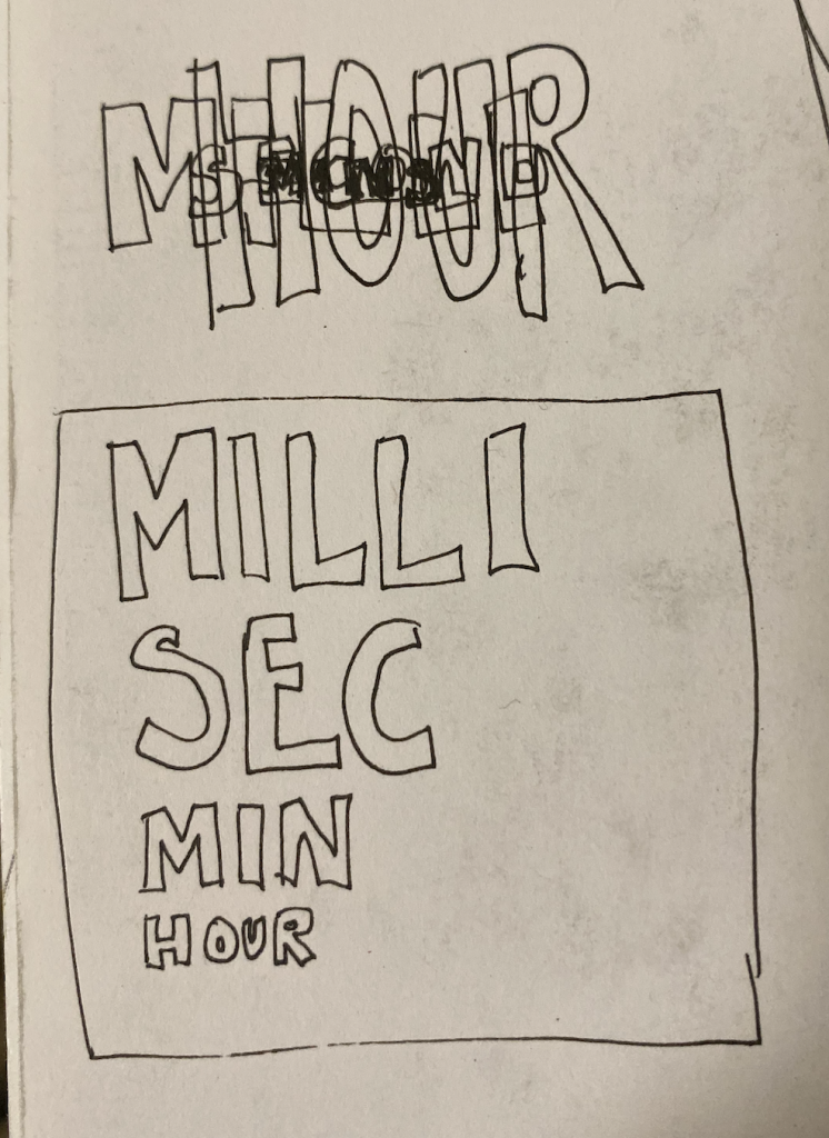
When thinking of ideas for this assignment, I initially brainstormed a variety of different pictorial representations of the passage of time. I eventually decided to go with a text-based clock after seeing this image online. I thought it was interesting to see time represented textually rather than in an analog or digital form.
The most challenging part of this assignment was converting the number of the time into text. I could only convert numbers up to 99, so for milliseconds, the number converted is divided by 10. I figured it didn’t matter as much because the milliseconds are illegible. I also had the size of the text increase based on the time.
Composition in Line by Piet Mondrian and Computer Composition With Lines by IBM 7094
I found this piece through a really interesting article about how an IBM 7094 computer generated a drawing that was very similar to a painting done by Piet Mondrian. The two images were prompted with this questionnaire—”One of the pictures is of a photograph of a painting by Piet Mondrian while the other is a photograph of a drawing made by an IBM 7094 digital computer. Which of the two do you think was done by a computer?” According to the article, few people, including those who claim to like abstract art, were unable to identify the painting.
I admire the thought and intentions behind this project and how it questions the nature of art, how one was made traditionally, with hours of an artists’ time spent in front of a canvas with oil and paint, while the other was generated by an algorithm, specifically and deliberately designed to emulate Mondrian’s original work. It challenges people’s ideas on what traditional art is, and introduces randomness and computational practices to abstract art.
![[OLD FALL 2019] 15-104 • Introduction to Computing for Creative Practice](../../../../wp-content/uploads/2020/08/stop-banner.png)