Ellan Suder Project-03: Dynamic Drawing

I first began with a really simple script that made the circle 50px wide on the right of the screen and 10px otherwise. Then I used the += to gradually add to the width, which made the circle have a more interesting transition as it crossed the x-axis.

dynamic drawing

/*
Ellan Suder
15104 1 D
esuder@andrew.cmu.edu
Project-03
*/

var angle;
var circleWidth;
var circleHeight;

function setup() {
    createCanvas(600, 400);
    var angle = 0;
}

function draw() {
    background(255, 90);
    fill(150);
    noStroke();
  
//if mouse crosses to right side, 
//circle adds value of mouseX to diameter
//gets bigger as it gets further from middle x axis
    if (mouseX > width/2) {
      circleWidth = 50 + (width/2 - mouseX);
    } else {
      circleWidth = 50 + (width/2 - mouseX);
  }
  
//if mouse goes to bottom half, 
//circle becomes black
    if (mouseY > height/2) {
      fill(0);
    } else {
      fill(200);
  }
  
//circle
    ellipse( 
      mouseX, 
      mouseY, 
      circleWidth,
      circleHeight);

// rectangle that changes angle according to mouseX
// rectangle moves further out as mouseY becomes bigger
    push();
    rotate(radians(angle));
    rect(5,mouseY, 50, 50);
    pop();
    angle = mouseX + 5;
}

Ellan Suder LookingOutwards-03

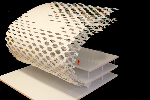
The Shenzen Bao’an International Airport, designed by Massimiliano Fuksas and Knippers Helbig (2013), is a large scale building designed with parametric fabrication.

I was actually in this airport before, but I didn’t know how it was designed until I looked up parametric design. According to this article, the building is meant to evoke the image of a manta ray, “a fish that breathes and changes its own shape, undergoes variations, turns into a bird to celebrate the emotion and fantasy of a flight.” It’s really incredible in person — the honeycomb-like windows and smooth silver curves look organic and futuristic. The sheer number of windows is lovely to look at.

I couldn’t find more information about the exact algorithms used to design the space, but the purpose of Helbig’s algorithm was to place the 60,000 panels onto a free form design. “Due to the free form design and varying dimensions of the façade panels a parametric development of the geometry was necessary.”

Erin Lim – Looking Outwards 03 –

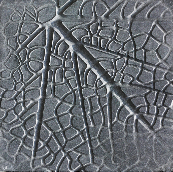
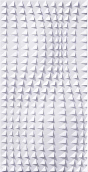
Anoma is a product design studio headed by Ruchika Grover to produce artwork made of natural stone, using a combination of digital manufacturing and traditional hand craftmanship.

What I admire about Grover’s work is that she incorporates natural textures and shapes of nature itself into her work. She first draws a 2-D illustration on paper, and then uses computer-aided modeling for precise measurements and adding intricate details. This is where she modifies the measurements before she develops the prototype.

A 3-D mapped prototype of Anoma that resembles a leaf’s veins

Then, prototypes are developed for about 4-6 months with dimensions translated into manufacturing directives and into a Computer Numerical Controlled (CNC) milling machine. A cylindrical tool then cuts and drills based on computer directions, with recycled water circulated in order to regulate the temperature of the cutting tool and base stone so that the rapid tool doesn’t wear and there’s no thermal expansion of the stone.

Another prototype of Grover’s studio 3-D mapped of natural forms

Finally, artisans carve detailed textures into the stone which adds a human touch to the digitally-fabricated artwork.

To the viewers, you could clearly see Grover’s background and interest in botanics as her inspiration for her artwork. The shapes and intricate details of each work resembles some shape or texture to those of nature. It is fascinating to see an artist create a work of nature generated by computer.

Link to Grover’s work: https://www.archdaily.com/898786/digital-design-and-indian-craft-merge-to-generate-these-beautiful-cladding-patterns

Lanna Lang – Looking Outwards – 03

Benjamin Dillenburger & Michael Hansmeyer’s “Digital Grotesque” / 2013, 2017

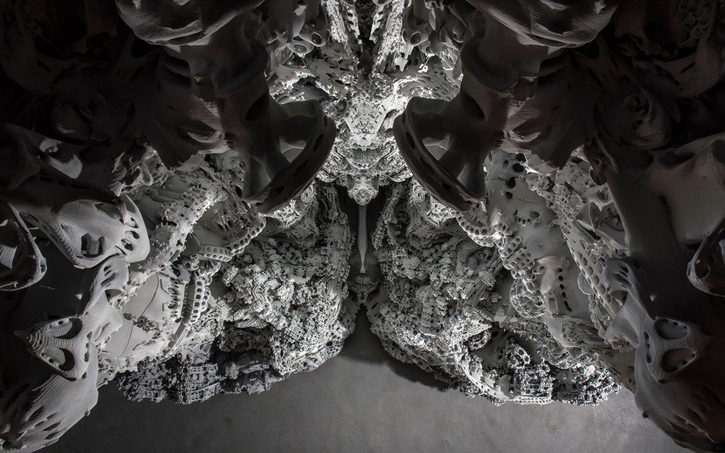
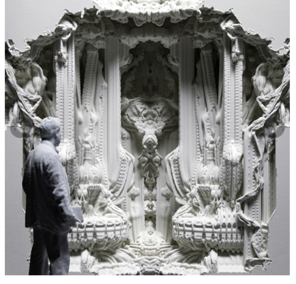
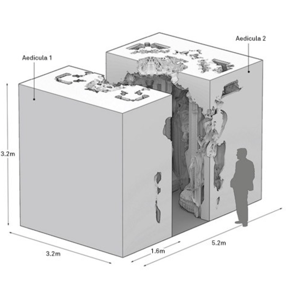
Digital Grotesque is made up of two full-size grottos that were 3D printed out of sandstone. It is a highly ornamented structure that was designed by algorithms, depicting how new technology is leading to radical changes in architectural design, and Digital Grotesque demonstrates this by taking this new technology to a scale never done before – truly life-sized. What I find admirable is the absolute intricacy of each crevice in this piece. The work is a 3.2-meter-high, 16 square meters long room, and is crammed full of minute details that stand between chaos and order.

Nothing can make this project any more perfect than it already is. It suggests an unimagined richness that at a glance can be overwhelming, and all the viewers can do is marvel, become curious and bewildered. One “flaw” that could be said about this piece is the seams between each 3D printed section, but I actually enjoy seeing the seams as a viewer because it’s a reminder of where this was initially conceived from; it’s not pretending to be built from stone or marble, it’s accepting its 3D printed quality. I applaud the creators who perfectly executed the concept full of juxtaposition: complexity yet reductionism, chaos and order, natural and artificial, foreign and familiar through its architectural design, composition, and geometric processes.

This project was reminiscent towards the Church of Sagrada Familia by Spanish architect Antonio Gaudi, and the artists are architects, programmers, and professors who are passionate about exploring the vast opportunities that computation applications can affect design and fabrication of architectural forms.

An image of the view looking up in the grotto II that depicts the sheer vastness and how ornamental, chaotic, and beautiful it is.
A video of the behind the scenes process of building “Digital Grotesque”
A video that shows fragments of the digital fabrication of “Digital Grotesque” and the computer-generated render.

SooA Kim: Looking Outwards-03

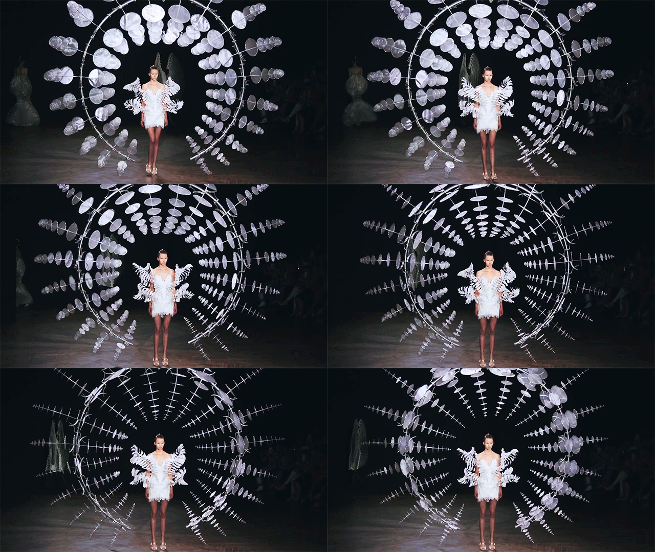
Hypnosis, fw runway 2019.

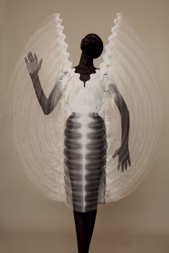
Iris van Herpen is one of the most avant garde designers known in the industry of fashion design. She has been innovating new methods in both design and garment construction techniques to fuse the past and future of couture craftsmanship. In her Hypnosis 2019 collection, collaborating with the architect Anthony Howe, she applies her design in using parametric patterns to the fabric that’s generated through 3D printing. The Hypnosis collection can be called as “kinetic couture,” since the garments move as models walk the runway. I believe the algorithms on generating these patterns were inspired by the complexity forms that is in nature, such as wind and fluidity of water. The kinetic movement and form was also adapted from the mechanisms of Howe’s sculptures. Howe’s design uses computational aid in creating parametric installation work.  I admired this collection and collaboration between fashion designer and an architect, where they applied architectural form using computational distortion to experiment on bringing into creation of haute couture.

behind the scene photo of Hypnosis collection


Sammie Kim – Looking Outwards 03

“Digital Grotesque” is a huge architectural piece led by Michael Hansmeyer that delves into the application of 3D fabrication technology.  Immediately, I was astonished by was the bold, massive scale of this artwork, as 3D technology has only been used for small-scale models in the past. Yet, the method of “sand-printing through additive manufacturing technology” overcomes such limitations, which allows for the fabrication of large-scale elements, along with high resolution and accuracy. Not only does the Digital Grotesque present a vast human-scale structure, it encompasses extremely complex geometry (260 million individual facets), along with ornate details that are impossible to draw by hand. What I find admirable about this project is the surprise element, how the base algorithms produce results that are not entirely predictable, though not random. The Also, what shocked me was how cost of the sand-printing technique, which was similar to printing a basic cube—there was barely any cost for customization. This showed how enormous the potentials of additive manufacturing in architecture can be, as even more complex forms could now be executed through the computer.

Photo of the Digital Grotesque (http://benjamin-dillenburger.com/grotto/)
Scale of the Architecture compared to the person (http://benjamin-dillenburger.com/grotto/)

Jacky Tian’s LookingOutwards-02

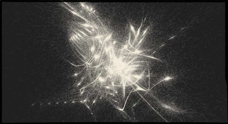
idea space – a cyclic universe by karsten schmidt

A screenshot of cyclic universe by Karsten Schmidt

This generative artwork is a timelapse animation where digital artist Karsten Schmist created a ongoing visualization project of space where steadily increasing number of moving particles are attractive by slow moving, invisible gravitational force centres. The imaginary cylindrical space act as a four dimensional canvas where the moving particles will leave permanent traces in time as well as in space. The paradoxical set up created ironical results that even with the increase of particles approaching to infinite, there is no increase in computational cost.

From the image, one can see the the particles have larger movements when they are far away from the gravitational centres. On the other hands, near gravitational centres, the density of particles is significantly higher than far away places. This symbolizes the shift of the university.

Jacky Tian’s Project 02

sketch

// Yinjie Tian
// yinjiet@andrew.cmu.edu
// Section D
// Project 02

var earSize = 20
var hairColor = 0
var glassSize = 45
var pocketPosition = 450
var rgb1 = 250
var rgb2 = 250
var rgb3 = 250
var mouthSize = 30

function setup() {
    createCanvas(600, 600);
    background(180);
 
}

function draw() {   
//Background
    stroke(0);
    fill(rgb1, rgb2, rgb3);
    rect(80, 50, 80, 550);
    fill(rgb2, rgb1, rgb3);
    rect(110, 80, 140, 520);
    fill(rgb3, rgb1, rgb2);
    rect(300, 100, 200, 500);
    fill(rgb1, rgb3, rgb2);
    rect(160, 170, 300, 430);
    fill(rgb2, rgb3, rgb1);
    rect(400, 200, 200, 400);

//Neck
    noStroke();
    fill(230,214,169);
    quad(240, 310, 235, 370, 320, 370, 315, 310);

//Ears
    stroke(240,224,179);
    fill(240,224,179);
 
    rect(195, 240, earSize, 40, 10);
    rect(340, 240, earSize, 40, 10);

//Face
    stroke(255,244,189);
    fill(255,244,189);
    strokeWeight(3);
    
    beginShape();
    vertex(210, 270); 
    vertex(210, 310);  
    vertex(250, 335);  
    vertex(310, 335); 
    vertex(340, 310); 
    vertex(340, 225);   
    vertex(215, 225); 
    endShape();

//Hair
    stroke(0);
    fill(hairColor);
    strokeWeight(4);

    beginShape();
    vertex(190, 220);
    vertex(205, 150);
    vertex(270, 125);
    vertex(338, 150);
    vertex(360, 218);
    vertex(342, 235);
    vertex(330, 235);
    vertex(290, 225);
    vertex(250, 235);
    vertex(217, 230);
    vertex(210, 230);
    endShape();

//Glasses
    stroke(225, 215, 0);
    strokeWeight(3);
    fill(255);
    rect(220, 240, glassSize, glassSize, 15);
    rect(288, 240, glassSize, glassSize, 15);
    line(265, 250, 288, 250);

//Nose
    stroke(0);
    strokeWeight(2);
    line(275, 280, 270, 300);
    line(270, 300, 275, 300);

//Mouth
    noStroke();
    fill(290,214,159);
    ellipse(290, 320, mouthSize, 10);

//Jacket
    stroke(0, 0, 0);
    fill(0, 0, 0);
    strokeWeight(4);
    beginShape();
    vertex(150, 365);
    vertex(90, 480);
    vertex(90, 600);
    vertex(430, 600);
    vertex(490, 480);
    vertex(410, 365);
    endShape();  

//Pocket
    stroke(255,165,0);
    rect(190, pocketPosition, 50, 60);

}

function mousePressed() {
    
    earSize = random(15, 30);
    hairColor = random(0, 220);
    glassSize = random(35, 55);
    pocketPosition = random(425, 475);
    rgb1 = random(0, 250);
    rgb2 = random(0, 250);
    rgb3 = random(0, 250);
    mouthSize = random(20, 50)
}

I used my portrait for project 1 as the base file. The three factors for variations I looked into were size, position and color. Based on the three factors, I created variables that can change the sizes of my nose, glasses, and mouth; alter the color of my hair and the background; reposition the pocket on my sweatshirt.

Sarah Choi – Looking Outwards – 01

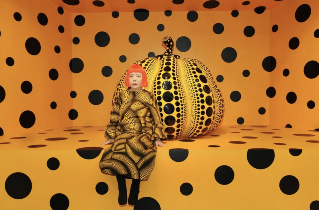
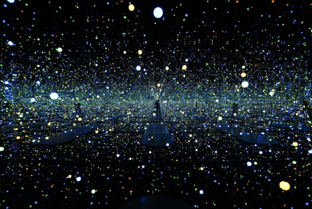
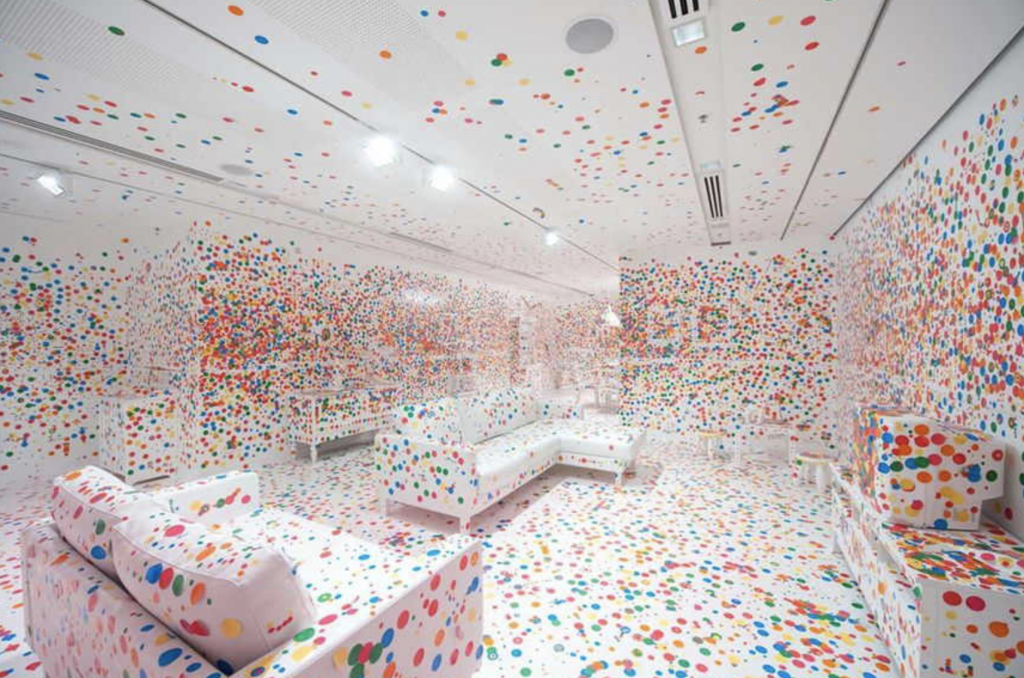
Summer of 2017, Yayoi Kusama held an exhibition in the National Gallery of Singapore. She has been more widely known as a contemporary artist. She created an expansive vision of the human body through a collection of interactive art called, “Life is the Heart of a Rainbow”. Working in Shinjuku, Japan, she worked with canvas using patterns and the stroke of waves that created the basis of most of her art. This work of various art took her around eight years to complete. Inspired, by paintings mainly from the 1950’s, Kusama further developed her works of art through contemporary mediums such as using LED Light. One of her most well-known pieces is called the “Infinity Mirrored Room – Gleaming Lights of the Souls”.  Her infinity mirror rooms transform the continuous and repetitive approach of her also famous net and dot paintings. This room-scale installation with kaleidoscopic environments bring another interactive experience to her audience, as she uses LED lights, metal, wooden and acrylic panels, and mirrors to create this art. 

https://www.nationalgallery.sg/see-do/highlights/yayoi-kusama-life-is-the-heart-of-a-rainbow

Yayoi Kusama

Life is the Heart of a Rainbow, 2017

Erin Lim – Project 02 – Variable Face

In my process of making this face, I learned a lot about using variables to code. I also experimented a lot with “else” and “if” to produce what I want to happen.

Erin Lim – Project 02

var eyeSize = 30;
var faceWidth = 260;
var faceHeight = 320;
var noseX = 275;
var noseY = 270;
var noseSize = 15;
var faceX = 300;
var faceY = 265;
var eyecolor = 255;
var pupilcolor = 0;
var lefteyeX = 250;
var eyeY = 200;
var righteyeX = 350;
var leftpupilX = 250;
var rightpupilX = 350;
var pupilY = 200;
var pupilWidth = 10;
var pupilHeight = 10;
var browHeight = 160;
var leftbrowX = 220;
var rightbrowX = 330;
var browY = 160;
var leftbrowWidth = 270;
var rightbrowWidth = 380;
var earHeight = 45;
var earY = 250;
var leftearX = 150;
var rightearX = 450;
var mouthX = 300;
var mouthY = 350;
var mouthSize = 45;
var r = 255;
var g = 241;
var b = 209;

function setup() {
    createCanvas(640, 480);
    // background(220);
    // noStroke(0);
}

function draw() {
  background(227, 103, 84);
  noStroke(0);

    fill(255, 241, 209); //face Q: HOW DO I USE VARIABLES FOR THIS?
    ellipse(faceX, faceY, faceWidth, faceHeight);

    fill(eyecolor, eyecolor, eyecolor); //left eye
    ellipse(lefteyeX, eyeY, eyeSize, eyeSize);

    fill(eyecolor, eyecolor, eyecolor); //right eye
    ellipse(righteyeX, eyeY, eyeSize, eyeSize);

    fill(pupilcolor, pupilcolor, pupilcolor); //right pupil
    ellipse(rightpupilX, pupilY, pupilWidth, pupilHeight);
    if (mouseX < width*0.33) { // HOW DO I CHANGE FACE COLOR?
        fill(255, 0, 0);
      } else if (mouseX > width*0.66) {
        fill(0, 255, 0);
      } else {
        fill(0, 0, 255);
      }

    fill(pupilcolor, pupilcolor, pupilcolor); //left pupil
    ellipse(leftpupilX, pupilY, pupilWidth, pupilHeight);
    if (mouseX < width*0.33) { // HOW DO I CHANGE FACE COLOR?
        fill(255, 0, 0);
      } else if (mouseX > width*0.66) {
        fill(0, 255, 0);
      } else {
        fill(0, 0, 255);
      }

    circle(mouthX, mouthY, mouthSize); // mouth


    stroke(0, 0, 0); // left eyebrow
    line(220, 160, 270, 160);

    stroke(0, 0, 0); // right eyebrow
    line(330, 160, 380, 160);

    fill(255, 241, 209); // left ear
    circle(150, 250, 45);

    fill(255, 241, 209); // right ear
    circle(450, 250, 45);

    fill(0);  // nose
    ellipse(275, 270, 15, 15);
    ellipse(275 + 20, 270, 15, 15);
}

function mousePressed() {

  faceWidth = random(260, 300);
  faceHeight = random(320, 400);
  eyeSize = random(10, 50);
  noseX = random(275, 300);
  noseY = random(270, 300);
  leftbrowWidth = random(270, 300);
  rightbrowWidth = random(380, 400);
}