![[OLD – FALL 2016] 15-104 • COMPUTING for CREATIVE PRACTICE](../../../../wp-content/uploads/2020/08/stop-banner.png)
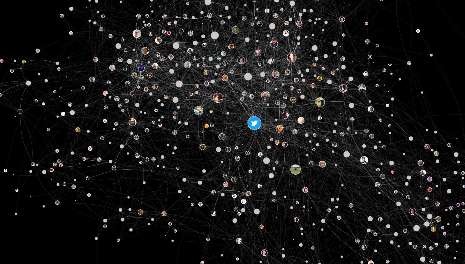
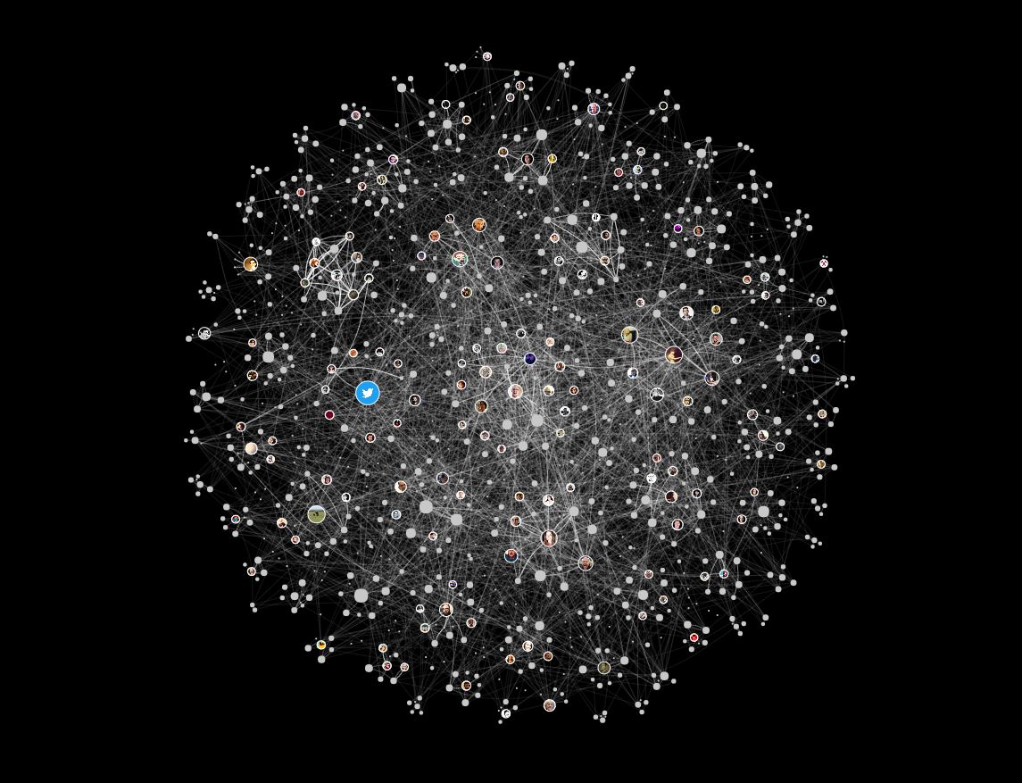
In 2013, Moebio Lab, lead by Santiago Ortiz, created a visualized map of all conversations made in Twitter in a week period of February 15th to 22nd. Moebio Lab is a team of data scientists who concentrate on exploring creative and effective ways of visually representing empirical and textual data. A lot of their work forms a cluster of various data according to parameters such as hierarchy and frequency.
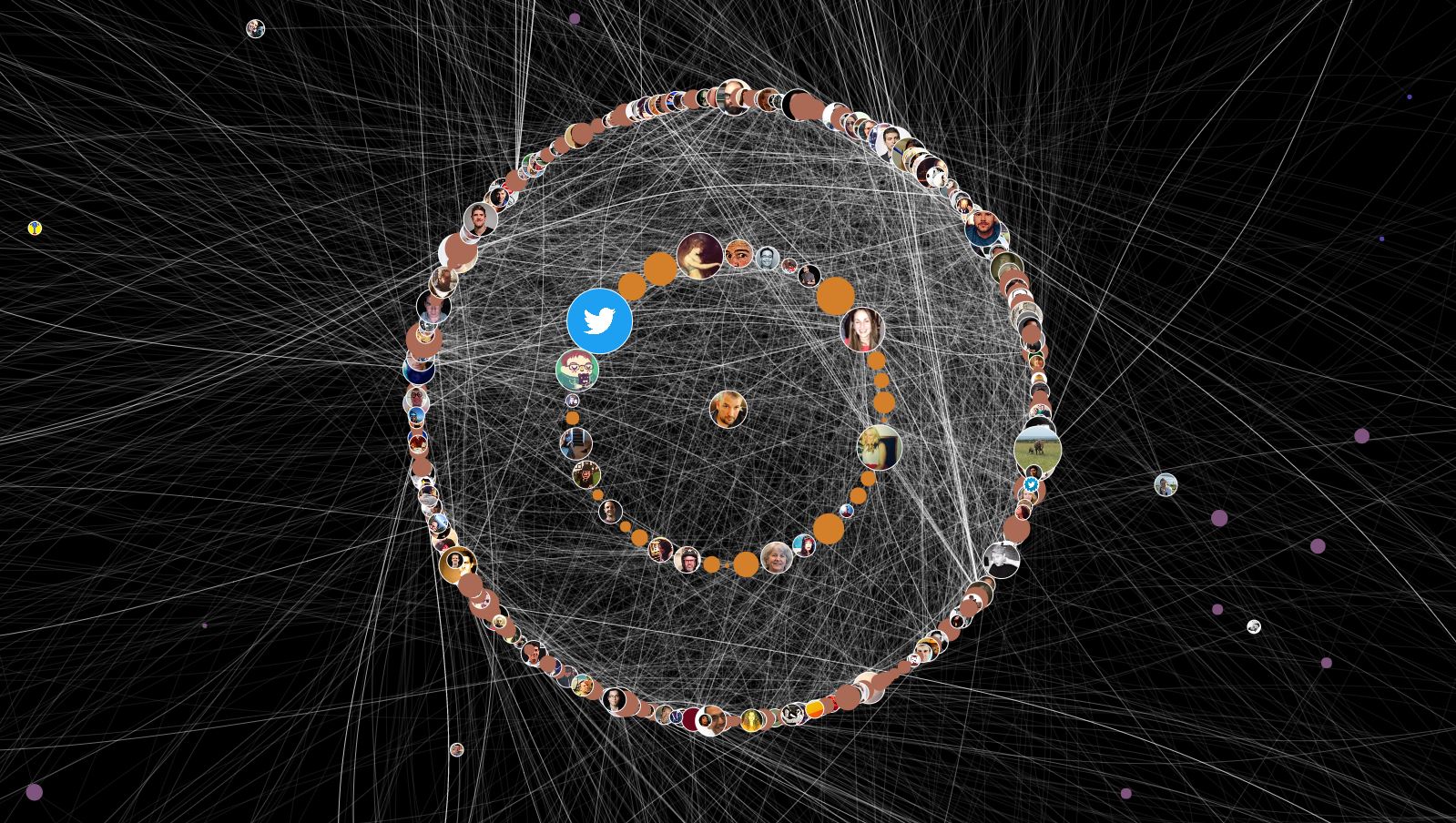
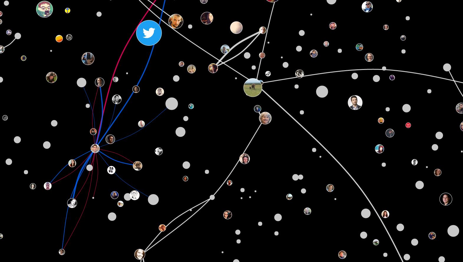
In this project, the threads are representation of the relationship between tweeter users according to tweets, retweets, tags, and comments. In a big picture, they are barely legible in individual sense, but the density of the threads show which and which has stronger relationship to each other. As the clusters are zoomed in, we are able to figure out which users are directly related in what way. The representation allows for the users to read the global and local interaction in the web sense.
This is a useful resource that could be applied in specific to creating statistics of public census, individual profiling, and human networking, which are useful to government organizations, job hunt/head-hunters, and consumer analysis branch of corporations. It leaves a possibility for development, as it could be more powerful if combined with statistical graph representation of the data.