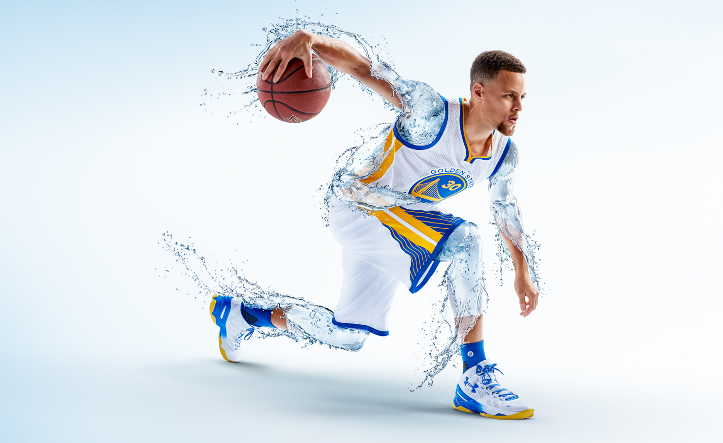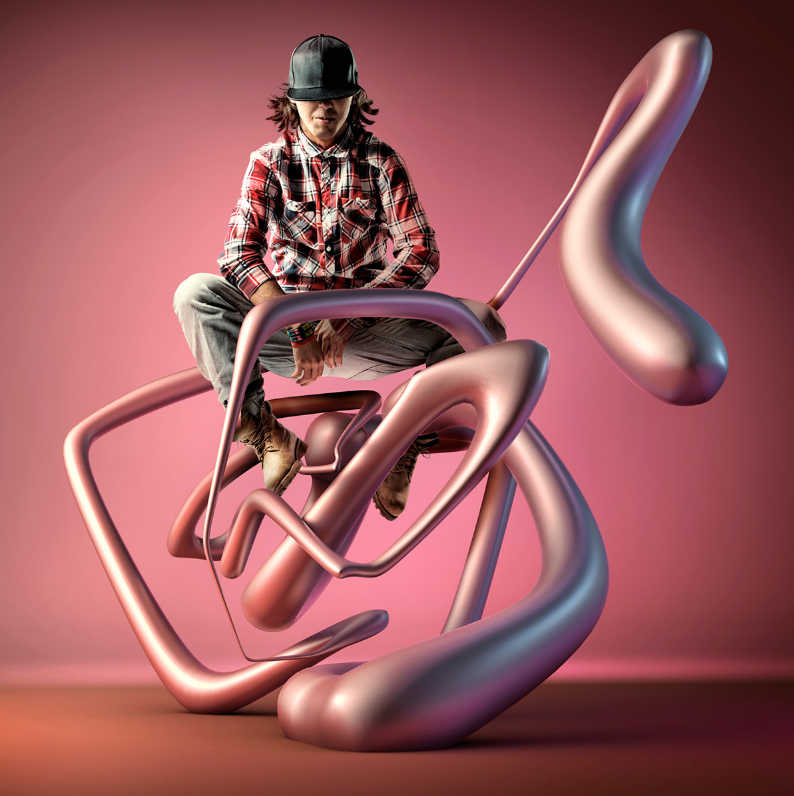
While surfing over various works by 3D graphic artists, I noticed plenty were creating graphics that were so real, that they were not distinguishable from reality, or ones that very picturesque to draw an awe from the viewer. However, Mike Campau’s work hit me with an odd way. Thought the texture was realistic, the general form was not. His work was not necessarily the most well composed or beautiful. Nevertheless, what is clear in his graphics is that all of them get a sense of what is being said across to the viewer. It is clear to even a child that Steph curry is very hydrated and that helps his performance. viewer is struck with a fresh and revitalizing feeling of the image, and when they notice that it is an advertisement for Brita (the water filter jar), the same sense of image stays. This ability explains how Campau is so successful in the advertising business.
In addition, Campau treats computer graphic as computer graphic. By this, I mean there in some integrity in his image that prevents it from deceiving the viewer to think something unreal is real. What is the purpose if computer graphic, a tool to make something unreal, makes something so real that it is indistinguishable from photography? Campau instead, integrates photography into his art and generates a synergy between what is unreal and real.


![[OLD – FALL 2016] 15-104 • COMPUTING for CREATIVE PRACTICE](wp-content/uploads/2020/08/stop-banner.png)