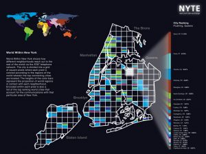
Aaron Koblin uses design to visualize real world data. In the New York Talk Exchange, he is commissioned by the Senseable City Lab at MIT to display where New Yorkers (using the AT&T network) are calling around the world. The collection illustrates information flowing around the world from AT&T long distance telephone and IP data. I like the collection, particularly Global Encounters because it tracks real time data from around the world in a visually pleasing way. You can see how interconnected one city is to the rest of the world and see direct lines of communication throughout the world.
I could not find exactly how it worked, but I am guessing that it takes the coordinates of the two ends of communication and simply draws an arc around a sphere (shown as a globe) on a three-dimensional plane.

Graphs where people in NYC using the AT&T network call around the world and restricted area.
![[OLD – FALL 2016] 15-104 • COMPUTING for CREATIVE PRACTICE](wp-content/uploads/2020/08/stop-banner.png)