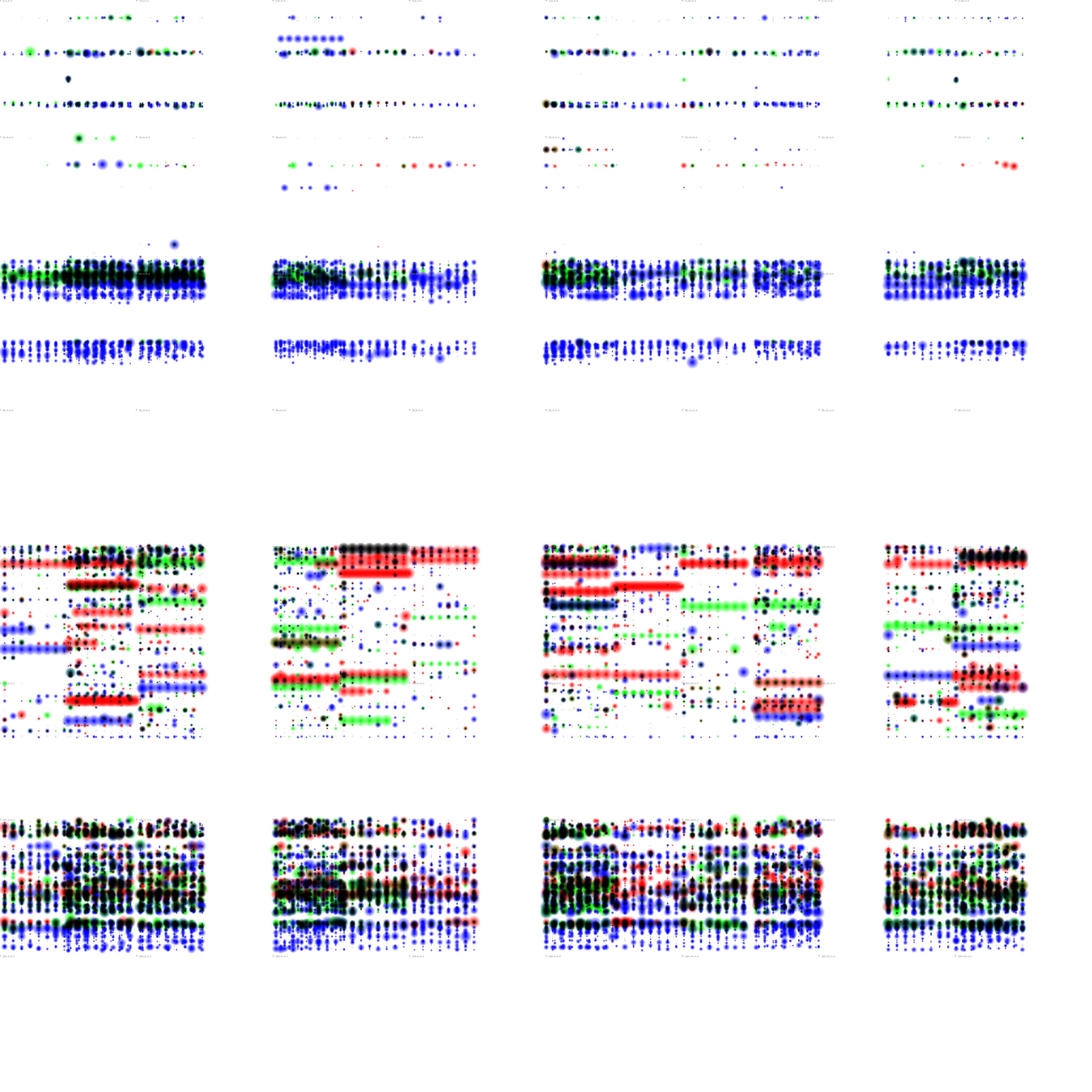
Lisa Jevbratt created several visualizations of data sets, but the one that most caught my eye was “Migration” created in 2005. She essentially mapped out the “migration interface” of websites from 1999-2004, and represented them through these little blobs of color that reminded me of tie-dye.

The link to Jevbratt’s 2005 Migration project is here.
The study originated in 1999, but had to be updated in 2005 due to the growth of technology and the need to keep up with it. The image and link above are for the updated version, while information about the original can be found at the link here.
I could not find a lot about the algorithms used in this visualization, but according to the description of the original project (linked above), the websites were randomly generated and their images were recorded so as to map out “all web servers in the database.” Because this study took place over the course of a few years, it also analyzes the changes made to such websites and the database over time.
This visualization is unique both in it’s subject of study as well as in its method of representation. We typically assume that data should be neatly mapped out and displayed, but this contradicts that in it’s messy yet understandable representation.
![[OLD – FALL 2016] 15-104 • COMPUTING for CREATIVE PRACTICE](wp-content/uploads/2020/08/stop-banner.png)