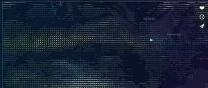
I really like Alison’s choice of Moritz Stefaner’s Project Ukko. I agree with her assessment that it is very user friendly. The visualization of the wind patterns through tilt, thickness of line, and color is very easy for anyone to read and also does not demand extensive time because it is so accessibly done. Originally when I just saw the still of the project and hadn’t yet read Alison’s review or checked out the webpage, I had thought that it was a piece of artwork because it looked so artful. I really appreciated that Stefaner found a way to make a mathy area accessible to humanities students and to give beauty to what might not seem beautiful on the surface.

![[OLD – FALL 2016] 15-104 • COMPUTING for CREATIVE PRACTICE](wp-content/uploads/2020/08/stop-banner.png)