function setup() {
    createCanvas(300, 300);
    background(200);
    ellipse(150, 150, 100, 70);
}

function draw() {
}
Month: August 2018
Rain Du Project 1 Face
function setup() {
    createCanvas(300, 300);
    background(200);
    ellipse(150, 150, 100, 70);
}

function draw() {
}
Han Yu Project 1 Face
//Han Yu
//section D
//hyu1@andrew.cmu.edu
//Project 01 Face

function setup() {
    createCanvas(600,600);
    background(255);
}

function draw() {
	noStroke();
	fill(99,189,214);
	ellipse(300,300,550,550);
	//hair
	noStroke();
	fill(64,35,19);
	ellipse(282,275,235,300);
	ellipse(308,280,235,300);
	quad(380,270,190,270,150,530,450,530);

	//face
	noStroke();
	fill(253,205,174);
	ellipse(300,285,200,255);

	//hair
	noStroke();
	fill(64,35,19);
	ellipse(292,180,130,70);
	ellipse(250,200,130,50);

	//brows
	strokeWeight(4)
	stroke(1)
	noFill();
	arc(250, 270, 40, 40, PI+QUARTER_PI, TWO_PI-QUARTER_PI, OPEN);
	arc(338, 270, 40, 40, PI+QUARTER_PI, TWO_PI-QUARTER_PI, OPEN);

	//eyelashes
	fill(0);
	stroke(51)
	strokeWeight(5)
	line(240,267,260,270);
	line(320,268,340,270);

	//eyes
	noStroke();
	fill(0);
	ellipse(260,280,18,27);
	ellipse(340,280,18,27);

	//glisten
	fill(253,205,174);
	triangle(260,280,300,280,350,350);
	triangle(340,280,380,330,400,290);

	//nose
	stroke(255,187,164);
	strokeWeight(4);
	line(294,310,290,338);
	line(290,338,300,336);

	//neck
	noStroke();
	fill(253,205,174);
	rect(280,410,40,58);

	//lips
	stroke(200,114,110);
	fill(200,114,110);
	ellipse(300,365,40,9);

	//sweater
	noStroke();
	fill(random(0,255),random(150,255),random(160,245));
	quad(230,440,370,440,420,530,180,530);


}
I like doing the project overall. It took me a long time to find colors that match together. I couldn’t decide on one sweater color so I used a range of random colors I like.
Hana Kim Looking Outwards 01

Text
Han Yu Looking Outwards 01
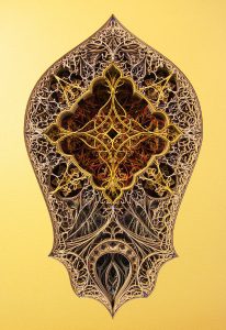
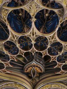
I was really inspired by Eric Standley’s laser cut paper art. Its incredibly intricate design is composed of at least 100 layers of antique paper precisely cut by a laser. Standley is the sole designer and craftsman of his laser papercuts. A lot of the patterns in his works are borrowed from gothic and islamic arts. His works often take several months to create since each layer of paper needs to be carefully planned. He needs to think about the negative spaces which are going to be cut off and also how can each layer contributes to the overall 3-D effect. And all of the designs are hand drawn on paper and then moved to software that controls the laser. In the interview below, Standley said his work started out as a bold exploration of a cardboard project he was working on a few years ago, as he decided to use laser technology to cut more precisely. Standley is hoping to make more complex works on larger scales in the future.
John Legelis Looking Outwards 1
Topic: Some Technological Art or Design that has Inspired You
Google Earth is one of the most powerful tools made possible by modern technology and with the internet has been made accessible to all. In order to complete this process an enormous amount of data needed to be processed and organized which required a team of nearly 500 people to implement at the scale it functions today. Because Google Earth is a relatively small part of the enormous Google enterprise, the organizational structure for this project was corporate and hierarchical. The Google Earth project was the first of its kind/scale and required novel software ideas to implement effectively. The idea for this project likely developed as an extension of one of the oldest visual data systems, physical maps. Google Earth is the current state of the art in cartography especially when it comes to coverage, as nearly nowhere is left unmapped. This project has been the foundation for many offshoots such as 3D photo spheres, street view, virtual reality voyages, and artists who use the natural beauty of the earth captured by satellites as part of their work.

I admire this project because it is a wonderfully useful and powerful tool that capitalizes on opportunities only made possible with computers. I admire Google Earth because it is an example of a seamless transfer from paper maps to technology without a barrier of entry and it creates the epitome of what maps can be.
Video demonstrating Google Earth being used in conjunction with virtual reality
Written by: JJ Legelis
Jessica Timczyk – Looking Outwards 01
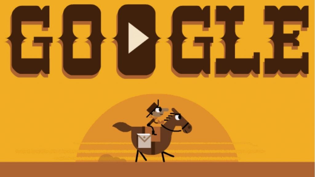
Google Doodles embody one of my personal favorite user interactive, computing based art projects. Each design simultaneously reminds users of important dates, is visually stimulating, and all the while still allowing Google users to interact with the piece. Specifically one of my favorites, Google’s 155th Anniversary of the Pony Express Doodle, débuted on April 14th, 2015 allowed searchers to play a game on the Doodle captured in colorful, western themed graphics. The most admirable aspect of the project though, comes in how the surprisingly complex game incorporates cartoonish graphics, while still maintaining Google’s branding. Maintaining all of those characteristics, making it new and fun for the user while still being complementary to Google’s logo would pose a difficult challenge for any creative team.
The video explains the inspiration behind the interactive animation and steps to its creation.
Seven different people were a part of the team that created this doodle:three engineering wizards: Mark Ivey, Kris Hom, Brian Murray, thebackground design: Kevin Laughlin, a project manager: Greg Capuano, a sound designer: Manuel Clémentand the art direction & character design/animation by Matt Cruickshank. This list included including three artists, where a normal Google Doodle would only require one. While this Google Doodle is incredibly unique, some inspiration was drawn from previous Google Doodles to keep the animation snappy, interesting and interactive. While not explicitly stated, the software/script of the animation appears to be novel and unique to this Google Doodle. Though this Doodle will not be reused, the level of intricacy and interactive-ness will and have inspired other important Google Doodle’s designs.
Rachel Jones Looking Outwards 01
Trees are plants.
Sarah Yae Looking Outwards 1
TheRain Room (2012), installed by Random International, is an interactive installation where the audience can walk through the rain, but not get wet. Rather than typical artworks at the museum, this interactive installation allows for audience to immerse themselves with different senses and have an ownership of the artwork. When I first visited the Rain Room,I was taken aback by such a refreshing, unique installation that was never widely introduced before in museums. Walking through this installation put me in a different atmosphere. I have never felt this way towards an artwork before.
This project was made from an organization called Random International. This organization aims to incorporate science and technology to art, in order to create a diverse and unique experience. The project took about 4 years to create, and 8 months to build.
For this project, I think creating this project required the development of custom software because this installation was something very new. This project was apparently inspired by sound. This artwork, I believe, began a trend of museums with interactive installations, which incorporates technology with art.
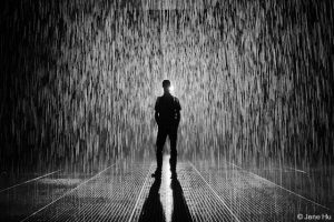
The link to Rain Room is: http://www.lacma.org/node/21938.
Rain Du Looking Outwards 01

This is some text!
![[OLD FALL 2018] 15-104 • Introduction to Computing for Creative Practice](../../../../wp-content/uploads/2020/08/stop-banner.png)