Yingyang Zhou-Project-05-Wallpaper

Wallpaper

//Yingyang Zhou
//yingyanz
//Assignment-05-b

function setup() {
    createCanvas(600, 600);
    background(98, 140, 178);


    for (var y = 0; y <= 600; y+=60) {
        for (var x = 0; x <= 600; x+=60) {
          var n = x/60 % 2;
          if (n == 1){
            noStroke();
            fill(255, 179, 5);
            bezier(
            x-15, y,
            x, y-25,
            x+20, y+30,
            x-15, y);
          }
          else {
            for(i = 10; i < 180; i +=10){
              noFill();
              stroke(255, 75, 27);
              strokeWeight(0.5);
              ellipse(x, y, i, i);
            }
          }
          stroke(0, 0, 255);
          bezier(x-60, y-60, x, y-60, x, y, x+60, y);
        }
    }
    noLoop();
}


function draw() {
    // draw is not called due to noLoop() in setup()
}

This wall paper are consist of small ’tiles’ and it could be a tile of a larger part, The elements are repeat not only horizontally and vertically but also diagonally.

Yingyang Zhou-LookingOutwards-5

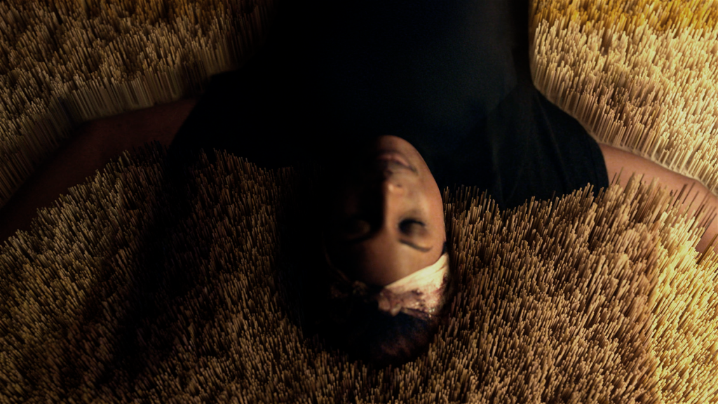
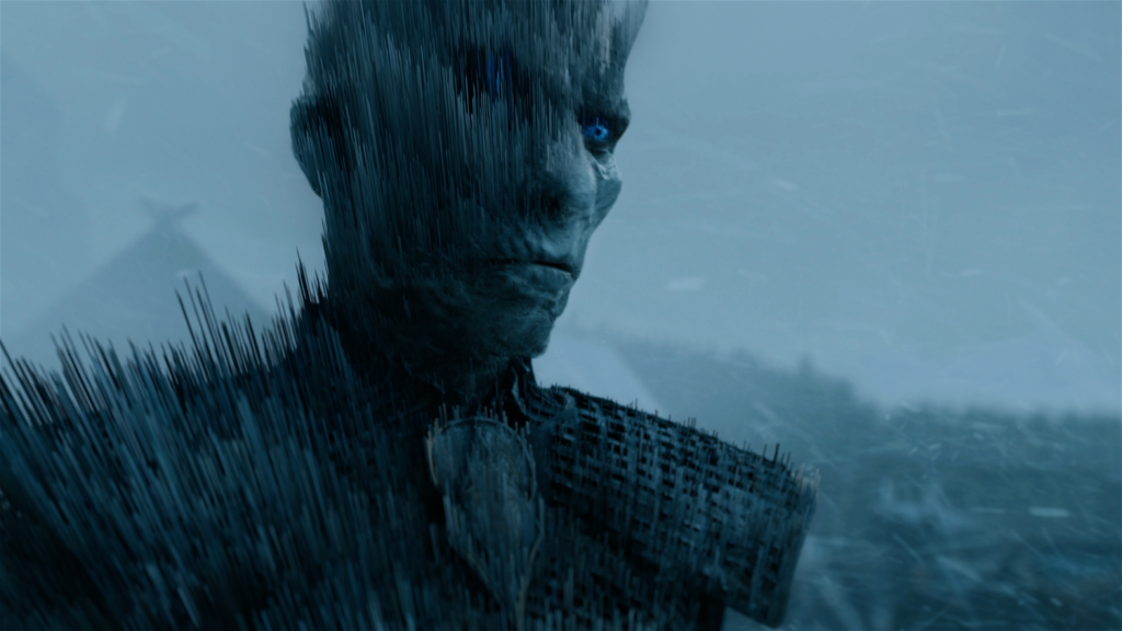
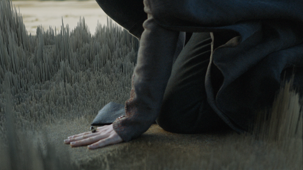
This is a the work of  Imaginary Forces NY, the short clip for  HBO, combining all the feature TV series.

The process started with a great edit, and figuring out which 2d clips would breakdown nicely into 3d “pixelized” scenes, figuring out how to move on them, how to tie scenes together, light and render them. Another challenge was pulling off a deep dive into HBO’s iconic ‘static’ id, going through the static and into the promo content.   The idea is to show the audience the 3D world that has always lived within the famous white noise  and ” We hope this new version gives you the same feels you got when hearing the opening growing up!” according to Imaginary Forces NY website.

I like consistance of the same sophisticated idea through the whole clip, and the transition is very good, it let audience stays in ‘3D’ world instead transit to ‘2D’ world several times in between different clips.

Project 5

sketch.js


var d = 20

function setup() {
    createCanvas(600, 400);

}

function draw() {
    background(0);
    for (var i=0;i<50;i+=1){
        for(var j =-10; j < 50;j +=1){
            fill (255,140);
            rect((50 + j *d * 1.5) + i * 15, 25 +(i *d *1.5), d+20, d); //offsets 

        }
    }
}
    

I created an optical allusion using for loop and offsetting the rectangles so when you look far away you can’t tell if the black negative spaces are straight or not.

Looking Outwards 5 -rrandell

https://www.artstation.com/vikiyeo

This is a link to some of the other works that this artist, Viki Yeo, has made previously.

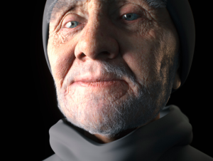
I am really amazed at this piece, due to the sheer detail that the artist was able to depict. This piece interests me because looks so real and so close to a real life portrait but was actually rendered using 3D computer graphics. The artist’s name is Viki Yeo and she used the software Adobe Photoshop, Zbrush, and 3ds max. The artist is a freelance 3D character artist and it is incredibly interesting to see how the artists choices manifest in this final form. On her website, it says that she is also a 3D texture artist. I found this interesting because texture is such a specific part of the artistic process that it seemed so limiting to have that be her only job but after seeing Viki Yeo’s work, the texture is so integral to her work that it now makes sense.

Jason Zhu Project 05

sketch

/* Jason Zhu
jlzhu@andrew.cmu.edu
Section E
Project 5
*/

// setup variables
function setup() {
    createCanvas(600, 400);
    background(10, 15, 35);
    var tw = 60/sqrt(3); //triangle width (adjusted)
    var th = 60; //triange height
    var oy = 50; //origin y of circles
    var ox = 50; //origin x of circles
    var r = 0;

    for (var y = 0; y < 6; y++) {
        //distinguishes even rows
        if (y % 2 == 0){
                //even rows: create 6 moon shapes
                for (var x = 0; x < 6; x++) {
                //position of moons x and y
                noStroke()
                fill(255);
                var py = oy + y * th;
                var px = ox + x * 103;
                ellipse(px, py, 50, 50);
                // create moon shadows and positions x and y
                push()
                fill(10, 15, 35)
                var py = oy + y * th;
                var px = ox + x * 93.5;
                ellipse(px+50, py, 50, 50);
                pop()
                }

             } else {
                //odd rows: create 5 main rectangle lines
                for (var x = 0; x < 5; x++) {
                var py = oy + y * th;
                push()
                //set random color and position variables
                var r = random(-50,50);
                var r2 = random(1, 5);
                var red = random(100, 255);
                var blue = random(100, 255);
                var green = random(100, 255);
                //offset origin x by an additional tw
                var px = ox + tw + x * 100;
                push()
                stroke(red, blue, green);
                // create 5 offset rectangle lines
                rect(px, py, 50, 1);
                rect(px +25, py +10, 45, 1)
                rect(px -25, py -10, 45, 1)
                pop()
                // create stars and set color
                fill(red, blue, green);
                ellipse(px+r, py+r, r2, r2);
                }
            }
        }
    noLoop();
}

function draw() {
    // draw is not called due to noLoop() in setup()
}

For this project I was inspired to create something that reminded me of stargazing as a child. When prompted to create something I would wear I interpreted that as to create something that I found meaningful to me and my own human experience. I wanted to create a wallpaper that conveyed a sense of time and wonder. Thus, I chose to demonstrate a very implied version of the moon cycle along with some colorful lines and stars that would tie the composition together. In terms of code, I tried to incorporate features from past classes–I added a basic random function to help create a slightly different experience upon each reload. Overall, I am fairly satisfied with the outcome and what I was able to learn from this project.

Yoo Jin Shin-LookingOutwards-05

Tentacle Tower

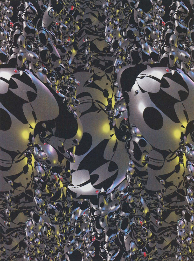
Tenacle Tower (2005) by Yoichiro Kawaguchi

Tenacle Tower by Yoichiro Kawaguchi is a mixed-reality work that “represents the growing visual impact of lenticular 3D imaging.” The dimensions of this work is 1 m x 1 m x 1.8 m and was displayed along the wall in Kawaguchi exhibition, SIGGRAPH 2005: Threading Time. This image seems to play with people’s abilities to shift perspectives when viewing images—at times it seems like there is movement downwards, but at other times it seems to draw you into the image. It also seems futuristic due to the chrome-like theme, and looks like something one may encounter in a sci-fi movie. This image is composed of repeating elements (like pattern and color), but also varying ones (like size and angles) that were probably incorporated into the algorithm to produce this piece.

Jason Zhu Looking Outwards 05

https://www.theverge.com/2017/7/18/15988096/war-for-the-planet-of-the-apes-joe-letteri-visual-effects-interview

View post on imgur.com

Created by Visual FX team for the Planet of the Apes film series (2011-2017). When lookin at computational artwork, I thought about the trilogy for the movies series Planet of the Apes. I thought it was amazing how well a computer was able to create apelike faces from human expression. In order to create such realistic renderings, it seems that the actors are wearing specialized motion tracking devices to capture facial expressions and movements as well as a slew of cameras to capture motions from various angles. The computer is then able to stitch together this data into overlays that take into account muscle, size, and movement. I find it fascinating how computer generated graphics have evolved over the years in order to create such realism and intimacy and I think it is only a matter of time until the technique is completely perfected and indistinguishable from reality.

Han Yu Looking Outwards 05

Trailer for The Maze Runner from Youtube

The project I chose to write about this week is from a movie called The Maze Runner. The movie had numerous computer generated art but the one I want to discuss about is the wall. There is no way that such a huge wall can be an actual movie prop so we can safely assume that it is computer generated. Regarding the wall, admire its sheer scale and realism. There’s engraved tally marks, names on the wall to elaborate the detail of the wall. I admire these traits because I think it’s not too extreme and in your face, but still plays an important role in the movie. Regarding the algorithms generated, I think that they used the for loop because of the wall’s repeating elements. Also I think that they used a green screen to overlay the wall in a studio. So that would be similar to calling a function in a function. The creator’s artistic sensibilities come into the final form because he has a very clear understanding of the wall and its role. The wall is simple in nature. Its goal is to protect the people from the elements. But the wall’s secret is that it contains dangerous monsters. I think this classic irony is the epitome of art. 

Carley Johnson Project 05

sketch

/*Carley Johnson
Section E
cbjohnso@andrew.cmu.edu
Project 05
*/

var d = 25;

function setup() {
    createCanvas(640, 480);
    background(255, 228, 233);
}

function draw() {
    for(var y = 0; y < 20; y += 2) {
        for(var x = 0; x < 20; x += 3) {

            // Bird body
            fill(0, 223, 252);
            stroke(0);
            rect((x*d * 1.5 - 185) + y * 25, 
                    25 + y*d * 2, d + 9, d + 2, 
                    0, 20, 20, 20);
            
            //Bird beak
            fill(255, 178, 76);
            stroke(0);
            triangle((x*d * 1.5 - 152) + y * 25, 35 + y*d * 2, 
                   (x*d * 1.5 - 152) + y * 25, 40 + y*d * 2, 
                    (x*d * 1.5 - 140) + y * 25, 35 + y*d * 2)

            //Bird eye
            fill(0);
            stroke(0);
            ellipse((x*d * 1.5 - 160) + y * 25, 33 + y*d * 2, 
                    3, 3)

            //Bird wing
            fill(154, 242, 253);
            stroke(142, 216, 252);
            bezier((x*d * 1.5 - 184) + y * 25, 38 + y*d * 2,
                    (x*d * 1.5 - 175) + y * 25, 55 + y*d * 2,
                    (x*d * 1.5 - 170) + y * 25, 55 + y*d * 2,
                    (x*d * 1.5 - 160) + y * 25, 38 + y*d * 2)

            //Bird food
            fill(255, 178, 76);
            stroke(0);
            ellipse((x*d * 1.5 - 110) + y * 25, 33 + y*d * 2, 
                    5, 5)
            }

      }
      
    }


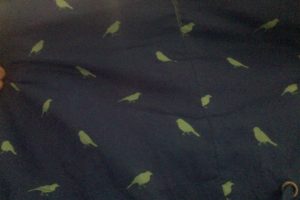
I knew I wanted to do birds, because I think birds are an adorable and eccentric pattern. (I have a rain jacket with a repeating bird silhouette pattern on it that I love, pictured above) so I chose that. For a while I was trying to create five thousand variables for each individual shape, but that was making different patterns with each shape, not following where the body was. Then I realized that I could simplify the process by using the same variables (which also unified where the objects appeared) and had to live with the retrospective embarrassment of taking so long to figure it out. But I think this is adorable, so, worth it!

Han Yu Project 05 Wallpaper

sketch

// Han Yu
// Section D
// hyu1@andrew.cmu.edu
// Project 05

function setup() {
    createCanvas(600, 600);
}

function draw() {
	background(184,233,230);
	// passion fruits
	for (var i=50; i<width-10; i+=100) {
		for (var j=50; j<width-10; j+=100) {
			noStroke();
			fill(27,179,111);
			ellipse(i, j, 70, 70);
			fill(122,196,36);
			ellipse(i, j, 60, 60);
			fill(234,40,95);
			ellipse(i, j, 55, 55);

			// seeds
			stroke(88,88,90);
			strokeWeight(4);
			point(i-13,j-3);
			point(i+5,j-8);
			point(i,j-13);
			point(i-10,j+9);
			point(i+1,j+10);
			point(i+13,j+4)
			point(i+1,j+1)
		}
	}

	//eaten parts
	for (var y=0; y<7; y+=1) {
		
		if (y%2==0 & y!==0) { // only on even rows
			for (var x=0; x<7; x+=1) {
				if (x%2==0) { //only on even columns
				noStroke();
				fill(184,233,230);
				rect(x*100+100, y*100-100, 50, 50, 5);
				}
			}
		}
	}

	noLoop();
}

Watermelon is my favorite fruit. It was fun to make a wallpaper full of watermelons. To add more variations, I covered up some parts of the watermelons on a few locations. Overall, I found this project very helpful for practicing nested loops.