Carley Johnson Project 02 Section E

sketch

/*Carley Johnson
Section E
cbjohnso@andrew.cmu.edu
Assignment 02A
*/

var skinColor = 250
var headH = 175
var headW = 150
var eyeColor = 226
var lipColor = 145
var lipCorner = 200
var hairLength = 220
var eyebrowH1 = 160
var eyebrowH2 = 155

function setup() {
    createCanvas(640, 480);
}

function draw() {
    background(182, 212, 115);

    fill(112, 62, 40)
    stroke(112, 62, 40)
    rect(200, 90, 220, hairLength, 100, 100, 0, 0 ) //back hair

   fill(255, skinColor, 180)
   stroke(skinColor) 
   ellipse(300, 200 , headW, headH) //Head

   fill(128, eyeColor, 252)
   stroke(70)
   ellipse (275, 175, 10, 10) //Left Eye

   fill(128, eyeColor, 252)
   stroke(70)
   ellipse (300, 175, 10, 10) //Right Eye

   fill(255, 124, lipColor)
   stroke(255, 124, 145)
   bezier(275, lipCorner, 280, 210, 285, 210, 300, lipCorner) //mouth

   fill(215, 106, 58)
   stroke(215, 106, 58)
   rect (270, 90, 125, 75, 0, 50, 0, 50) //bangs

   fill(112, 62, 40)
   stroke(112, 62, 40)
   bezier(255, eyebrowH1, 270, eyebrowH2, 280, eyebrowH2, 280, eyebrowH1) //Left eyebrow

   fill(112, 62, 40)
   stroke(112, 62, 40)
   bezier(290, eyebrowH1, 290, eyebrowH2, 300, eyebrowH2, 320, eyebrowH1) //right eyebrow

}

function mousePressed() {
     skinColor = random(190, 250)
     headW = random(150, 200)
     headH = random(150, 200)
     eyeColor = random(190, 270)
     lipColor = random(60, 160)
     lipCorner = random(220, 185)
     hairLength = random(200, 300)
     eyebrowH1= random(170, 160)
     eyebrowH2 = random(160, 145)
     
}

This was tough, a real learn-by-doing experience. Now I feel like I really understand variables and how to control them (like learning to add parameters to the ‘randomness’ under the mousePressed function) and am proud of this. It may not be the most complex face, but it definitely changes and the way the expression changes (done by changing the height of the corners of the mouth and eyebrows) which I really like.

Tanvi Harkare – Looking Outwards – 02

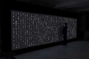
A project that I really liked is the Digital Type Wall that was created for Monotype, and then exhibited in the Metropolitan Wharf in London, UK in November of 2012. The exhibition and print design were created by the SEA design team, and the installation concept and code were created by Marcin Ignac and the Variable team. The project was created in collaboration with the Pencil to Pixel exhibition to help show how typography has changed through the years. There are over 6,000 different combinations that can be shown based off the animation that creates it, and it takes typography from over hundreds of fonts. The custom software was created using a Plask framework which creates the animation that chooses the specific fonts to display. Based off the video that I saw about the project, I assume there is a library of characters that this software goes through and creates an animation to display them in a random order.

 I find this project interesting because of the variety of fonts that it displays. Because of this workflow, its engaging for all audience types and provides a unique experience. I think if the exhibit were more interactive, it would be more successful in helping to engage the audience further. Additionally, it seems that the project currently is just displaying the characters in a grid-like format. Although this creates a clean look which is easy to understand and look at, it would be interesting if the letters formed into something else, like a symbol or object. For more information about this project, visit the website here

Christine Chen- Looking Outwards-02


Above is Austrian artist LIA’s work, Weaving, that was created in 2018
Source: https://vimeo.com/279291848

After looking at a range of various generative art, I found Austrian artist LIA’s work, Weaving, most fascinating and inspirational. LIA started producing art with softwares and algorithms as early as 1995 and is considered as one of the first developers of the field. She translates concepts into codes which she uses as “machines” to generate multimedia outputs, which are then used to generate art. In her piece Weaving, LIA was inspired by the use of punch card in the Jacquard mechanism that was used to record information in the past to efficiently weave complex patterns for textiles. LIA developed the software to reflect the method of the Jacquard mechanism to develop “digital textiles.”

What interests me most about this piece is how simultaneously different and alike the Jacquard mechanism and LIA’s method of creating the piece is. Both translates aesthetic patterns into codes, yet the output of one is physical while the other one is digital. It is as if one is a newer version of the other. Through this piece, LIA combined traditional art with today’s computer generated algorithms to create a breakthrough of both sides.

Kade Stewart-LookingOutwards-02

Marcin Ignac, Every Day of My Life (2012)

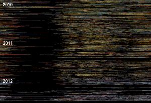
Marcin Ignac completes a lot of projects that focus on data visualization. Whether that’s data from an Internet of Things, from the stock market, or even from his dad’s workouts, Ignac finds a creative way to model the data. In “Every Day of My Life,” Ignac used an app called Tapper to track his foremost running app at all times of the day, every day, for two and a half years. He then visualized the data using Plask, separating each program into a specific color and each day into a band. The project should be consumed from top to bottom.

What I admire most about Ignac’s work, and specifically what I admire about this project, is that the work is something I would consider art at the end, but does not come from that. The usage of different programs is not meant to be artistic, and yet, Ignac takes it and makes art. In addition, the art holds onto the meaning – if I were to look at dark spots, I could probably guess where the holiday season slowed his work. This algorithm was probably pretty simple, assigning colors and arranging them chronologically. This simple yet meaningful project embodies Ignac’s style of grounding his work in the very real world of data.

Marcin Ignac

Emily Zhou – Looking Outwards – 02

London-based artist, Quayola, uses image-analysis and manipulation algorithms to generate digital landscapes in a project titled Pleasant Places.


Pleasant Places, Quayola, 2015

I am a big fan of the irony that is present in this work. The artist uses a computer program, a far cry from the natural world, to construct pleasant, organic works of art. I admire the contrast against the popular belief that only nature itself can produce feelings of comfort and tranquility.

The algorithm requires an input video (e.g. trees swaying in the wind), which it then relates by analyzing patterns of movement and colour. The result is a painting-like scenery. The shot-breakdown is demonstrated below:

Artistic sensibilities come into play in developing the algorithm. The artist performs computational brush studies as well as generative painting simulations in order to create a digital synthesis that can be applied to natural landscapes. The work exhibited as an audiovisual installation will hopefully inspire more people to consider computer technology as a means of art-making.

ChristineSeo-LookingOutwards-2

Metamorphosis is a generative animation video that was created by Glenn Marshall. This work is not a commercially used animation, it also shows the usage of technology, and exposes the process of rendering the technology through algorithmic animation programmed in Processing. As a generative animation, I thought this animation was very intriguing because it shows different movements through butterflies as well as having great transitions. Not only the project is aesthetically pleasing, the music plays a great role in showcasing this video, which I believe adds a lot to the mood of the overall piece. The color palette in the animation is eyeopening and the different strokes and movement of the piece expresses great nature in a technological way.

This piece is inspired by this previous short film made in 2007, called Butterfly. This film used experimental techniques using traditional 3D and 2D software. Expanding his creativity and experimental aspects in digital art, he created this algorithmic animation a year after. Overall, the interaction between the video rendering with animation, music and transitions created a beautiful and inspiring project.

Looking Outwards-02 Sophia Kim


Frederik Vanhoutte’s “Com Sigil – Pattern in Absence” is aesthetically pleasing to the eye. I appreciate the use of space and colors in this project. Using neon colors (pink, blue, and yellow), Vanhoutte makes the viewers notice the black shapes moving throughout the generative illustration. This generative art depends on the sound waves and vibrations from the song “Take a Deep Breath” by Talvekoidik. The system generates black shapes from multiple directions to move through the colored lines whenever there is a change in tone or vibration. The colored lines form many 3D shapes to make the illustration resemble a cube puzzle. I believe this project could have used JavaScript and/or Adobe Illustrator for its algorithm. In Vanhoutte’s recent works (2018), he focuses a lot on combining grids, geometry, and sound into his algorithm. “Pattern in Absence” is a great example of how he utilized those concepts, especially because he used a song that did not have drastic changes in sound.

Julie Choi-Looking Outwards-02


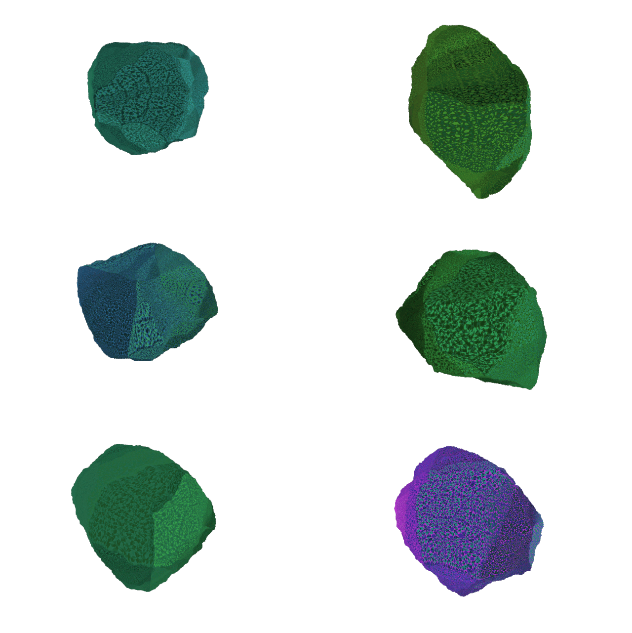
Like the human eyes, the graphics of this artwork shows a visual harmony involving many shapes. I admire this project because building this system must have required a very technical calculation of each and every one of the pieces. Although, as a whole, it seems like a circular illusion, each shape is in certain and very specific positions to create a functioning system.

Memo Akten is an artist who mainly uses computation as his media to create projects that explore the collision between nature, science, and technology. This project, “Reducible Complexity” was designed in 2013 by Akin. He created this project to represent a visual form of reducible complexity derived from the natural world. Reducible complexity is a system that is composed of single interactive parts that are needed for a whole function. In other words, without one single element, the system will not be able to function or display. A natural and visual example of this is the human’s eyes. The mechanisms of eyes are systems that have fundamentally evolved with small incremental changes since humans naturally need both pairs for a full function.

Connor McGaffin – Looking Outwards – 02

This week I looked outwards to the work of Memo Akten. This work explores generating visuals of nature through the movement of manmade objects. The visuals generated have a paint-like quality, possibly driven by Akten’s admiration of impressionist art. Among the images seen in this video are simulations of crashing waves, flames, clouds, and plant life.

Atken describes the project as:

 “a deep neural network making predictions on live camera input, trying to make sense of what it sees, in context of what it’s seen before.”

With this information, I would infer that the algorithm used in this project may be similar to those used in Photoshop’s filters and patch tool. The filters apply an aesthetic quality to the visuals while the patch tool interprets what visuals are around it in an effort to generate more of the image. From watching the video, it becomes evident that certain hues of color correlate to different textures and hues, depending on which “mode” the generative algorithm is in.

A deep neural network making predictions on live camera input, trying to make sense of what it sees, in context of what it’s seen before. It can see only what it already knows, just like us.

I feel incredibly drawn to this work because of it’s ability to make natural phenomena feel so understandable. The work draws parallels between the incredibly organic and the accessibly human. I am most excited about the experiment with the water simulation driven by manual fabric manipulation.


source 

uploaded April, 2018

Alice Fang- Looking Outwards-2

“Metamorphic Drawings” by Miguel Nóbrega, days 1-6

it’s doing it is an online exhibition where artists express a set of instructions through code which then generates images daily for 45 days. With a new, unique image generated every single day, this project experiments with removing the physical viewing aspect of interactive exhibitions, instead driving the viewer to revisit the webpage over a month and a half. A new visit to the website will have a new set of images curated. I think this is an interesting solution to the problem of displaying media in galleries that are limited in the physical world, and I wish I knew about this while it was still current, to experience first hand the intrigue in visiting the site daily to see unique, but similar pieces of art.

Written instructions are given to the viewer as well, and they tend to be very poetic, and although the computer generates the image, the artist still has their own personal touch (through style and type of content). Each artist probably used algorithms with different purposes, from randomizing variables of size and generating numbers for colors (Matthias Dörfelt’s ‘Daily Donut’) to adding filters and effects from images in a database (Daniel Schwarz’s ‘Morning Routine’), to generating random handwritings (Adam Ferriss’ ‘Signed Autograph’).