Miranda Luong – Looking Outwards – 12

“One More” Official Music Video(2018) by Yaeji start at 2:11

This video by Yaeji features many distortion effects that build upon the trippiness of her own music. A certain effect I really liked and is related to my upcoming project is the ripples generated at every clap in the music (such as 2:11). These ripples are timed perfectly well, with a slight bounce back because the claps occur in sets of 2. In addition, visually, these generated waves are quite organic but their pacing is what makes them obviously generated by something man-made, that is her music.

Beethoven (1955) by Josef Müller-Brockmann

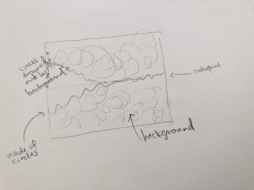
Josef Müller-Brockmann was an iconic Swiss graphic designer. One of his most notable works was his Beethoven poster, featured above. In his poster, the concentric arcs relate directly to the mathematical systems and structures present in Beethoven’s music. Dramatic changes in scale, placement, and color are a manifestation of the same drama in Beethoven’s music. This static image possesses a dynamic energy that I hope to emulate in my own project.


Yiran Xuan – Looking Outwards 12

Greg Borenstein‘s work is quirky and fun, utilizing lofty technology to bring tokens of enjoyment to life. One of these is Ten Seconds, a short game that involves your player ball jumping around trying buy more time for the game by attempting to obtain collectibles, while also avoiding hazards. Containing one interesting and “perpetual” mechanic, this game has the same spirit as the likes of Temple Run, Flappy Bird, and Tiny Wings, “toilet games” as I like to call them, capable of keeping one amused for the duration of a sit, but also having the potential to be competitive and give tryhards a challenge. This is the type of game I’d aspire my own project to be, though it does not have a “perpetual” mechanic. I wish to emulate the clean style and effective sound design of the game, though I wish Mr. Greg would remove gravity from the game and maybe add more depth to the levels, so that it would almost be like an exploration campaign rather than a boxed and contained experience.

Katherine Hua – Project-12 – Proposal

With my proposed collaborator, Min Lee (mslee) from Section A, we are going to make an interactive visual representation of a song (yet to be decided). We want a song that gives off a peaceful and dreary vibe. The visual part will be of a visual sound spectrum based off the wavelengths of the sound that is set in the middle of the canvas. The spectrum will be made up of small circles of varying colors that are constantly drowned out by the background (to give it a look of lagging behind to further reinforce the dreary and peaceful vibe intended). For the interactive component, we wanted to create layers of sound. We will find the individual instruments that come together to make up the song (flute, percussion, voice, etc.). This representation will start off with just one layer (one instrument). With each click of the mouse, a layer of sound will be added. With each layer of sound, a layer of color will be added to the visual representation as well. So we were thinking of having the circles having lower opacities so that different colored circles could come together to form new colors. Of course this means we need to choose appropriate colors that will make actually pretty colors. Below is a quick sketch of what we expect our project to look like.

Our sketch of our project


Robert Oh- Project 12- Proposal

For my final project, I wanted to create a “multi-tasking” game. I remember back when I was a kid, there was a multi-tasking game that my friends and I would play in order to see who could score the most number of points (and so prove who was the best at multi-tasking).

And so, I wish to create a similar game where you must keep track of many different elements at the same time in order to survive. For example, I have 4 examples in my photo below that the player must keep track of. The top-left photo contains a ball on top of a platform in which you have to balance (the ball may move to the right or left of the platform). The top-right photo contains a clicking game where you must click inside the spawned circles before the time runs out. The bottom-left photo contains a turtle running hurdles, where you have to press the space bar for the turtle to jump. Finally, the bottom-right photo shows a hollow semi-circle that you must rotate to allow the arrows on the sides to hit the middle of the semi-circle.


Project 12: Final Project Proposal

For my final project, we wanted to create an audio-visual experience that would also have some interactive aspect tied to it. We want to set a peaceful and dreamy tone, so we’ll be using a variety of different-colored circles to represent the sounds. To make it an interactive experience, we’ve decided to add layers of audio with each click so that the user can see the different types of instruments that go into making a song. The graphic interface will start of with the circles in the middle of the canvas in a straight line and fluctuating as the sounds are piled on. We’ve also decided that we will assign a different color to each new instrument/sound that is added. In that way, the user will be introduced to a combination of sounds that transform what they previously saw from before clicking.

Proposed collaborators: Katherine Hua (khua)

Audrey Zheng – Looking Outwards – 12

This is an audio visualizer created by Willian Justen, Luis Henrique, and Marcio Ribeiro that I found on github. Music visualization, a feature found in electronic music visualizers and media player software, generates animated imagery based on a piece of music. The imagery is usually generated and rendered in real time and in a way synchronized with the music as it is played.

View the page here.

I enjoyed this project because it was cathartic just looking at the page. I liked how the low, loud beats corresponded to larger ellipses forming on the screen. From a artistic standpoint, the project is aesthetically pleasing and calming.

This is a weather visualizer made by George Edmonds. This is rather simple in execution, the site simply fetches the weather data and then chooses from a set of hardcoded icecreams to visualize. Still, I thought it was a fun idea.

Alessandra Fleck-Project 12

For my final project I would like to engage what skills I have learned in creating and illustrating animations in p5js and bringing those skills into an interactive application that allows the user to bring changes into their background. So sort of an interactive green-screen with animation idea that is curated specifically for the purposes of trying to bring design ideas into the environment the user is in. I am not entirely sure what the parameters for the design will be as I have not explored all of the possible moves I could make using augmented reality yet. However for a start, I most certainly want the augmented reality animation created with p5js to be informative and useful as a tool to the user. After looking at some examples in how to engage the user with an animation, I found augmented reality as a common method for making such engagement happen. Though there are less examples and resources available specifically curated towards the p5js library, there are several for javascript available online. In terms of the resources that are available for working with the p5js library, I found TangibleJS, to be a tool that can be used to bringing interactivity to code that relies on the p5js library. In terms of precedent assignments that were worked on in class that relate to the concept of augmented reality and animation, the raining letters with webcam assignment is one such example of the concept of augmented reality being implemented with p5js.

Concept Diagram:

Collaborators: None proposed

Looking Outwards 12 – Min Lee

I am interested in creating an visual representation with audio, much like how Ren Yuan does in her project Sorting. Using Processing, she sorted copious amounts of data and created visual and audio aids to pair with the data actual data being sorted. In Studio Antimateria’s Shape in Scapes, a similar use of data visualization is at work, with students’ architectural projects at three different locations are being abstractly demonstrated. Although I believe that the visual and audio representations were added as aids for the user’s fascination in watching the project, I believe they play just as important roles in making the user interested in otherwise a very confusing experience. For my project, I also wanted to create some visual and audio accompaniment to some third factor.

Sources:

Sorting – Visualisation, sortification and sonification of an algorithm

Shape in Scapes – Transporting architecture into audio-video performance

Katherine Hua – Looking Outwards – 12

“Funky Forest” by Theo Watson and Emily Gobeille (2007)

The first project that I admire is called Funky Forest, created by Emily Gobeille and Theo Watson, creators of high-end interactive installations for children. Funky Forest is an art installation in the Singapore Art Museum acting as an interactive ecosystem in which children can bring trees to life through their bodies and use physical logs to control the flow of water from the waterfall to the trees. The children use this water to water the trees and keep them alive. The health of the forest and everything that resides within it relies on the basic health of the trees. Funky Forest is an interactive and collaborative experience for children to create their own stories and go on their own fantastical adventures. I enjoy this project because it places an emphasis on meaningful interaction and systems build to support open play and discovery while creating a sense of wonder and delight at the same time.
“Replicants” by Lorna Barnshaw (2013)
a printed 3D scan of a human face
a printed result of one of the digital methods
The second project that I admire is the projects of Lorna Barnshaw, a virtual/glitch sculptor. She uses 3D technology to print three very different sculptors, using herself as her model. In her series called Replicants, Barnshaw fuses self portraiture with 3D technology to create sculptures that give off an eerily, sub-human feel to them as Barnshaw uses computer glitches to that are unable to accurately 3D print the scan; thus resulting in a sculpture with humanistic qualities that are distorted at the same time. I admire this project because it finds a platform for fine arts in an area where 3D technology is revolutionizing science, medical, and design worlds.


Yoo Jin Shin-LookingOutwards-12

Interactive Resume (2018) by Robby Leonardi

The first project is an interactive resume by Robby Leonardi. It’s colorful, fun, and highly interactive. The user scrolls up or down to move the figure through Robby’s resume. It really shows off the designer’s personality. One thing is that there is no link to a portfolio of his actual works/projects.

Interactive Resume (2018) by Charles Richard

The second project is another online resume by Charles Richard. Similarly, the user scrolls up or down to navigate through Charles’s resume. However, this project uses more muted colors. One thing I noticed is that he uses circles throughout his project so it’s difficult to tell at a glance which ones are buttons and which ones are simply for aesthetics. Overall, I think both of these projects are fun, interactive ways to display one’s resume.