Looking Outwards 12-Project Priors and Precursors-Veronica

For this week’s looking outwards, I decided to look at the works from Chloe Varelidi(http://varelidi.com) and Kaho Abe(http://kahoabe.net/portfolio). They are both new media artists and game designers working with a variety of mediums and often produce projects that are a mix of digital and physical artifacts.

Chloe Varelidi is the founder of Humans Who Play, a design firm that uses play as educational and creative tools. What really inspires me about her work is that she could always manage to bridge that creative gap and make coding easily accessible to everyone. In her projects there are also always a physical artifact to help understand the coding work that’s going on behind the scenes, and makes the process of play more meaningful and informative.
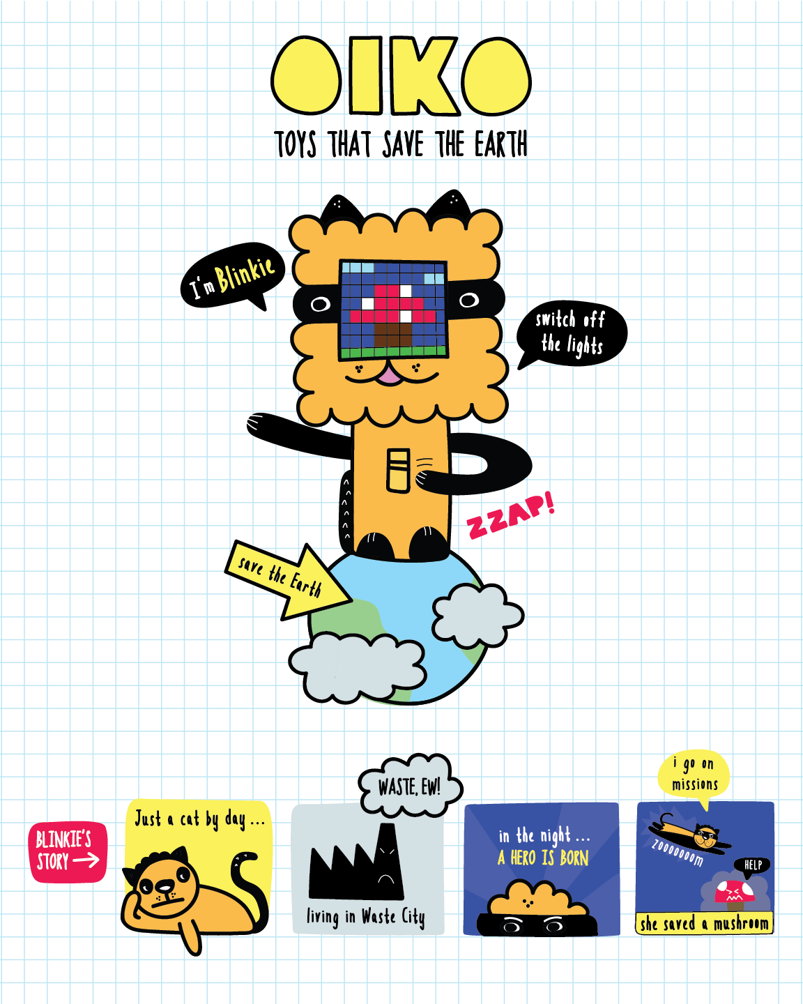
project oiko by Chloe Varelidi

Oiko is a project created for younger kids to learn about environmental and energy saving strategies by reminding them to turn off the lights. She managed to make the process fun and playful rather than tedious.
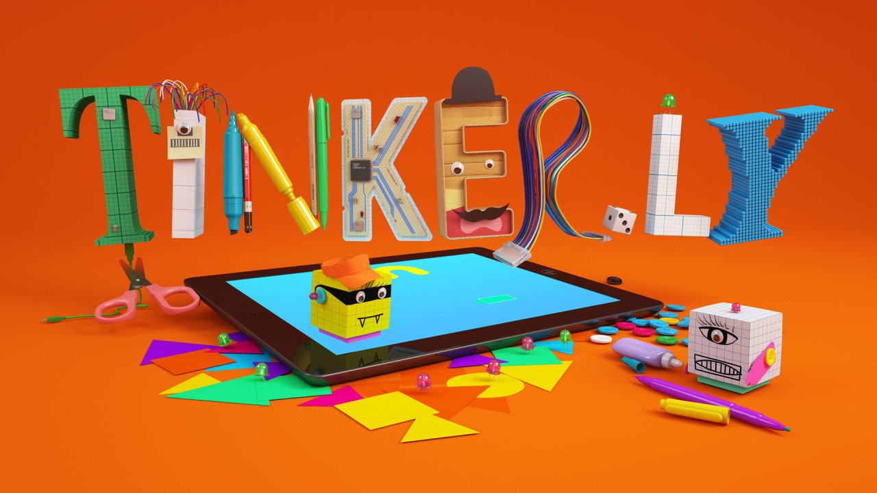
Tinkerly A prototype I developed with the always crafty Jess Klein for an ipad game app that interacts with conductive-paper avatars that kids can tinker with. The gorgeous 3D art is by Christopher Labrooy..
project tinkerly by Chloe Varelidi

Tinkerly is a project to foster creativity, with a digital interface on an ipad that can be combined with physical paper models to create avatars and scenes for children.

Kaho Abe is an American Japanese artist focusing on designing for social interactions and experiences that enhance the relationship between people. Previously a fashion designer, her interest in wearable technology and game design combined to create projects that engage behaviors, gestures, and custom controllers.

Her animation Window Vistas is a generative landscape video that documents her travel on a train. I am hoping to do something similar for my final project and learning from her how she created 3D-looking landscape elements.
screenshot of her animation Window Vistas

Hit Me! is a wearable game device that engages two players and speculators, and tests for their agility, strength, and ability to take quick snapshots. The interactive headpiece has a button and camera that connects wirelessly to a screen. The objective is to hit the opponent’s button, and then take a snapshot of them using your own camera.

Hit Me! (2011) from Kaho A on Vimeo.

Both artists’ work are inspiring, especially how they made digital artifacts tangible and accessible to everyone. Although it would be hard for me to incorporate physical artifacts in my final project, I was inspired by their style, method and intent for their project to be educational and informative.

Christine Chen-Looking Outwards-12

Camille Utterback’s Glimpseand Theo Watson and Emily Gobeille’s work Living Libraryare two projects that interested me.

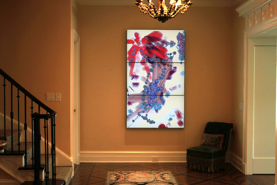
Utterback created Glimpsefor a collector’s foyer. It is an interactive multi-monitor piece that turns the entryway of the foyer into a dynamic experience for people who pass through. The visual shapes evolve according
to the people’s movement. The shapes that are created remain in the background, and the work continues to evolve as others come and go. What I admire most about this project is how it invites everyone to create one artwork, allowing people to somehow connect to each other. Another interesting thing about this work is how it turns the space into an interesting experience for people, adding some sparks into their daily lives as they pass through the foyer.

Above shows a video of Watson and Gobeille’s work Living Library, Source: https://vimeo.com/203193098

Like Glimpse, Watson and Gobeille’s work Living Library is also an interactive work. It works with the Connected World exhibition. The work utilizes two cameras and a laser light source projector. The cameras track the visitor’s hand’s positions, allowing them to trigger animations through motions. How the creators turn a book reading experience into a more interactive one fascinates me as now things that are limited by prints, such as sound and colors, are brought into life through animations.

Camille Utterback, Glimpse, 2012

Both Glimpse and Living Libraryuses motions to control the created visuals. This is what I would like to explore in my project. Even though it would be quite hard for me to create something that senses the user’s motions as smoothly as they do in these projects, perhaps I could utilize the mouse’s motion instead.

Yingyang Zhou-Project-12-Proposal

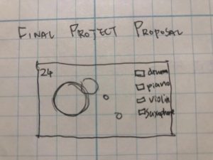
For the final project, I would like to play with the sound effect since I’m very interested in it and we don’t have a chance to do a project on sound.

I would like to a game that is similiar to keyboard instrument. The idea is you need to press the right key of the instrument that is playing right now, the legend of keys will be given on screen. Also the score will be cumulated and shown on screen. Ideally, the level will be harder when you get to a certain amount of score.

Kevin Thies – Looking Outwards 12

For my final project, I was looking at making a top-down dungeon crawler game. There’s plenty of games like this, like some of the original Legend of Zelda Titles, but the one I saw as most relevant to my project was Edward McMillen and Florian Himsl’s 2011 Flash-based game, The Binding of Isaac. Admittedly, I’d heard of the newer version, but I never really looked at the older one, which was initially made in a week. The way the player moves through rooms makes sense mechanics-wise, and means generating levels should be simple (in theory).

One of many possible Isaac rooms

From here I took a look back to see what older games did for level generation, which ended up becoming a tangent that led to my finding Nethack. I found it fascinating mostly due to the ASCII graphics, but turns out it was made in 1987 by Mike Stephenson, and has had continuous edits and updates. In fact, their GitHub repository was last updated 15 hours ago, at the time of writing. I found it interesting in that NetHack levels take up no more than the size of the screen. They’ll never scroll. It’s also all open source, albeit written in C.
An example of the NetHack ASCII graphics
If I was to follow this format, I could just store the levels in an array and be able to call them individually by number, which could be interesting. It also breaks up the really boxy rooms of Isaac, which relies more on having different environment assets placed in different places in each room.

JasonZhu-Proposal-12

Rudimentary video animation of our project.


Collaborator: Miranda Luong

My partner, Miranda Luong, and I plan on doing an audiovisual performance visualization for our final project. Interested in the dynamic capabilities of static design, our project will oscillate simple geometric shapes to visualize sound waves in music.

We were heavily inspired by Swiss Design, a time in design where strong geometry was utilized to create interplay between form and content. To break down our proposal for this project, our source audio will be represented by a singular circle placed in the midst of triangles and quadrilaterals. This circle will change in scale in accordance to the intensity of beats and the outside shapes will change as well. We imagined ripples, created by water droplets as an inspiration.  We wanted our visual display to suggest a connection between the source audio and its environment. We will explore the communicative capabilities of flat imagery and test our own abilities to visually communicate music.

JasonZhu-LookingOutwards-12

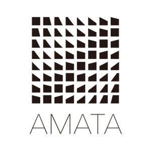
AMATA K.K.’s logo design

AMATA K.K. is a Japanese game development company centered in Tokyo, Japan. What I wanted to focus on was the logo for their company. A square composition constructed out of slightly variated quadrilaterals with a few triangles thrown into the mix, they use this logo as an opportunity to communicate their strong abilities in animation. Although the logo is merely a flat composition of simple shapes, the proximity of these shapes and their slight differences convey a sense of movement and depth. In relation to our project proposal, this is exactly what we hope to communicate through our own imagery. The difference is that we would be actually animating these shapes to generate a series of images that will visualize more than just one wave of movement but multiple, like that of music.

GIFs by Sami Emory.
LEVEL by Paris-based design studio IF

LEVEL is an audiovisual experiment by Paris-based design studio IF for Paris nightclub Machine du Moulin Rouge’s fifth-anniversary celebration. It utilizes light to “represent the dialogue between space and its limitations.” Set to the ambient tracks of Trespur, LEVEL projects a fast-paced series of dizzying distortions on a transparent material superimposed onto a semi-reflective surface. Each viewer in the room sees something different as lights shift and change from any given perspective in the room. I found this to be an inspiration for my own final project due to the very nature of the project, but especially for their one projection of ripples. In addition, after seeing all these other kinds of projections, perhaps I will try other kinds of movement besides radial.

Jenni Lee – Project 12 – Final Project Proposal

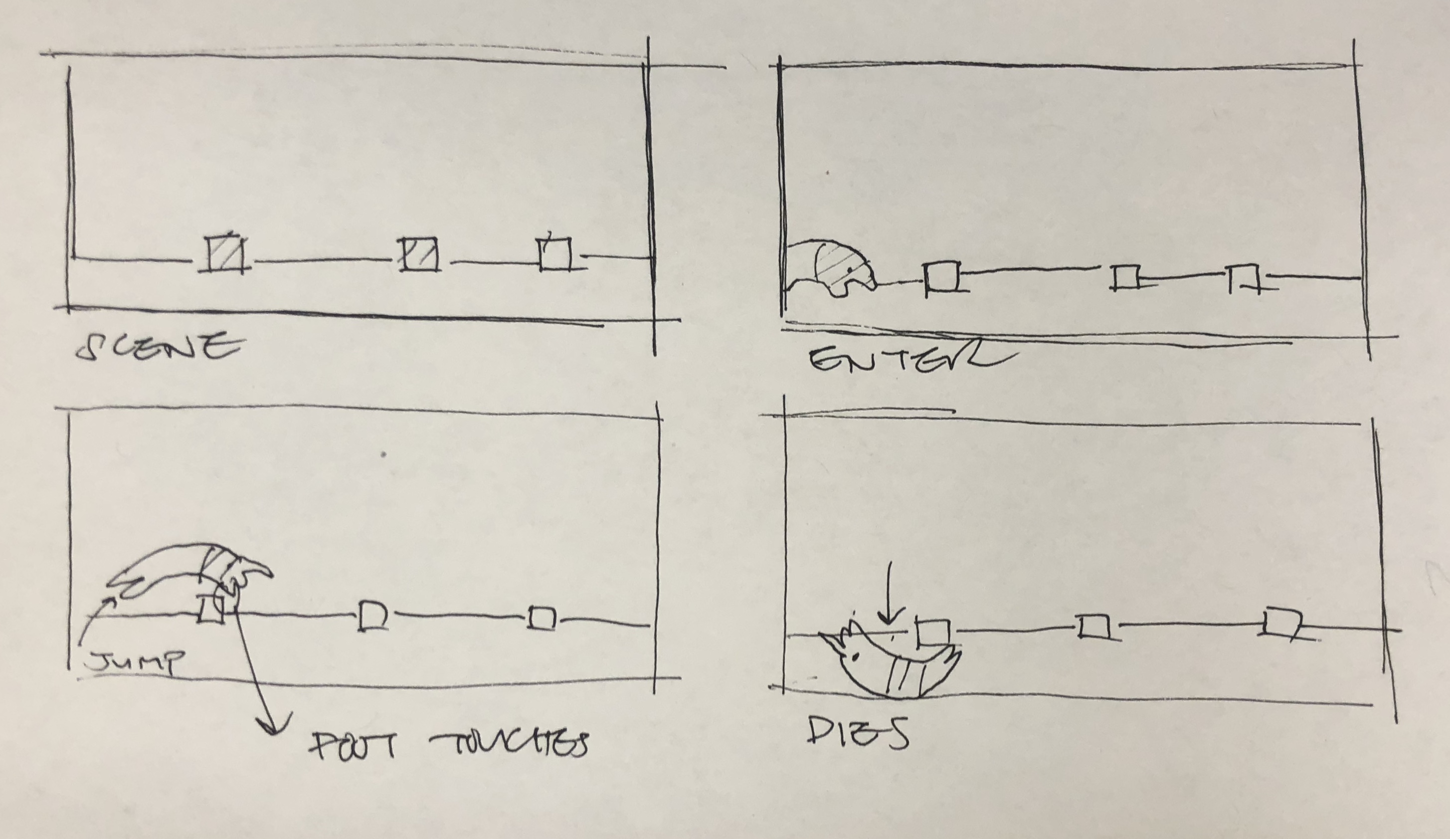
For my final project, I plan on using a moving landscape as a base for an animal jumping game. The the ground will be moving, and on the ground there will be posts. Everytime the page refreshes, an animal will appear on the left, and it will begin to run. When the space bar is pressed, the animal will jump, dodging the posts which will result in the animal dying upon touch. I plan to implement elements of sound, such as a sound when the space bar is pressed and a sound when the animal dies. The number of posts that the animal successfully jumps over will be displayed on the top corner. I plan to display the words “you have lost” once the animal dies. The objective of the game is to gather as many points as possible.

Eunice Choe – Project-12-Proposal

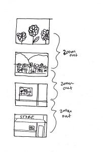
For my final project, I want to mimic the effect of a book I read in elementary school called Zoom by Istvan Banyai. The book is composed of several landscapes that zoom out as each page is turned. As a result, the zoom outs continually cause shifts in perspective and allow readers to embark on a journey through several different landscapes and environments. With each zoom out, I plan to incorporate animations within each landscape that reflect the environment. For example, I will incorporate elements of gravity and physics to make the landscapes seem more realistic. I will also make my project interactive by allowing the user to click on a “zoom out” button that will show a new, zoomed out landscape. I also plan to incorporate elements of randomness in the landscapes so that the users will have a different experience every time they interact with the project. While I am unsure of how many frames I will incorporate, I hope to create the same effect the book gives off with each zoom out.

A sketch of the “zooming out” effect.

Inspiration (pages of Zoom):

Jenni Lee—Looking Outwards 12

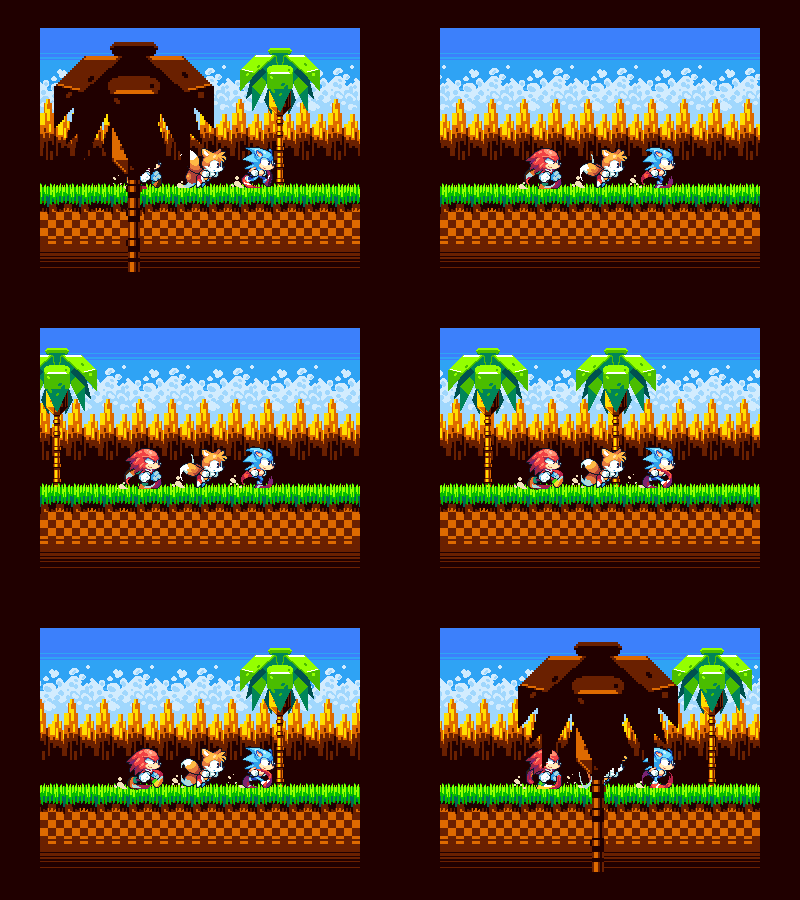
“All Aboard the Sonic Train”

The first project that I will draw inspiration from is “All Aboard the Sonic Train” by Phil Giarrusso. Phil Giarrusso is a designer, illustrator, and animator specializing in pixel art and game development. Inspired by a beloved childhood video game, Sonic the Hedgehog, Phil Giarruso recreates a scene from the game through motion graphics using a pixeled aesthetic. Because my project will involve a character running and jumping across a moving landscape, I was inspired by the aesthetic of this project. In addition, I enjoyed the colorful, bright colors in this gif, and I plan on drawing inspiration form this color palette and using it in my project.

Click here to view more of Giarrusso’s work

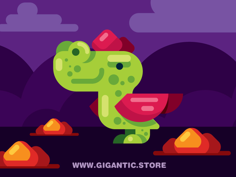
“Flat Design Dragon for Games”

The second project that I will draw inspiration from is “Flat Design Dragon for Games” by a design company called “Gigantic” which specializes in flat design illustration and 2D animation. Similar to the project above, I was inspired by not only the color palette and gameplay aesthetic, but I liked the usage of various layers within the piece. I plan on incorporating various layers and colors in order to create depth in my project.

Click here to view more of Gigantic’s work

Eliza Pratt – Looking Outwards 12

For my final project, I’ve drawn inspiration from a handful of game designers that create intuitive, aesthetically pleasing games for web and mobile platforms.

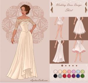
Azalea’s games are known for their intuitive controls and unique artistic style

Since I plan on creating an interactive dress up game, I’ve paid particular attention to the game developer Azalea, an artist known for creating almost a hundred fashion games for girls. She first draws the figures, clothing and backgrounds on Photoshop and then programs the interactive elements in actionscript 3 using Adobe Flash. Not only is Azalea known for maintaining her own site of exclusive games, but she’s gained attention for her unique artistic style and clean, intuitive designs. Since online games that are developed for children often use excessive decals and loud visuals, I admire Azalea’s distinct artistic expression and attention to usability.

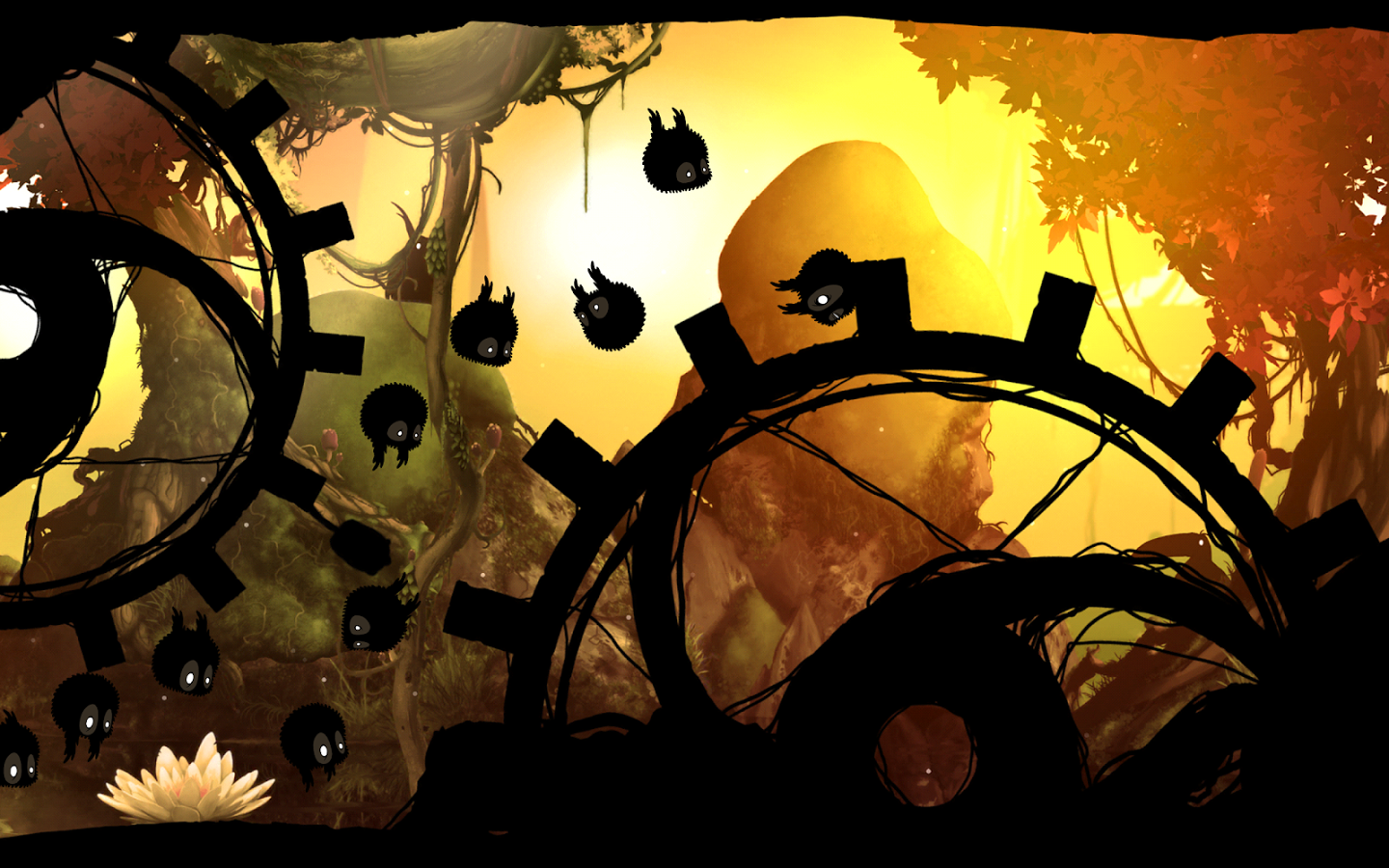
The mobile game Badland has received considerable attention for its captivating visuals

While researching games with strong creative voices, I also drew inspiration from Badland, a mobile game developed by Frogmind. Following its release in 2013, Badland has received considerable attention for its captivating visuals, simple controls, and adventurous narrative.

I admire developers such as Azalea and Frogmind for their ability to combine beautiful visuals, strong user interfaces, and programming to create games for the public. While I’m developing my own game for this project, I hope to draw inspiration from these successful elements in my own design.