ECloud (2010) is “a dynamic sculpture inspired by the volume and behavior of an idealized cloud.” It was designed by Aaron Koblin, Dan Goods, and Niki Hafermaas and is currently handing above in the San Jose International Airport. The tiles’ opacity updates periodically by real time weather data from around the world. The algorithm seems to take in values like sky weather, temperature, wind speed, direction, humidity, and visibility to produce the tile patterns and opacities. I love the simplicity of this installation and how it almost resembles indoor clouds. I think it’s a cool way to abstractly depict clouds and would be looking above if I were to come across this on my way around the airport.
This visualization was custom-made by a reddit user with a combination of R, Python, and Javascript and related plugins. The data used was estimated using a combination of U.S. Census data and public transportation inflow/outflow statistics. Using this visualization, we can make analyses about city activity. What I most admire about the project is the work put in to create the population estimates, and the fact that a straightforward visualization method (3D bars) can used to create an image that appears to make the city breath.
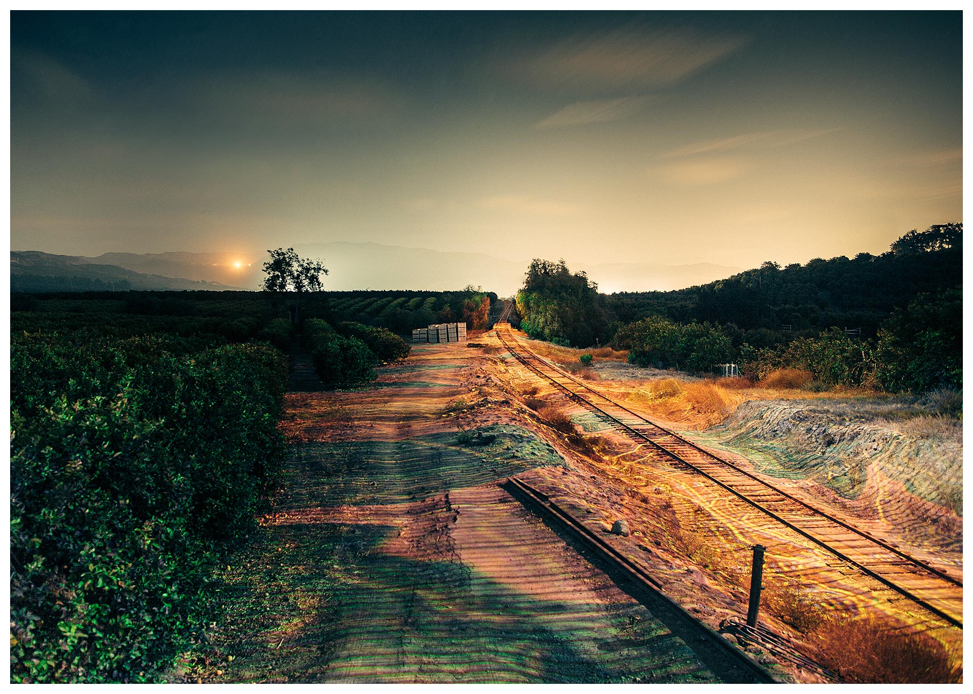
I was inspired by Ben Tricklebank’s and Aaron Koblin’s work called “Light Echos” where he broadcasts the patterns of light onto landscapes by a laser that is on a moving train. The artists utilize transportation and mount a laser to project various images such as maps, patterns and quotes onto the landscape. They represent space and time through the data of light reflecting off of earth. According to Wikipedia “A light echo is a physical phenomenon caused by light reflected off surfaces distant from the source, and arriving at the observer with a delay relative to this distance.” I admired how he was able to use coding and engineering to project the different images onto the landscape. This project was also a part of Doug Aitken’s station to station. Through this project these artists were able to use technology to manipulate how we look at the world around us.
The project’s name is ‘Mesmerizing flight visualizations over 24 hour periods’ and it’s created by NATS, an air traffic control services provider. It is not produced by an artist as an artwork but it did provide me with a fanscinating new way of looking at the sky.
As a student of design, it is often required to produce good-looking drawings that contain information. But I feel most of them a waste of time since the raw data is as clear as the visualized version. There are only two kinds of information visualization that I find meaningful: information that is ‘dynamic’ and information that can have interaction with. This project falls into the first category. For this project, even looking at the screenshot the dynamic flow of it can be felt.
In technical aspects, I think arrays in P5js can do similiar things by putting data of different flight courses in different arrays.
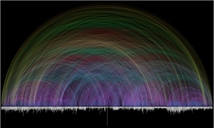
Chris Harrison’s Bible Cross-References Visualization Project
The computational information visualization project I chose was Chris Harrison’s Bible Cross-References. Chris worked with a Lutheran pastor to create a visualization of biblical data regarding textual cross references. At first, they wanted to create an interactive visualization that people could zoom in on and learn from but then they realized that a lot of other projects/programs existed for that purpose. As a result, their focus was just on the creative, beautiful visualization of the data. They wanted to capture the complexity of the data and honor the immensity of the textual cross references in the Bible. So, they came up with the visualization above. The colors represent the distance between two chapters from the cross reference and it creates a beautiful rainbow-like figure. There are so many different colored lines, 63,779 to be exact, that shows exactly what Chris wanted to show through this information visualization which was the complexity and immensity of the biblical data. I really admire this project because when I think of design, I focus on making effectiveness or efficiency and not just beauty. This project however really emphasizes the beauty of the data and focuses on a very simple yet important goal. It shows me that design can just be an aesthetic that I can admire and enjoy for visual pleasure.
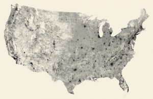
Ben Fry’s simulated visualization of every street in USA
Ben Fry works head of a design and software consultancy where he combines his knowledge in computer science and graphic design to generate visual data of different sets of information. As a fan of geography and integration of urban areas and habitation, this project called “All Streets” is basically what the title says it is – using his software of TIGER/Line shapefile to generate a series of tiles and prints out a map of every street in that country.
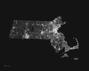
As a person who grew up in Boston, my bias tells me I like this print a lot
What makes me admire these sets of work so much is the negative spaces that generate in between the lines. One can see where the urban areas are, which spaces are largely inhabited and which may be resourcefully insufficient.
Canada is very sparse
The funny thing is that I have to remind myself every time that this is not a density population map or a light pollution map – these are simply streets; however, the magnitude of them is directly correlated to the number of people that use them in a given radius.
For this week’s Looking Outwards, I chose “The Creatures of Prometheus – Generative visualisation of Beethoven’s ballet with Houdini” by Simon Russell. This project visualizes the audio of Bethoven’s 1801 Ballet. The Houdini setup reads the notation and emits particles using the pitch to derive their height and amplitude to derive their speed. As the volume of each note increases it also effects the color emitted. This creates a futuristic, fresh feel. I was initially drawn to the colors and aesthetic of this piece– I love how the colors almost glow while floating in space. Although this piece was computer-generated and more related to information/data visualization, Russel still manages to incorporate his artistic sensibilities through usage of color and movement. The differentiation in colors of each section of the orchestra makes the music easier to dissect/understand. As a former violin player with background in music composition and orchestras, this generative visualization was very nostalgic and intriguing for me. It blends my 4 favorite disciplines together: design, art, music, and technology. As a design major, understanding this computational information visualization will inspire me to combine my knowledge in various disciplines together in order to create unique designs.
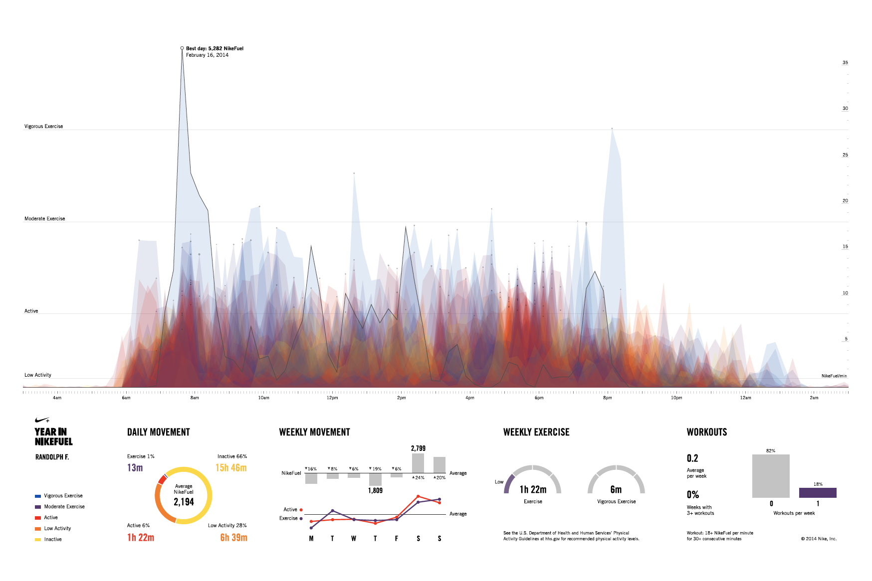
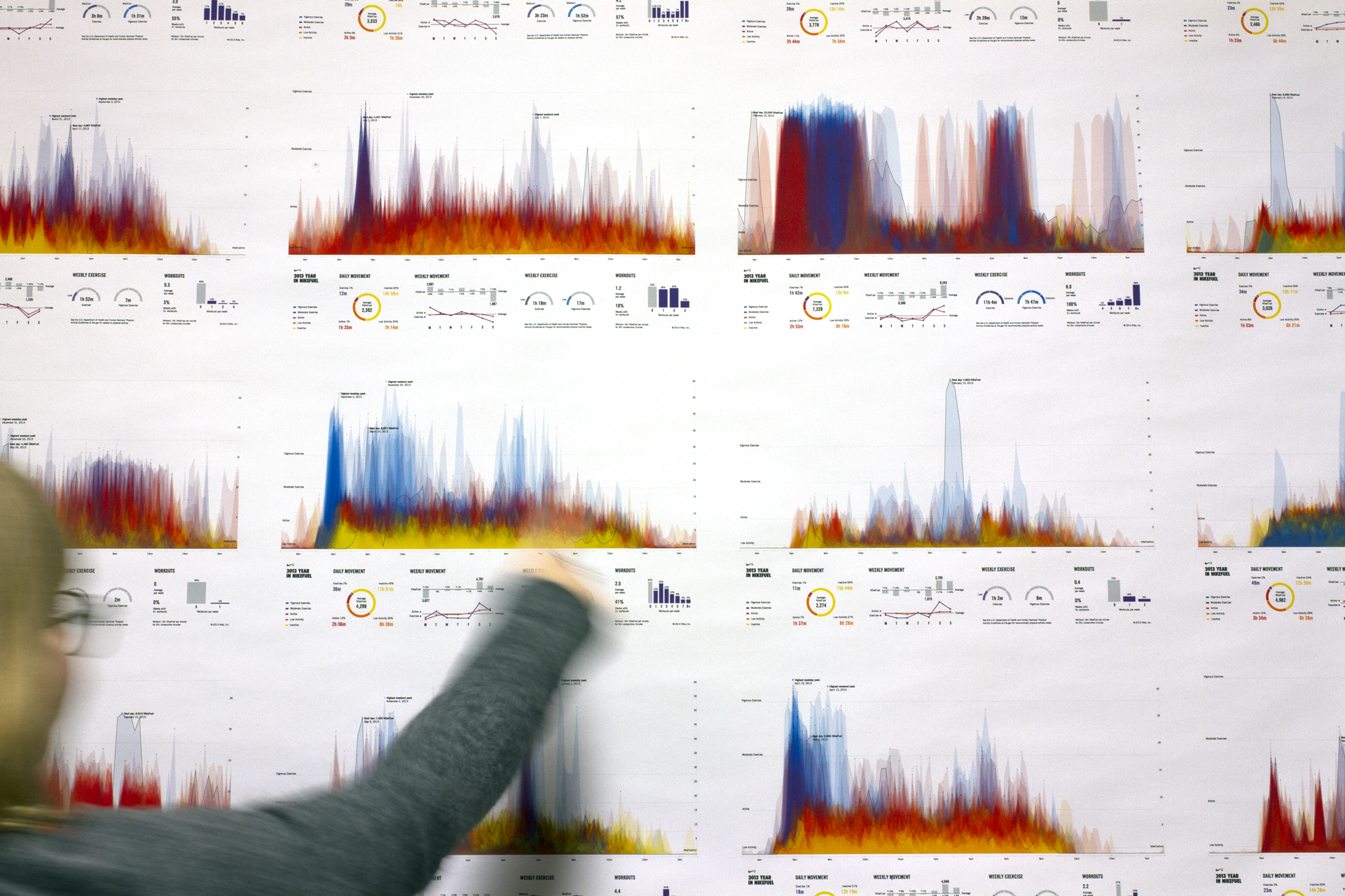
The above video shows the website “YEAR IN NIKEFUEL” built by Fathom for Nike+ FuelBand for users to view their personal physical activity patterns (couldn’t find exact year created) Link: https://vimeo.com/151097197
What I admire most about the various aspects of computation visualization information is how they bring so much convenience and assistance into our daily lives. The website that Fathom, a design agency, created in collaboration with Nike for Nike+ FuelBand users perfectly illustrates this. On this website, users are able to download and share posters with information of their daily movement for everyday of the year. Different colors are used to depict different levels of activities. Different concentrations of colors are also utilized to depict patterns and behaviors of activities. Unfortunately, I couldn’t find the algorithm and software that Fathom used to create the actual website, but the software that they used to create the model is Frame.
As someone who is having a hard time finding motivation to work out, I think this website is great for motivating those with low daily activities. Because of all the different usages (entertainment, easy access to various sources of information…etc.) that technology provides to us, most people today spend their time sitting in front of their TV or computer or scrolling away on their phone. Thus, they end up not “moving” around enough to build a healthy body. I really love how this app displays visually the differences of low and high areas of activities, reminding people of how their lifestyle is like as they can easily visualize it. The “sharing” aspect of the website also motivates people as others will be reminded or motivated to workout when they see their friends posting from YEAR IN NIKEFUEL.
The team’s choice of using the three primary colors (blue, red, and yellow) as the main theme colors for the website also helps to give the whole website a “simple” vibe that is user-friendly, which encourages people to try and experiment with the website. The various graphics that helps to organize information are also designed and considered so well that it minimizes distractions and helps users to understand the information right away. The graphics are designed so well that they seemed to be designed without effort. As a designer-in-training, I only realized how hard it is and how many things are needed to be considered when I entered the program of design at CMU. Thus, this is one of the many things that I am trying to learn from, which is why I admire this design from Fathom so much!
/* Samantha Ho
Section E
sch1@andrew.cmu.edu
Project 07*/var x;var y;functionsetup(){createCanvas(480,480);frameRate(25);}functiondraw(){background(255,255,200);var nPoints =20;var radius =250;var separation =125; // draw the squares in the back
push();translate(2*separation, height /4);for(var i =0; i < nPoints; i++){var theta =map(i,0, nPoints,0, TWO_PI);var px = radius *cos(theta);var py = radius *sin(theta);rect(px -5, py -5,10,10);}pop(); // draw the baseline squiggle
strokeWeight(1.5);stroke(0,0,255);fill(250,255,250,80);push();translate(2*separation, height /2);beginShape();for(var i =0; i < nPoints; i++){var theta =map(i,0, nPoints,0, TWO_PI);var px = radius *sin(theta);var py = radius *sin(theta);vertex(px +random(-5,10), py +random(-5,10));}endShape(CLOSE);pop(); //green squiggle
strokeWeight(1.5);stroke(0,190,200);fill(0,195,220,80);push();translate(2*separation, height /2);beginShape();for(var i =0; i < nPoints; i++){var theta =map(i,0, nPoints,0, TWO_PI);var px = radius *sin(theta);var py = radius *sin(theta);vertex(px +random(-mouseX/3,10), py +random(-mouseX/3,10));}endShape(CLOSE);pop(); //yellow squiggle
strokeWeight(1.5);stroke(0,190,200);fill(255,255,0,80);push();translate(2*separation, height /2);beginShape();for(var i =0; i < nPoints; i++){var theta =map(i,0, nPoints,0, TWO_PI);var px = radius *sin(theta);var py = radius *sin(theta);vertex(px +random(-mouseX/3,10), py +random(-mouseX/3,10));}endShape(CLOSE);pop();}
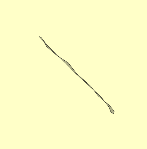
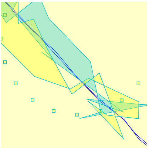
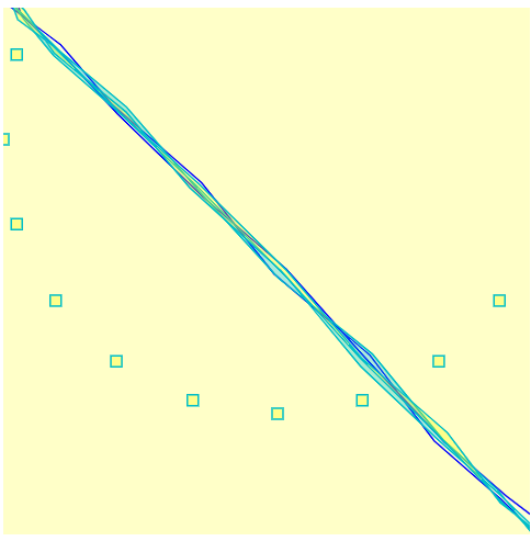
After playing around with the circles and the graphs, I liked the animated rendering effect so I continued to play around. I created this layered squiggle and baseline whose form is contingent on the cursor’s X-position.
initial vibrating squigglemax-position squiggleminimum position squiggle
I really liked Fathom’s project with Nike because not only is it visually stunning, but also it’s extremely interactive with the user. The charts break down a user’s daily movement and visualizes their active lifestyle. This is really cool because this feature is enhances the entire Nike+ FuelBand system. It creates a collaborative community aspect to the product that further engages the user
year in NikeFuel
Additionally to the community aspect, the details and features of each graph are unique to the user completely.
The top of the poster serves as a unique “fingerprint” of a person’s behavior, routines, and lifestyle, while the bottom portion offers a detailed summary of their year in hard numbers.
No user will receive the same graph, thus the sharing aspect is further encouraged so people can share with their friends and compare.
![[OLD FALL 2018] 15-104 • Introduction to Computing for Creative Practice](../../../../wp-content/uploads/2020/08/stop-banner.png)